Tree Abraham on Designing Kat Chow's Memoir Seeing Ghosts
Tree Abraham is a book designer, illustrator, writer, & maker of things. Here she takes us through her process for designing Kat Chow’s beautiful memoir, Seeing Ghosts.
“I love you as high as the sky, and as deep as the ocean”, Kat Chow’s mother used to tell her and her sisters, quoting from the children’s book Owly. Originally titled As Deep as the Ocean, later renamed Seeing Ghosts, Chow’s memoir is about the matching depths of love and grief. For Chow, grief came too soon after love when at thirteen her mother died suddenly from cancer. What follows is the telling of a Chinese-American family mourning in the cracks between two cultures. It is ancestral rituals lost in translation for a child of immigrants and a loss that was never going to make sense in any language.
To begin, I had: a 70-page book proposal with sample chapters; a Chinese-American creative director with his own experiences and vision; a Chinese-Peruvian best friend grieving her mother’s recent passing from cancer at a similar intersection; a brief that said NO ASIAN IMAGERY; a publisher that said “maybe Asian imagery?”; and an editor prompting visuals that were creepy-whimsical-cool-macabre.
A rising debate in the packaging of books by BIPOC authors is to what degree ethnicity should be evidenced on a cover. Some argue, historically underrepresented voices should be overtly advertised as such, with a cover that celebrates its non-whiteness after centuries of default-white protagonists. Others argue that an unfair burden is placed on BIPOC works to overemphasize ethnicity, without the creative freedom that white authors are afforded in their words and on their covers. I argue that race is not a literary genre, it is one element of many that may be at the heart of a narrative, and as with all covers, the extent to which this heart is displayed is a cryptic negotiation between the author’s content, what a publishing team believes will tempt prospective readers into courtship, and whatever glow a designer can muster.
Intuitively, I aspired to find a design solution that had a nod to Chinese culture, with a twist—not stereotypically, or as an exploitation of a minority voice, but because the book is about how belief systems define us, and the uniqueness of Chow’s subject matter was a fascinating angle to explore visually.
In the first few rounds, I drew from scenes in the proposal that made mention of ways the dead are honored that comprised both Chinese and American elements. I searched for a photo of offerings at the temple that mixed traditional foods with some Western snacks. I put incense in a Folgers can. There was a funny story of how the author’s mother’s initial tombstone was carved to replicate the hand-drawn design made by Chow and her siblings that included fish, flowers, and bamboo stalks, with the company using Comic Sans to imitate a child’s handwriting.
When the family visits the grave and it starts to pour rain, Chow’s older sister pulls out a collection of goofy-patterned umbrellas and they hand them off to one another, pricking the sorrow with a communal tenderness and humor. Seeing Ghosts lives here, not just in the seams of two cultures, but of emotional states that break and rebuild us.
After meals, Chow’s mother would inspect her rice bowl for remaining flecks, saying “the number of grains you leave behind will be the number of pockmarks your future husband will have”. I imagined this becoming one of many things that would forever remind Chow of her mother. It made me think of tasseography, and how in our yearnings, we search for familiar patterns amongst the flecked randomness.
There was no consensus on the directions. With every round there was discussion over whether the Asian symbolism was necessary or not enough, whether the palette should be vibrant or subdued, and what the symbols were conveying in relation to the title.
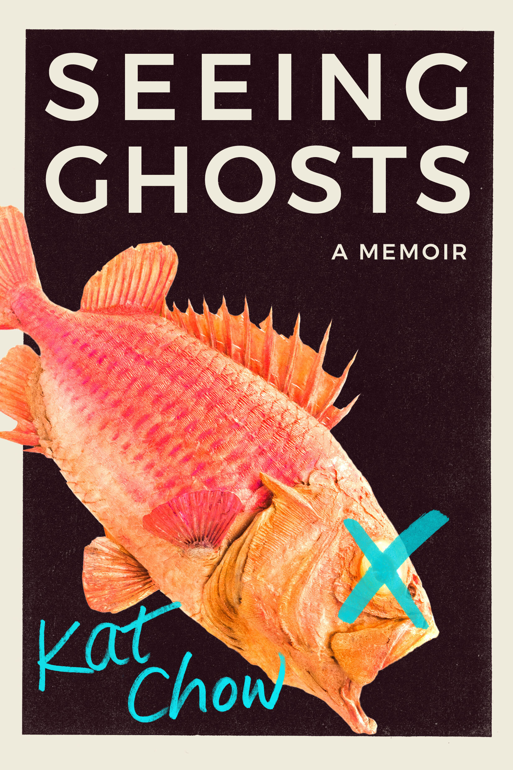
One symbol that Chow had suggested was a dead fish. Chow’s mother had once jokingly requested her body be taxidermied after death and kept in Chow’s future apartment so that she could always be a part of Chow’s life. Many years later, Chow found a dead fish in the family home, with congealed eyes, peeling scales, and crispy fins. It was her father’s attempt at taxidermy.
A dead fish was obviously fitting to the book, but the main challenge was how to make the fish appear dead without appearing horrific. A classic taxidermy fish made it seem like a book about fishing, and was not reflective of the amateur version decomposing in the Chow home.
My creative director, Albert Tang, suggested greater abstraction. He envisioned glimmering scales and saturated hues.
The team had many favorites among these with the ultimate decision of fish, background color, and cropping being made by Chow herself. The author name is not written by me, or a fake handwritten typeface, or the computer’s interpretation through Comic Sans. It is Chow’s own handwriting, and it is exactly right.
Final cover
Editor, artworker and lifelong bibliophile.