Emily Mahon Creates a Strong Cover for Juli Zeh's Empty Hearts

Emily Mahon is an Art Director for Doubleday in New York. Here she takes through her process for designing Empty Hearts by Juli Zeh.
I always enjoy working on covers for the German author, Juli Zeh. Her writing is unusual, contemplative, and smart. Since the first book I worked on for her, In Free Fall, I've developed an overall look that continues to work. All three of these novels are loosely related visually, but what makes them cohesive is the cut-paper approach, bold colors and lines, and big type. For In Free Fall and Decompression, I came up with concepts that needed to be shot and I cut the type into paper, and had them photographed with dimension.


For Zeh’s most recent book, Empty Hearts, the subject matter connotes urgency. In this near-future dystopian thriller set in Germany, the protagonist searches the Internet for people contemplating suicide, and invites them to her organization, called the Bridge. She then links some of these people with organizations looking to deploy them in suicide missions for a fee paid to the Bridge, and to the participants’ survivors. The story is funny at times, but mostly dark.
I started experimenting with cut paper and layering the letters in such a way that there was some slight dimension and texture to the paper. I scanned the letter forms in and started adjusting the contrast. It actually seemed to work best when the letters appeared more in silhouette, but remained obvious still that I had cut them.
I kept thinking, I don't want to show a heart since it's in the title. That’s too obvious! So, I tried a few options with bridges forming teeth in a face or just using the bridge as a central element, with rain falling.

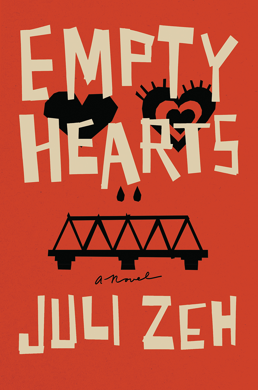

But, I kept coming back to eyes and tears, and how menacing just one eye would be. It just made sense to stick the eye in a not-perfect black heart and let that be it. I printed this with 2 hits of red and 2 hits of black to create a rich feel on an uncoated textured stock. I think the simple palette, with that slight touch of blue, has worked in making this cover pop.
Final cover
Editor, artworker and lifelong bibliophile.