Sarah Lopez on Designing Futures: A Science Fiction Series for Radix Media
Radix Media publishes new ideas and fresh perspectives, prioritizing the voices of typically marginalized communities to get to the root of the human experience. Sarah Lopez currently runs their digital press and is responsible for designing the lion’s share of their new Futures: A Science Fiction Series. Here she takes us through her process.
Futures: A Science Fiction Series explores critical contemporary issues in an imagined future. It features stories about climate change, dystopian politics, animal uprisings, interpersonal relationships, reinvention of the self, and of course, robots! Each chapbook was written by a different author and features illustrations and graphics from different artists. Our challenge was to create one cohesive identity to unify the different styles.
We started by setting parameters. Radix Media was initially formed as a print shop, and all of our publications are designed and printed in-house. Our covers are usually letterpress printed, so that set some limitations from the beginning. The nature of letterpress printing means that we’re bound to a limited color palette if we want to be efficient. We decided that the covers would be printed using two ink colors on colored stock—a primary color used to print most of the information on the cover, and a secondary color that would be used for the Futures logo and accents. My co-worker Nick suggested that we use pastel cover stock to make the chapbooks stand out. The pastels are a slight departure from more traditional sci-fi covers while staying true to the aesthetics of the genre.
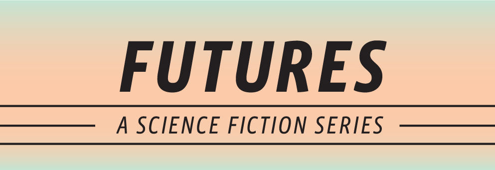
The next step was coming up with a header and choosing the typeface for the title. We wanted the header to be bold without taking too much attention away from the individual titles. We also wanted it to look modern, but reminiscent of vintage sci-fi. I presented four header options. We had cover art for the first story, Always Blue written and illustrated by John Dermot Woods, so I used it to mock up the headers. I also came up with a quick idea for the second story, Guava Summer by Vera Kurian. This would give an idea of what the header would look like using art and titles of varying sizes. We decided to go with the first header—it’s sleek, leaves plenty of room for the cover art and title, and is prominent without attracting too much attention. The header is set in Vista Sans OTCE and the chapbook title is set in Oriya MN.


We promoted each chapbook individually, but wanted to market Futures as a series as well. Futures was originally available as a subscription, so I wanted a visual to use when asking people to subscribe. I knew that we were publishing seven stories, and that all of the covers would be printed on pastel paper, so I made a red and blue gradient, and played around with different value ranges until I arrived at the gradient that we used for all of the graphics specific to Futures as a series. I didn’t want to use any of the colors from the specific chapbooks, and I also avoided black, white, and gray. We think that the gradient also hints at the wide range of stories in the series and the different backgrounds and perspectives of our authors.
The cover art for each chapbook was created by different artists, my coworker Nick designed two of the covers, and I designed the rest. I’m happy to say that they all look cohesive and part of a whole. The consistent running header and use of primary and secondary colors pulled each book into the project's visual identity while allowing them to stand on their own.


Editor, artworker and lifelong bibliophile.