How to Perfect Your Book Cover’s Typography

Even if the average bookshop-browser doesn’t know the difference between a serif font and a sans serif font, the typeface of your book's title and other cover text can make the difference between yours being the book they pick up, and the one they glide past.
An especially crucial component of your book’s cover, your choice of typography can let readers know whether your book’s for them by reflecting its content, genre, and overall professionalism. The wrong typographical choice can make it seem unprofessional, unexceptional, and misleading — a font-derived fate we’d all rather avoid.
The first step towards making your cover text look professional is being aware of visual hierarchies. To highlight certain elements and help readers navigate your cover, you can play with the weight and size of the lettering, as well as the natural contrast, to achieve an elegant balance between image and text.
Experimenting with shape and form, and light and dark, might sound like something you’d have to learn about in art school (as many book cover designers will have done), but the basics are actually quite intuitive. For example, if your cover features an elaborate or eye-catching illustration, keep the typography simple and understated — as on the cover of Beth Morgan’s A Touch of Jen — to let the artwork grip the reader’s imagination. If you want the text to dominate the cover, pare back the imagery, as Anna Morrison has done with Glittering A Turd. (Who wouldn’t want that title to stand out?)


This kind of cover — where the text is left to speak for itself — goes well with big, bold typography. Frequently used for books with emphatic titles (like ones about turds), this typography shouts “Look at me! Pick me up! Read me!” As you may have guessed, subtlety is not a priority here, so often you’ll find these big, bold titles sitting atop bright splashes of color.
Of course, making typography the visual focus of your cover doesn’t have to mean blowing up the font until it fills all available space. While your title does need to be large enough to be read (whether from an Amazon thumbnail or bookstore shelf), keeping things minimalistic and playing with white space is another effective way of making the absence of an image into an attention-grabbing statement.
Minimalist covers, mastered by the likes of Matt Dorfman and Peter Mendelsund, are stripped back to the bare essentials: simple fonts, muted colors, and very minimal, often abstract, design elements. Quiet and elegant, these sorts of covers have the bewitching power to turn a whole lot of nothing into something.


Whether you go big and bold or simple and understated, one of your main priorities when perfecting your book cover’s typography will be your font choice. There are a few industry truisms when it comes to fonts: serif fonts are thought to look more trustworthy, sans serif fonts more modern, and swirling fonts tend to evoke fantasy. But really there’s only one hard and fast rule: don’t use a font that comes pre-installed on MS Word.
If you find a font on Word that you think is perfect for your book, at least tweak it in a program like InDesign before adding it to your cover. You can alter the spacing or the length of letterings, or use an eraser tool to remove the edges — anything that prevents the font from being instantly recognizable. Authors who use a font like Comic Sans or Garamond when self-publishing a book immediately stamp their cover with the word “amateur” in big red letters.
For a cover that looks homemade in the very best way, you might try a hand-written title. This kind of typography feels right at home on the cover of quirky YA with buckets of warmth and personality (think anything by John Green) — but hand-drawn covers are so versatile that they’re present in pretty much every genre. The versatility of hand-drawn fonts also makes them the perfect vehicle for designers to add a special touch — such as turning the Y in “Gatsby” into an elegant cocktail glass, or the ampersand in “Eleanor & Park” into a headphone wire.


Given complete freedom to exercise their creative license, some designers will create a font that is almost an image in and of itself. Thinking of typography as part of the design can be a really cool way to include visual puns on your cover that hint at elements of your book.
The Delivery by Peter Mendelsund, for example, has been made to look like a parcel wrapped in brown paper (I promise it’s very cool in person); while Na Kim’s cover for The Rain Heron has been made to look like a display case in the rain — and I really want to touch it.


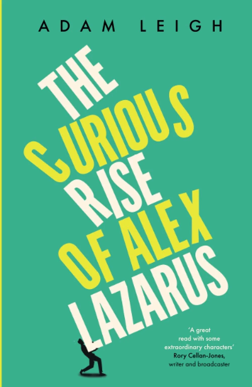
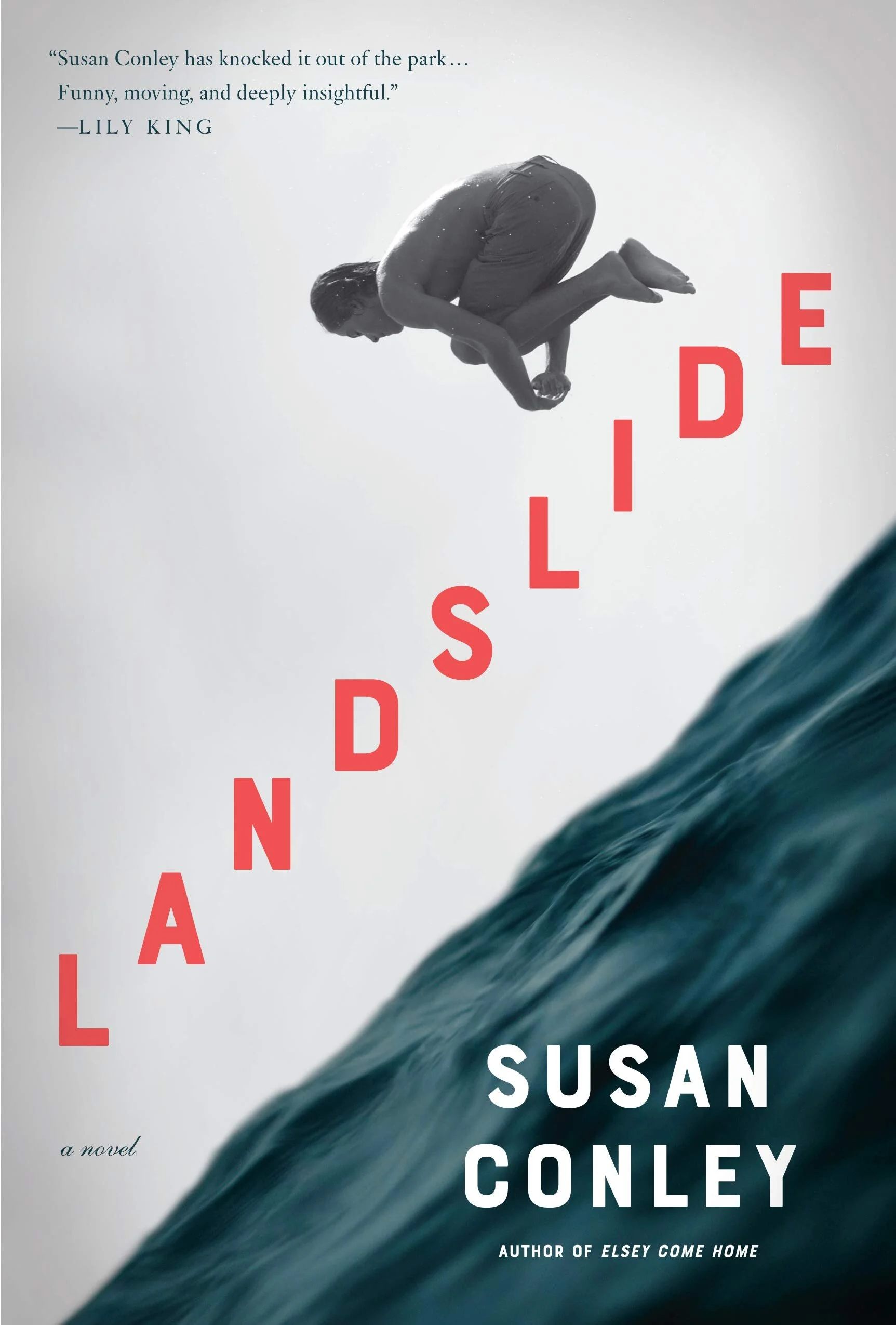
If you don’t quite have the artistic skill of Na Kim (and let’s face it, who does?), there’s a much easier way to combine imagery and typography on your cover — and it’s all about placement. Just by tilting some letters, Jack Smyth has made the title of Adam Leigh’s book look like a precarious stack of very large words; while Kelly Blair has created a dizzying sense of movement on the cover of Landslide simply by putting the title along the diagonal.
Of course, whatever you do with your typography is about more than just creating a cool illusion; it’s about conveying a message. And a very crucial part of that message is signaling to your audience that your book is, say, a romance, or a memoir, or whatever category it might fall under. Readers of certain genres will, consciously or unconsciously, expect certain things from the covers of the books shelved in their domain. And if your genre has strict conventions (for instance, those swirling fonts favored by high fantasy that I mentioned earlier), it’s important that you don’t stray too far from the ventured path.
To sum up, the role of typography on book covers is to a) maximize the impact of your book title, b) draw the reader's eye, c) reflect the book’s content, and d) send a genre bat-signal. If you achieve all of that, nothing is going to help your cover more when it hits the shelves — and hopefully I’ve shown you a few ways in which you can tick every one of those boxes!
Savannah Cordova is a writer with Reedsy, a marketplace that connects self-publishing authors with the world's best editors, designers, and marketers. In her spare time, Savannah enjoys reading literary fiction, writing short stories, and browsing the bookstore for interesting covers. She's no artist herself, but she remains deeply fascinated by contemporary design!