Eric C. Wilder on Designing Nataliya Deleva’s Four Minutes

Eric C. Wilder is a freelance cover designer, and former publisher of Spine Magazine. He, along with designer Cherie Chapman, is co-founder of Chapman & Wilder, a studio specializing in book covers, interior layout, and marketing across all genres. Here he details his process for designing the upcoming English translation of Nataliya Deleva’s Four Minutes for Open Letter Books.
Nataliya Deleva’s award-winning debut Bulgarian novel, Four Minutes, is a multi-layered portrait of the kids left in care homes for orphaned and abandoned children during communism and its painful aftermath in Bulgaria. (more)
For the English translation, Anthony Blake of Open Letter Books had sent me a brief that included materials such as excerpts, plot summery, and the original Bulgarian cover. What caught my interest among these materials was and explanation of meaning behind the title, which was strongly tied to the structure of the book. Within the novel there are standalone character studies that are meant to be read in about four minutes time each – a nod to a social experiment that hypothesized that it only takes four minutes of looking someone in the eyes and listening to them speak to develop empathy for that person. From that premise I knew that I would take a look at a few options that centered around eyes.
In this first concept I wanted to show a pair of eyes over a passage of time intermingling with the title and author name. I didn’t feel that a reader would understand there being a time passage in a repeat of the eyes without some significant change in each pair. So I decided that the first pair should have a youthful wide-eye feel to them. Then each pair after would progress with about a decade of growth in-between to dramatize the passage of time. It finishes with the more mature, empathetic gaze. The illustration and hand-lettering for this option was done by Andrea Hickey (who I highly recommend working with!)

I did another option where I tried to make a connection between eyes and the passage of time, along with one that was in direct reference to time, but they both felt a little overstated.
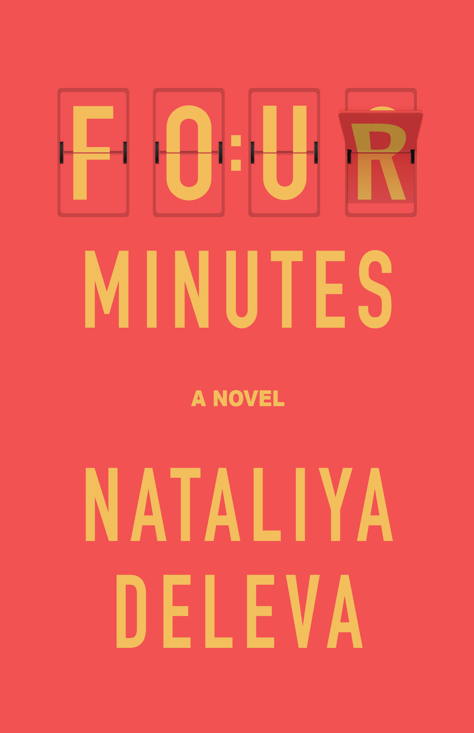
Final cover
The approved cover is a clean and simple visualization of how we interpret what we see. I created a medical diagram on how the eye sees “A Novel” and then translates that for the brain. It felt like a visual metaphor. It is also designed so that the title and author name make a clear visual impact in a retail environment. There’s a nice balance in how they played on the top and bottom of the image area. “Four Minutes” boom. “Nataliya Deleva” boom. Simple, elegant. I’m really happy with the way it turned out.
The English translation of Four Minutes will publish in 2021.
Editor, artworker and lifelong bibliophile.