For many people, several decades since the FedEx Logo was designed, the FedEx Arrow is still something that has yet to be discovered.
Lindon Leader designed the famous FedEx logo back in 1994, and with this prestigious logo design, inadvertently created something way more powerful than ‘just’ a logo.
People around the globe see the FedEx logo on a near daily basis, and this brilliantly bold and colourful logo quietly does its work to promote, market, advertise, represent the company for which it represents.
They recognise the FedEx logo, and get on with their day.

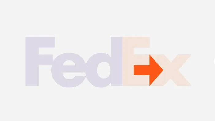
Then there are the people who know this dirty little secret about the FedEx logo, and for many all they now take note of is the arrow first; with the FedEx wording following closely.
For many, the FedEx arrow IS the FedEx logo, or at least a big part of it; this genius bit of negative space design somehow outshines the purple and orange lettering.
FedEx Logo and Negative Space
This use of the negative space between the E and x, has ensured that the logo has won several awards, and makes it one of the most effective logos designed.
Design guru Stephen Bayley included the FedEx Logo in his list of the 20 Designs that Defined the Modern World, calling it “one of the happiest accidents in the history of graphic design.”

The FedEx Arrow was a Happy Accident
This forward facing arrow wasn’t planned at all; it came about somewhat by chance.
During the comprehensive FedEx logo exploratory stage with over 400 versions being designed, it was noticed that the negative space between the E and x created a suggestion of an arrow.
“Farthest from our minds was the idea of an arrow. But in an internal critique midway in the logo exploration, I was intrigued by a design that had very tightly spaced letters.”
“After a few days, it dawned on me that if a genuine arrow could be introduced into the letterforms, it could subtly suggest getting from point A to point B reliably, with speed and precision.”
https://edition.cnn.com/
The power of the arrow, Leader thinks, is simply that it is a hidden bonus, and not seeing doesn’t reduce the impact of the logo itself.
So how many people actually see it without being told where it is?
“The prevailing notion is — I’ve heard — that perhaps less than one in five people find the hidden arrow unaided.
But I can’t tell you how many people have told me how much fun they have asking others if they can spot something in the logo,” Leader said.
https://edition.cnn.com/

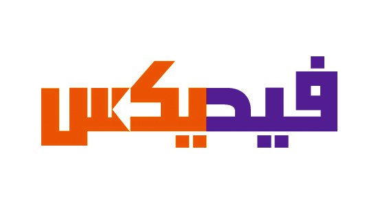
The Arabic FedEx Logo
It’s also worth noting that the Arabic version of the FedEx logo, also includes the arrow, but this time going from right-left.
Given Arabic is read right-to-left it then makes sense that the negative space arrow follows this same reading direction as well as the design logic of the original FedEx logo.
It’s a heck of a lot easier to spot the negative space arrow in the Arabic version due to the typography constraints, but it’s still a decent translation/conversion.


Federal Express Corporation
Following text from the Leader Creative FedEx Project Page:
A global research study revealed that customers were unaware of Federal Express’ global scope and full-service capabilities, believing that the company shipped only overnight and only within the United States.
Federal Express was advised to better communicate the breadth of its services and to leverage one of its most valuable assets—the FedEx brand.
The bold FedEx identity, with the “hidden arrow” embedded in the “E” and “x”, conveys the dynamic attributes that maintains FedEx leadership.
The system allows for better consistency and greater impact in an array of applications ranging from packages and drop boxes to vehicles, aircraft, customer service centers and uniforms.