Dominic Forbes on Designing Skyward Inn

Dominic Forbes is a London-based designer who worked at HarperCollins for many years before going freelance in 2018. Here he talks us through his process for designing Skyward Inn.
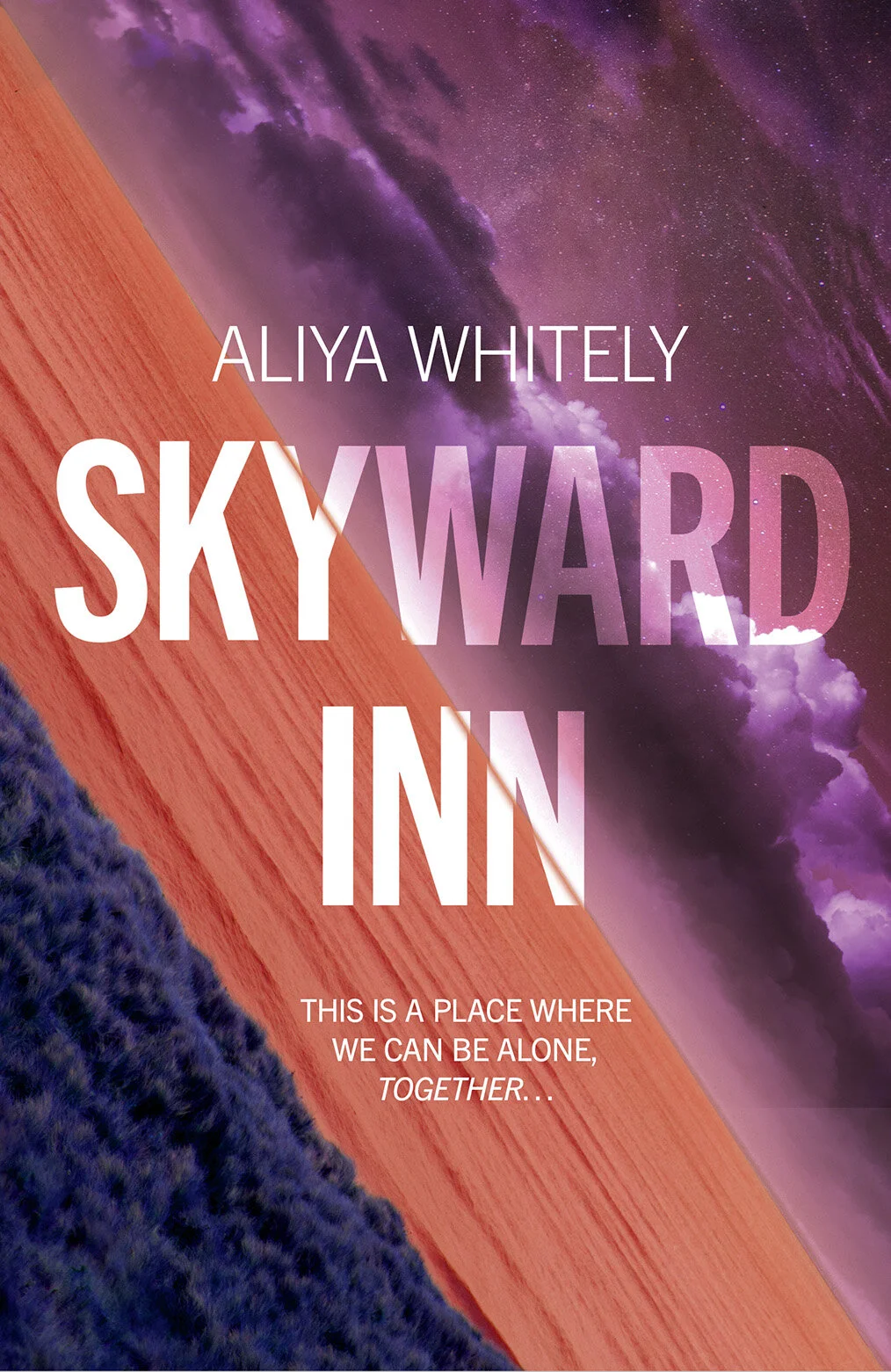
Skyward Inn is a speculative science fiction novel by Aliya Whiteley published by the Solaris imprint of Rebellion.
The titular inn is situated in The Protectorate which is an enclave on an Earth which has just won a war against an alien civilisation, the Qitans, far across the galaxy through a portal. The co-owners of the Inn are human and Qitan, veterans escaping the aftermath of the war and seeking a quiet life. The Protectorate eschews modern technology, so the parts of the story set there are not shiny technological sci-fi, the feel is very pastoral or frontier like. Almost like one of those classic Cornish smuggler pubs in a Victorian novel.
The book is really beautiful and haunting. It gradually reveals information about the war and the past of the characters, drawing the reader into a complex, layered story about belonging and what it means to be human. The flashbacks to the conquest of Qita are almost hallucinatory in their strangeness.
The brief was for a design-led, literary cover featuring some of the elements of the book.
Looking back at my sketchbook, I made a lot of quite cryptic notes for this one, there were so many different things in the story that could translate into a cover design. It was actually quite tough to whittle them down into a reasonable amount of approaches. Things that stand out are: pub, chips, pie, pints. Grey light, perfect fractal patterns. Bench, galaxy. Purple sky, red ocean. Hand melding, belonging, ownership. “I TAKE HIS HAND”, macro plant photographs = weird.


For the first round of visuals I explored a range of concepts ranging from typographic, through scenic to abstract.
A bold typographic option with images pulled through the letterforms themselves, representing Earth with blue sky and green grass, Qita with purple skies and star fields. I tried using the title as an actual pub sign, with a beautiful starry night sky behind.
A couple of options with macro photographs of plants, succulents in particular look incredibly alien close up.
Various scene based ideas. Showing the pub and a lonely bench that features in the book. Looking at how to represent the two worlds in some way, an alien red sea in a split cover with the bench on Earth, or just Qita’s red seas and purple skies.
One idea which was starting to look interesting featured two hands reaching towards each other across the night sky, but with a weird melting effect. Representing Human/Qitan duality, two worlds reaching out across the stars. Without giving too much away, hands are important to the story beyond the obvious representation of two former enemy species reaching out in friendship.
As well as these more literal renderings I wanted to try and represent the alien, slightly hallucinogenic atmosphere I got from the book with something more abstract. To that end, I used a stock image of abstract bubbles which I manipulated and montaged with the photos of two hands reaching out from the other visual, but so hidden within the illustration as to be almost invisible at first glance. The bubbles helpfully represent the Qitan-brewed beer too. For these options I went very big and bold with the type, I also tried adding etching style illustrations of objects from the book to hint at the almost “living in the past” feel of the Protectorate.


After submitting the first visuals, I was really pleased that Rebellion chose the bold abstract option to develop further, it was definitely my favourite too.
For the next round they just asked for a range of colour treatments. At this stage I also worked the type a bit further by allowing it to subtly interact with the bubbles, this seemed to integrate all the elements nicely into a strong and cohesive cover.


This design really lent itself to a full wraparound illustration which allowed me to bring in further elements on the back such as a beer bottle and the “kissing gate” stones from the Qitan homeworld. The print budget allowed for both spot varnish and case blocking, for which I emphasised those bubbles again.
All in all this was a fab project to work on and I’m really pleased with how the whole package turned out. Many thanks to David Moore at Rebellion for the brief.
Final cover


Editor, artworker and lifelong bibliophile.