Andrew Davis on Designing Finding Henry Applebee

Andrew Davis is a designer and illustrator at HarperCollins. He lives in London. Here he tells us about designing the cover for Finding Henry Applebee.
Finding Henry Applebee is a charming and uplifting story about unlikely friendships, the power of love, and how it’s never too late to change your life. It follows eighty-five-year-old Henry Arthur Applebee as he boards a train from London to Edinburgh, on a mission to find the woman who escaped his life decades earlier.
As this title was published initially as an e-book, I had to ensure that my designs were legible, clear, and eye-catching at thumbnail size. In terms of narrative, the brief was fairly open. It asked for the cover to be ‘emotional and uplifting’, while at the same time communicating a life-changing journey. I also had to ensure that it appeal to readers of commercial fiction and romance, as well as making it clear the novel has a slight literary leaning, too.
I began with some literal indications of a journey, using symbols associated with rail travel. Initial ideas using train tracks proved to be too harsh and mechanical, so I then used a train ticket as a frame in which I could insert the text. The title was different then, so this design focused on the ideas of transformation and lost love.
Some colleagues still felt that these designs were too harsh, so we discussed trying a typographic cover with some elements from the above design. I recycled the origami birds and heart, but though the new approach would appeal to readers of commercial romance, it didn’t evoke the personality of the book clearly enough.
During the book’s edit, the title of the book changed. I revisited the ticket idea, but it no longer seemed cohesive. It also seemed too bright. With the title now focused on Henry in the singular, it became clear that I needed to focus on Henry, and try to imbue the design with a sense of his sweet yet quirky personality.
So I began to think about the sort of luggage that Henry might typically use. Leather vintage brief- and suitcases seemed to do the trick, as these helped show a sense of Henry’s age, of the time in which events take place, as well as a sense of nostalgia. Although the cover needed to be bright and eye-catching, I wanted to give the art a hand-rendered quality, even though they were finished using my Wacom tablet and Photoshop. I applied a parchment texture to the background, and processed the drawings to give them a woodcut style finish. Next I played with the individual letters, hoping to give them a slight higgledy-piggledy feeling, which was in keeping with Henry’s character.
The title changed again, but this didn’t impact the design. Following some tweaks, the final design was ready to go. I had loads of fun trying to give readers a sense of Henry without showing him on the cover. These objects seemed to find Henry Applebee, after all.
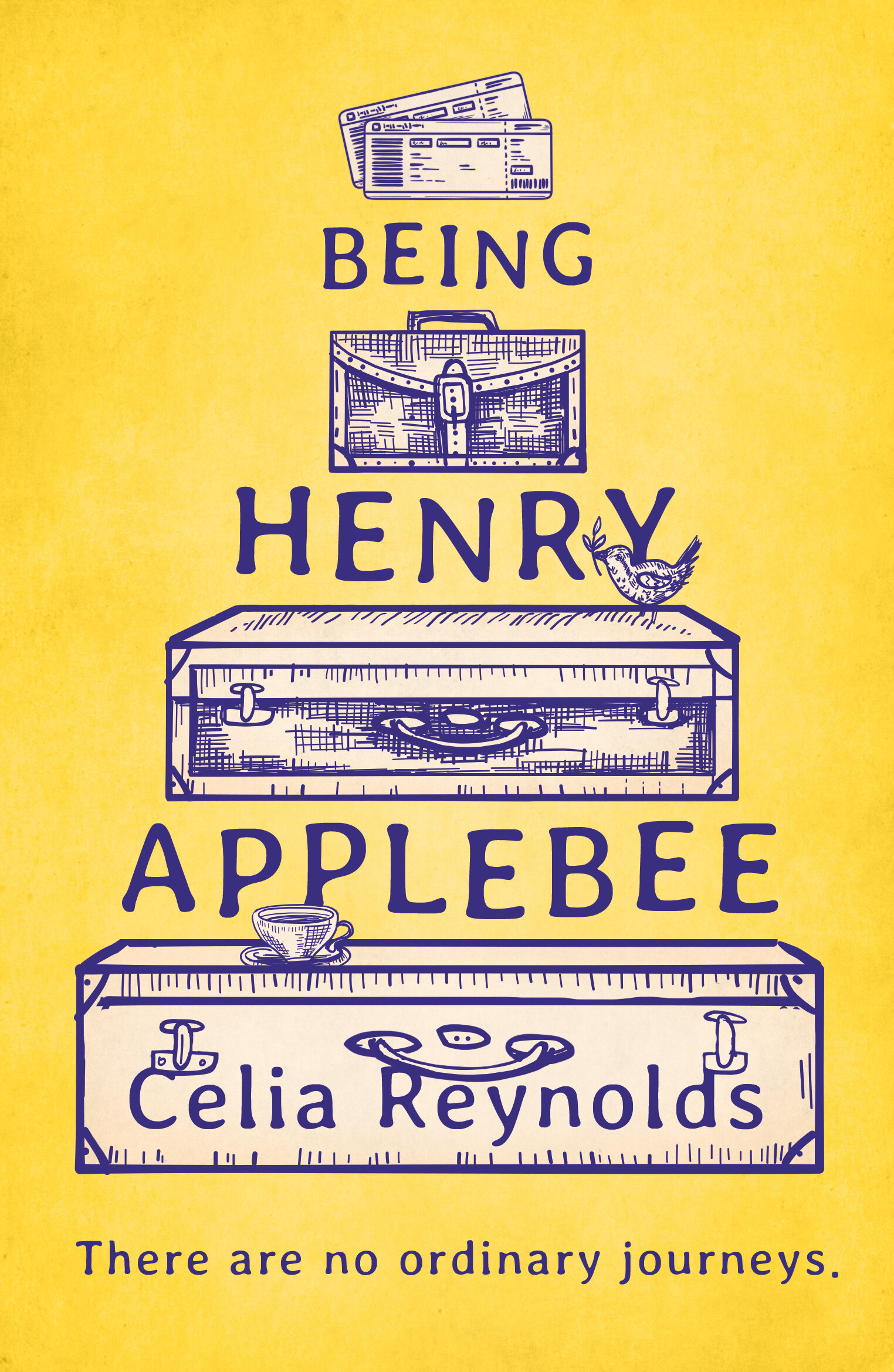
Final cover
Editor, artworker and lifelong bibliophile.