Henry Petrides on Designing Lauren Groff's Matrix
Henry Petrides is a book cover designer and illustrator based in London. He currently works as a Senior Designer for Penguin Random House. Here he takes us through his process for designing the cover for Lauren Groff’s Matrix.
It’s hugely daunting being asked to design a cover for one of your favourite writers, particularly when that writer is as universally acclaimed as Lauren Groff . Lauren’s short story collection Florida took my breath away, and her new novel Matrix is equally as exquisite.
Matrix tells the fictionalised story of Marie De France, banished by the royal court to become the prioress of a remote and ailing abbey. The novel follows her decades of rein over the abbey, exploring themes of female creativity, desire and power. I read the manuscript over Christmas last year, jotting down phrases that caught my attention and doodling some initial visual ideas in the margins. I could sense at this early stage it was going to be a balancing act between the medieval setting, and the thoroughly modern tone of Lauren’s writing.
After reading, the first point of call was immersing myself in imagery from the Medieval ages, with a focus on religious scripture and illustration. I love this stage of the book cover process - pulling in references and reflecting on how you might reassemble them in a way that feels new, or how you might collide them with something completely different to complement the atmosphere of the book.
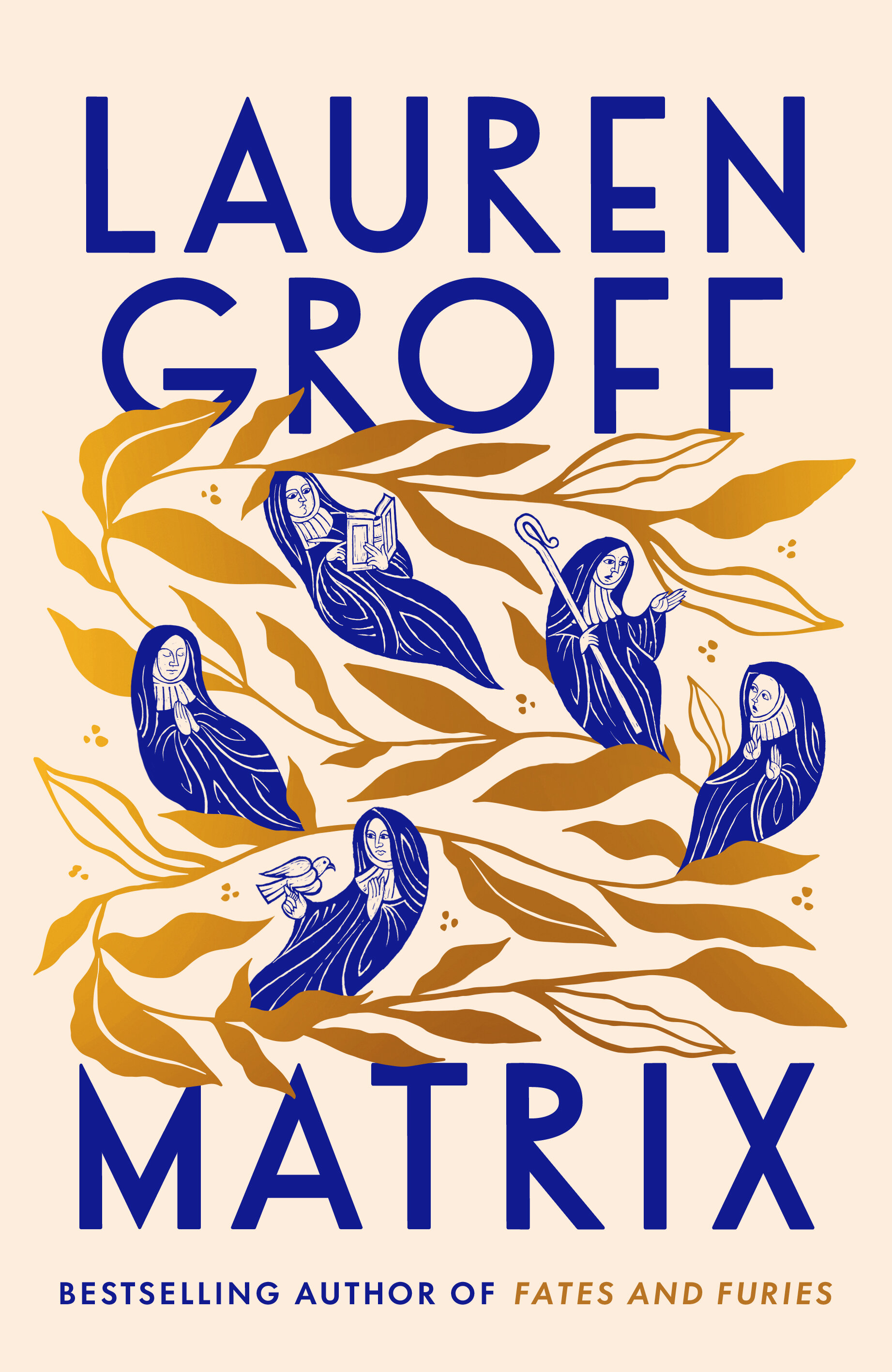
As part of this research I listened to a lecture on the liturgical practices of medieval nuns by Dr Katie Bugyis, after seeing the author mention it as a starting point for Matrix. One part of the lecture revealed how lapis lazuli (a very rare and expensive blue pigment used in the creation of illuminated manuscripts) was found embedded in the teeth of an 11th century nun. It was concluded that the woman was a painter who might have ingested the pigment while licking her brush to a point, and this transformed the assumption that only monks worked as scribes on these luxurious manuscripts. Like Lauren (who beautifully references this discovery in the text) I found this to be such a dazzling image, and knew then that a bold, unnatural blue would become a key component of the book’s visual identity.
After some initially more stripped back visuals, I took inspiration from one of Marie’s visions in the book – women sprouting from the branches of a tree. I felt a version of this would be an ideal way to portray the thriving community of the abbey, as well as introduce the book’s mystical and humorous elements. I came across the work of Elana Gabrielle, a Portland based illustrator whose drawings of plants have a clean and modern sensibility that I could see working to balance the historical setting. Elana kindly agreed to let me adapt an existing piece of her work for the cover, so the next stage was commissioning the illustrator Joe McLaren to bring the sisters of the abbey to life. I discussed with Joe about echoing the naïve and jagged illustrative style of medieval manuscripts, and how I wanted the nuns to interact across the rustling leaves. A huge thank you to both Elana and Joe for their amazing work.
I was overjoyed when Lauren said she loved the cover, describing the sisters as ‘jolly blue nun-beans’ and the font choice as ‘the sans-serif of [her] dreams’. This was such an exciting brief to work on, and I couldn’t be happier with the finished result.
Final cover
Editor, artworker and lifelong bibliophile.