Laura Mock Redesigns the Iconic Ramona Series

Laura Mock is a graphic designer focused on book and print design with a love for typography. Here she gives us a peek into her process for redesigning the Ramona series, those timeless childhood favourites by Beverly Cleary.
Growing up, I was a huge Ramona Quimby fan and have such fond memories of my mom reading the books to me over and over and over again. I grew up in Portland, Oregon (where Ramona grew up) and my parents would drive us by Klickitat Street so we could try to guess which house was Ramona’s. Needless to say, I was incredibly excited when I found out that I would be working on the latest repackage of this series’ covers!
My art director, Erin Fitzsimmons, and I started the redesign process by looking at the existing covers to see if a design refresh using the existing art could work. I isolated the illustrated characters, zoomed-in on them, and placed them on bright solid backgrounds. I thought filling the background with different styles of hand lettered titles could be a fun and fresh addition to the series.
Original series
In the end, the team decided that commissioning new art would be best direction. We knew how beloved Ramona is to so many readers and the importance of choosing the right artist, so we commissioned character sketches from three different artists. We fell in love with Ramona Kaulitzki’s sketches of Ramona and her family, and knew that she would bring a lot of energy to the characters in her finished work.
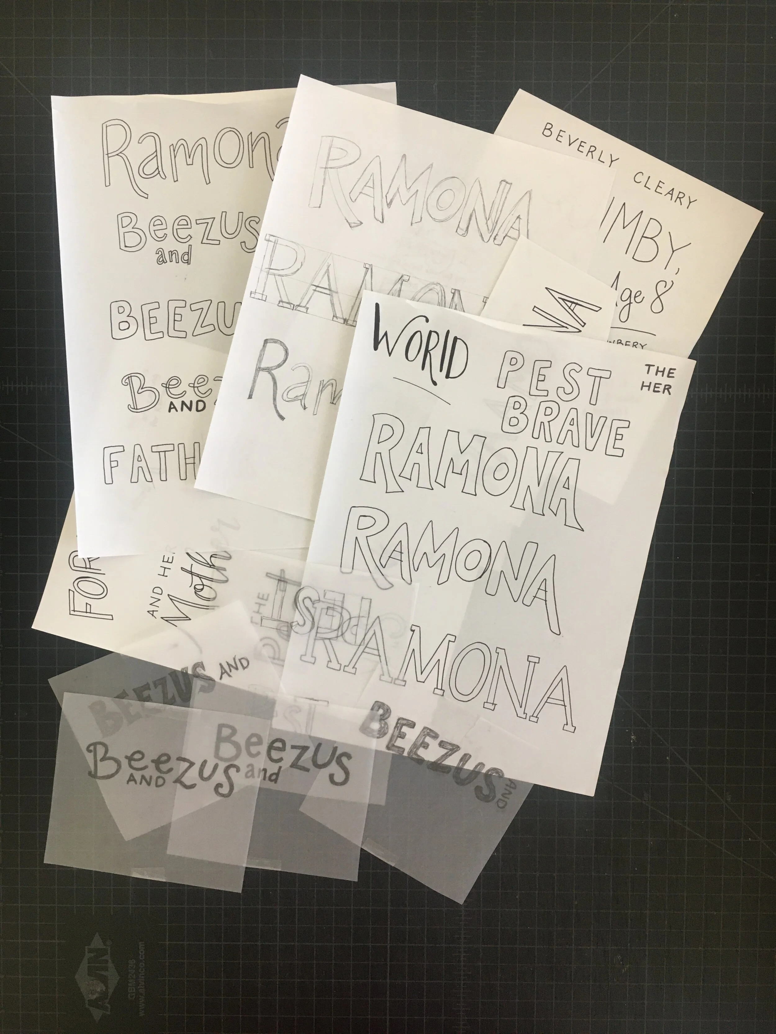
We asked that Ramona K sketch Beezus and Ramona first, so that I could try to develop a design and lettering system to unite all of the covers. I knew that I wanted to experiment more with the design direction and lettering that I had started earlier on the initial comps. After seeing Ramona K’s sketch and my lettering together, the team thought there was still one element missing and suggested that I try adding some sort of “design element.” Figuring out what this could be was the most difficult part of the process. It needed to be something different from comparable series', and subtle enough to not interfere with the art. I played around with the idea of background patterns, background shapes, and textures. I also sketched out different variations of the word “Ramona” to see what would work best:

My art director Erin suggested that I consider thinking of the title as a 3-D object, which is when the idea of adding a shadow behind the Ramona branding came into play and the covers really started coming alive. Then I thought, what if the shadow changed direction from cover to cover to add more variety? This idea got really positive feedback, so then came the fun part of experimenting with multiple color palettes! Should the shadow color be the same on each book? Should the shadow be tone-on-tone with the background color? Should the background color stay the same or change?
Erin and I decided to look at Ramona K’s portfolio for color inspiration and ended up picking 8 colors that felt true to her art and that we thought would be a fresh palette for the series. We wanted the series to feel really cohesive and have a limited color palette, so we decided keeping a consistent pale yellow/off-white background throughout the series and using one bright color on each cover was the strongest direction.
At this point, we asked Ramona K to sketch the isolated characters for all 8 of the books, and she did an amazing job of bringing Ramona to life with such great energy in all the facial expressions. I was then able to choose the shadow direction and draw the lettering around each of the sketches.
I ended up vectorizing all of the lettering so that it would be clean and smooth, but I also tried to keep a little of the original sketched wonkiness to keep it young.


When I opened Ramona K’s final art files, I think I squealed with delight! I couldn’t be happier with how all of the final elements fit together and how the covers turned out.
Next came the task of keeping track of 16 sets of files since both paperbacks and hardcover editions were going to be printed. The previous hardcover editions all had white cases underneath the jacket, but I decided picking bright case colors that matched each of the shadow colors would be a fun pop of color under the jackets.
Seeing the printed books arrive in the office was so exciting and rewarding. I can’t wait to see these books in the hands of new (and old) Ramona fans!
Final covers
A huge thank you to everyone who was involved with this project—my art director Erin, along with Amy and our creative director Barb. Editors Alyssa and Rosemary, and copyeditor Nicole. The production team Kimberly, Meghan, and Nicole. And of course, our amazing artist Ramona! It was truly a group project!
Editor, artworker and lifelong bibliophile.