Discover the art of branding and visual identity with Compe's project, highlighting how competent, reliable partnerships drive business success.
In today's competitive business landscape, establishing a robust branding and visual identity is paramount for companies striving for distinction and reliability. The Compe project, meticulously designed by Douglas Alff, serves as an exemplary case study in achieving these goals.
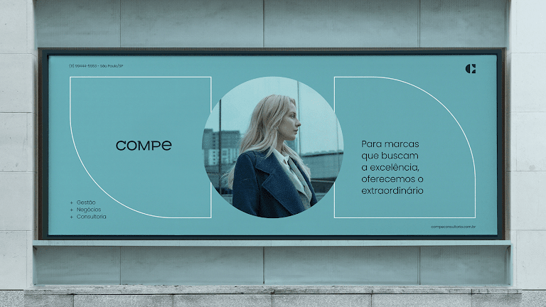
Compe, a management consulting firm, positions itself as a beacon of competence and reliability for its clients. The genesis of its name, rooted in the concept of 'competence,' instantly communicates the firm's pledge to deliver outstanding results. This strategic choice in naming underscores the importance of a meaningful and reflective brand identity in connecting with the target audience.
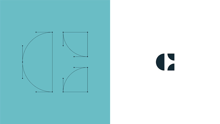
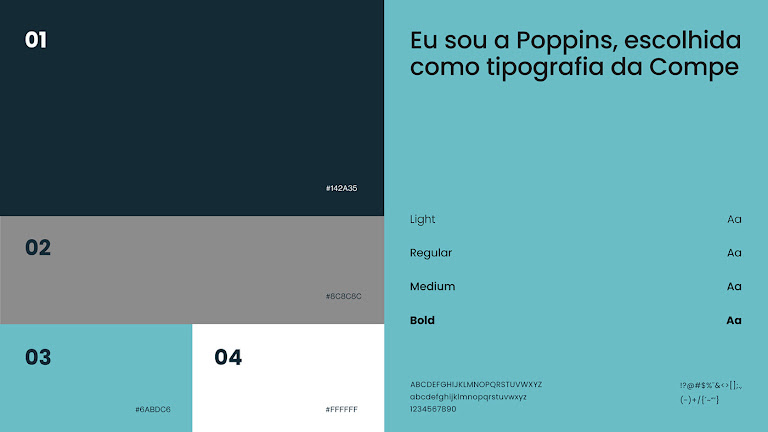
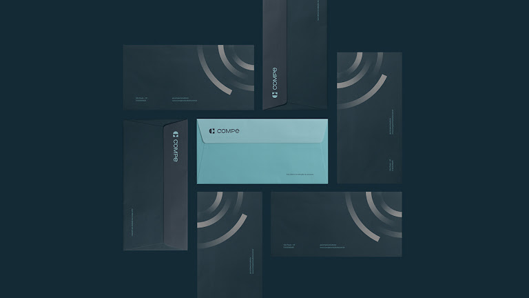
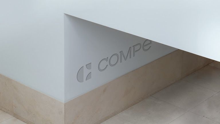
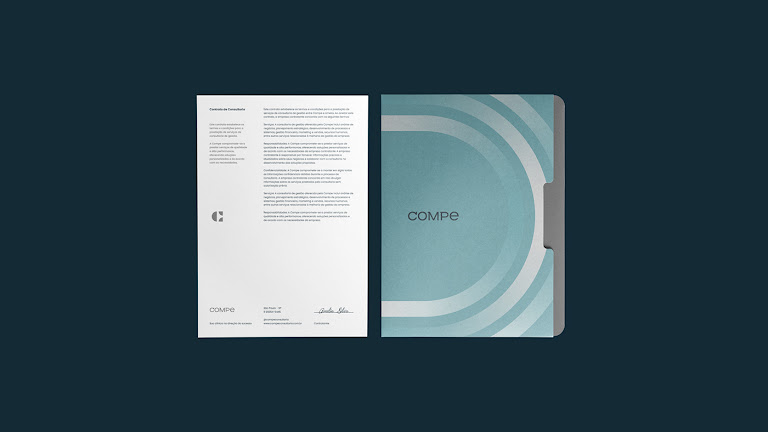
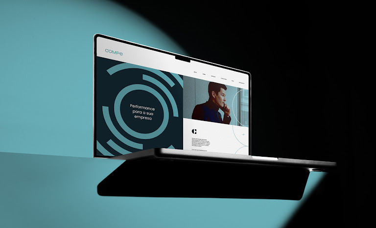
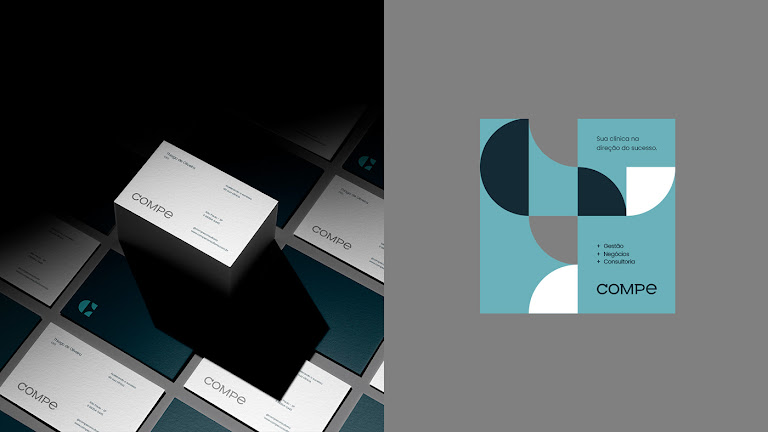
Central to Compe's visual identity is its symbol, ingeniously inspired by a magnet. This choice is emblematic of the company's ability to attract and establish a strong connection with its clientele, signifying a magnetic allure in the realm of business consulting. Compe's typography, a blend of modernity with a hint of serifs, further reinforces this message. The typographic decision not only exudes authority and trust but also mirrors Compe's expertise and credibility in the industry.
The color palette selected for Compe is deliberate, aiming to evoke a sense of authority, sophistication, tranquility, and stability. These colors are not merely aesthetic choices but are deeply emblematic of Compe's core values and professional demeanor in tackling the intricate challenges of management consulting.
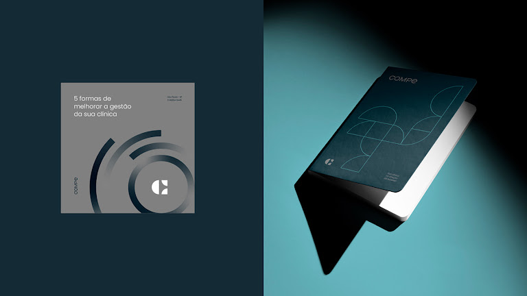
Moreover, the incorporation of unique and dynamic graphics introduces a layer of personality and movement into Compe's branding. These visual elements distinctively position Compe in the marketplace, reflecting its innovative and progressive ethos. This approach to visual identity exemplifies how design can encapsulate and convey a company's forward-thinking vision and its journey towards future advancements.
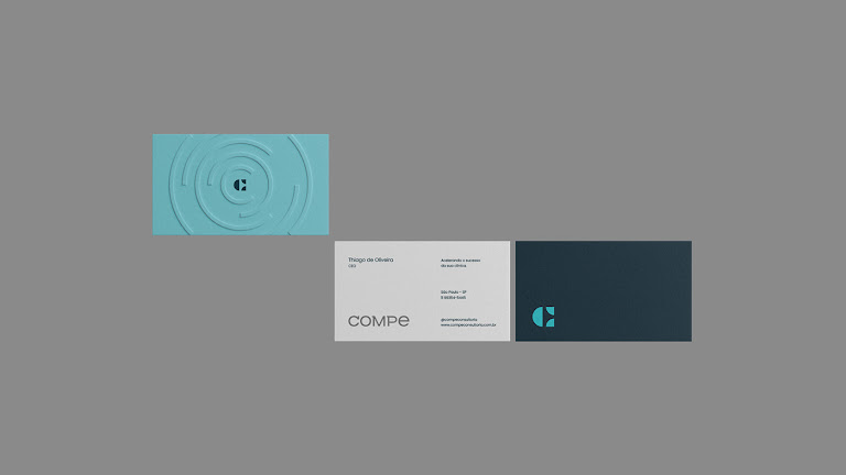
The Compe project, with its coherent blend of naming, symbolism, typography, color, and graphics, exemplifies the essence of effective branding and visual identity. It stands as a testament to the power of design in crafting a compelling brand narrative that resonates with clients and distinguishes a company in its field.
Branding and visual identity artifacts


For more information make sure to check out Douglas’ website (douglasalff.com.br) and and Instagram @alffdesign.


