Jason Arias on Designing Space Forces

Jason Arias is a freelance graphic designer, illustrator, and art director based in Nashville, TN. Here he takes us through his process for designing Space Forces.
Synopsis for Space Forces:
“Many societies have imagined going to live in space. What they want to do once they get up there—whether conquering the unknown, establishing space “colonies,” privatising the moon’s resources—reveals more than expected. In this fascinating radical history of space exploration, Fred Scharmen shows that often science and fiction have combined in the imagined dreams of life in outer space, but these visions have real implications for life back on earth.”
The first image that came to mind was a spaceship bouncing from planet to planet with a bit of whimsy and charm indicative of the mid-century optimism in space exploration as a juxtaposition to our current dystopian lens. The iconic spaceship is a reference to the red aeronautics symbol in NASA’s “meatball” logo designed in 1959, and the way it’s interrupting the title represents human efforts to domesticate outer space.
I continued exploring the idea of space migration through further abstraction in the following designs. The first cover is meant to evoke the feeling of terraforming a planet through a primitive simulator.
The next design is an iteration on that idea, showing migration between two planets being terraformed and the displacement of people and resources.
While researching I came across a NASA infographic illustrating the amount of space debris in low-Earth orbit. As you’d imagine, it’s grown significantly since the 1970’s and since these objects travel around 18,000 mph there’s a big risk in sending spacecraft into deep space. I wanted to evoke that uneasiness with a disordered graphic pattern to suggest the ecological effect of space exploration. The white dots can read as celestial bodies or space debris.
The final design in my initial comps was inspired by the Voyager Golden Record. I collaged a few of those icons along with astronomical glyphs and vertically-stretched type to give the cover a contemporary feel.
The feedback to these initial covers was that they’re missing a clear human element and cynical tone, showing how space exploration has shifted from a pursuit of discovery to a pursuit of profit.
I can get caught up in abstraction and expect these minimalist compositions will communicate subtleties that require some liberal interpretations, so having this new framing was helpful in zeroing-in on a clearer solution.
In this new round I sourced dystopian illustrations of space colonies where the environments could read as either in a state of construction or deconstruction.


While the cynical tone came off more clearly in these new designs the team felt they leaned too much into sci-fi associations and that a photographic approach might help them feel more realistic. The space debris idea from the first round seemed the most promising but needed a more literal translation.
In these next two designs I sourced renderings with a warmer color scheme and collaged in space debris implying we’ve colonized Mars, but still face the same problem we created on Earth.


In the next design I sourced a photo showing a small crop of Earth and collaged in space debris. Having the emphasis on the debris is meant to convey our lack of stewardship.
In the last design from this round I used the same type treatment as the previous cover, overlaying a planet illustration I made with a bunch of land satellite imagery from my archive. The strange coloring is meant to be a bit ambiguous, maybe someone will read it as a dramatically transformed Earth that serves a new purpose or has been jettisoned like the debris surrounding it, or maybe it’s a colonized Mars millenia in the future.
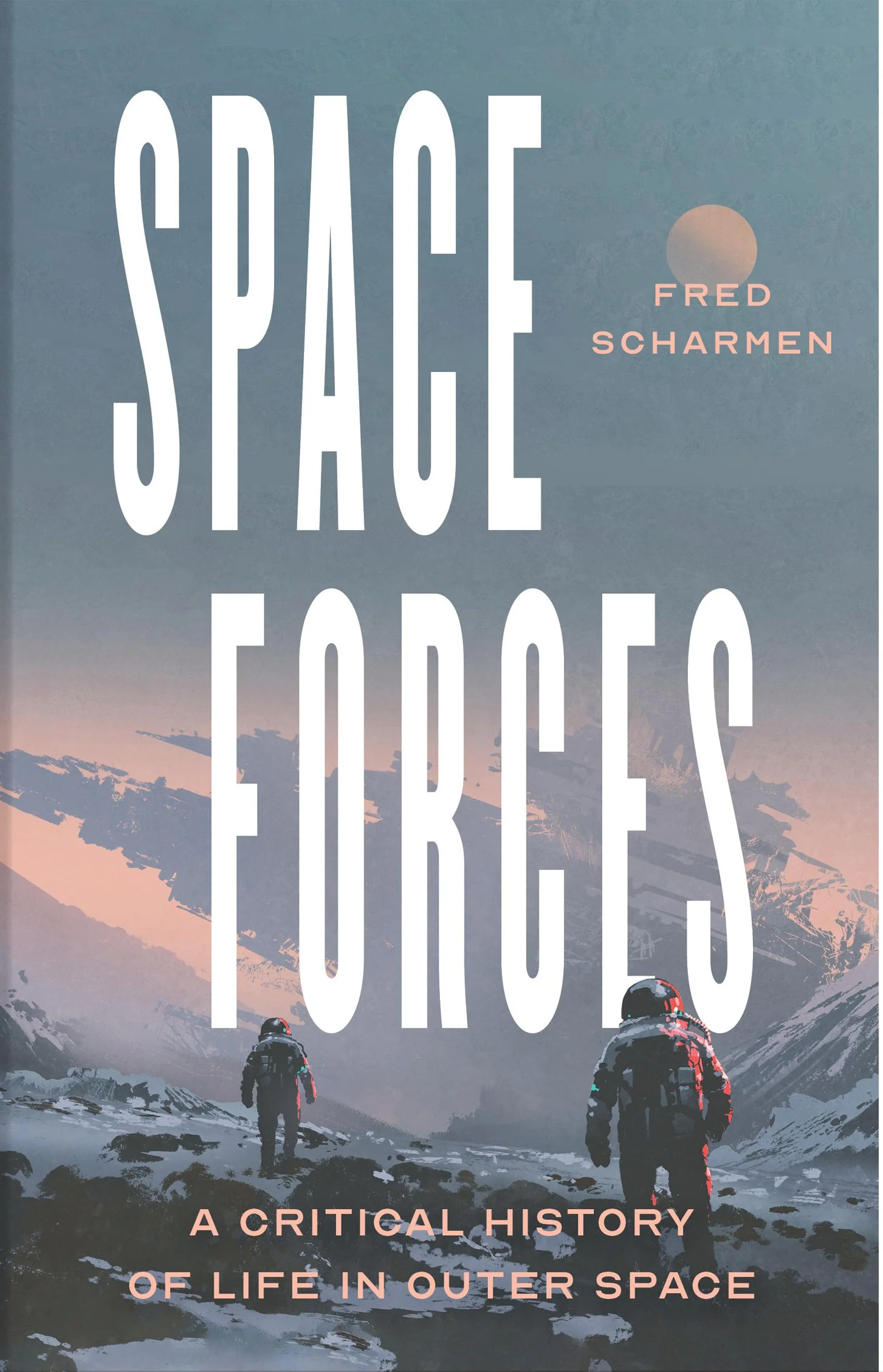
The design showing the top-crop of Earth with space debris and yellow sans-serif title was the favorite and was pretty close to being the final design, but the author had a change of heart. He felt the red planet design made for a more interesting visual, but the type felt a bit too sci-fi and called for something more utilitarian.
I shared this new title treatment and chose a subtitle font that reads as historical, which got the final approval.
Final cover
While I was nervous hearing the author changed his mind right before final approval, thinking I’d have to start from scratch, I’m really happy he did and saved my planet illustration from the reject bin.
Many thanks to the art directors Phil Dibello and Devin Washburn for their openness to my early experiments and nudging me in the direction of a clearer solution. They’re a real pleasure to work with.
Editor, artworker and lifelong bibliophile.