Exploring Peony Natural Beauty Studio's branding and visual identity, a blend of nature-inspired elegance and sophisticated design in Amsterdam's beauty scene.
In the bustling city of Amsterdam, Peony Natural Beauty Studio stands as a beacon of refined elegance, showcasing a branding and visual identity that is as unique as it is captivating. The studio, designed by Erva, offers an array of high-quality beauty treatments, each aimed at enhancing natural beauty with meticulous care. The essence of this approach is not just in the services offered but profoundly ingrained in the studio's visual identity.
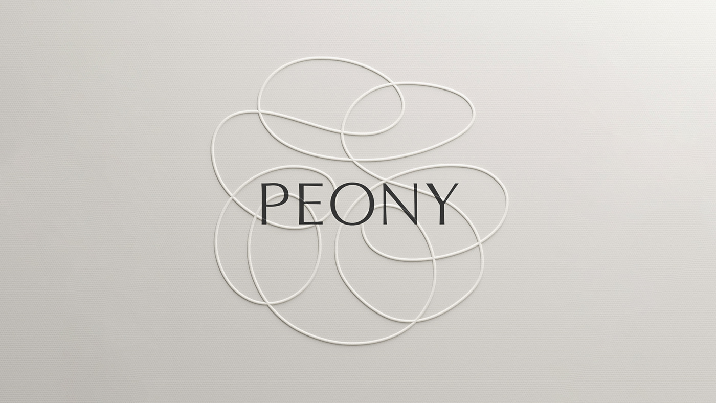
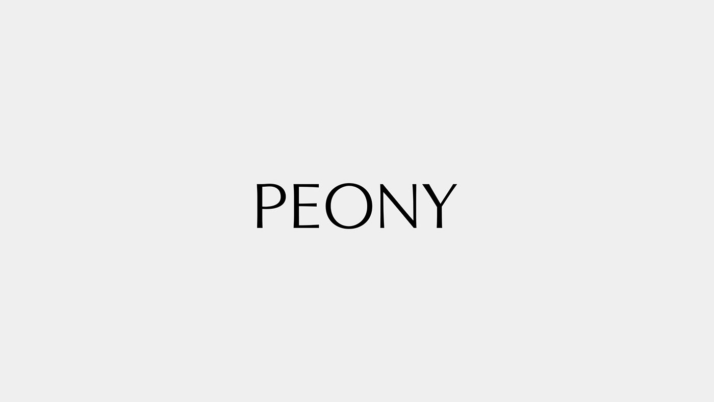
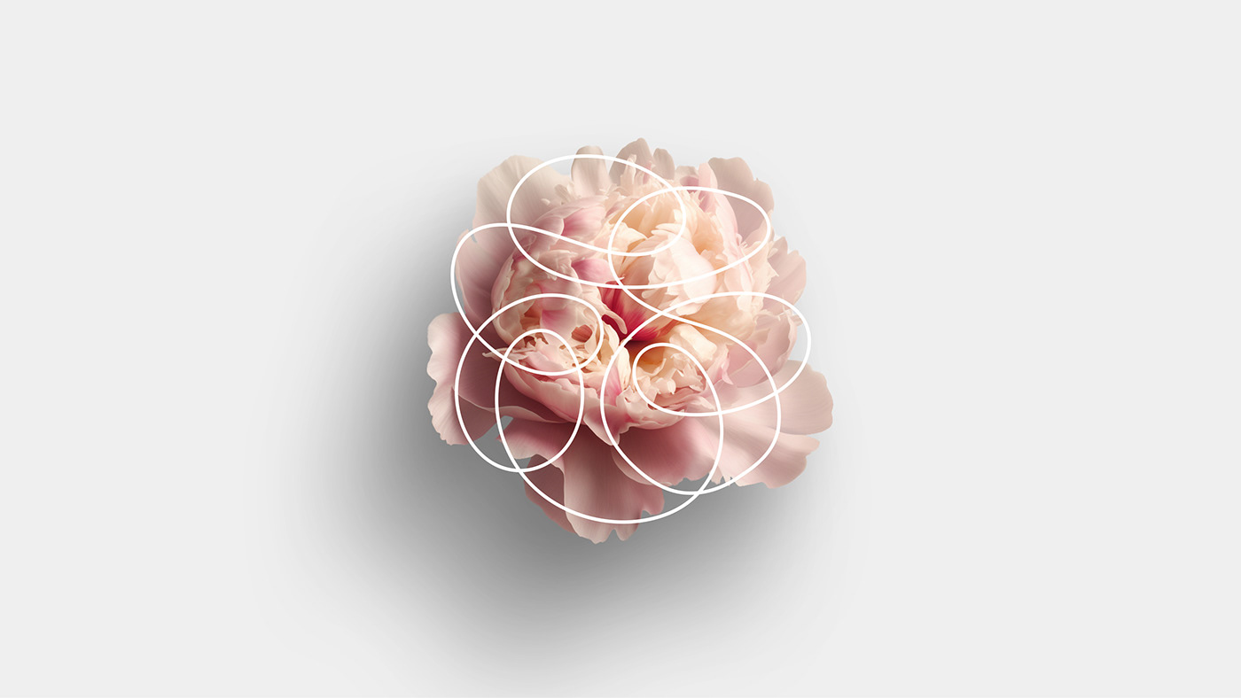
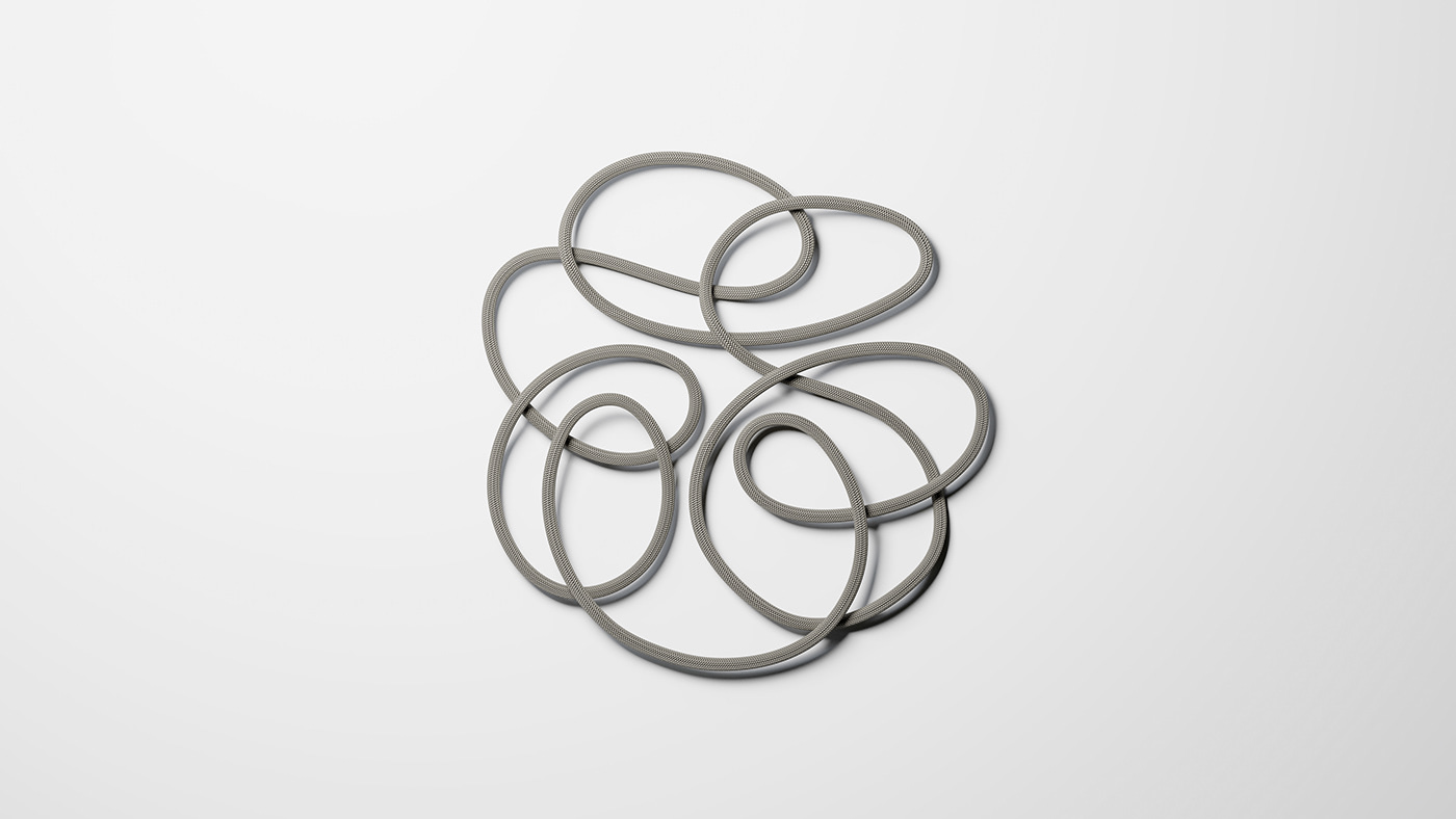
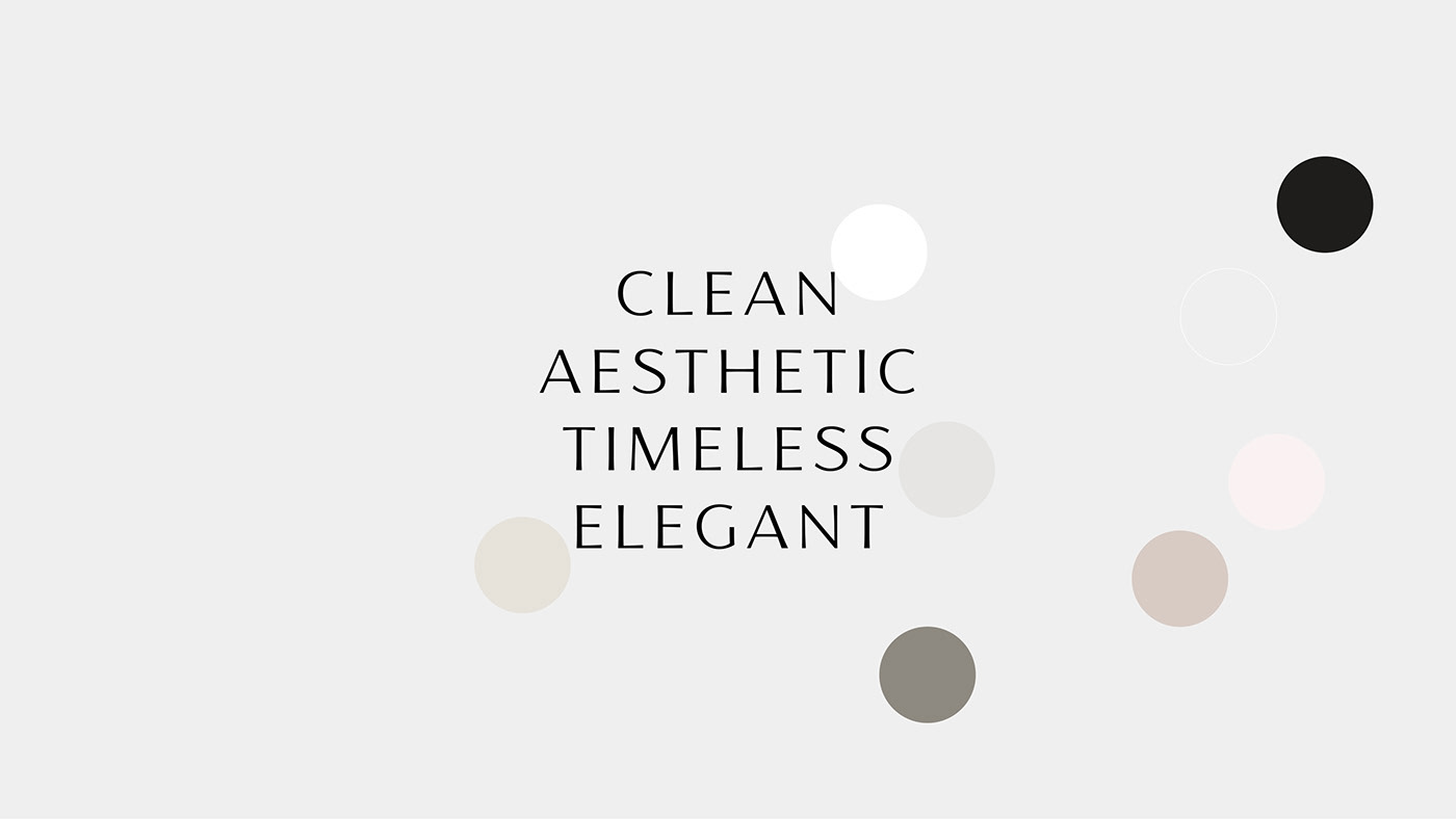
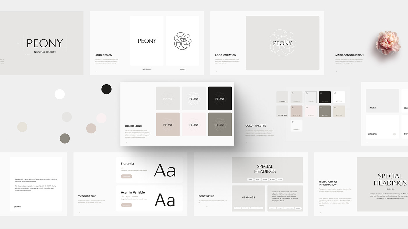
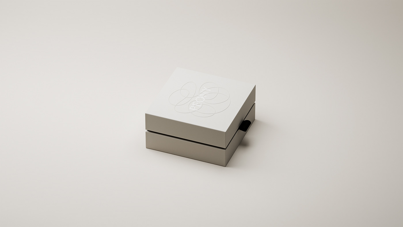
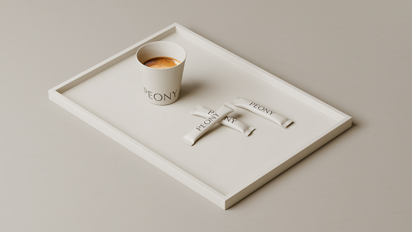
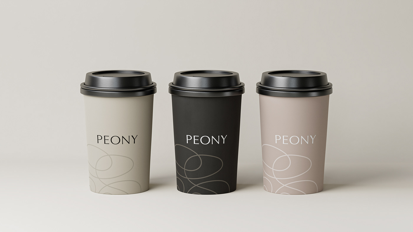
Peony's logo is a testament to the sophisticated simplicity that characterizes the brand. Drawing inspiration from the organic beauty of the Peony flower, the logo is an embodiment of natural elegance. Its design speaks volumes of the studio's philosophy - to complement, not overpower, the natural beauty of its clients. This approach is reflected in the carefully chosen color palette and textures, echoing the hues and subtleties of nature.
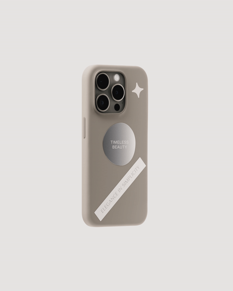
The visual identity extends beyond the logo. It encompasses every touchpoint of the brand, from the studio's interior design to its online presence. The use of natural light, soft colors, and minimalist decor in the studio creates a tranquil ambiance, inviting clients into a serene oasis in the heart of a bustling city. Online, the studio's website mirrors this aesthetic, offering a user-friendly interface that is both elegant and easy to navigate.
For designers and branding enthusiasts, Peony's branding is a masterclass in the power of simplicity and elegance. It demonstrates how a well-thought-out visual identity can elevate a brand, creating an immersive experience that resonates with the clientele. By harmoniously blending graphic design with elements of nature, Peony establishes a strong, memorable brand identity that stands out in Amsterdam's competitive beauty industry.
In conclusion, Peony Natural Beauty Studio is a prime example of how branding and visual identity can play a pivotal role in the success of a business. Its approach to design – prioritizing natural beauty and simplicity – not only aligns with its service ethos but also sets a high standard for branding in the beauty industry.
Branding and visual identity artifacts
For more information make sure to check out Erva website.


