Discover how Quagga's innovative branding and visual identity brings a playful, engaging twist to minimalist furniture design, redefining industry standards.
In the world of minimalist furniture design, standing out requires more than just functional products; it necessitates a brand identity that speaks volumes. This is precisely what newkid achieved for Quagga, a Canadian furniture company specializing in minimalist platform beds. With a clear objective to infuse the brand with as much personality as the product itself, newkid embarked on a journey to transform Quagga's brand identity into something not just seen but felt.
Quagga's story began in a modest shop in Niagara-on-the-Lake, Ontario, under the hands of a visionary woodworker named Carl. Inspired by the simplicity and functionality of furniture designs he encountered growing up, Carl set out to create furniture that marries ease of assembly with minimalist aesthetics. However, the brand's identity was failing to communicate the unique playful and enjoyable experience their products offered.
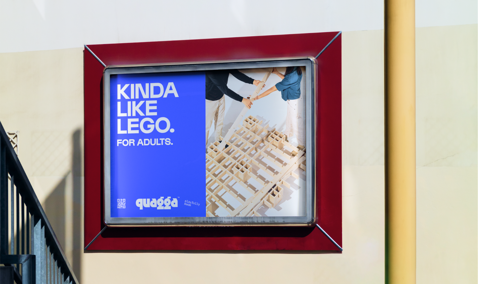
Enter newkid, a branding studio with a knack for making brands shine at their debut. The team at newkid, already fans and customers of Quagga, noticed the disparity between the product's innovative design and its brand presentation. They saw an opportunity to highlight Quagga's uniqueness through a brand overhaul focused on the concept of "Playfully Made." This rebranding effort wasn't just about a new logo or a refreshed website; it was about redefining the entire consumer experience.
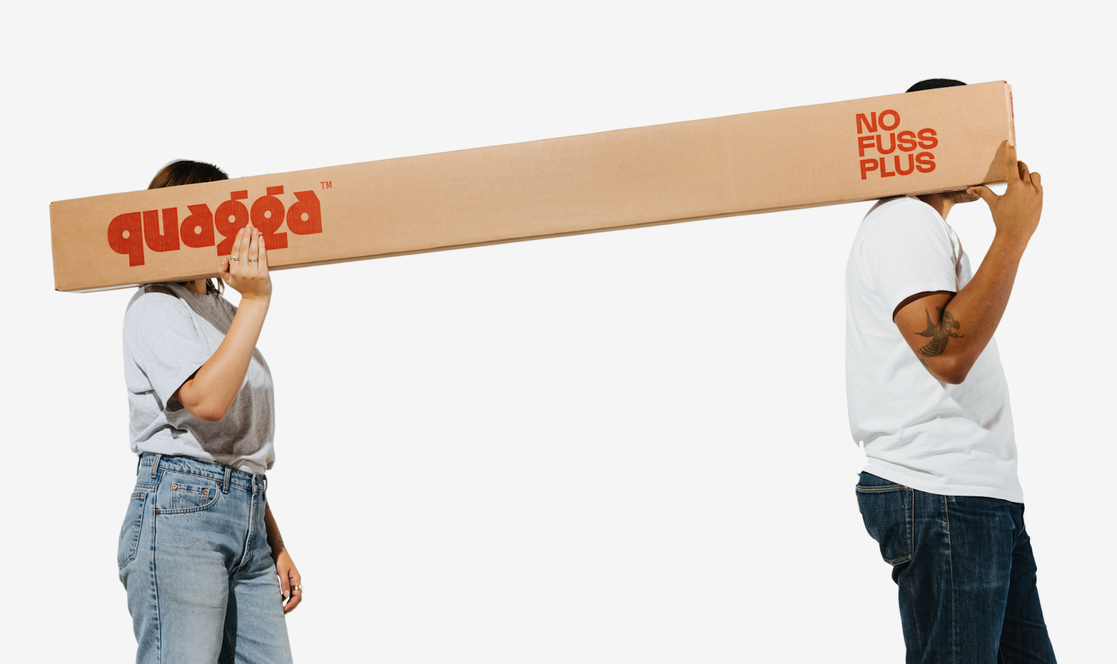
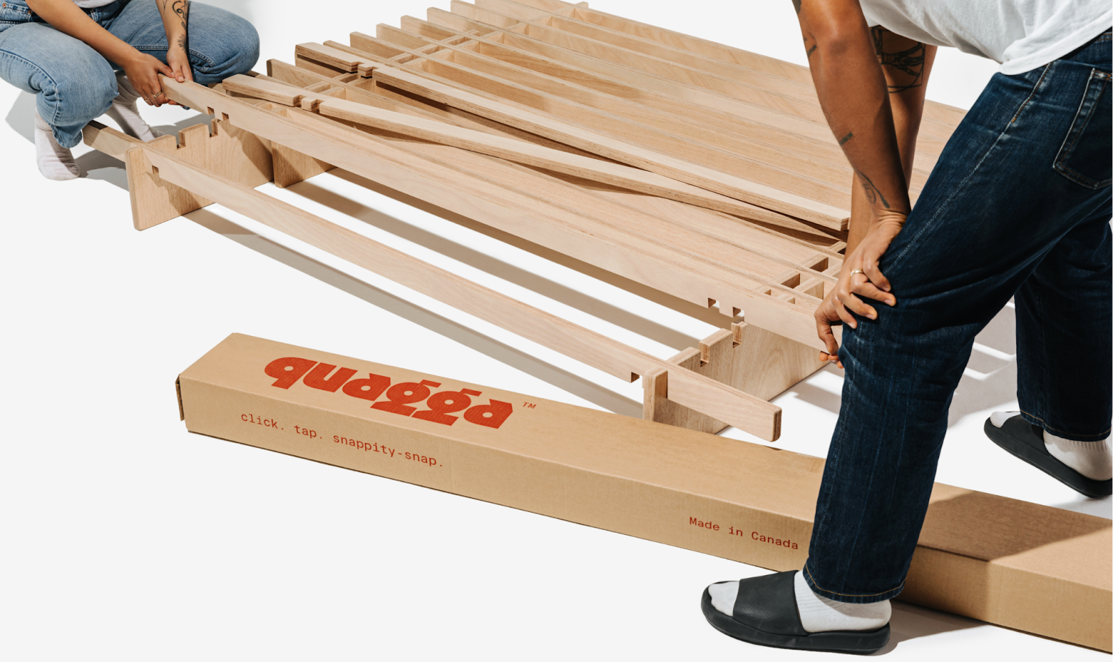
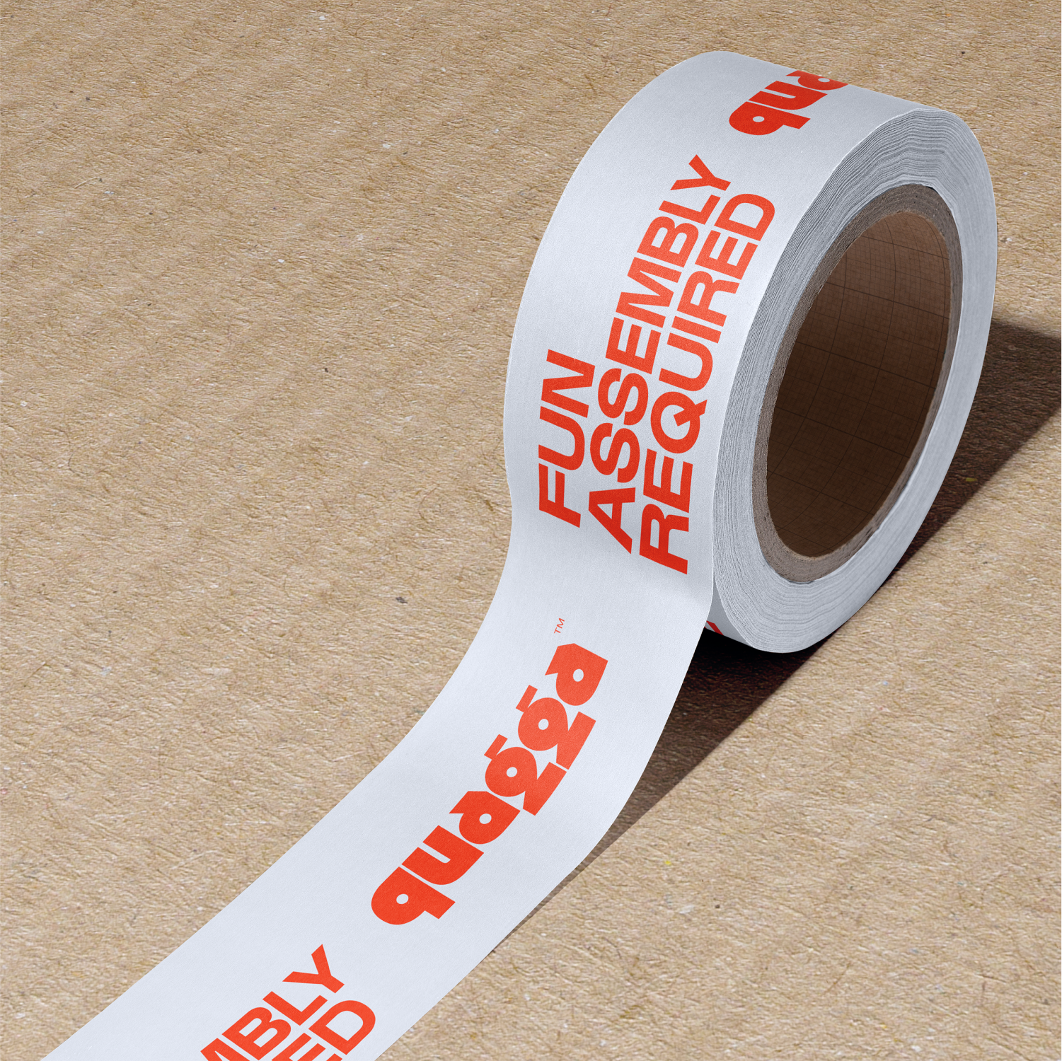
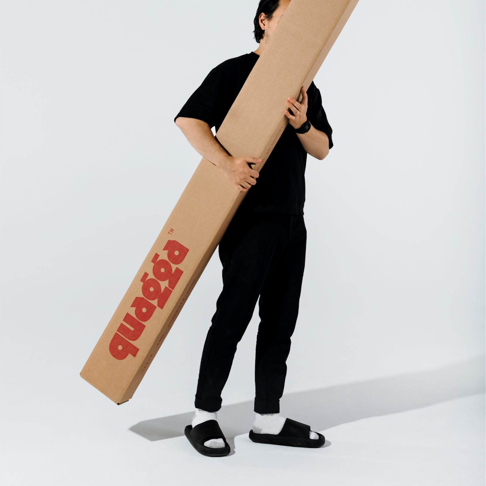
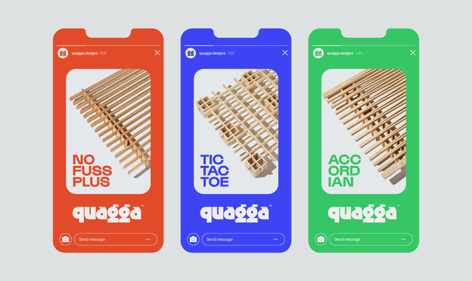
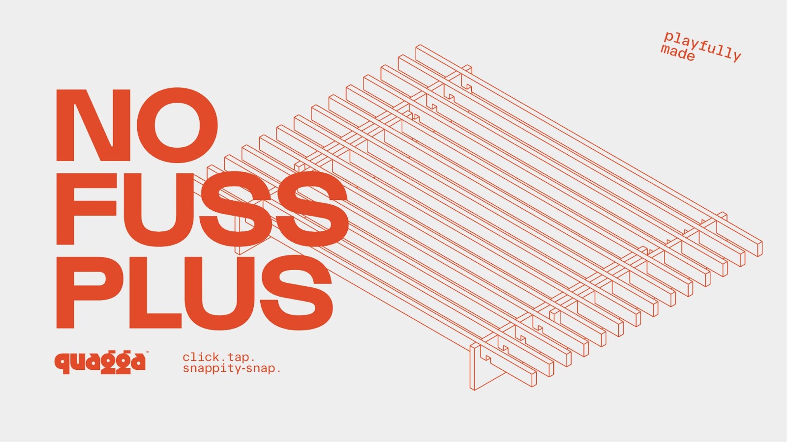
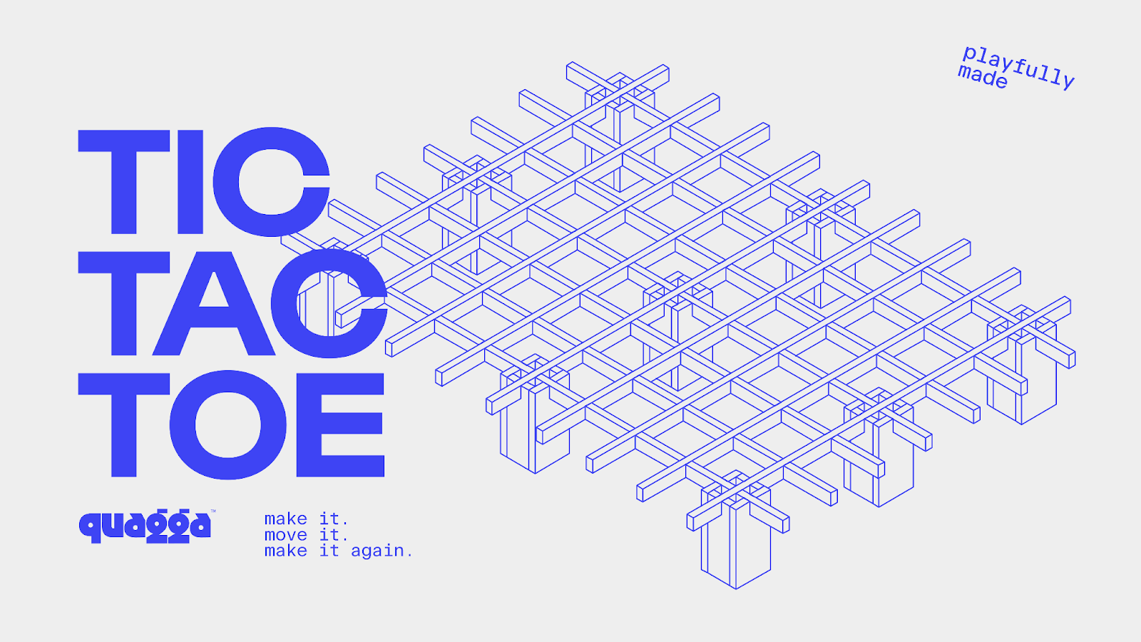
From the logomark to the color palette, and the language used across all brand touchpoints, newkid infused Quagga's identity with elements reminiscent of toys and games. The aim was to make assembling furniture as enjoyable as playing with Lego. This approach extended to the marketing materials, including diagrams and instructions that were designed to be more engaging and less daunting, inviting users to partake in a gamified assembly process.
The collaboration was a testament to the power of strategic brand positioning and the importance of aligning a product's identity with its intrinsic values. Through playful imagery, a fun and accessible language, and a user-friendly digital presence, Quagga's new brand identity resonates with a broader audience, encouraging them to see furniture assembly not as a chore but as an enjoyable pastime.
This project showcases the importance of a well-thought-out branding and visual identity strategy in distinguishing products in a saturated market. For brands looking to elevate their market presence, Quagga's transformation serves as a beacon, proving that even the most functional products can become memorable through playful and engaging branding.
By leveraging the universal appeal of fun and simplicity, newkid not only elevated Quagga's brand but also set a new standard for how products connect with consumers on an emotional level. This strategic brand repositioning not only enhances Quagga's market presence but also offers valuable insights into the significance of branding and visual identity in modern design.
Branding and visual identity artifacts


Credits
- Client: Quagga
- Branding: newkid
- Photography: Louisa Nicolaou
- Prop Stylist & Production Design: Abigail Ballanger
- Website: B9 Digital
- Wordmark typography: Ozik / NuForm type
- Headline typography: Gustavo Bold / Lift Type
- Secondary typography: Blank Mono / Frost Type
- Website: newkid.services
- Instagram: @newkid.services


