Fonts for Luxury Brands: part two
In part one, we took a look at three typefaces recommend for fashion or luxury brands. Of course, your final decision about font choice will depend on a variey factors, such as the brand’s personality, its target audience, and the kind of message it wants to convey. And, although, we tend to typically associate high contrast typefaces with high fashion, they’re by no means our only choice.

There is something to be said for bucking the trend, for using something that other brands don’t usually consider. It really depends on what you wish to convey — for an edgier brand, perhaps choosing a typeface not typically associated with fashion or luxury will make the brand stand out. On the other hand, choosing a style of typeface that is typically associated with fashion might leverage some of the cachet of existing famous brands. Ultimately, your choice will come down to how you want to place the brand — and the voice you wish to give it.
Here are another three typefaces that we think work particularly well for fashion and luxury brands. And they’re all available in the ILT Store:
Altesse
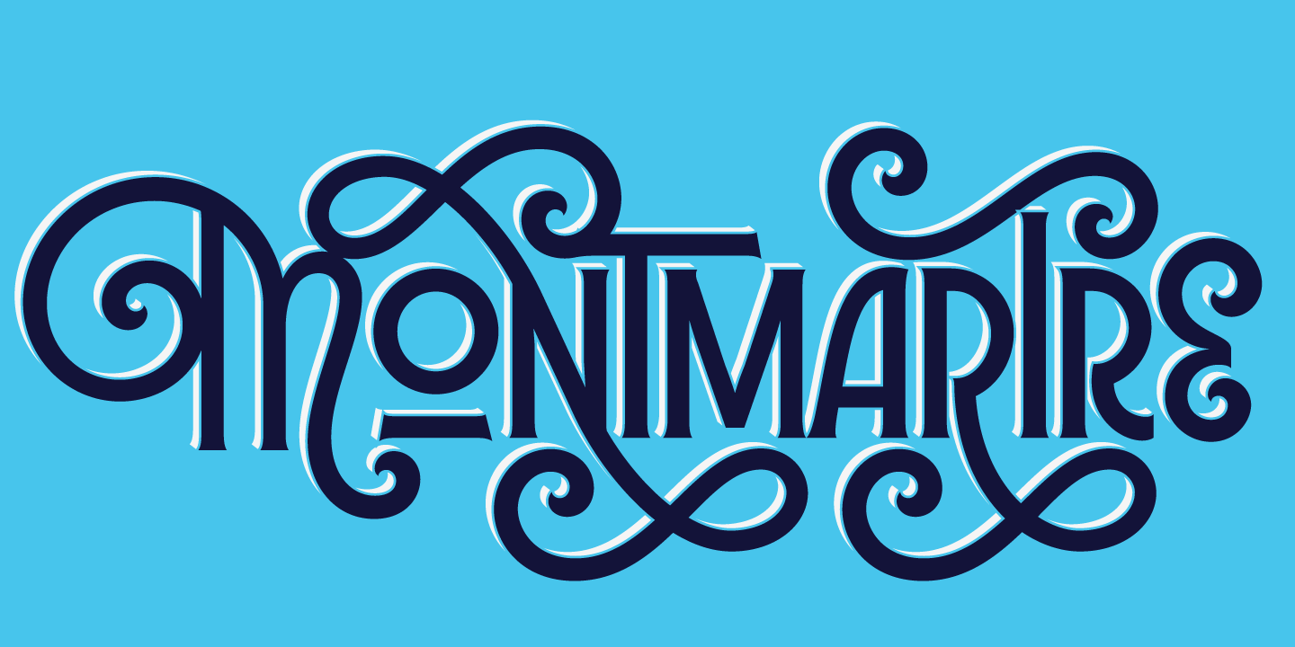
Elegant and graceful vibes in this classic and fluid copperplate script. For sure Altesse, from Typofonderie, exudes a sense of luxury and sophistication. It’s also one of Seb lester’s favorite calligraphic typeface.
Koning Display
If you’re into the present trend for unfussy sans serifs, then Koning Display, from Lucas Fonts, is definitely worth a closer look. Koning is also pretty versatile: from a rather fragile and delicate looking, and almost mono-linear Ultra Light, through to the the heavyweight Black style. Koning Display looks particulary good in all-caps settings. Give it a try in the ILT Store.
Gwen
Not only is the new Gwen from Fontfabric an absolute gem, but it sparkles like one too. Our favorite feature of Gwen is most easily accessible in the variable font that has a kind of sparkle or sharpness axis — in addition to a weight axis. This makes it ideal for animation, but also means that you can dial the ‘sparkle’ from muted to magnificent — perfect for injecting a little personality and pizazz into your brand.
Read part one
Related:
Fonts for Human-centered Branding
Why Bodoni for Fashion?


