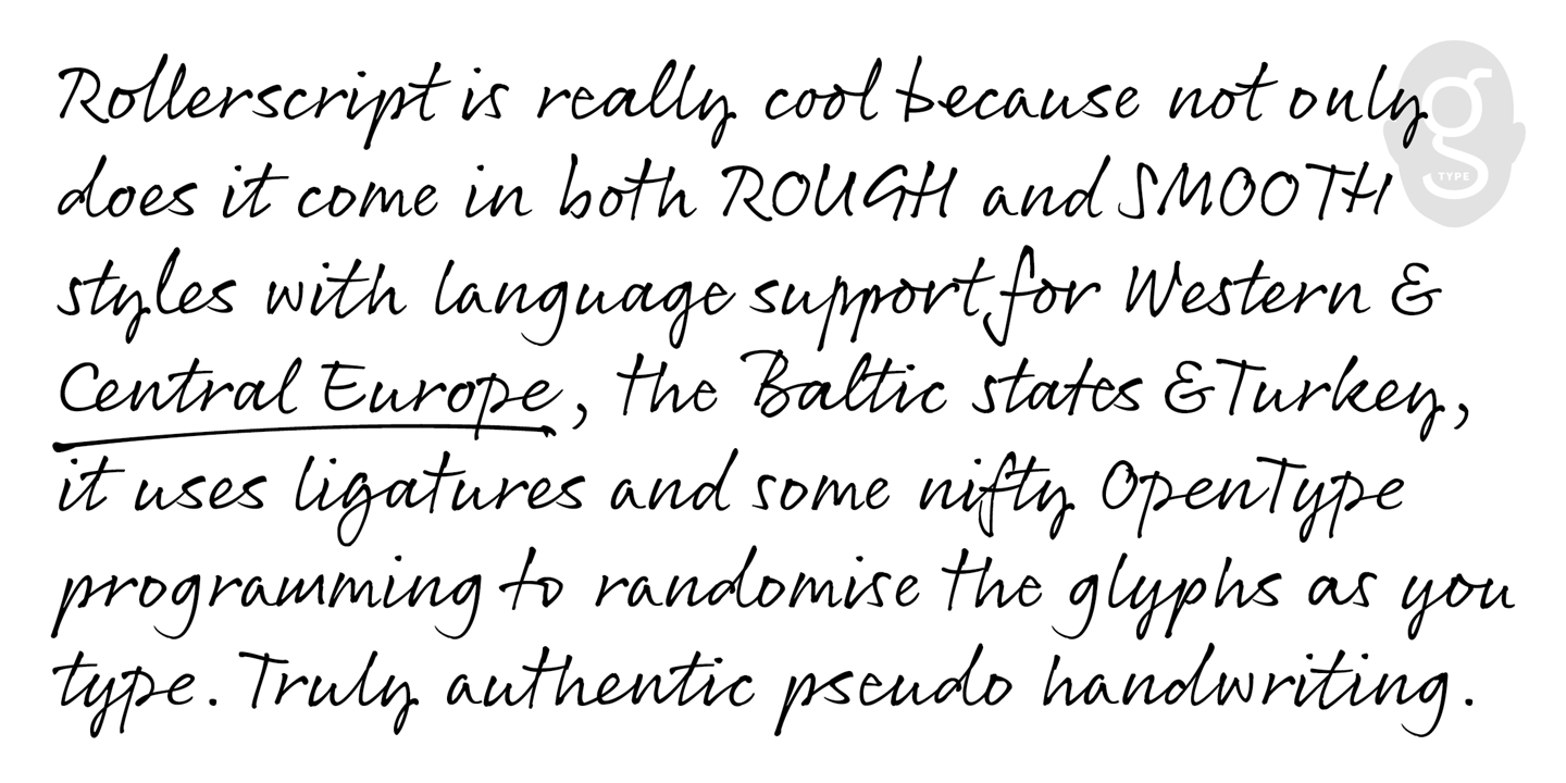
There are two things that I usually look for in selecting a typeface: readability and seduction (not always in that order). For readability, it is prudent to choose a classic letterform that has been reliable over time. A fine didone (a sensual mix of Didot and Bodoni, for instance). For seduction, it is judged by what my mind conjures when I see the specific letters. One typeface that is influenced by these aforementioned classics with a contemporary flavor can be found in ATOL, designed by Robert Jarzec in 2013. ATOL has all the elegance of a fine metal cut and some subtle yet distinctive – nuanced anomalies.

The most delightful of the quirks can be found in the lowercase members of the ATOL Light family. The “e”, for example, has a script affectation with the thin portion at the bottom of the letter swirling up to form a closed bowl, akin to a number 6, The other visual pleasure is the lowercase “t”, which is bifurcated at the top, above the cross stroke. It also has a curved base that makes the lowercase look like a shell-less, erect snail. The rest of the letters have the usual thick and thin strokes, except the base of the cap “A”, top of the cap “V”, and both the top and bottom of the caps “M” and “N” have serifs that blend into a straight, unbroken line. This works beautifully with all but the “M”, which gives the appearance of a how-to lettering diagram of an M between two ruled lines. Whether this should be considered a visual flaw or not is up to the user. For me, it is not.

When the cap “M”, for example, is juxtaposed with lowercase letters, it serves as a nice accent. Try setting Marilyn Monroe in the type tester, and that “M” with its parallel top and bottom lines is a charming accent. But set the word NAME in all caps, and the lines are awkward.
For the best use of ATOL, all the weights have a sense of classical and seductive contemporaneousness.
| Font of the Month: Atol | |
|---|---|
| Designer: Robert Jarzec | Foundry: Type & Roll |
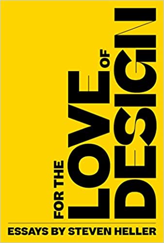
 Steven Heller is nothing short of a legend in the design community. Award-winning graphic designer, author and editor of hundreds of books (yes, 100s!) and one of the world’s foremost authorities on graphic design history; and arguably its best design commentator. Follow Steven on the must-read The Daily Heller and read his latest book, Growing Up Underground: A Memoir of Counterculture New York.