The New Johnson & Johnson Logo
The new Johnson & Johnson logo is more than a typographic blunder. It’s also a massive branding gamble with a high risk strategy.
— I Love Typography (@ilovetypography) September 17, 2023
If you don’t have Twitter / X, then here’s the thread:
- The new Johnson & Johnson logo is more than a typographic blunder. It’s also a massive branding gamble with a high risk strategy.
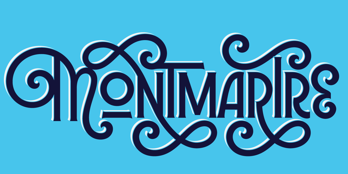
- Let’s start with some type critique: You have a well loved logo that is instantly recognizable. The replacement of an iconic design cannot be another random sans serif, no matter the adjectives you string in front of it. The logo was based on the handwriting of the founder…
- While the style of the old logo is not unique to that logo, its usage over more than a century had clearly carved a place for it in our collective visual memory. That, from a branding perspective, is priceless. The new logo is not ugly, but it has no story to tell either.
- The argument that young people are not writing cursive & therefore we should drop that style is pure unfiltered bullshit. Cursive styles have been increasing in popularity over the past 15 years whether in lettering or in type design. There is a yearning for less sterile designs.
- Then there is the branding strategy blunder. It seems that the new logo is to denote a shift to pharmaceuticals and medical devices, while consumer products (like shampoo and band aid) will be spun out under a different brand completely: Kenvue. This is mind boggling.
- There is an emotional attachment & massive brand equity to the J&J logo on those everyday products. If u want to go into sterile branding, why not keep the well loved logo and name for the consumer brand & bring out the new sterile branding for the occasions when sterile is good?
- According to a Kenvue spokesperson, the J&J name will be eventually phased out from everyday products. So the J&J shampoo might become Kenvue shampoo? Just another shampoo with absolutely no history. Hopefully they keep the shape & color of the bottle 🤦♀️
- The question of brand trust has come up, because of recent lawsuits related to baby powder. Here you have 2 choices: rebuild or demolish? They went with the demolish option, and that just smacks of guilt. Why else would you throw your history out the window?
- Finally, a somewhat off topic but absolutely important point: we would love if the design press does more than regurgitate the talking points supplied by the brand or its agencies. Otherwise it’s PR and not journalism and we desperately need the latter.
Before & after logo image from Sportslogos.net


