Fonts for Editorial Design
Typefaces for editorial design need to be expansive enough to support complex typographic hierarchies. They need to be readable (people read magazines & blogs) — but they also need to fulfill roles as titles, captions, pull quotes, drop caps, etc.
Here are just three typefaces, of the many in the ILT font store, that we recommend for editorial design:
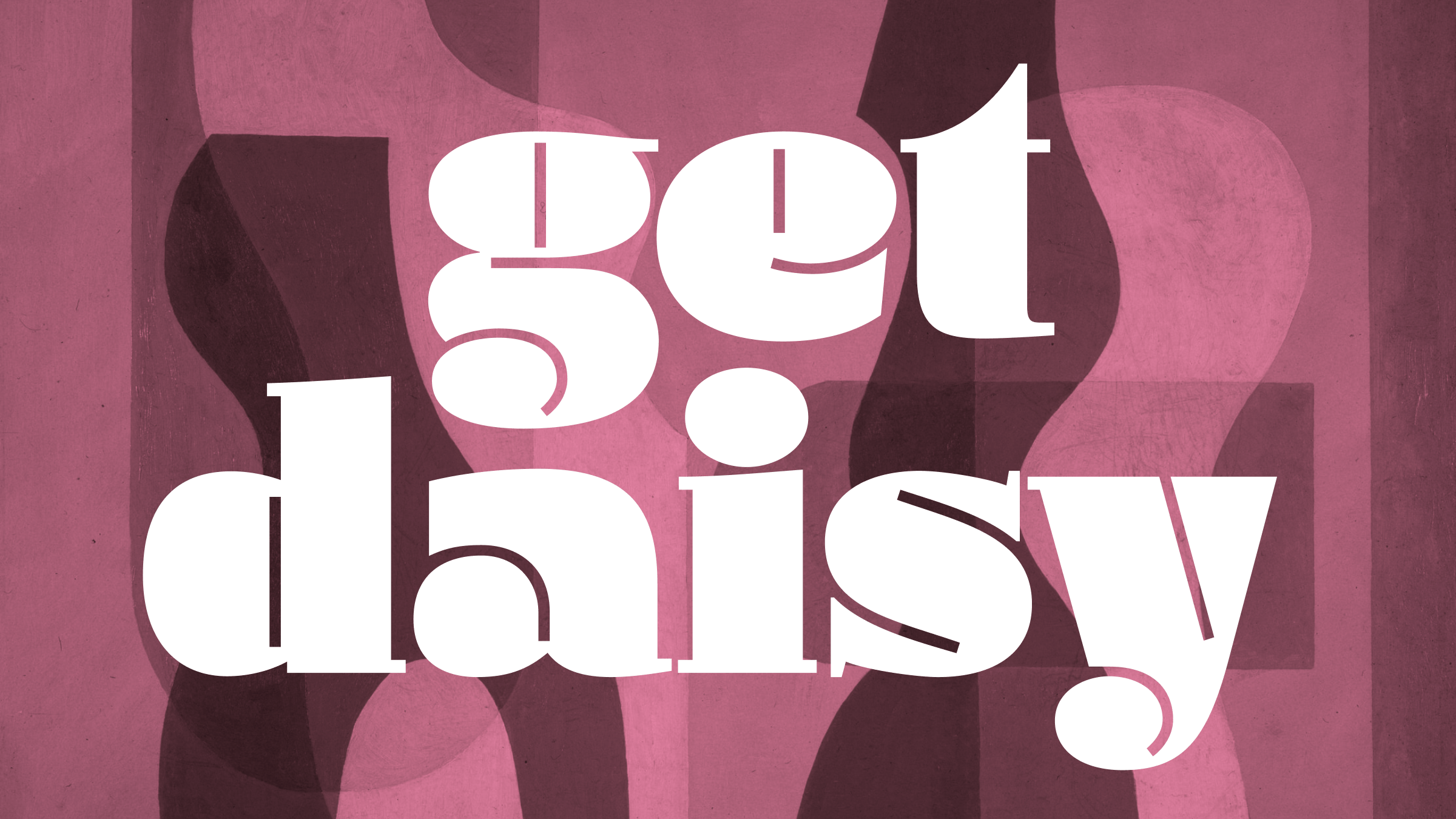
1. Blacker Pro by Zetafonts
Blacker Pro covers all the bases when it comes to typefaces for editorial design. The lighter weights are perfect for text, while the heavier weights, including those in the italic are idea for display purposes and elements of typographic hierarchy.
2. Comma Base by Martin Majoor
A typeface that asks us to reexamine the difference between sans serif and serif typefaces, and is a reminder that great text typefaces — even those for text — don’t necessarily need serifs! Comma Base’s counterpoised rounded and chiseled forms not only produce some splendid counter shapes, but also lend the entire design the aplomb and splendor of those ancient and seminal roman Capitals.
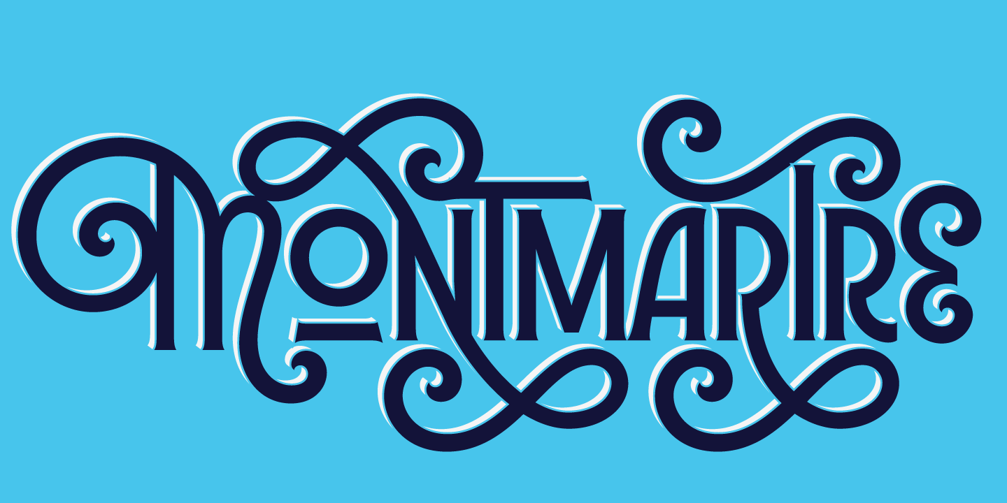
3. Dejanire by Retype
3. Dejanire is s super superfamily of Text, Headline, Sans, and even a Jewel variant! The kind of typeface you could design a whole magazine around. Classic text fonts, plus display styles with lots and lots of personality — and that Jewel style for large titles or to-die-for drop-caps. Dejanire also features in our Expert Lists: Fonts for Books.


