Colour Choice in Logo Design: Psychology and Science
Selecting the right colours for your company's logo is no small task. Your chosen colours will shape customers' perceptions of your brand and help determine how memorable it is. But with millions of hues to pick from, where do you start?
This comprehensive guide will explore the science and psychology behind logo colour choice. We'll look at factors like colour theory, colour meaning, industry conventions, and more to help you make informed decisions. By the end, you'll understand how to choose logo colours that align with your brand identity and resonate with your target audience.
Table of Contents
Why Colour Choice Matters in Logo Design

Before diving into colour selection, it's worth stepping back and asking—why does colour matter so much for logos in the first place? Here are three key reasons:
Colours Evoke Emotion
Research shows that different hues trigger different emotional responses. For example, blue conjures trust and security, while red evokes excitement and intensity. Selecting colours that align with your brand personality is critical for making the right impression.
Colours Improve Memorability
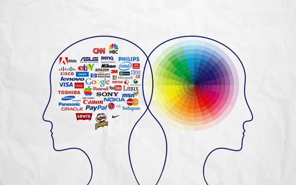
Humans remember visuals with colour better than black-and-white images. Using distinctive colours in your logo can dramatically improve brand recognition and recall.
Colours Convey Meaning
Colours have symbolic associations that allow logos to communicate certain qualities at a glance. For instance, green signals nature, calm, and health, while purple conveys luxury, creativity, and spirituality.
With this foundation laid, let's explore some frameworks for choosing impactful colours.
Understanding Colour Psychology
Before diving into colour choices, it helps to grasp some colour psychology basics. Our eyes and brain don't just determine the colours we see. They also trigger emotional responses. Brands can harness these reactions to evoke the right feelings about their products or services.
Some vital psychological associations with colours include:
- Red: Energy, passion, aggression, danger
- Orange: Fun, youthful, inexpensive
- Yellow: Happiness, optimism, warning
- Green: Nature, growth, wealth, tranquillity
- Blue: Stability, professionalism, sadness, trust
- Purple: Luxury, wisdom, spirituality
- Pink: Feminine, compassion, romance
- Brown: Reliability, durability, earthiness
Of course, colours rarely provoke the same response in all people. Context, culture, gender, age, and personal experiences all impact how we perceive different hues. However, understanding these typical associations can provide helpful starting points when selecting logo colours.
Factoring in Brand Personality and Messaging

Once you know the introductory colour psychology, consider how your brand personality and critical messaging come into play. Your colour choices should complement the identity you want to project.
Here are some examples of how logo colours can reinforce branding:
- Playful brands (especially youth products) often use bright, saturated hues like orange, yellow, or green
- Luxury brands leverage colours like purple, blue, black, gold, or silver
- Organic brands rely on earthy tones like greens, blues, and browns
- Feminine brands incorporate pinks, reds, and lighter purples
- Bold brands use intense reds, blacks, or dark blues
Your colours don't need to match your industry. For example, a bank could use green to convey trust and growth instead of the typical navy blue to seem stable yet innovative. But avoiding colours with vastly different associations than your brand traits is wise.
Intended Audience
Your target demographic should weigh heavily in choosing logo colours. Age groups, genders, psychographics, cultural backgrounds, and geographic locations influence colour perceptions.
For instance, preschool brands use bright primary colours, while more subdued blues, greys, and browns appeal to older audiences. Feminine products leverage pinks and reds that would feel off-putting to most men. And blue is viewed as a top colour in the US, while it's white in China and green in the Middle East.
Research suggests customers also develop physiological reactions and preferences for logo colours based on brands they liked growing up. So, the lifecycle stage matters greatly in evoking positive brand nostalgia.
Colour Harmony Fundamentals
Once you've considered the psychology and branding associations, it's time to get into colour theory. Even if you aren't a designer, understanding colour harmonies helps select logo hues.
Some common types of harmonious colour schemes include:
Monochromatic: Shades, tones, and tints of one colour
Analogous: Colours located side-by-side on the colour wheel
Complementary: Colours opposite each other on the wheel (like blue and orange)
Triadic: Three colours equally spaced on the wheel (such as red, yellow, blue)
Split Complementary: A colour plus the two adjacent to its complement
Tetradic: Two sets of complements
Square: Four colours spaced evenly around the wheel
Combining colours from the same family or leveraging contrasting yet complementary hues often creates attractive, balanced palettes. But don't be afraid to break “rules” if it fits your brand personality.
Avoiding Common Mistakes

Some logo colour choices tend to be less than ideal:
- Using too many colours: Stick to one or two primary hues. It looks unprofessional if there are too many.
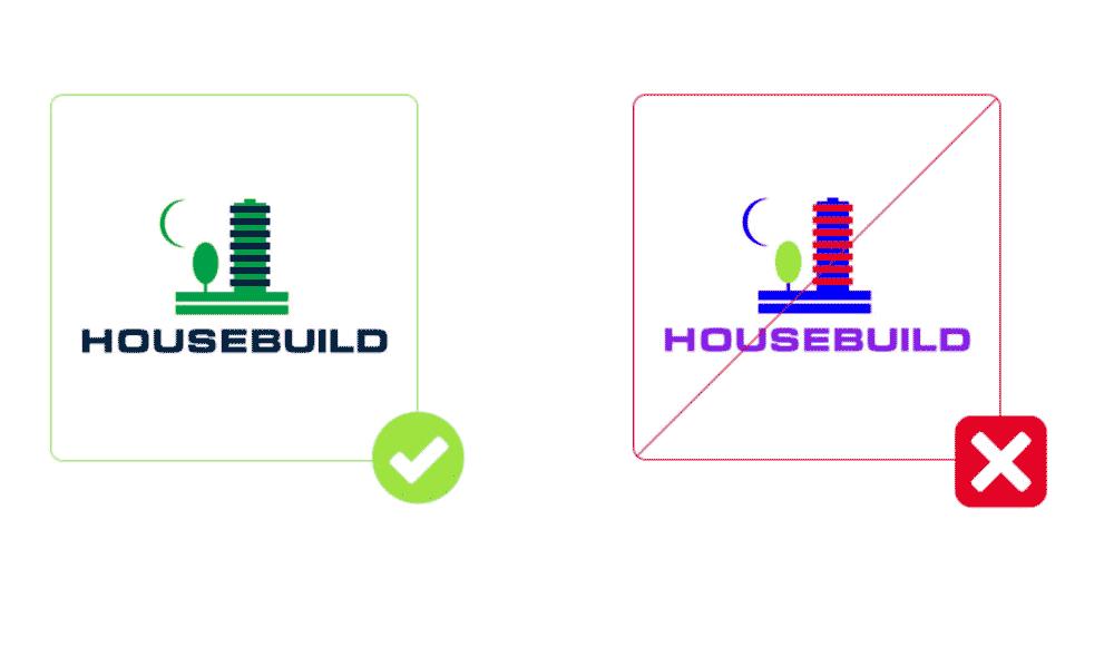
- Unpleasant colour clashes: Ensure colours complement each other through testing.
- Choosing colours too literally: Like making a bird logo blue since birds are blue.
- Following tired colour associations: Using blue for tech logos has become a cliché.
- Not considering print uses: Dark colours may not photocopy well. Light colours could disappear.
- Ignoring accessibility: Colour-blind and sight-impaired users may struggle with specific hues. Always double-check for issues.
- Forgetting colour context: A colour with positive meaning in one culture may be offensive elsewhere.
Design Considerations When Selecting Logo Colours
Beyond psychology and symbolism, assessing practical design factors like reproduction and versatility is crucial. Ask these questions to evaluate colour options:
- How do colours render in black and white?
- Are colours distinct when scaled to small sizes?
- Do colours work for both digital and print usage?
- Are colours visually accessible for colour-blind users?
- Do colours stand out in competitive environments?
- Can palette work across branding touchpoints?
Aim for colour combinations that retain their visual impact in any format. Logos regularly get reproduced at tiny scales where fine distinctions get lost. Make sure colours differentiate vital elements.
Limiting your palette to 3-4 harmonious colours is also ideal. Restricting the number of hues will make your logo more memorable and cohesive across applications. Just be sure to test colours under real-world conditions before finalising them.
Getting Colour Inspiration From Competitors and Category Leaders

Researching how industry peers and pioneers use colour can reveal helpful insights. But the goal shouldn't be to copy their palettes. Instead, use competitors for inspiration by:
- Cataloguing common and distinctive colour choices in your category
- Identifying gaps where your colour use could stand out
- Seeing what symbolic associations dominate versus are underutilised
- Finding examples of effective and poor colour execution to learn from
Always balance fit with differentiation. Choose colours aligned with audience needs and expectations but with unique styling that sets you apart. Benchmarking the competition prevents choosing colours that blend in.
Testing Logo Colour Options With The Target Audience
Ultimately, no universally “right” or “wrong” logo colours exist. The response depends entirely on your specific audience and their impressions. That's why real-world validation is essential.
Here are some tips for testing colours with users:
- Show a range of colour options to prevent fixation on one design.
- Ask about the feelings and attributes each option conveys.
- Evaluate which palettes users consider most and least appropriate for your brand.
- Assess not just conscious appraisals but also emotional reactions.
- Try not to over-explain concepts so you get unfiltered feedback.
Run tests with a representative sample of your target users. Pay attention to what they say, micro-expressions, and body language. Iteratively refine based on insights gleaned until you land on genuinely resonating colours.
Tools and Testing
Thankfully, many online tools can generate colour palettes, identify clashes, simulate different types of colour blindness, and convert brand colours to other uses. Please take advantage of them to create the best logo hues.
But you'll still need to test your colours in different formats physically. Print out your logo in black and white and confirm it still works. Look at other digital displays to spot gradients or colour reproduction issues—mockup real-world items like business cards, apparel, and mugs.
Iterate based on the findings of your testing. The right colours may take some trial and error to pin down.
Colour Trends to Consider
Colour choices often align with particular eras and trends. While you don't need to chase every fad, keeping up with colour trends can ensure your brand feels fresh versus dated.
Some current colour trends to look at for logos include:
- Vibrant neon tones
- Dusty, muted hues like sage greens
- Retro brights straight from the 80s and 90s
- Complex duotones mixing two colours
- Metallic colours like rose gold
- Unconventional colour mixes
- Expanded pastel palettes
- Soothing natural tones
Colour Tips for Common Industries

Although you don't need to follow your industry norms, many logo colour selections in the same field have similarities. Here are some familiar logo colour choices for various sectors:
Technology
- Blues and greens (conveying trust and security)
- Greys and silver (signalling sleekness and innovation)
Food & Beverage
- Reds and oranges (appetising colours)
- Browns (connect to ingredients like coffee or chocolate)
- Greens and blues (indicate natural or organic)
Beauty
- Pink, purple, and red (feminine colours)
- Black or white (luxury and elegance)
- Earth tones (natural ingredients)
Home Services
- Blue and green (trustworthy hues)
- Yellow and orange (energetic vibes)
Automotive
- Greys (signify durability)
- Reds and oranges (empowering colours)
- Blacks and whites (sleek)
Colour and Consistency
Whatever colours you select for your logo, aim to keep brand identity cohesion across all uses. Having the same logo colours and palettes integrated throughout your:
- Website
- Print materials
- Product packaging
- Apparel
- Advertisements
- Signage
- Social media
- Promotional items
Consistency builds recognition. So, only deviate from your core colours when it truly supports a specific campaign or initiative.
Key Considerations When Finalising Your Logo Colours
Choosing the perfect logo colours takes research and experimentation. By considering elements like:
- Colour psychology
- Brand personality
- Target audience
- Colour theory
- Current trends
- Testing
You can select colours that genuinely resonate with your consumers while representing your vision and values. Just be sure to:
- Avoid common mistakes
- Check accessibility
- Maintain consistency
With strategic colour selections, your logo can build brand recognition, influence perceptions, and help your company connect with customers across channels. Productive logo colours signal that you put thought into understanding both your industry and the people you serve.
Frequently Asked Questions About Logo Colour Selection
Still have some questions about choosing logo colours? Here are answers to some frequently asked questions:
How many colours should a logo have?
Limit your logo to one or two primary colours. A maximum of three hues can work if they are complementary and purposeful. More than that, it tends to look messy and amateurish.
Should I use the colours of my national flag in my logo?
Using flag colours can work well for brands emphasising national pride or origins. But beware that some colour meanings change across borders. Do your research to ensure your local associations match the message you want to send.
What are the best tools for checking logo colours?
Helpful online tools include the Contrast Checker, ColorBrewer, Coolors, Canva's Color Palette Generator, Picular, and Vischeck. Adobe programs like Photoshop and Illustrator also include useful colour tools.
What is the most popular logo colour?
Blue is currently the most popular global logo colour, followed by black, red, and white. Blue conveys trust, security, and dependability. But other colours can be just as impactful, depending on your brand.
Should I use the same colours as my competitors?
Avoid copying direct competitors' logo colours, as you want your brand to stand apart. However, leveraging typical industry colours can help consumers quickly recognise your business type. Put your unique spin on the hues to differentiate.
Final Logo Colour Considerations
Selecting the perfect logo colours requires understanding colour theory and psychology combined with your brand's unique personality and goals. While challenging, pinpointing the ideal hues helps your logo instantly convey your business's promises to customers. For such an important brand asset, thoughtful colour choice pays dividends for years.
