Luke Bird Embraces Minimalism to Create a Cover for Pew

Luke Bird is a graphic designer specializing in book covers, branding, food packaging and limited edition packaging for music and books. Here he outlines his process for designing the cover of Pew.
Pew is found on a sleeping on a church pew in an unnamed American town. They have no specific gender or race, and very rarely speak.
As Granta’s brief mentions, this book is at the cutting edge of contemporary literature. The prose is clean, modern and bold. Most of all, though – or, at least, this is what stood out to me the most – it’s a novel which is unerringly eerie. To lend a line or two from the cover copy…:
“Unable to agree on how to treat a person they cannot categorise – whether to adopt to imprison, help or harm them – this small town is quickly undone by Pew’s terrifying silence.”
From the outset, I felt that the cover for Pew should as brave and as striking as the novel itself.
—
My first set of explorations for the novel were quite varied. I’ve included a very small selection of the initial cover roughs, below.
I started by looking at photographs of places-of-worship in Southern, small-town America. It’s immediate, to me, that there is something inherently unsettling about a small, empty church. I love the shadows, the menacing organ pipes, and the fact that they look so cold, stark and silent.
I paired these photographs with simple, clean layouts and typography which I felt gave a subtle nod to American gothicism, without looking too ‘horror’. Fortescue – from the Colophon foundry – and Albertus black have a good balance of contemporary cleanliness and razor-sharp edges.


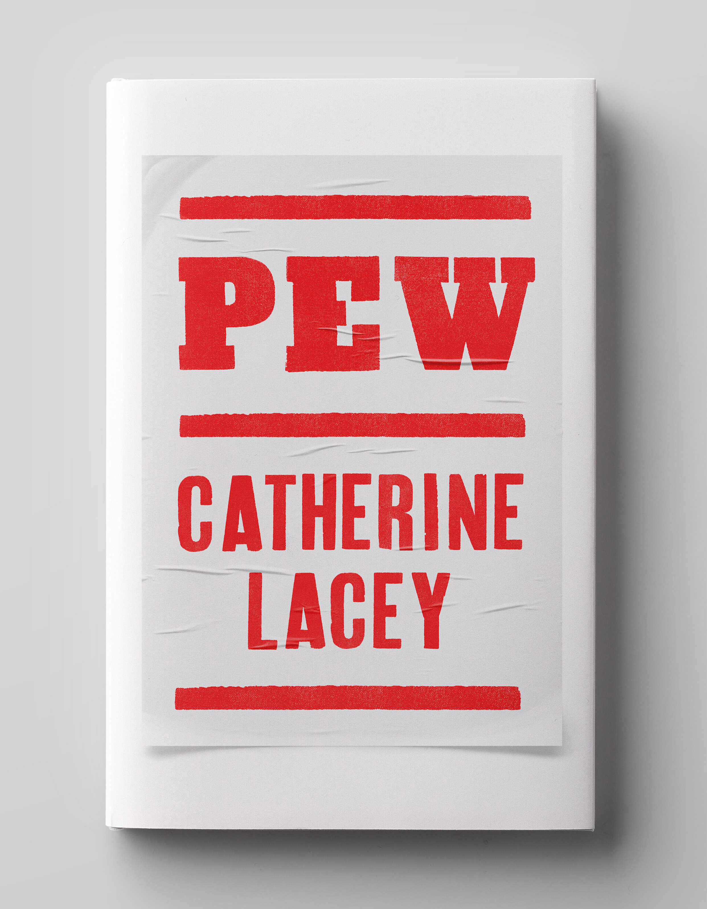
Elsewhere, I had the idea of combining something of the traditional southern American typographic-letterpress style, with a simple, woodblock-esque illustration of a church. I picked out a passage from the book in which Pew sees a series of "plain white signs with red type”, advertising the town’s terrifying “Forgiveness Festival”, and I used that as a kind of concept to house my idea.
I also produced a visual which utilised a very simple, isolated line-drawing of a church pew, on a dark background. The naivety of the illustration combined with the overbearing darkness of the layout felt creepy and fitting, to me.


Ultimately, the author was also keen to try something which was more of a direct visual interpretation of the silence at the heart of the novel.
I felt the best way to show the silence might be through visual ‘space’, so worked up some additional covers which were, visually, quite sparse. I’m a firm believer that design should always be bold, but that boldness comes in many forms. Something unusually clean and which embraces space, with carefully-placed, small typography, can often be every bit as arresting as something very busy, with large, stylistic typography.
Final cover
In searching for an image which I felt could be a visual representation of silence, I went back to looking at rural churches, and I came across an image by Evelina Kremsdorf. The church spire is subtly modern-gothic, and a small flock of black birds – presumably either circling the spire, or taking flight from a perch nearby – adds a kind of Hitchcock-esque eeriness of the scene. But what is most unsettling is the emptiness.
The original image is treated with texture and colour, but I felt that limiting the palette and stripping the grunginess out of the image would add to the starkness.
I ended up using another Colophon font – Aperçu – for the typography. Somehow when combined with this image, a traditional serif (or any of the contemporary serifs I’d tried in previous visuals) sent it too far into the realm of ‘gothic’, so I opted for something simple, bold and sans-serif, and gave it ample room to breathe.
Editor, artworker and lifelong bibliophile.