There are many reasons to choose one typeface over another. Oft times, the motivation is practical (e.g., readability, legibility, modernity, eccentricity, even electricity—it simply turns you on); sometimes the decision is completely irrational (e.g., it triggers something visceral, like a taste or smell); and every once in a-while (and this is the reason why I’ve picked Sandhouse for Font of the Month), the choice is based on a confluence of random, indescribable stimuli.

Allow me to explain. First, I love the billowy quality of these letters. Second, Sandhouse only comes in one weight, ‘regular’ — yet I ask: Regular for who or what? It is quite decidedly an irregular type style that flaunts its quirkiness with impunity. Third, it really does not matter whether or not it is used as all caps, all lowercase, or altogether as U&lc; the result is the same: Sandhouse is a wild-and-crazy style. It is perfectly weird without being imperfectly blotto.
Sandra Garcia, who designed Sandhouse in 2023, included a generous diversity of accents, alternative letters, dingbats, symbols, and punctuation. Leaving no detail to chance, each and every alphabetic eccentricity is carefully calibrated to work in harmony with all letters of the alphabet (and numerals too). For one weight, there is a joyful number of lettering concepts, especially in the lower cases. In addition to the elasticity of the rounded letters, I am particularly fond of the tiny ticks in the lowercase where there would otherwise be circles, and most especially the connectors between the strokes of the m and n.

But there is another, more important, reason. Sandhouse rings a familiar bell. No, not its shape or format, but rather the name. “Sandhouse is named in honor of Louise Sandhaus, a graphic designer, teacher & writer,” writes Garcia. “We met her through the book Baseline Shift. Untold Stories Of Women In Graphic Design History. A book that we highly recommend…” So, as far as typefaces are necessary to identify, classify and accentuate, I can’t ask for anything better.
| Font of the Month: Sandhouse | |
|---|---|
| Designer: Sandra García | Foundry: Tipastype |
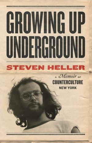
 Steven Heller is nothing short of a legend in the design community. Award-winning graphic designer, author and editor of hundreds of books (yes, 100s!) and one of the world’s foremost authorities on graphic design history; and arguably its best design commentator. Follow Steven on the must-read The Daily Heller and read his latest book, Growing Up Underground: A Memoir of Counterculture New York.