
The Year in Type
What a year! There was much to bemoan in 2020 2021, but the never-ending year was still an inspiring one in type. This issue of the Month in Type takes a look at some of the highlights of The Year in Type. Enjoy!
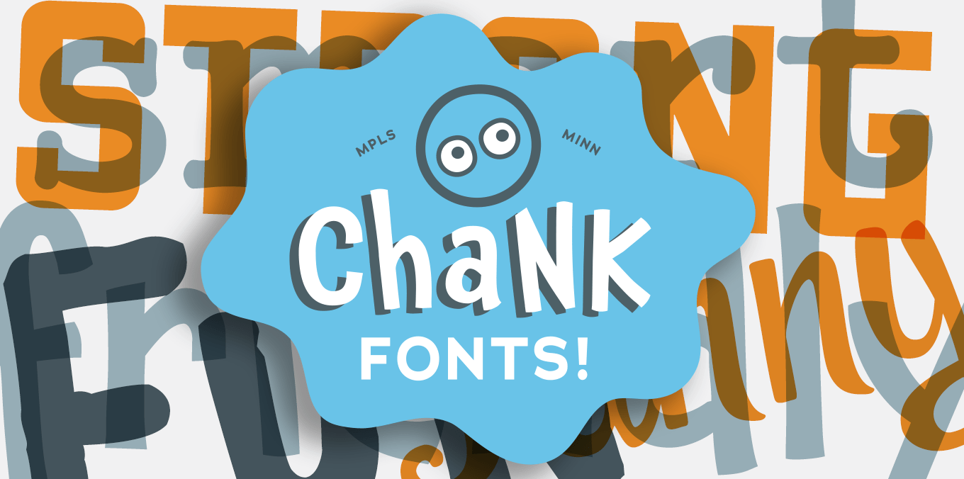
The Year in Type is sponsored by Chank Fonts and Liquorstore
Inspiration
We’ll kick off with one of the most popular and reshared stories: This archive of old cassette tape designs proved hugely popular, and even spurned a modern take with our own Fonts on Tape.


My personal favorite of 2021: Remaking books: A new book designed by Kat Ran Press that features just some of the hundreds of re-drawn book spines of Dutch graphic designer and artist, Ootje Oxenaar, created over a 50-year period.

Craig Ward’s brilliant LEGO type. More, please!

There’s much more inspiration to be found in this archive of Russian textbooks. The website is straight out of the 1990s – and in Russian – but with Google Translate and some patience, you’ll discover some real gems!

A wonderful graphic design history resource from we made this. Will keep you busy and inspired for ages. It’s huge!

Still one of my favorite vernacular type and lettering accounts:

The 2021 Wes Anderson movie, French Dispatch, hits a home run in the graphic design department – designed by Javi Aznarez.

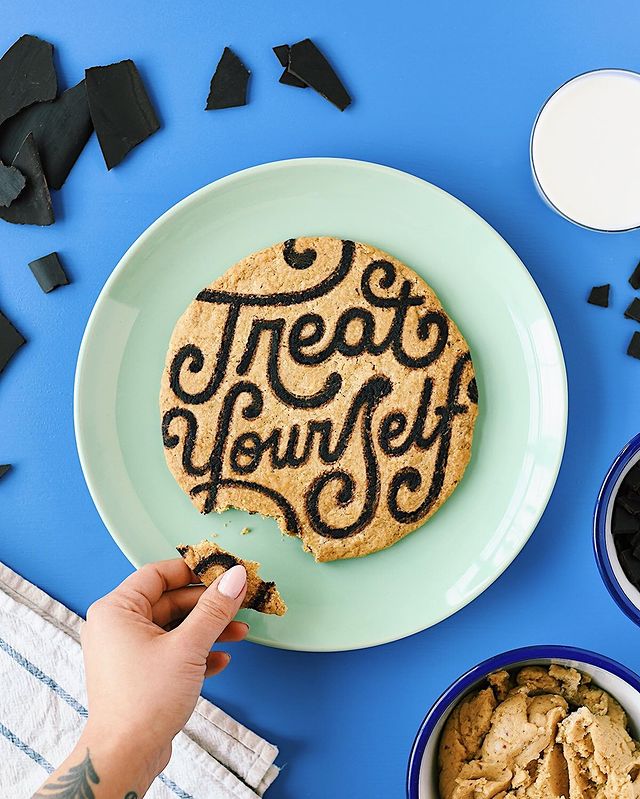
Food plus fonts — what’s not to like! The work of the rather brilliant and inspiring Lauren Hom:
Plenty to inspire on the Women of Type Insta:

And another must-follow, Good Type:

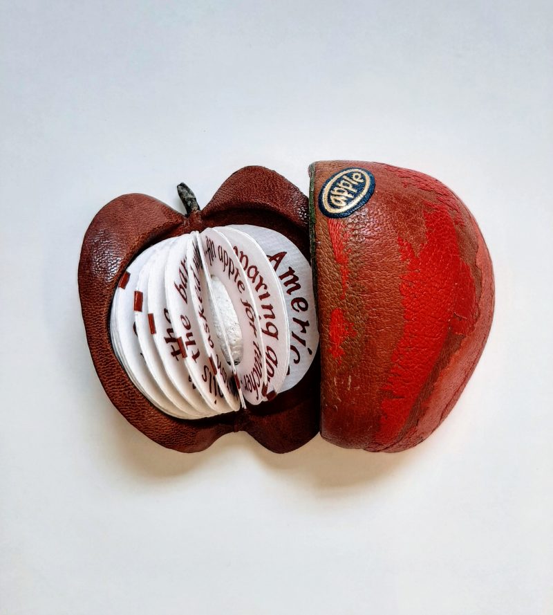
How about an apple that’s a book. Made in 2015 by award-winning bookbinder George Kirkpatrick. Now at the Bodleian Library.
And, Maria Montes, illustrating what we know to be true:

Fonts
Super-talented Australian designer and illustrator, Travis Price hits a homerun with Dragster:

From Tré Seals and Vocal Type comes VTC Ruby:

Megazoid, David Jonathan Ross’s August Font of Font of the Month, scoring cool points both for the name and the design.

Platia, a wonderful new family from Toshi Omagari’s new Omega Type Foundry.

Watch
A brief history of movie titles.

The incredibly popular handwriting font LiebeHeide owes some of its authentic look and feel to color fonts technology. How does that work? Designer Ulrike Rausch explains how.

Recommended reading
Interested in designing your first typeface? Then here’s a good place to start: with Dan Cederholm’s, Twenty Bits I Learned About Making Fonts.

James Edmondson, the talent behind the brilliant Ohno type co., published Some Tips on Drawing Type: from A–Z. Paper copies all sold out, but it’s now available as a PDF.

FEMME TYPE: A Book Celebrating Women in the Type Industry:

The award-winning A History of Arab Graphic Design, by Bahia Shehab and Haytham Nawar. Steven Heller reviews the book over at Print, in An Overdue Arab Design History Book (part one; part two).

2021 saw the publication of Kris Sowersby’s book, The Art of Letters, available now from Formist Editions:

Mark your calendars. Covid delayed the release of Debbie Millman’s new book, but you’ll be able to get a copy in February. Add Why Design Matters: Conversations with the World’s Most Creative People to your wishlists.

People of Type
An interview with one of my favorite book designers, with Jason Ramirez, Art Director at Viking/Penguin Books in New York City.

Learn
Google has launched its new portal for learning about the fundamentals of type. Fonts Knowledge is a great resource for new and experienced designers alike. Includes a very handy glossary of terms.

New on the blog
In episode #1 one of my new Ask ILT series, I answered, What’s the difference between Grotesque and Neo-Grotesque? In episode two we ask, Why do fashion brands and magazines use so much Bodoni & Didot?

Way back in March we interviewed four brilliant women. We also interviewed the fine folk at Fontfabric, John Hudson, designer of the Brill superfamily, and Ulrike Rausch, designer of one of our favorite handwriting fonts, Liebe Heide.

We also published our popular list of Helvetica Alternatives, our recommendations for Fonts to Gift, and Seb Lester wrote for us about his favorite calligraphy inspired fonts.

We also launched a brand new regular column from the legendary Steven Heller. Catch up on his Font of the Month.

The Year in Type is proudly sponsored by Chank Fonts and Liquorstore. Get 25% off all Chank Fonts until December 31.

It’s been a pretty crazy year, in more ways than one. Back in June we launched our shop as a place to support indie type foundries. We launched with 40 foundries and signed another 21 in November. In the coming year, expect many more great foundries and thousands more great fonts.
Thanks for tuning in and for your support of I Love Typography this year, as we head into our 15th year! Here’s hoping for a great 2022 to us all. Stay safe!
![]()


