Ultimate Guide to Typography for Logos & Branding
Selecting the right typography is one of the most critical decisions when creating an impactful and memorable logo design. The fonts and typefaces used in a logo directly influence how consumers perceive a brand. This comprehensive guide will explore the key considerations around typography for logos and branding to help you make informed decisions.
Table of Contents
What Makes a Good Logo Font?
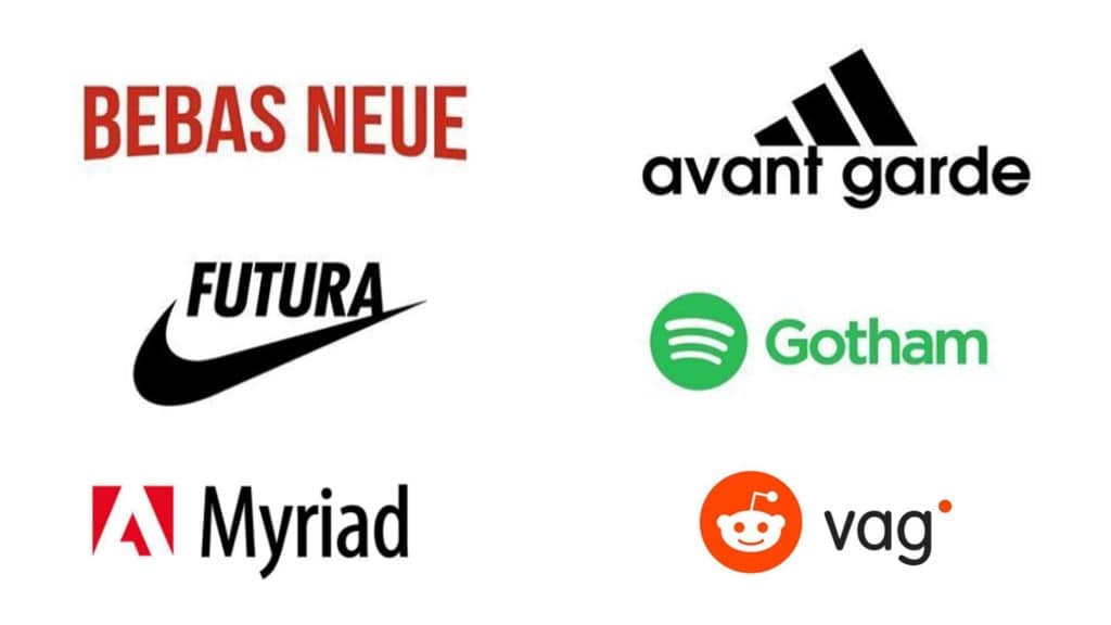
What defines a “good” logo font? The standards may depend on your brand’s unique personality, target audience, and industry. Nonetheless, some universal principles underpin strong logo typography:
Readability
Will customers be able to distinguish individual letters easily? Prioritise legibility, even at small sizes like business cards or mobile screens. Consider factors like:
- Letter shape/space: Generous spacing between letters with distinguishing shapes enhances readability. Decorative thin strokes or tightly packed letters can impair.
- Simplicity: Overly intricate fonts might look sophisticated but reduce comprehension. Simple, clean lines promote effortless reading.
Recognition & Recall
Is the font style distinctive enough for your target customers to quickly recognise and recall? Consider:
- Familiarity: Both standard and unique styles have high memorability. Finding the “Goldilocks” font that balances familiarity and distinctiveness is critical.
- Consistency: Using consistent typography across applications strengthens the linkage with your brand in customers’ minds.
Relevance
Does the typography style align with the brand identity, personality, emotions, and values?
- Style matches message: The right font elicits the desired customer perceptions of your brand. Playful, bubbly fonts won’t match corporate brands.
Flexibility & Longevity
Will the font retain effectiveness as the brand evolves?
- Adaptability: Logo fonts must project consistently across various media formats like print, digital, signage and merchandise. Test fonts at different scales first.
- Timelessness: Trendy fonts fade fast. Opt for classic fonts aligned to an industry that can work for years, not months.
Now that we've defined the standards for solid logo typography let’s delve into the step-by-step process of selecting the perfect font.
Choosing the Right Typeface
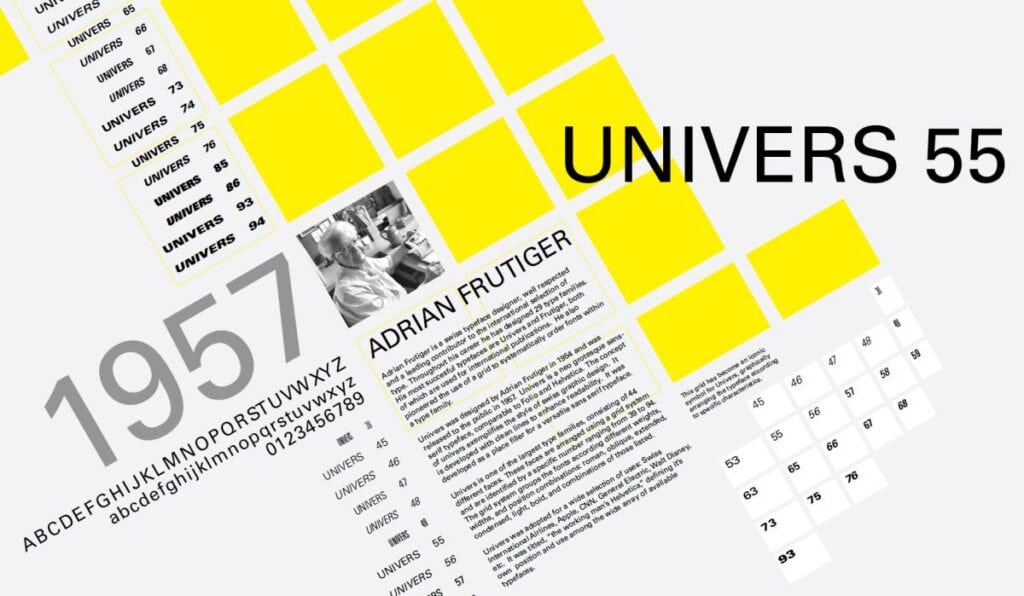
Step 1: Specify Industry and Brand Values First
Rather than jumping right into the creative work of browsing fonts, begin by clarifying industry norms and brand values. These inputs shape ideal typography directions. Consider:
Industry Typography Conventions
Some industries have established typography conventions:
- Luxury: Serif fonts like Didot exude heritage and prestige
- Tech: Clean, simple sans-serif fonts reflect innovation and simplicity
- Food & Hospitality: Script and bubbly sans serif fonts convey warmth and appetite appeal
Derive industry insights by auditing competitors and leaders. Does your font align with conventions or intentionally break the mould? Both routes can work pending alignment with brand values.
Brand Personality & Values
Clarify the emotions and values driving brand perceptions—for example, Outdoorsy brands value adventure and grit. Typography must align. Reference brand style guides and vision statements and interview stakeholders if needed.
Key defining emotions include seriousness, cheerfulness, confidence, dynamism, etc. This informs appropriate font characteristics.
With industry norms and brand identity clarified, you can pull potential font contenders that align.
Step 2: Browse a Wide Range yet Organised Set
Now, let’s browse potential logo fonts aligned to the industry and brand specifications defined. But with so many options out there, where to begin? These steps make exploration more systematic:
Search within Pre-defined Categories
Browse fonts within popular logo-relevant categories like:
- Serif – Evoke heritage and sophistication
- Sans Serif – Modern, neutral, universal appeal
- Script – Impart personality and warmth
- Slab Serif – Industrial strength, stability
- Display – Eye-catching extravagance
Filter further by characteristics like bold, condensed, all caps, etc., aligned to brand values. Save contenders to shortlist for review.
Reference General Best Practice Lists
Design gurus often publish lists of the best fonts for logos. Scan these lists, pulling options that align with your specifications. But also go beyond these lists to find that under-the-radar gem.
Review Award Winning Logos for Inspo
Analytics platforms showcase logos and win design awards. Study these selections to see typography styles aligned to different brand objectives. Does your target personality and industry appear? What fonts are utilised? Take inspiration from these.
Allow this broad yet organised review to spur logo font ideas aligned to specifications.
Step 3: Shortlist Font Finalists
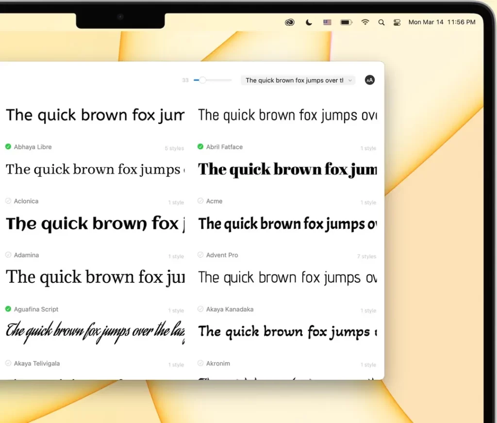
With a broad list of contenders aligned to industry and brand standards, systematically narrowing options to a shortlist of 4-6 fonts merits further design testing. We aim to identify 1-2 primary logo fonts, with a secondary font for supporting communications.
Prioritise based on strengths on essential criteria we defined earlier, including readability, recall and relevance.
Grid Evaluation Process
An effective process is populating a grid to benchmark font options on critical criteria:
Score each font on relevant dimensions like personality expression, versatility, compatibility, etc., on a scale of 1-10. Higher overall scores signal contenders warranting further design mock-ups.
Through this process, patterns often emerge on frontrunner fonts that check multiple boxes. Perhaps serif and sans serif pairings emerge as primary plus secondary logo contenders.
Remember, the ultimate goal remains to identify typography uniquely expressing the brand's identity and values. There are no universally “best” or “worst” fonts, just appropriate and inappropriate selections for specific brand objectives.
Step 4: Design Mock-Ups with Frontrunners
With a narrowed subset of ~2 primary and ~2 secondary logo font finalists, take your evaluation to the next level: practical design mock-ups. Testing shortlisted fonts within hypothetical logo designs clarifies strengths and weaknesses that are hard to discern through abstract analysis alone.
Style Scenarios
Design mock logo concepts utilising frontrunner fonts across a range of styles:
- Full brand name
- Initials
- Icon plus text
- Text only
Testing flexibility across applications prevents late-stage surprises. Not all contenders translate positively into icons or exclusively uppercase treatments, for example.
Populate clean, simple templates showcasing the isolated impact of the font.
Size Testing
Further stress test legibility by showcasing fonts at actual deployment sizes like:
- Web banners
- Print business cards
- Mobile sites
- Billboards
Zooming in on an isolated style on your desktop screen misrepresents real-world visibility. Account for minimum sizing early when reviewing fonts.
Through this hands-on design process, 1-2 primary fonts typically outshine alternatives. The moment of truth has arrived!
Step 5: Finalise Primary Font
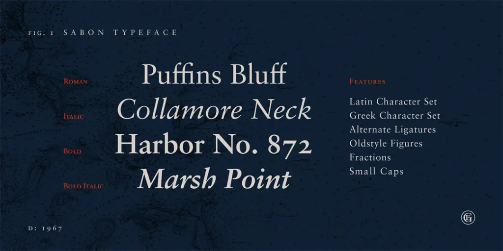
After thorough industry analysis, expansive searches, structured shortlisting, and meticulous design mock-ups, the finishing milestone includes finalising your distinctive primary logo font.
- Re-verify selected typography uniquely aligns with brand identity and values based on mockups
- Ensure industry legibility and compatibility requirements are satisfied
- Triple-check trademark conflicts do not exist
- Confirm technical formatting compatibility (hint: convert to outlines)
Upon sign-off, coordinate with designers to roll out across crucial brand collateral like:
- Style guide documentation
- Templates featuring font
- Iconography & imagery direction
- Business cards & stationery
- Website & advertising design
- Signage
- Merchandise
Maintaining consistent typography applications is critical for driving visual recognition and strategic messaging. But our work does not end here. Maximising impact requires ongoing optimisation…
Step 6: Track Performance & Optimise
Like any strategic initiative, actively track the performance of your logo font over time and fine-tune it based on learnings. Metrics to monitor include:
- Brand survey alignment – Do customers perceive intended branding?
- Visual appeal – Hero-focused testing on the logo alone
- Comprehension – Legibility testing on collateral
- Conversion lift – Multivariate testing with font options
- Accolades – External design awards
Your font underperforms on mobile platforms, warranting modification. Or a competing brand emerges, copying your typography, demanding distinct pivots.
Treat logo fonts like your visual brand heartbeat, warranting consistent health checks and evidence-based improvements. Do not just sit and forget. The most impactful logo font selections evolve informed by data.
Typography Structure and Layout

Once you have selected the main font, the next area to focus on is the structure and layout of the typography. Well-structured typography is readable, balanced and aligned to the brand style.
Spacing, Kerning and Leading
Carefully adjust the spacing between letters (kerning) and lines (leading) to create balanced typography:
- Even spacing enhances legibility
- Too tight reduces clarity between letters
- Too loose looks awkward and disjointed
Aim for precision and consistency with spacing.
Word Spacing and Layout
Word spacing and positioning also require consideration:
- Centred logos look formal and symmetrical.
- Left-aligned logos feel reliable and honest
- Diagonal logos inject energy and dynamism
Evaluate the desired brand personality and values when making layout choices. Consistency across usage is critical.
Capitalisation
Varying capitalisation creates visual impact while aiding recognition:
- All caps communicate confidence and directness
- Title case helps distinguish word boundaries
- Lowercase feels casual and friendly
Consider combinations, e.g. capital first letters + lowercase remaining.
Enhancing with Colour
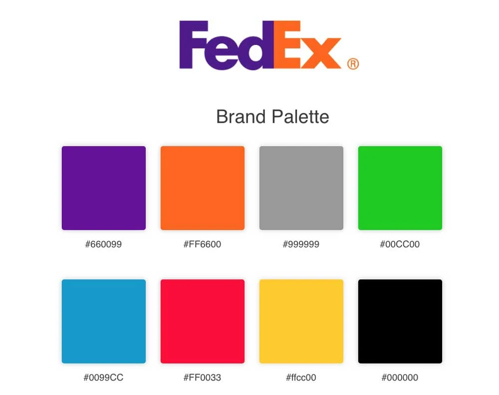
While less dominant than the typeface, strategic use of colour provides another layer of visual distinction and brand alignment.
Accent Colours
Use colours sparingly to draw attention and energise the logo design:
Accent colours work well on initial capitals, logo icons or underscoring flourishes.
Colour Psychology
Combine accent colours strategically considering colour psychology:
- Red – urgency, passion, excitement
- Orange – friendly, confident
- Yellow – optimism, clarity
- Green – growth, organic
- Blue – professional, trustworthy
- Purple – creative, mystical
This aligns typography colours with the brand personality.
Consistent Usage
Establish guidelines for colour usage so applications remain flexible while staying recognisable. Overuse of colour reduces impact, so be strategic with usage.
Typography Size and Hierarchy
Logos feature the brand name prominently but often integrate additional descriptive text or slogans. Constructing the visual hierarchy requires strategic size and weight usage:
Prioritising the Brand Name
Viewers focus on the largest, boldest elements. The brand name must dominate to ensure instant recognition and recall.
Balancing Secondary Text
Slogans and descriptors play a supporting role. Use significantly smaller sizes and lighter weights to distinguish the hierarchy while retaining legibility.
Well-structured logo wordmark with clear visual hierarchy.
If secondary text competes too directly with the brand name, it detracts from the core identity, so aim for clear proportional contrast between elements.
Typography Flexibility and Versions

Logos are featured across diverse touchpoints, from billboards to mobile screens. Balancing continuity while optimising for specific formats is critical.
Digital-First Design
Prioritise a simplified, digitally-optimised typography design:
- Single typeface
- Clean lines
- Graphically versatile
Overly intricate details appear cluttered at small sizes.
Print and Merchandise Usage
Alternate versions can layer in stylistic detail for print and merchandise:
- Intricate serifs, textures and shading
- Multi-color and metallic treatments
Maintain the core typographic structure while embellishing to add depth.
Clear Space and Minimum Sizes
Establish clear space guidelines and minimum size standards, ensuring legibility across formats. Streamline detail, spacing and flourishes to retain clarity when reproduced small.
Evaluating and Testing Typography for Logos and Branding
Gaining objective design feedback is crucial before finalising logo typography:
- Focus groups to evaluate consumer reactions
- Online surveys to quantitatively measure preferences
- Expert reviews from brand strategists and designers
Iteratively refine based on feedback to ensure typography achieves branding objectives.
Key Considerations and Common Mistakes
By avoiding these common logo design pitfalls, you can create brand-aligned and impactful typography:
✅ “Typography Crimes”
❌ Difficult to read with unclear spacing
❌ Overly intricate details or complex styling
❌ Cheap-looking, gimmicky or cartoonish fonts
❌ No connection between typography and brand
✅ Best Practices
❏ Strategic use of colour and visual hierarchy
❏ Streamlined digital optimisation
❏ Precision spacing and kerning
❏ Consistent structure across usages
Get the fundamentals of clarity, alignment and flexibility locked in to allow creative embellishment without losing brand identity.
Conclusion
Defining the typographic foundation of your logo marks a pivotal stage in crystallising a memorable and distinctive brand identity. By balancing legibility, visual impact, flexibility and brand alignment in your choices, the logo typography will become a recognisable signature of your organisation. Champion simplicity in structure and consistency in usage, allowing more expressive styling once the core elements are established. With careful precision given to spacing, sizing and layout, the logo wordmark can directly influence positive perceptions while delivering standout quality. So embrace typography as an impactful tool to imbue personality and own your competitive space.
FAQs
What are the most critical factors when selecting typography?
The key factors are legibility, visual impact to be memorable, flexibility for usage across contexts, and connection to the broader brand identity and values.
How can I add visual interest to typography without compromising legibility?
Strategic colour accents, varied capitalisation, custom letterforms with unique shapes, and alternate versions with details for print can all add distinctiveness without reducing clarity.
What makes logo typography different from body text?
Logos require bolder, more distressed, condensed and simplified letterforms to maximise standout impact on first impression, unlike continuous reading comfort needed for body copy.
Should my logo work well digitally before adding intricacy?
Prioritising a clean, simple, digital-ready version of the logo ensures versatility across contexts. More detail and flourish can be layered for specific high-visibility print usages without compromising baseline flexibility.
What if my logo typography tests poorly with audiences?
Continuously test and refine logo designs based on qualitative feedback and quantitative data until they achieve branding goals. Be willing to simplify, establish visual hierarchy, improve spacing, change colours, etc., based on audience reactions.
