
In the world of typography, there are numerous terms that are necessary for every designer to know. A little typography knowledge goes a long way, so today we will cover two basic terms of typography measurement, which are cap height and x-height.
If you want to start learning more about basic typography anatomy and its terms, check out this video from the Envato Tuts+ YouTube channel.

Jump to content in this section:
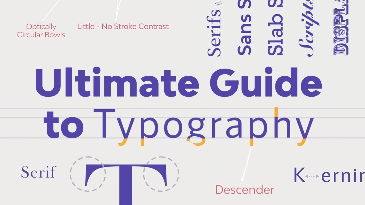
Understanding Typography Anatomy
Typography anatomy is based on how letters are aligned or organized on an invisible guideline called a baseline. All fonts are drawn from the baseline. It is the lowest point of all capital letters and most lowercase letters. The typography baseline guides where all the characters sit, and it's an important element for aligning text with images and other content.
Now let's address two other important terms of basic typography anatomy, which are cap height and x-height, both related to typography measurements.


Typography Anatomy: What Is Cap Height in Typography?
Now for a lesson on typography measurements: cap height in typography. Cap height simply stands for the height of the capital letters in a typeface. In typography, cap height or cap line refers to the height of the flat capital letters measured from the baseline, the bottom of the cap height, to the top of the flat characters. The distance from the baseline to the top of the capital letter is what determines the point size of a letter.
Note that the cap height marks the height of flat letters like M, H, T, or I, as opposed to round letters such as S, O, or Q, or pointy letters like A and V, which tend to overshoot. Some letters will tend to overshoot the cap height slightly to achieve the effect of being the same size as the cap height.
Keep in mind that the cap height in typography is lower than the maximum height of the typeface.


Cap Height in Typography: Different Typefaces
Below is a sample preview of the five different cap heights of some script fonts that can be found on Envato Elements: Belinday Monoline Script, Saranghae, Machia Script, Gallery Monoline, and Dirgantara script.
Every typeface has a unique cap height. Depending on the typeface, you will notice that sometimes the styles appear above the normal cap height or below the typography baseline. This is most common in script fonts.
Also, when comparing typefaces, you will realize some font sizes may appear bigger even though the same type size is used. Depending on the font, the differences can be considerable. A 100 pt font can appear smaller than a counterpart with the same point size, as seen below.


Typography Anatomy: What Is X-Height in Typography?
As far as typography measurements go, X-height refers to the height of the main body of lowercase letters in a typeface. It is mainly based on the size of the font's lowercase 'x' and occasionally the letters u, v, w, and z. The font x-height indicates how tall or short each typeface glyph will be and measures from the baseline up to the 'meanline' or median. The meanline is the imaginary line at the top of the x-height.
Why is it called 'x' height? Because the letter 'x' is the only letter in the alphabet that has all its terminals touch both the baseline and the meanline, with no extending points. Curved letters such as a, c, e, o, r or s usually pass the font's x-height slightly.
Make note that, while the letter x is typically the measure of the x-height, it may not always be the case. In some decorative or script fonts, the swirls, styles, and embellishments often appear above the x-heights.


Why Is X-Height in Typography Important?
The x-height is an important factor in identifying the type and its readability. Legibility can increase or decrease depending on the relationship ratio between the cap height and x-height in typography.
Typefaces with large x-heights are generally considered easier to read at small font sizes, whereas small x-heights require more spacing between letters and larger font size to achieve legibility. Have a look at the sample below. While the Ageo font (with a large x-height) is easily readable at 12 pt, the Blauth font (smaller x-height) needs a 17 pt size to be considered readable.
Typically a font with a bigger x-height compared to its cap height tends to appear larger and more legible than a font with a small x-height at the same size. However, there is no strict rule in modern typography regarding x-heights and the matter of legibility. The x-height can vary greatly between typefaces, so one with a long x-height can also sometimes look condensed and difficult to read.
Also, as a tip for good design, if you want to pair fonts, chose typefaces that have similar x-heights to create a sense of harmony in your design.


Find Helpful Videos From the Envato Tuts+ YouTube Channel
I hope you enjoyed this quick lesson on cap height and x-height in typography. Remember that cap height and x-height vary in fonts, while the typography baseline is the common structure that all the characters share and sit on.
If you would like to complete the lesson with more typographic terms, head over to the Envato Tuts+ YouTube channel for more.
Amazing Resources From Envato Elements
Envato Elements is an amazing digital resource platform for fonts, templates, graphics, and more. Check out its amazing library of assets, to find the resources you need. And if you wish to continue learning or find more useful information, check out our amazing article from the Envato Blog: How to Make a Font: 10+ Typography and Font Tutorials for Beginners. You can also learn more with these tutorials on Envato Tuts+:

 Typography: The Anatomy of a Letter


 The Must-Have Fonts for Graphic Designers and Font Lovers


 A to Z of Typography: Terms, Tips, Tricks, and Hacks!


 The Ultimate Guide to Basic Typography

 Typography in Action: Design Simple & Effective Type Logos


 A Brief History of Type

 What Are Variable Fonts?

 System Fonts: All You Need to Know


