
The vernacular typography of Blackpool’s hotels
Sarah Horn’s book En-Suites Available shines a spotlight on Blackpool’s little-discussed graphic design legacy
The UK seaside resort of Blackpool has a reputation for a number of things: its famous illuminations, its hen dos, its rock, plus a particularly compelling episode of Four in a Bed.
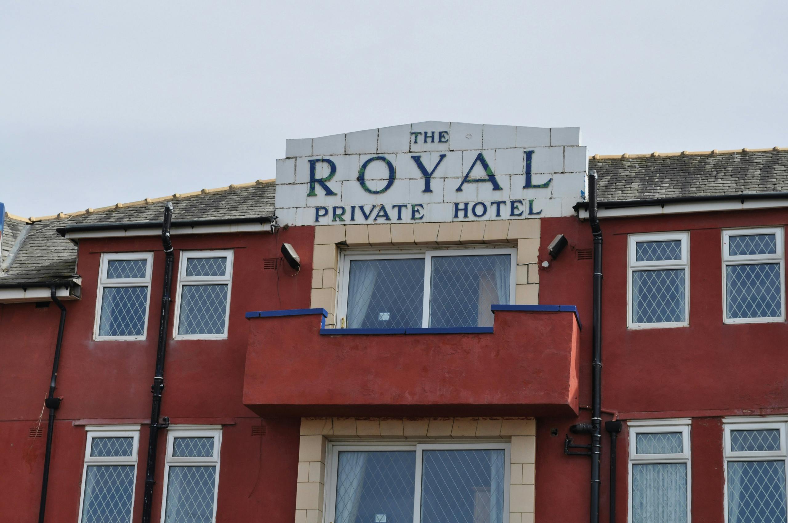
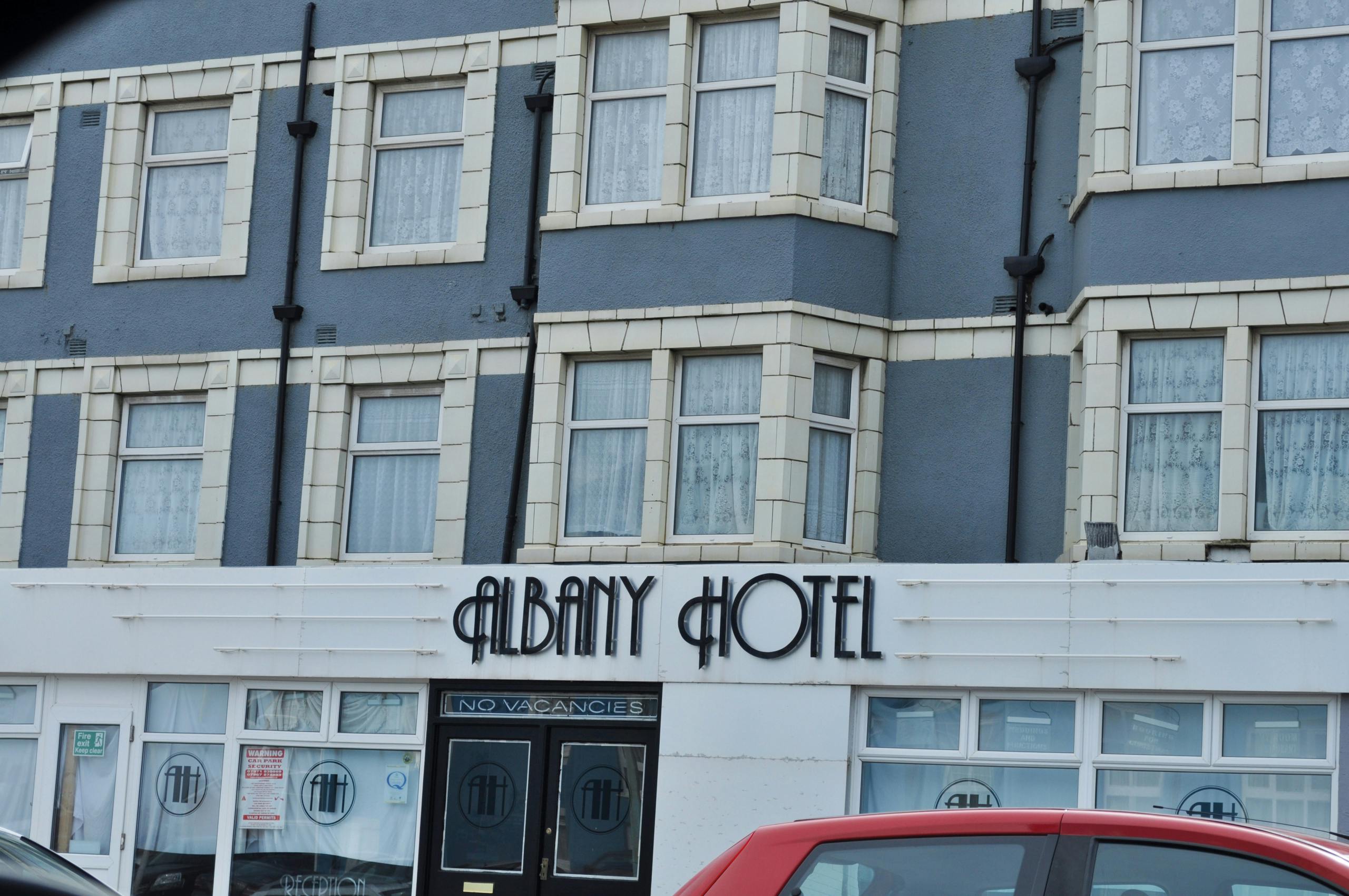
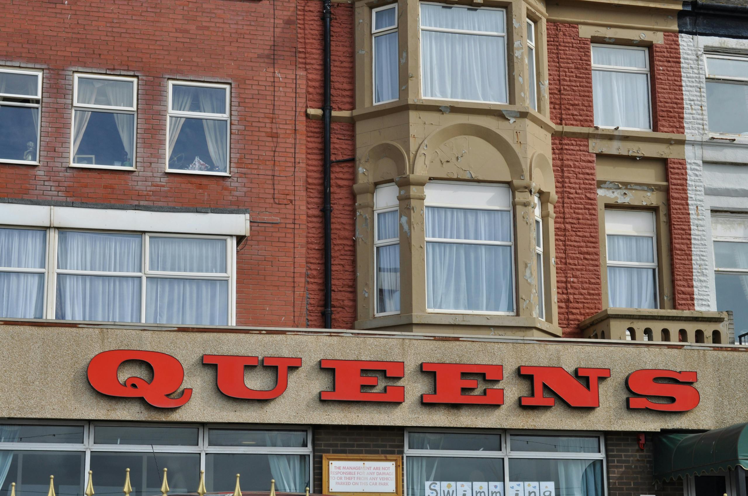
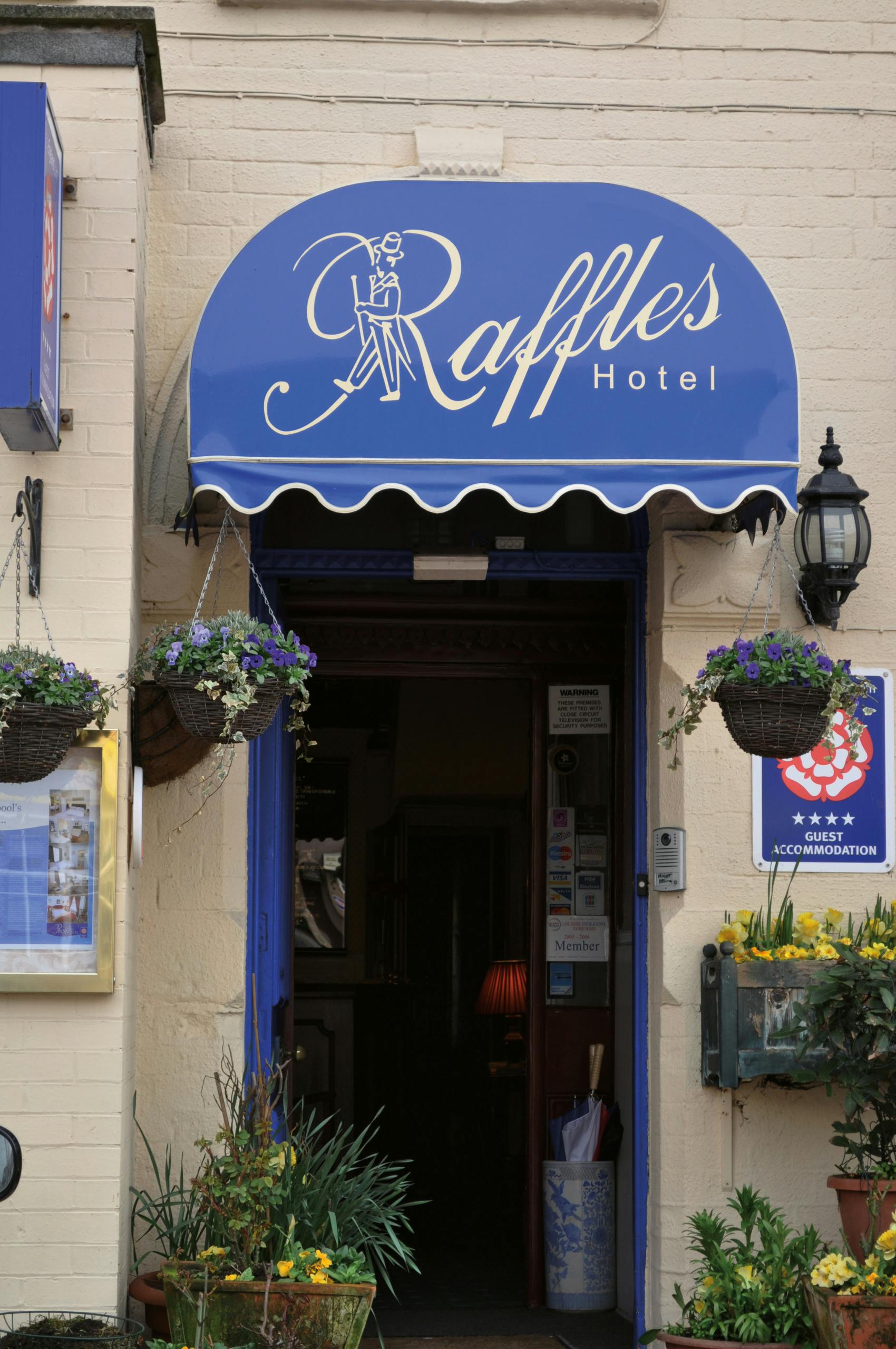
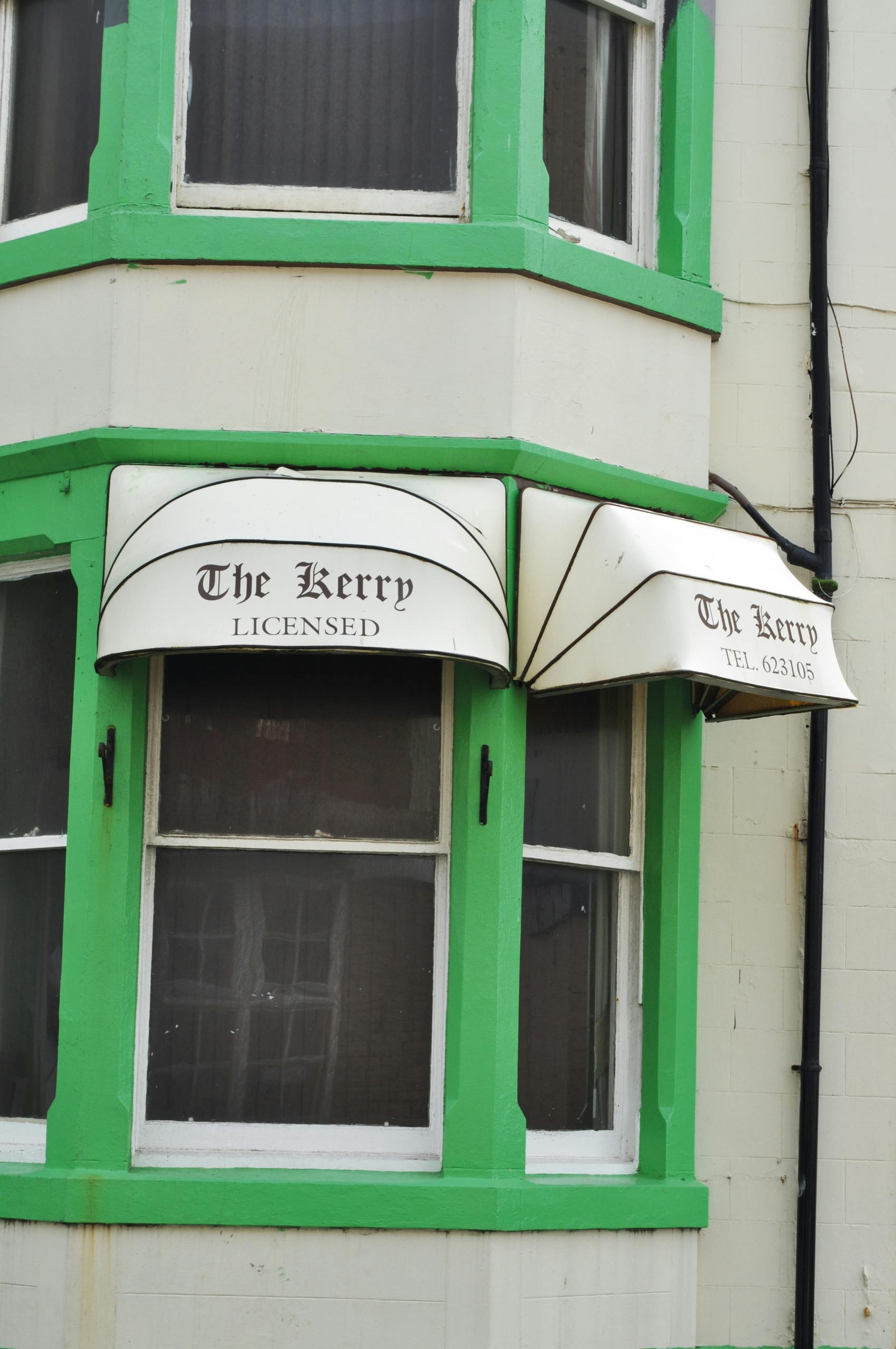
Until now, it’s not exactly been known for its graphic design. But that could be set to change thanks to a gorgeous new book from Sarah Horn titled En-Suites Available that presents the Lancashire town’s many hotel signs, holding them up as beautiful examples of seaside vernacular signage.
Released by Occasional Papers, the arts-focused non-profit publisher founded by graphic designer Sara De Bondt and curator Antony Hudek, all the images were shot by Horn, and she also designed the book.

Horn, who currently works as a designer at Build, was born and raised in Blackpool, describing herself as “a true Sandgrown’un”. Part of her aim with the book was to showcase her hometown in a way that gives it “a positive, design-led twist,” she says.
“It’s a photographic, celebratory tour of its social history. The city gets a lot of negative press, and I think if someone more removed designed this book, it might start to make it feel like a joke. In fact, we’re honouring this bonkers town!”
This particular selection of photographs was initially taken as research for a project Horn was working on at university, which briefed the students to research a specific typographic theme. She chose B&Bs since there’s “hundreds of them in Blackpool,” she says, and because of her long-standing fascination with the typefaces and colours of seaside vernacular signage.
“Since then, I’ve shot lots of signage all over the place, but nothing beats the signs at home. They’re very special to this part of the country,” says Horn. “People’s renewed interest in local tourism since Covid-19 and a post-Brexit nostalgia made the project suddenly very relevant.”
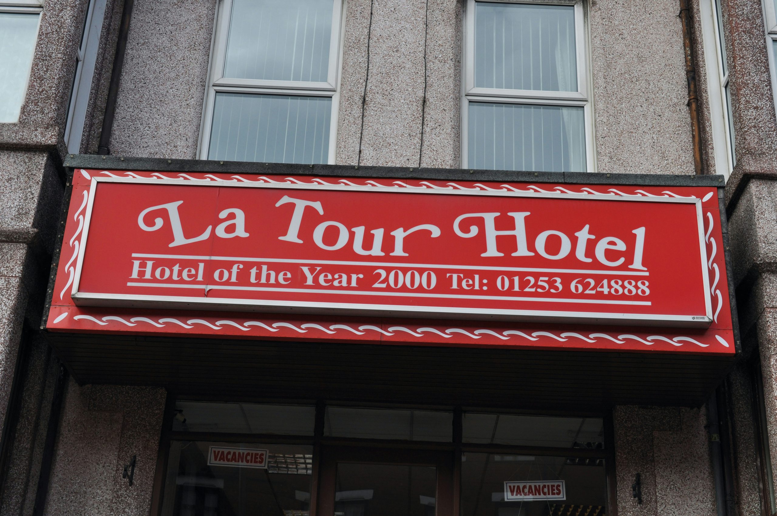
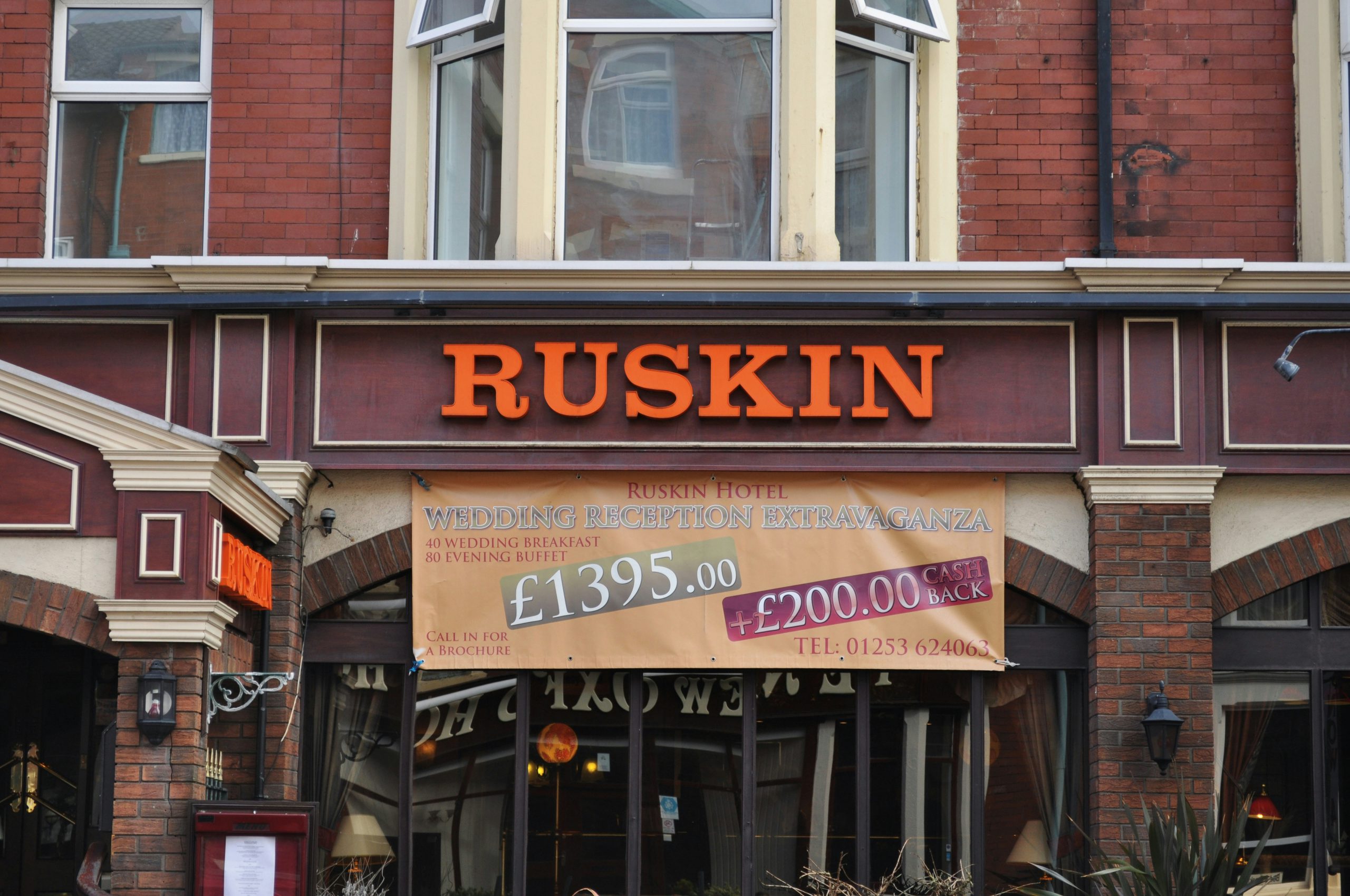
The main things Horn looked for in the signs she photographed were standout typography, intricate letterforms, funny names and bold colour palettes. Her personal favourite images are those where the typography extends beyond the hotel name itself, such as ‘No Vacancies’ signs and those bearing the titular ‘En-Suites Available’. “Having said that, I do love ‘Palm Springs’ and ‘Sweet Afton’, mainly due to the styling and the typefaces that have been used. They look like good fun!” Horn adds.
As for the design of the book, the layout was deliberately kept simple in order to better spotlight the photographs and signage. Its small size and landscape format aim to replicate traditional holiday souvenir booklets, and an index page was included at the front to help readers easily locate each hotel, and to give it a more “serious” feel. The bright yellow cover is inspired by Blackpool’s sweet wrappers and its Golden Mile, the stretch of promenade between the north and south piers.
As well as introducing the world to Blackpool’s lesser-known typographic prowess, Horn hopes that readers will experience a dash of nostalgia or affection flicking through the pages of En-Suites Available. “The hotels conjure a wistful humour reminiscent of a bygone age that I love so much about Blackpool,” she says. “I hope it’s a helpful archive of coastal architecture and vernacular typography we all know and love for fellow designers.”
En-Suites Available by Sarah Horn is published by Occasional Papers; occasionalpapers.org
Latest from CR


