Bauhaus typography at 100
An exhibition at San Francisco’s Letterform Archive looks at the expansive legacy of Bauhaus type on graphic design over the past century
The legacy of the Bauhaus school’s graphic design has been vast, informing the likes of Kamekura Yusaku’s iconic Tokyo 1964 Olympics identity, with its condensed sans serif font; Malcolm Garrett’s 1977 Orgasm Addict design for Buzzcocks, bearing an upside-down photomontage image by Linder Sterling and type that snakes itself round a sharp corner; and Neville Brody’s art direction of The Face magazine in the early-mid-1980s, delighting in sharp primary colours and geometric shapes.
It’s hard to underestimate the impact that Bauhaus type in particular has had on graphic design today: it spawned now-ubiquitous fonts like Futura, beloved by everyone from Barbara Kruger and Wes Anderson to Stanley Kubrick, Ikea and NASA.
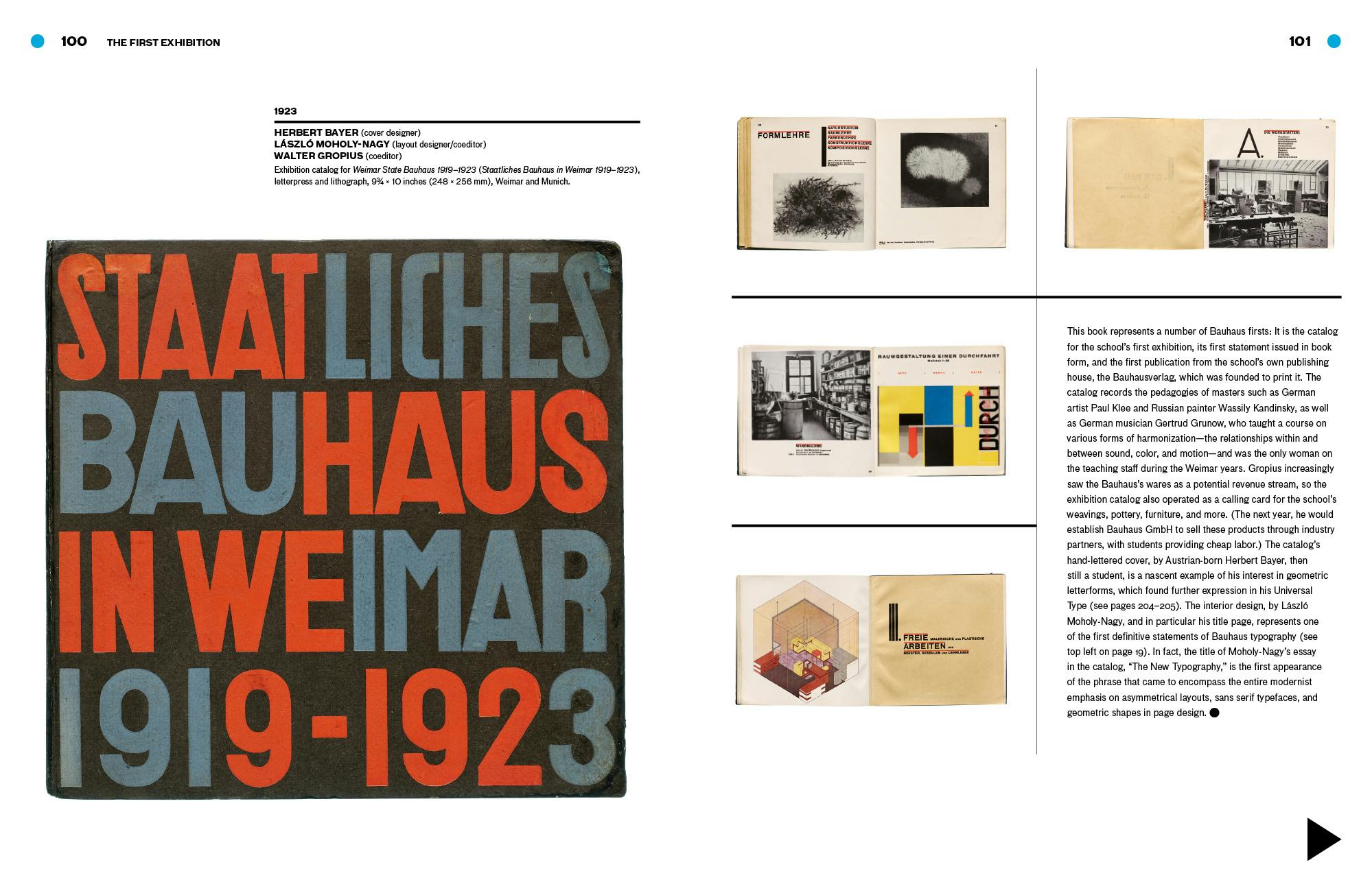
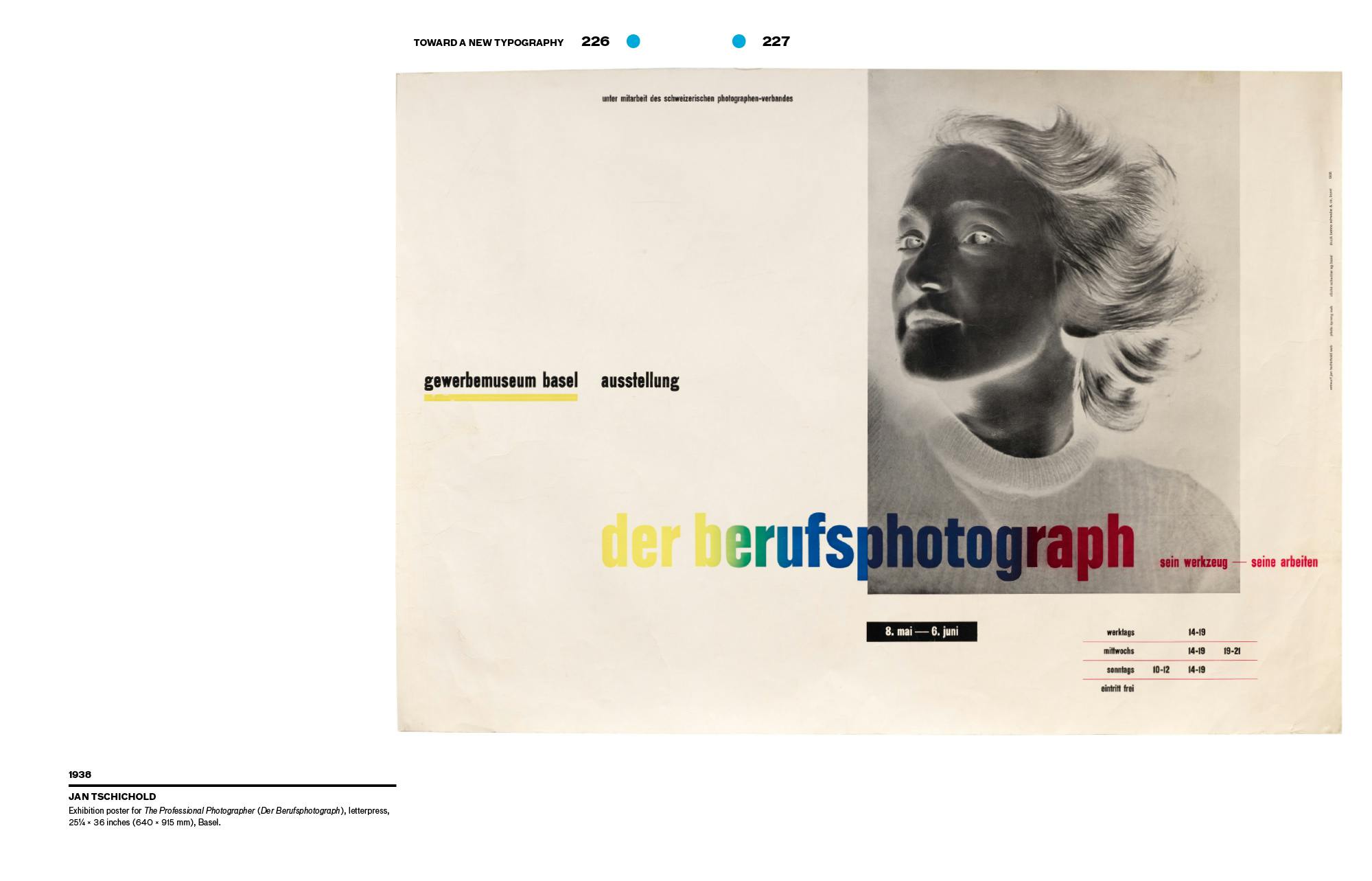
German typographer, designer, teacher, and writer Jan Tschichold cited the first Bauhaus exhibition as directly leading him to forge a more experimental way of working with letterforms that was also simple and practical; and he went on to lay out his principles in seminal book Die Neue Typographie (The New Typography). Between 1947 and 1949, he oversaw the production of more than 500 Penguin book covers.
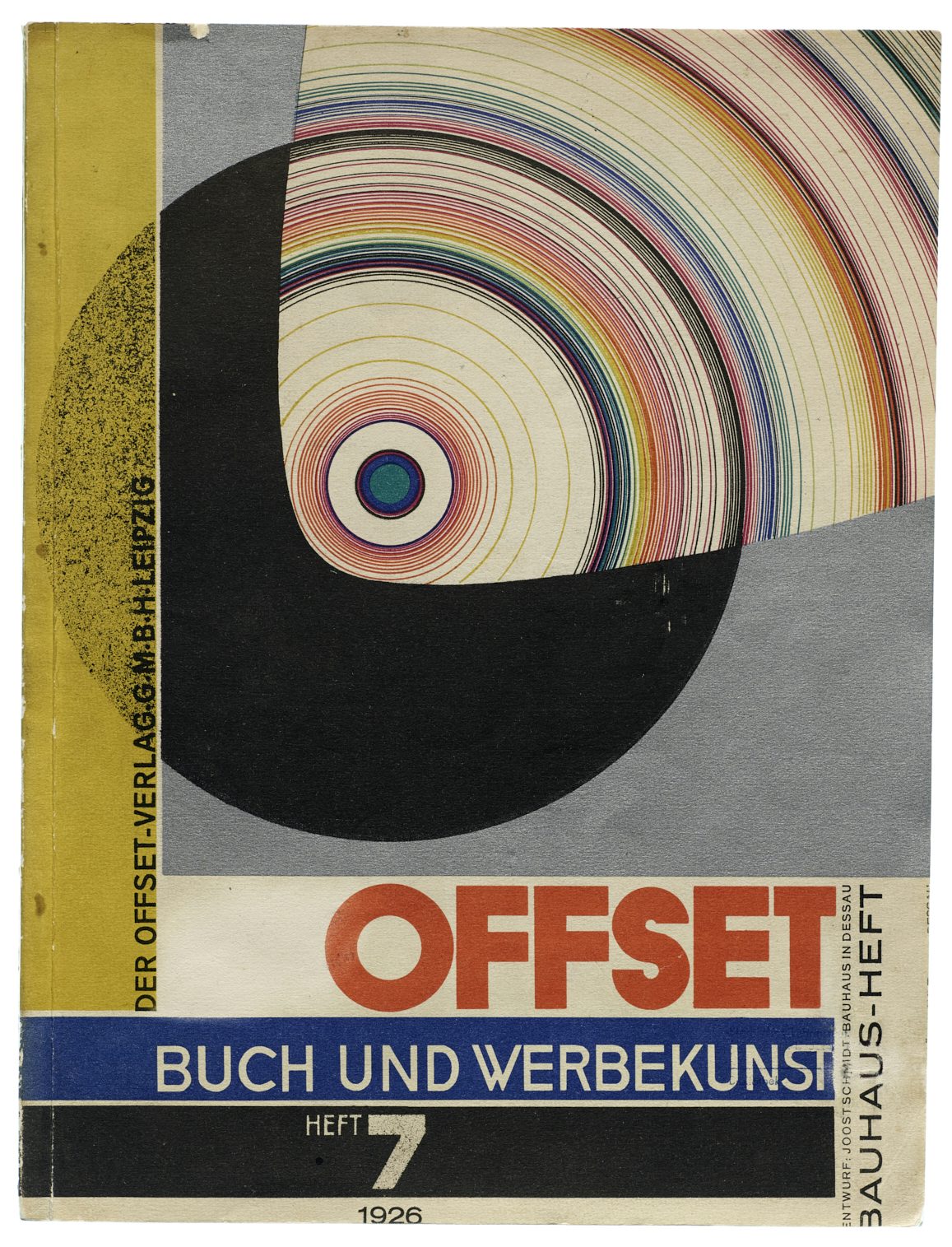
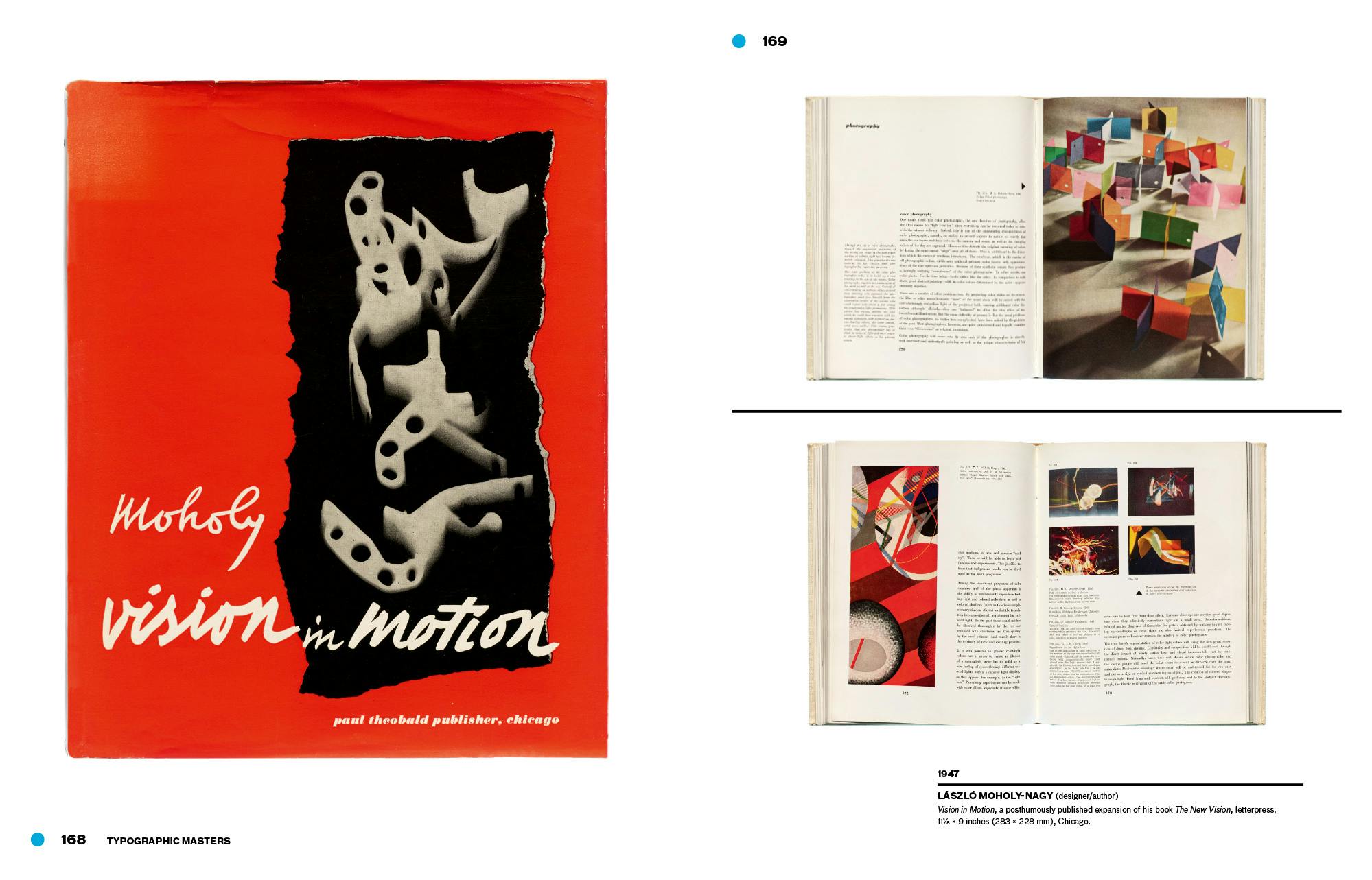
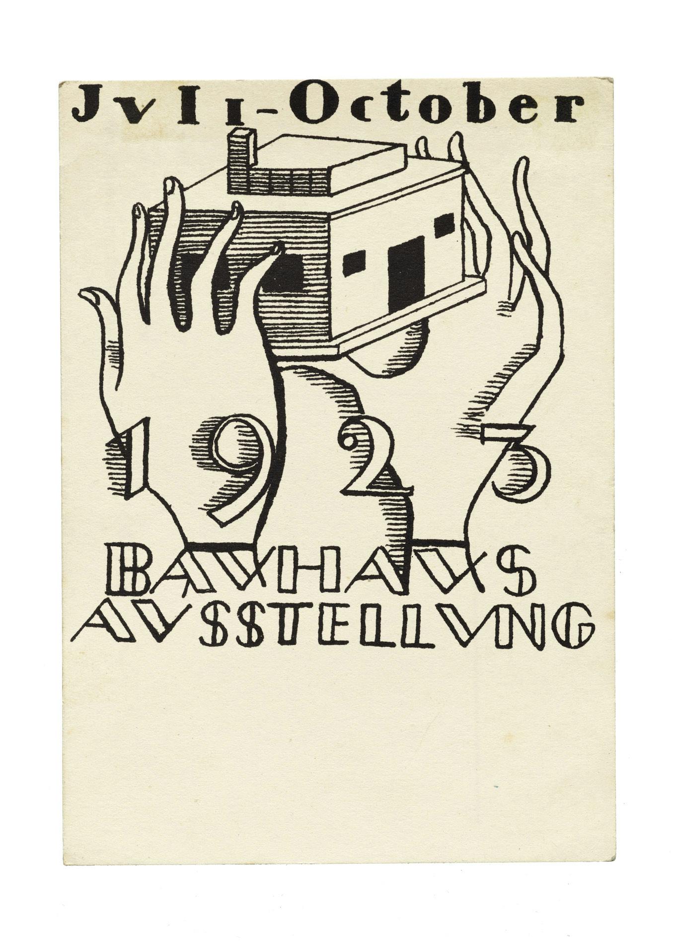
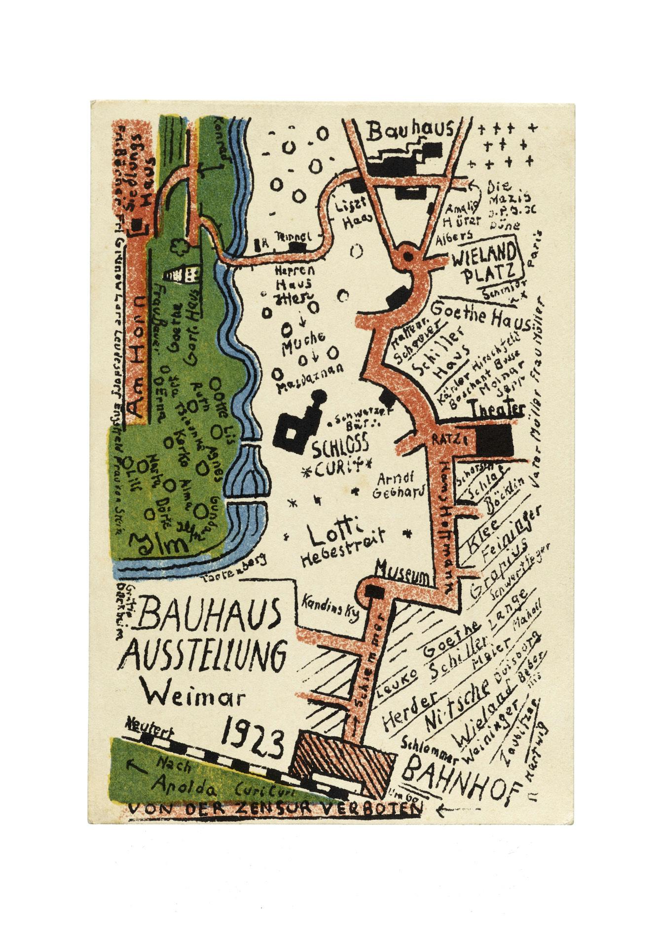
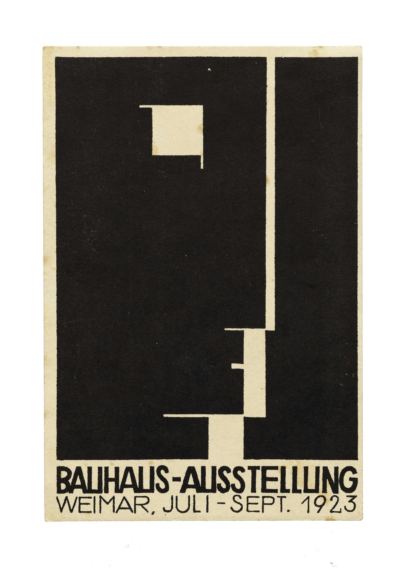
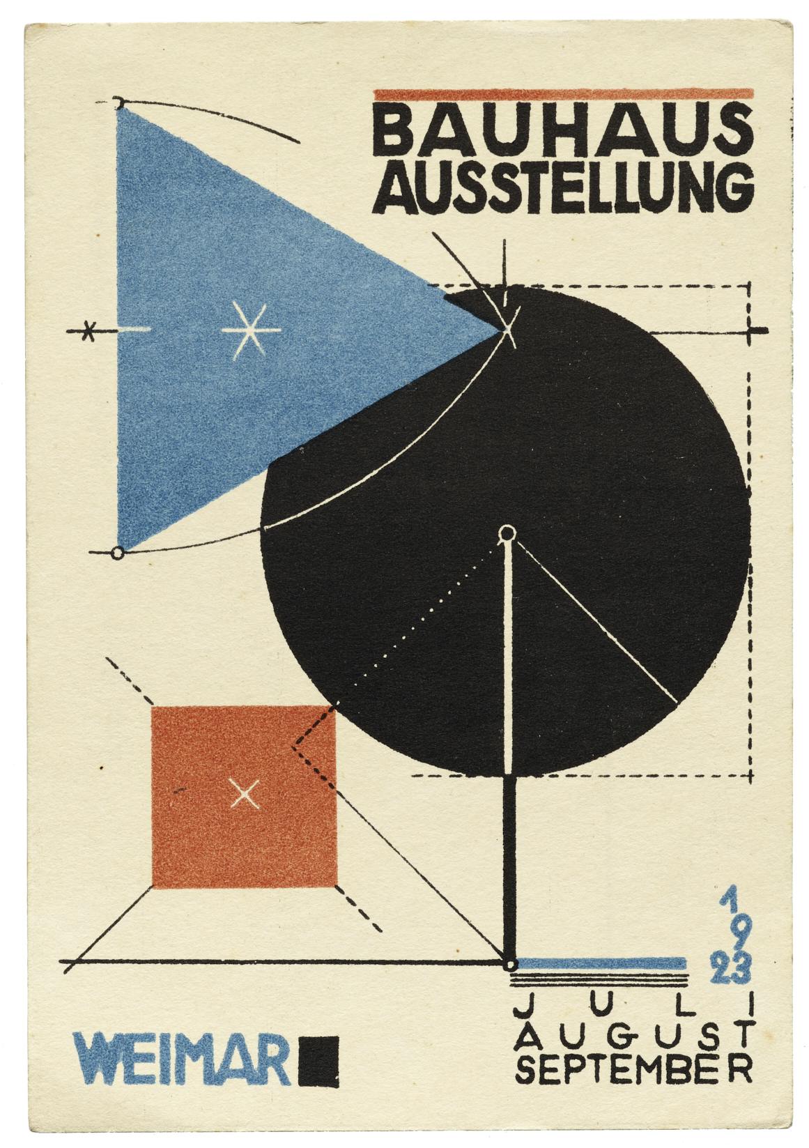
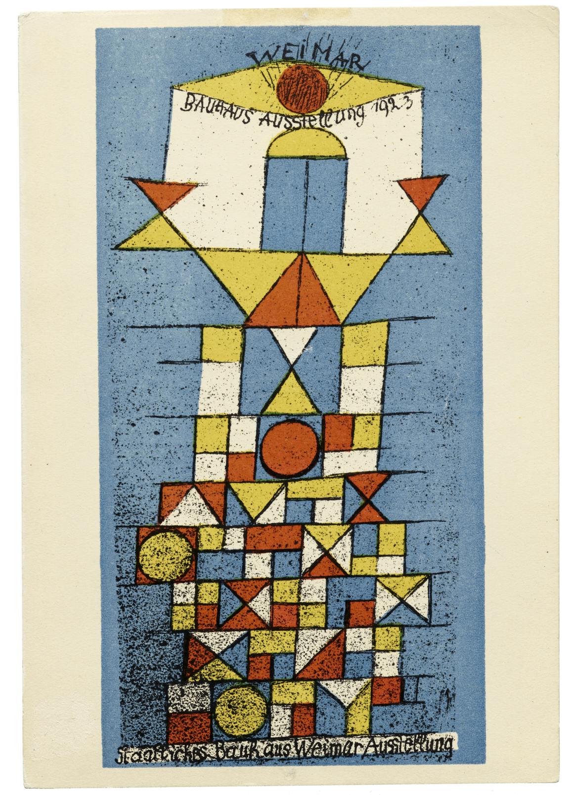
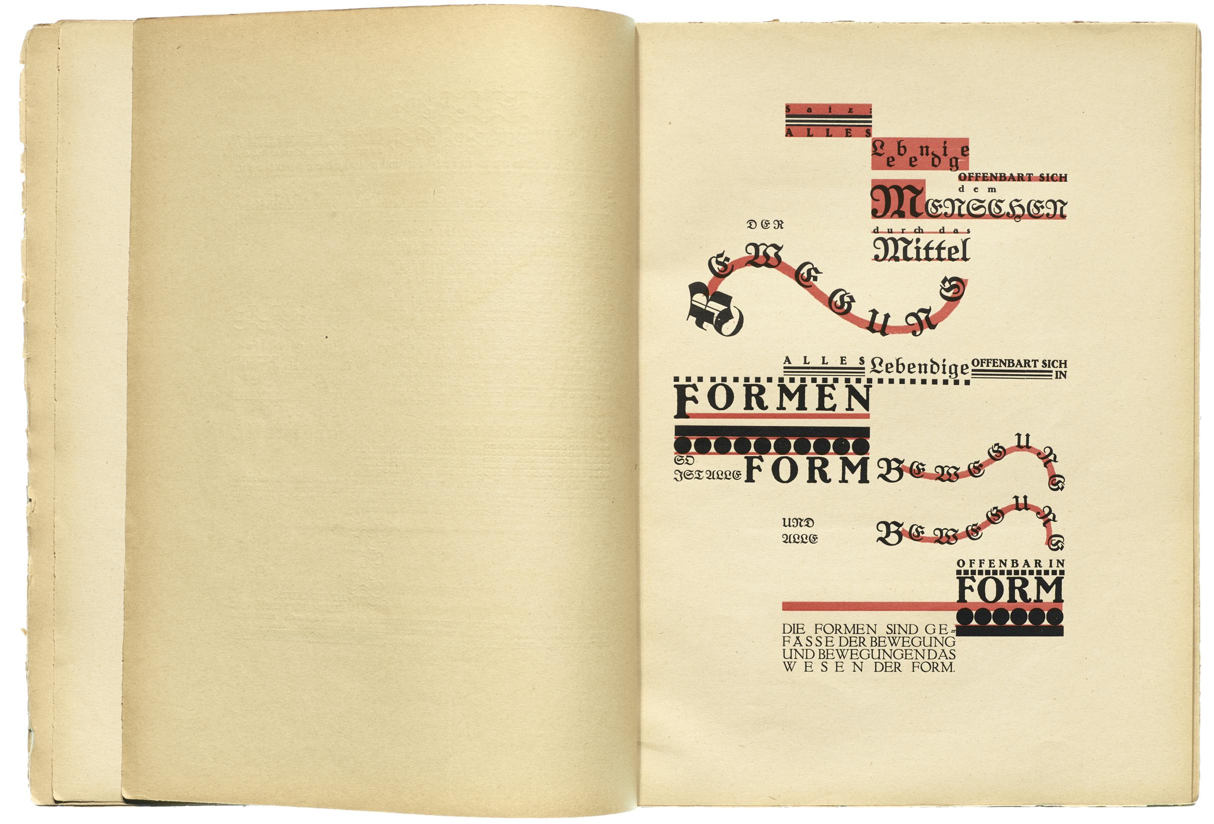
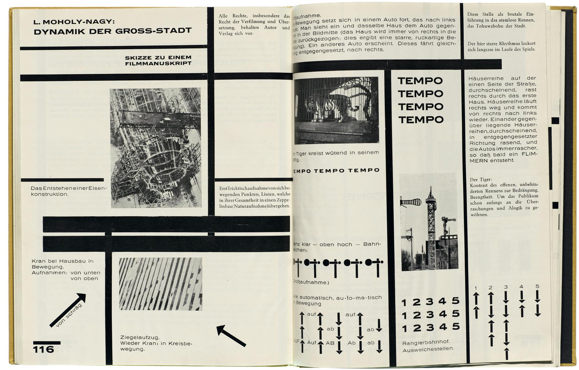
To celebrate the impact of Bauhaus’s typography over the past century, Letterform Archive in San Francisco has devoted the inaugural exhibition at its new custom-designed gallery to a show titled Bauhaus Typography at 100. Running until April 27, the exhibition has been curated by Rob Saunders and Henry Cole Smith and features more than 150 pieces from the archive’s permanent collection. Among the Bauhaus artists and designers in the show are László Moholy-Nagy, Herbert Bayer, Joost Schmidt, Paul Klee, Wassily Kandinsky, and Johannes Itten.
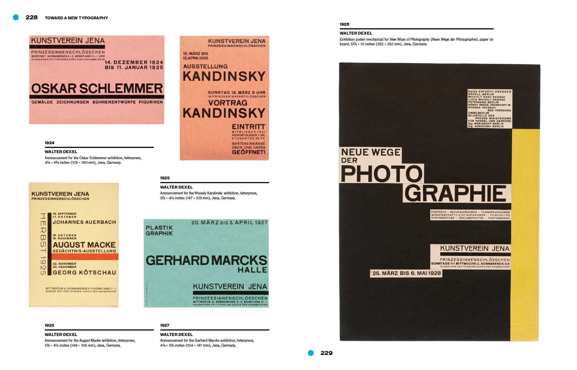
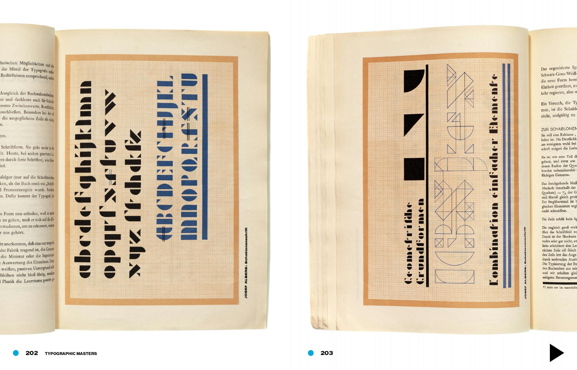
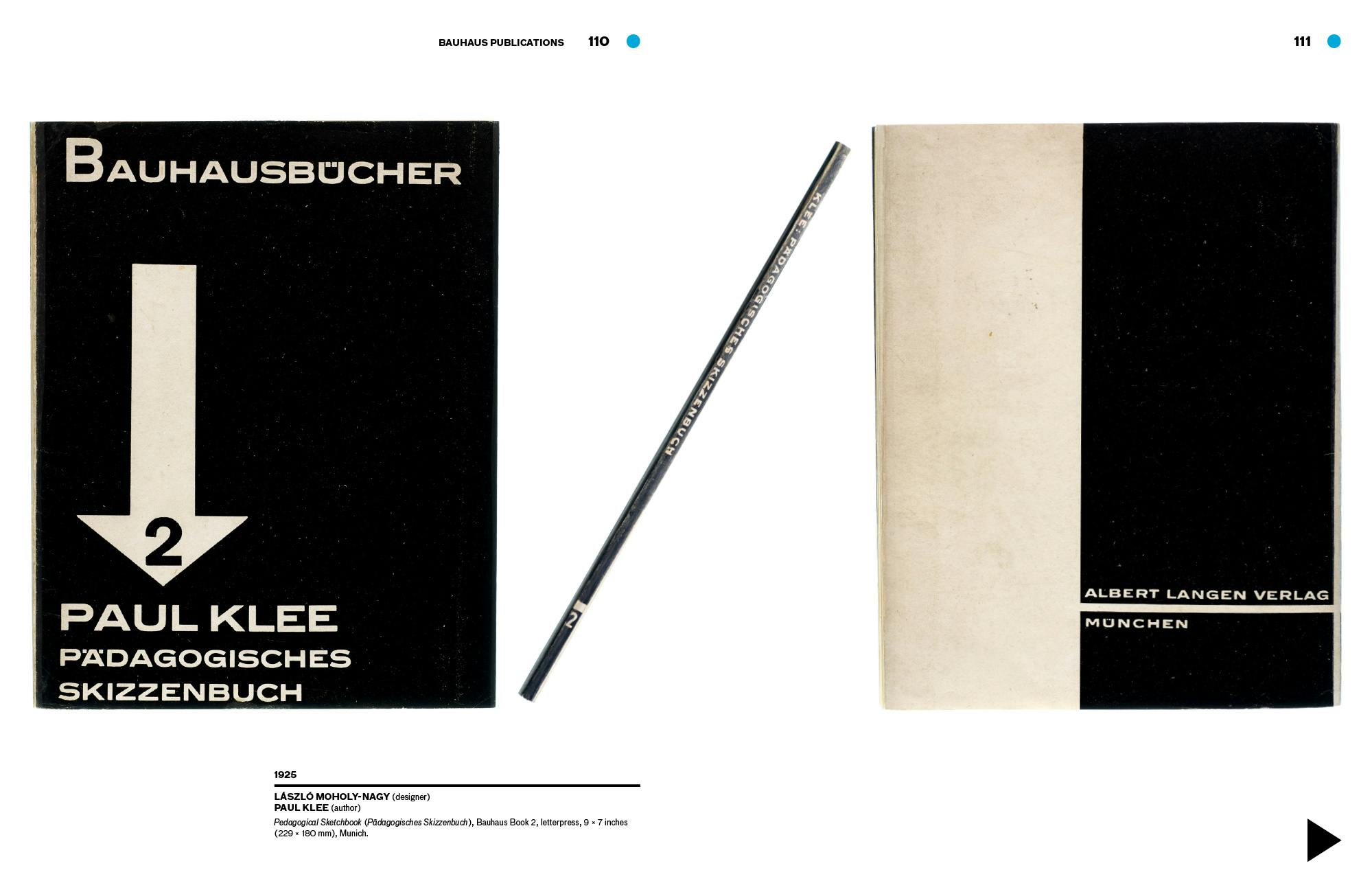
The show aims to trace the impact of Bauhaus type from the school’s founding in 1919 to the present day. The school’s graphics were a vital tool to communicate the Bauhaus’ multidisciplinary, forward-thinking values through the medium of print via designs characterised by their utilitarian but experimental look and feel: sans-serif typefaces, asymmetrical layouts, experimental alphabets and photomontage.
These elements were used throughout the Bauhaus’ printed output, such as teaching materials and promotional ephemera like posters and pamphlets, as well as the school’s self-published magazines and books.
“Today, just over 100 years after the Bauhaus’ opening in 1919, the school’s visual hallmarks — its minimalism and utility, enlivened by experimentation — have, for many, come to define modernity as it appears on the printed page,” says Letterform Archive.
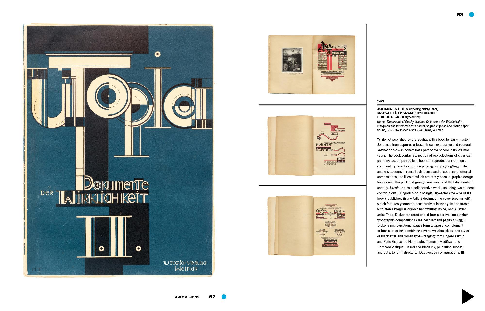
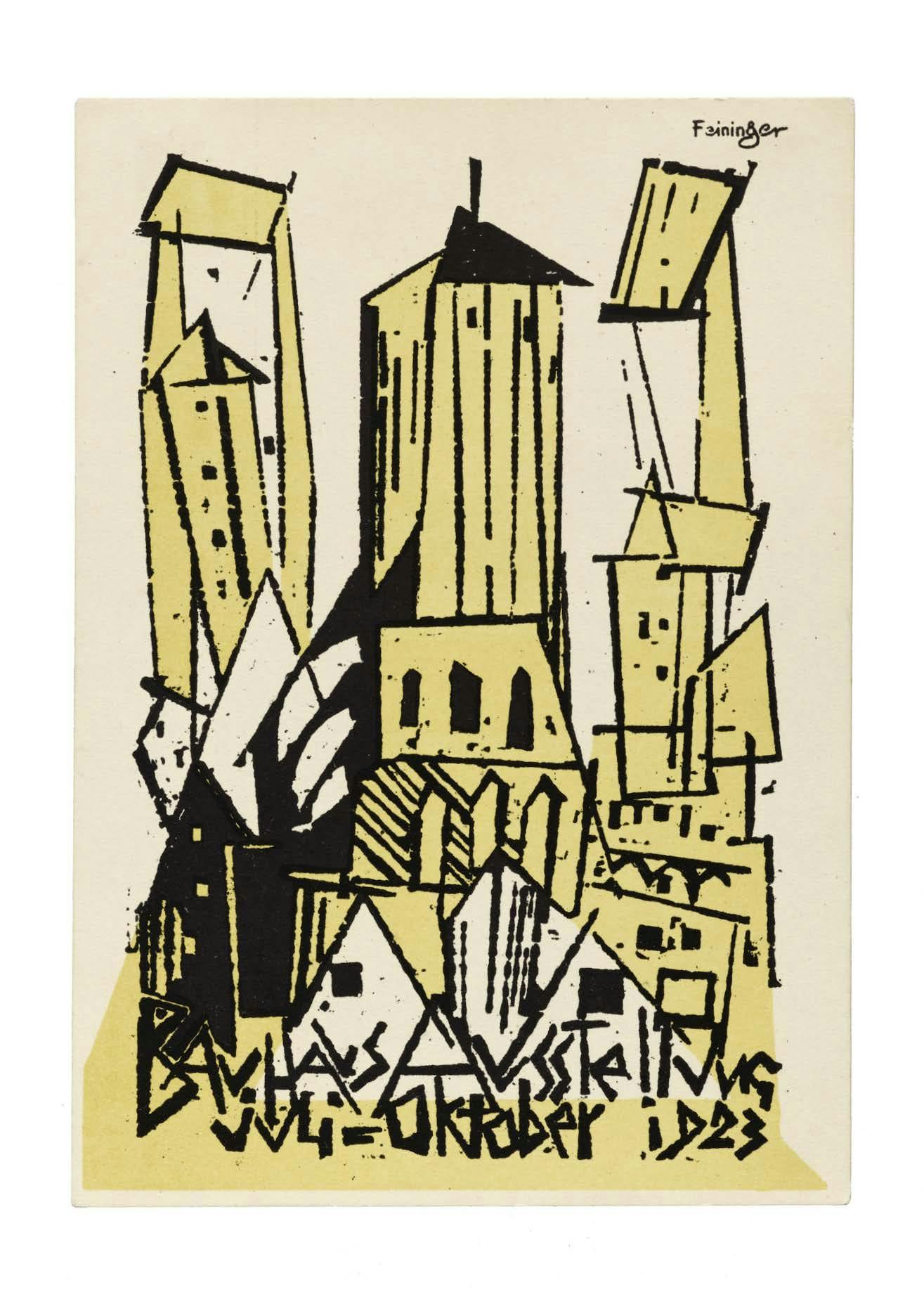
“But the Bauhaus did not start off as a school of graphic design, and its initial forays into the genre indicate more nuanced origins … many of the Bauhaus’ early lithograph and letterpress prints veer toward the expressionistic — even the mystic — in their organic approaches to line and letter.”
As the exhibition details, typography wasn’t initially taught at the Bauhaus, but was soon brought in as founder Walter Gropius and his instructors embraced advances in photography and printing and teachers like László Moholy-Nagy, Herbert Bayer, and Joost Schmidt made their stamp on the design pedagogy at the school.
It was in the workshops that “Bauhaus typography took on its distinctive form — its rejection of serifs and capitals, embrace of experimental alphabets, insistence on universal clarity, and innovation in layering and hierarchy,” the archive adds.
While there’s been no shortage of Bauhaus celebrations over the past few years — especially during its 2019 centenary year — often, we’ve seen the women designers who made significant contributions to the movement sadly overlooked. This show looks to remedy that, showcasing work by practitioners including Friedl Dicker, an Austrian artist and educator who was involved in teaching Bauhaus workshops in textile design, printmaking, bookbinding and typography from 1919-1923.
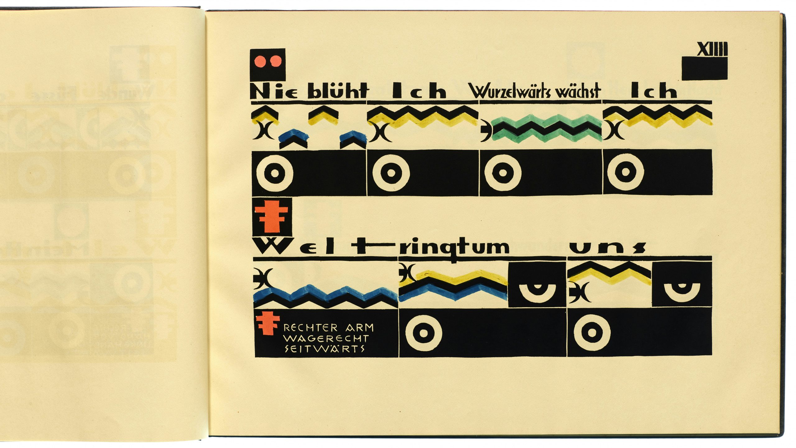
According to Saunders, the Letterform Archive’s Bauhaus collection and this current exhibition focus “as much on the earlier, more expressive work as on the better known ‘new typography’”.
The show also features works created over the decades since the school’s closure due to Nazi pressure in 1933, such as a 1956 lithographed envelope by Elaine Lustig-Cohen, as well as her 1960 brochure, On a Hilltop in Jerusalem for the National Museum of Israel; Chermayeff & Geismar’s 1968 Mobil Corporate identity; Takenobu Igarashi’s 1988 ABC Book and Max Bill’s 1990 screenprinted poster for the Montreux Jazz Festival. Among the most recent works in the show are a 2020 piece by digital designer Zach Lieberman titled love reflect #2.
As well as in its physical format in the San Francisco design district, Bauhaus Typography at 100 is also shown in an online exhibition designed by Jon Sueda and Chris Hamamoto.
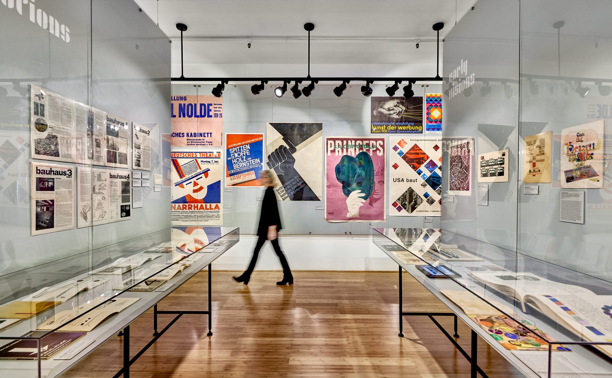
Bauhaus Typography at 100 is on show at Letterform Archive in San Francisco until April 27; letterformarchive.org

