Mama Mexa by Seachange
Opinion by Richard Baird Posted 6 July 2022
Tacos are a Mexican staple, consisting of a small hand-sized corn or wheat-based tortilla topped with a range of fillings. They make for perfect on-the-go food, packed full of flavour. This combination of convenience (quick to make or eat) and tastiness has seen the traditional dish rise in popularity as an ideal product to package and sell in many markets.
Packaging up a ‘cultural tradition’ for an international audience provides business with a potential. When you satisfy expectations and reassure with familiar tropes, you end up going against established brands doing the same thing; attempt something completely different, and things can get lost in translation.
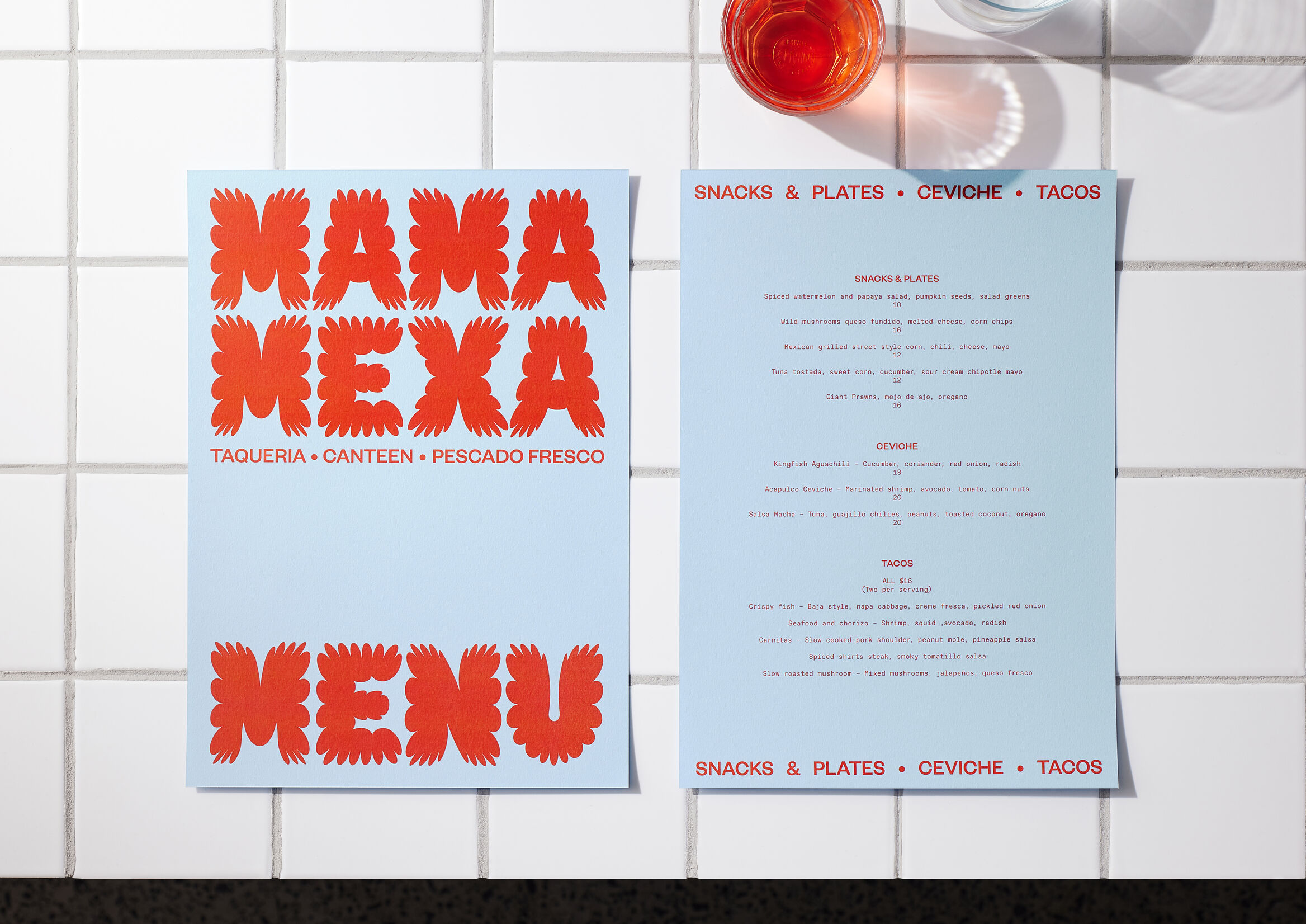
A pop-up provides a useful space to try something different, and it’s a format inherently tied to experimentation and craft that demands the unusual. Mama Mexa is just that, offering ‘reimagined classics from neighbourhood taquerias and market tostadurias’. Seachange went back to the source, delving deep into Mexico’s colourful, rich, vibrant culture to draw out the unexpected.
This post includes Extended Insights for BP&O Plus members.
Find out more and sign-up here.
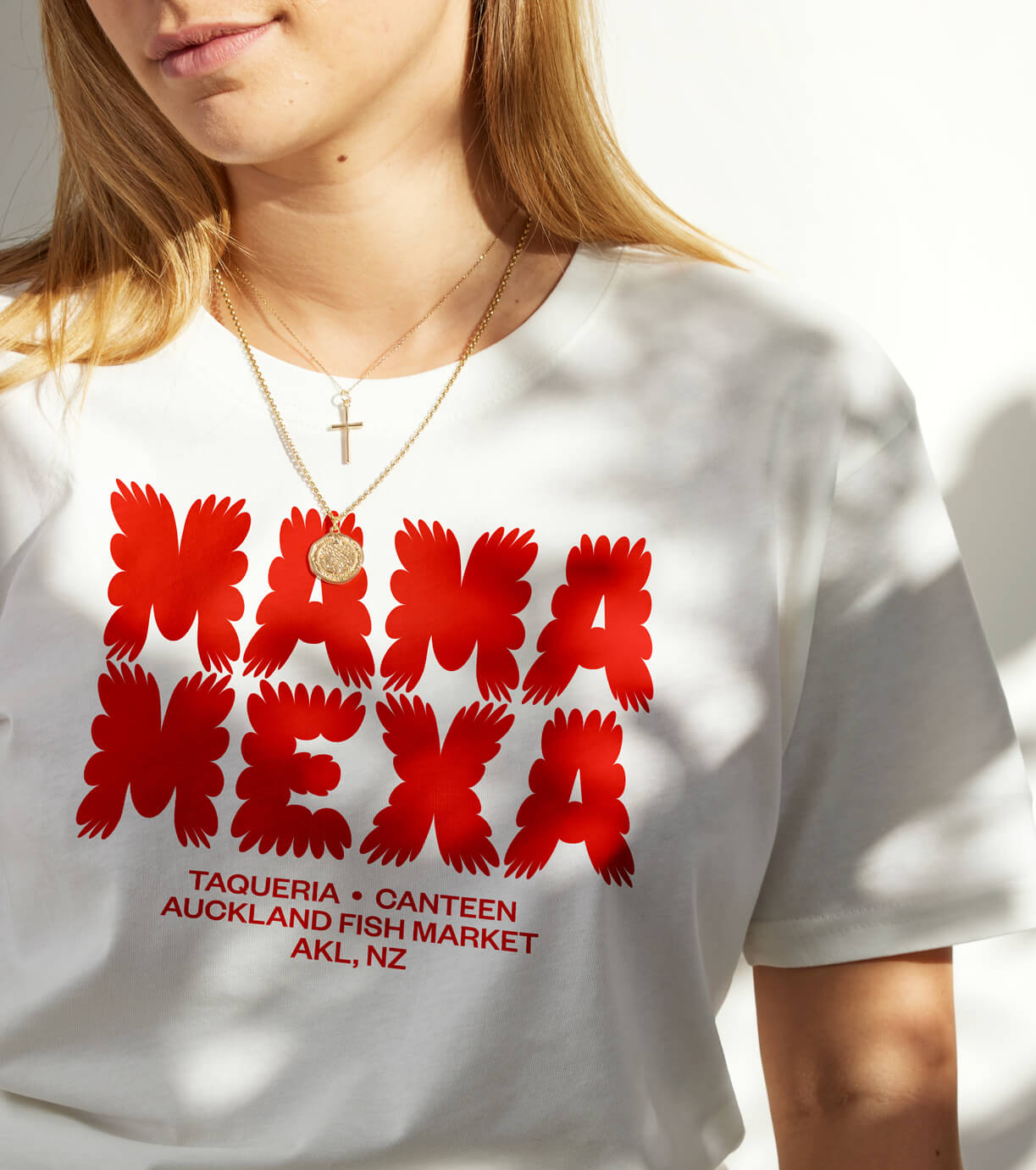
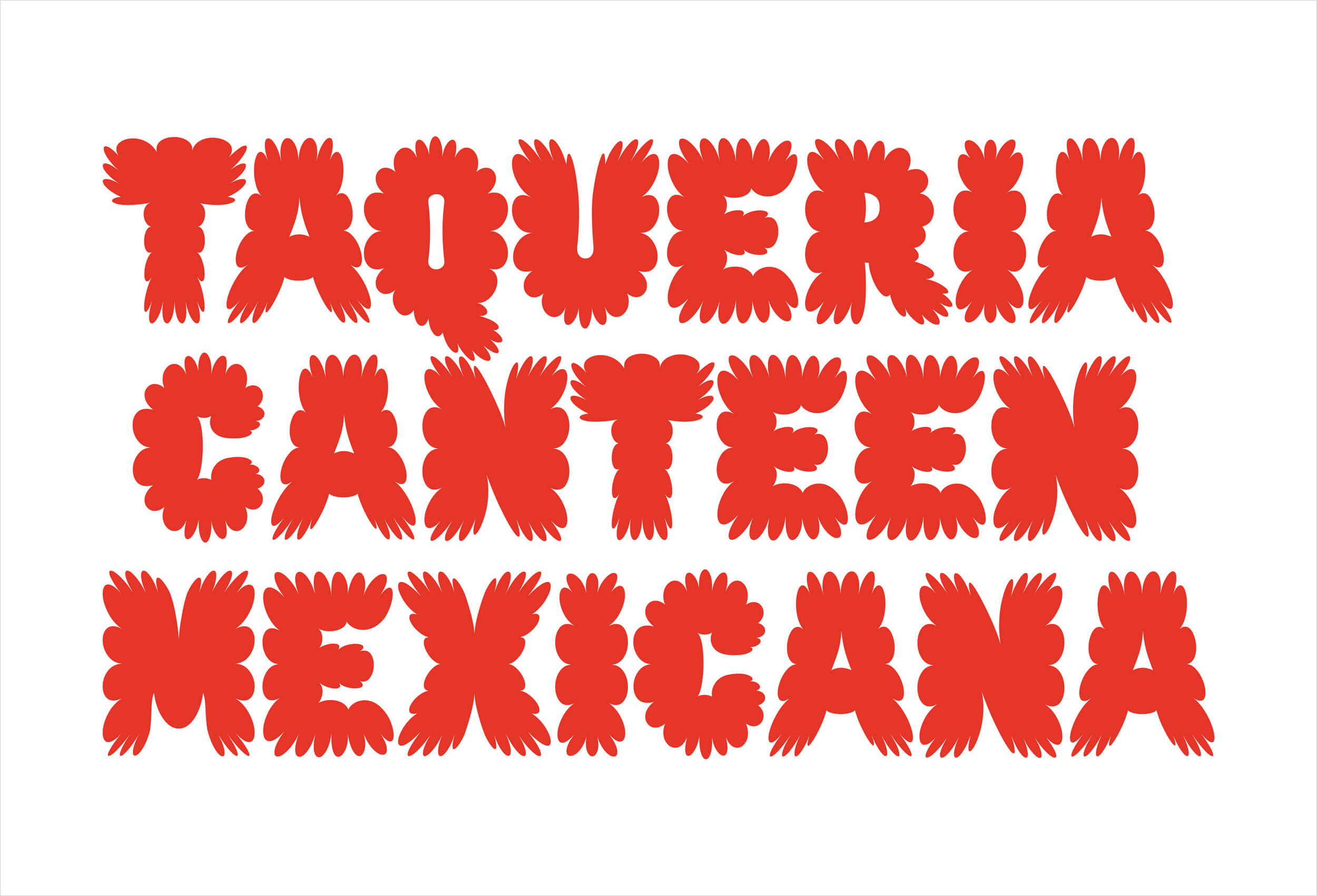
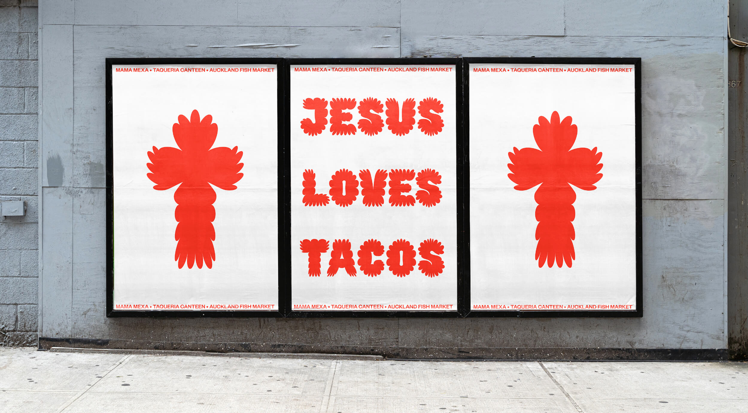
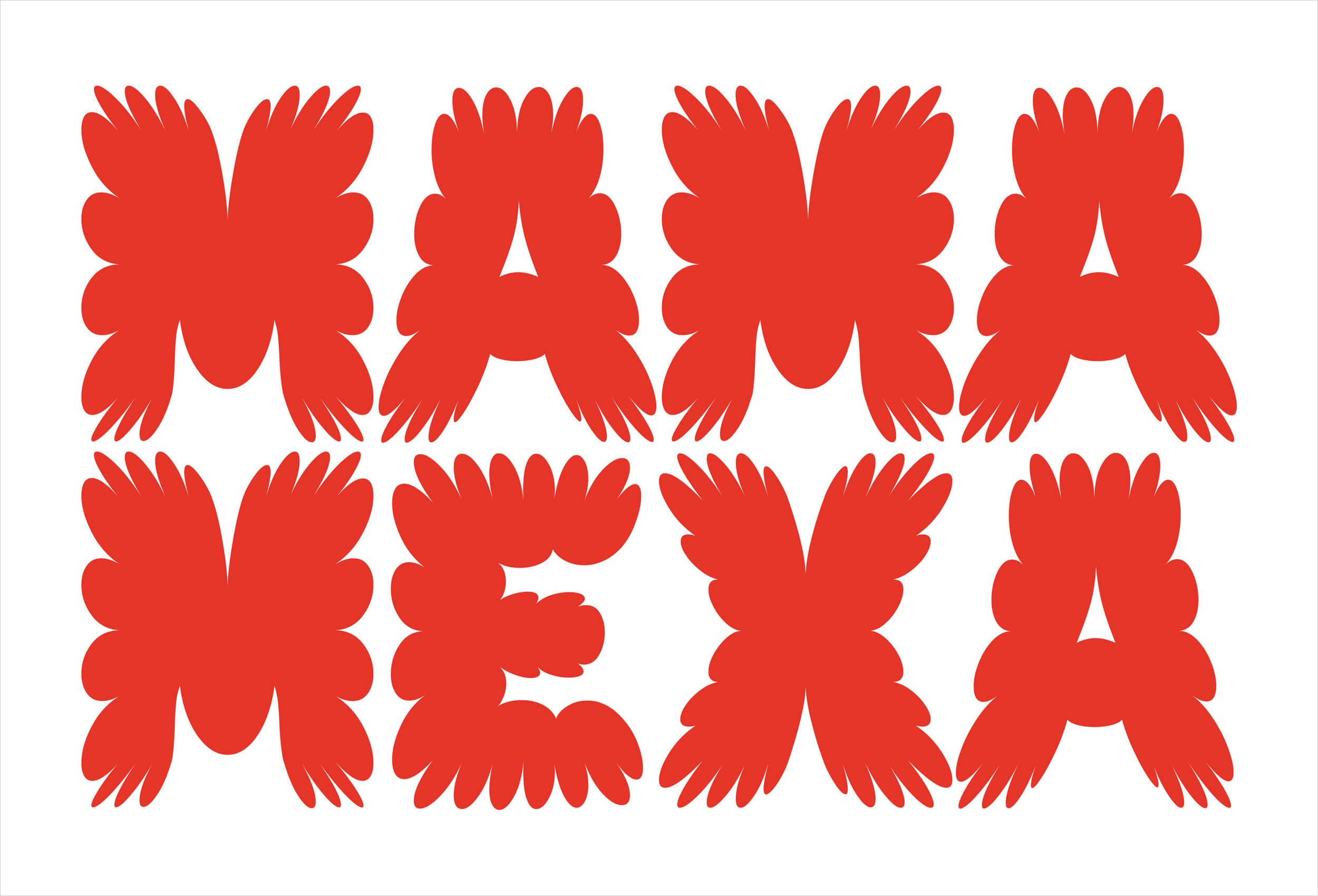
The brand is defined by a custom display typeface, at once bright and inviting, yet edgy and provoking. It’s simple but thoroughly immediate, delivering the typographic equivalent of an exotic plant. No tropes. Just type. It also benefits from a name that – at least to a Kiwi audience – rings familiar and triggers associations of comfort and home (‘māmā’ means ‘mother’ in Maori).
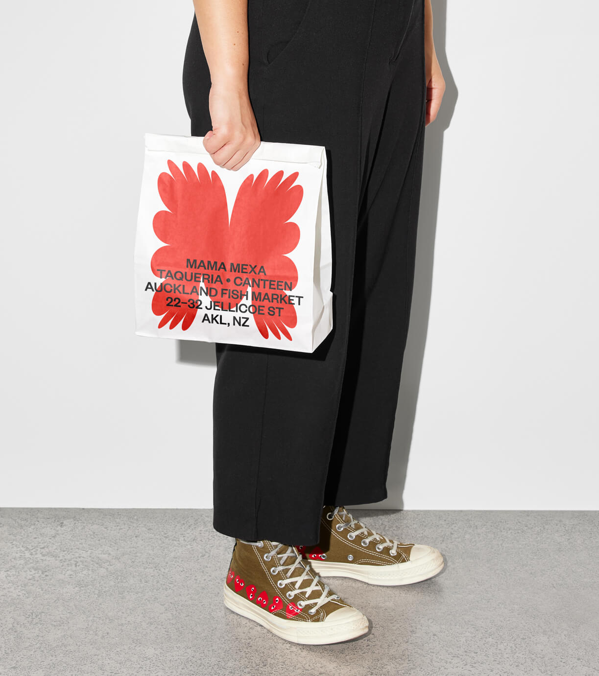
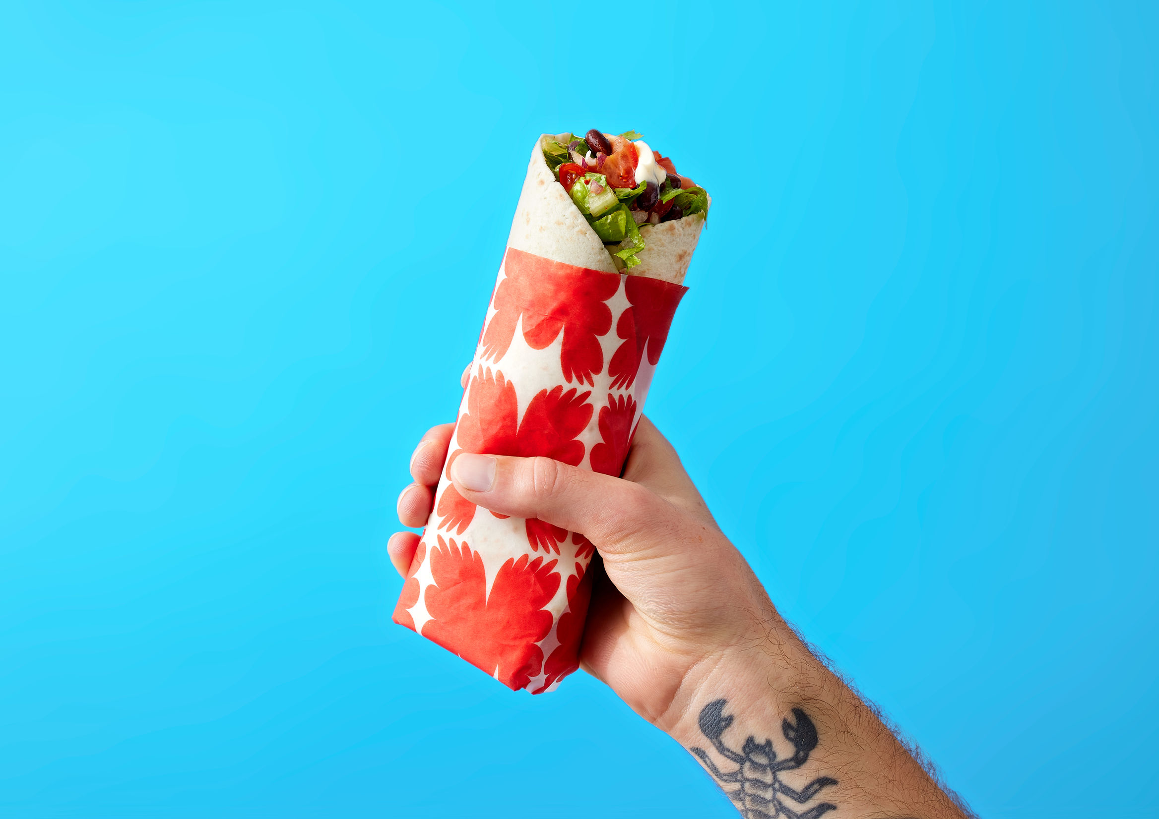
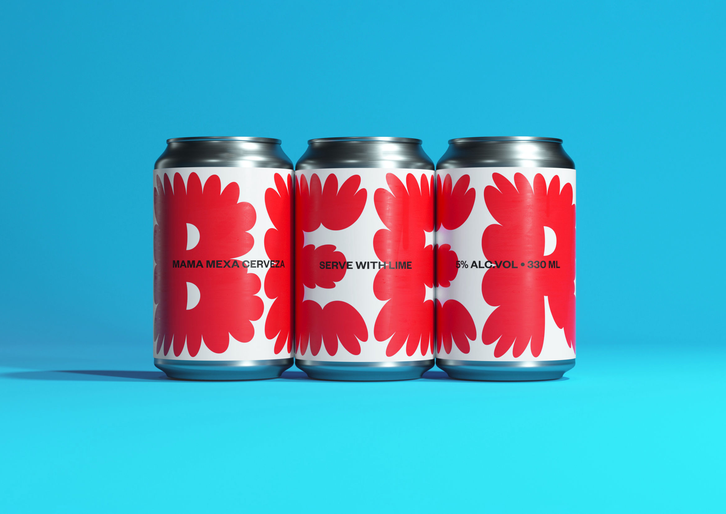
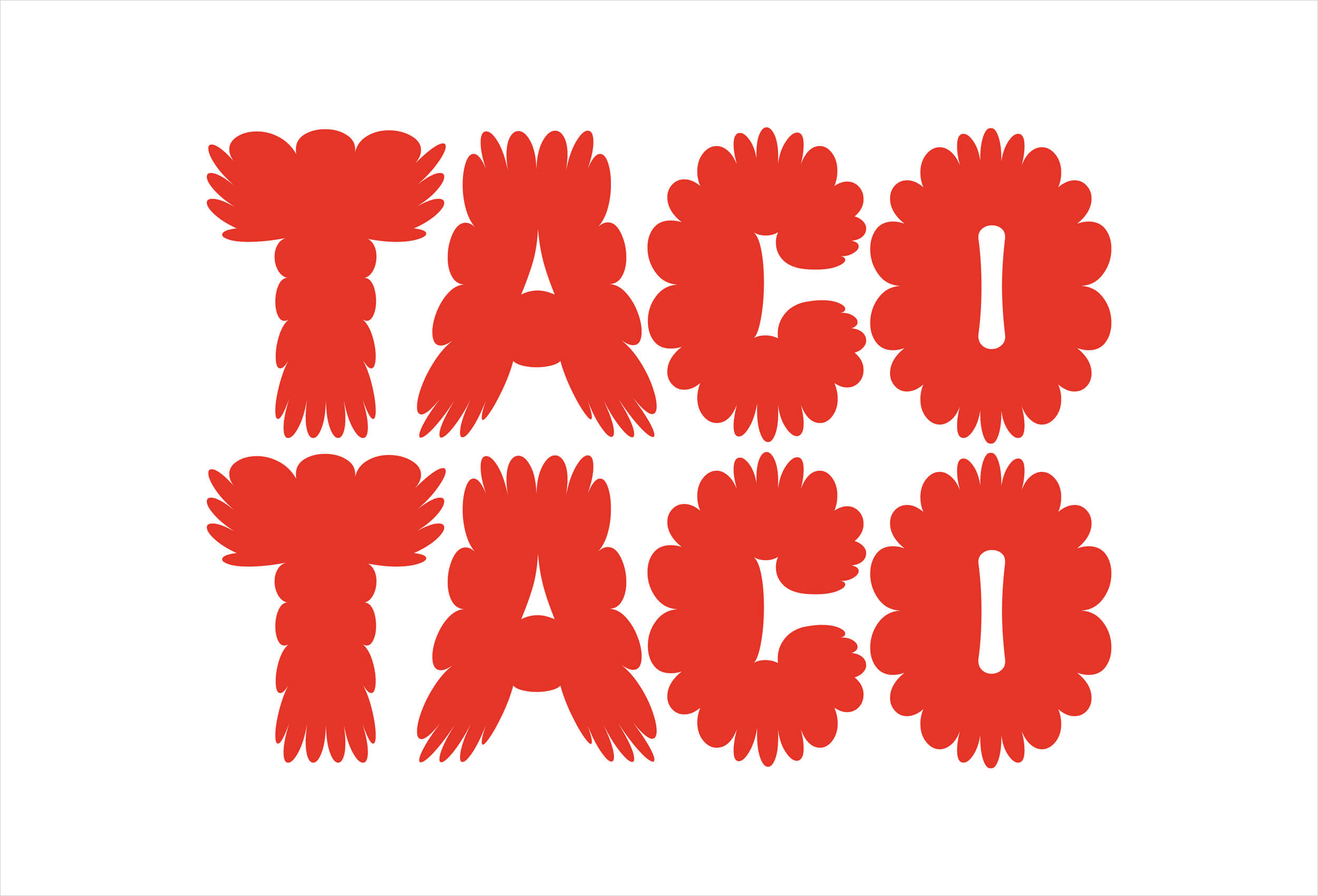
The type work is lovely with each letter composed of a set of varying width petals, lending an organic quality that feels both ‘crafted’ and natural in its expression. The wordmark then becomes part of a formalised font that can be deployed in words or in single striking letters across surfaces from takeaway bags to temporary signage and circular coasters. This intersection of type and image delivers a communicative usefulness and graphic distinction, requiring little more than the utter warmth of that red (friendly and ‘full flora’) with workhorse Founders Grotesk to anchor the elements and establish some basic, supportive communication.
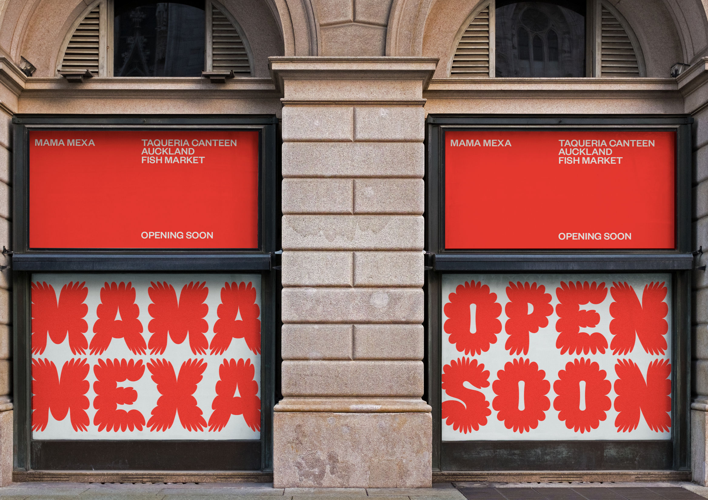
By its nature, a pop-up is temporary. It appears, has a set existence in a particular time and space, and then it is gone. Creating a presence and generating interest requires urgency – it must grab attention straight away, creating interest and activation at once. Furthermore, a pop-up venue requires makeshift signage solutions. Large format print is the key messaging medium (rather than polished backlit panels or digital boards). This comes with practical baggage – solutions that don’t incur great expense or generate a lot of waste take priority.
A custom typeface with character and visual immediacy, generating an invitational familial warmth and evoking Mexican flora offers a surprising and sensible solution. Within the context of a pop-up – time-limited and makeshift – and in conjunction with tone-of-voice, it delivers impressive ‘bang for the buck’.
