Accessibility Handoff: a guide for product designers
How to instruct developers to build accessible products
Just as we designers, who are responsible for the quality of the products we build, do not receive reinforced training on accessibility in traditional bachelor’s and postgraduate courses and courses in general, developers also need this study. Mainly in cases of self-taught and/or people who migrated from the area. Accessibility still suffers greatly from the lack of information and it is necessary to take a specialized course on the subject in order to master good practices.
Taking that into account, it is up to us — designers specialized in accessibility — to pass on this knowledge in a documented form in the design handoffs in order to guarantee maximum compliance with WCAG. Our duty goes a little further than the visual: it is necessary to instruct how each element should work in each context.
But how to ensure greater assertiveness in this task? Let’s do it in steps.
Before everything starts, raise awareness and cultivate empathy
Explain the reasons
Our work takes a higher meaning when we understand why we are doing it. A list of technical requirements for a development deliverable may seem unimportant. But imagine the difference it makes to know that, if I spend just a few hours of my day providing efficient navigation with screen readers, I am allowing more than 500,000 blind people — according to the IBGE — to use this product (and this is just in Brazil!).
Propose dynamics to generate empathy
Putting ourselves in the other’s shoes or, at least, experiencing certain situations helps us to create empathy and understand the importance of certain demands. This can make all the difference when we’re starting to get to grips with accessibility. There are tools on the internet — plugins, sites, extensions — that simulate visual impairments, such as color blindness and glaucoma. How about proposing a dynamic in which employees should spend 1 hour a day surfing the internet or even working using such a tool? Or perhaps watching a video with the audio turned off, relying only on the auto-generated caption.

Teach them how to test product accessibility
One way to reduce the “back and forth” in the approval process is to teach developers to test other types of navigations. Instruct them to navigate the keyboard with TAB and the directional arrows and also to use screen readers. Indicate how to enable VoiceOver on Mac, which screen readers exist for Windows, Linux, and others, where to download them, and how to activate this functionality on smartphones. Prepare or find a tutorial video for other people who may join the team in the future.
Provide supplementary content
Sometimes we are faced with new challenges that require research and study to reach a conclusion that works for as many users as possible.
Using a form as an example, imagine that this is the first time we are creating accessible inputs and labels. There are parameters that must be applied so that the error messages of a data entry are provided correctly so that a user with a screen reader will know of the occurrence of the error and how to correct it based on the instructions provided. Therefore, it is interesting to provide documentation or a previous study on best practices.
On the other hand, we can come across cases of functionality that are much more complex than a simple form and that may not have been so studied before. Taking that into account, it will be up to the team to propose a solution and test it with its users — and how about writing an article to share this case with people who may face the same problem in the future?
Now it is necessary to make some changes to the work process
Indicate online validation tools
It is a fact that you cannot use automatic tools as the only way to validate accessibility and that we will only be closer to that when we test with users. However, we have to start somewhere, especially when we are still getting familiar with the subject.
- Online validation websites
Some sites like WebDev allow you to do a first test to validate your page’s code, at least in the first instance. It is important to test accessibility, page performance, and SEO. The Wave tool will give you some suggestions on accessibility improvements as well. - Inspect element
The browser’s “inspect element” used by developers also provides some accessibility information, such as whether there is minimal contrast between colors.

- WCAG Checklists
To ensure WCAG compliance, checklists can be used not only by designers but also by developers, quality assurance analyst, and product managers. You can create your own or use a ready-made one, like the this one from A11y Project.
Discuss use cases considering alternative scenarios
In the dynamics of the use cases, add the context of users with disabilities: how does a person with a disability make adjustments to a platform so that it’ll fit their needs? Or how is the flow of a user who depends on a screen reader, would it be the same or different from a user without a visual impairment? Start bringing these questions and fostering discussions.
Use documentation tools
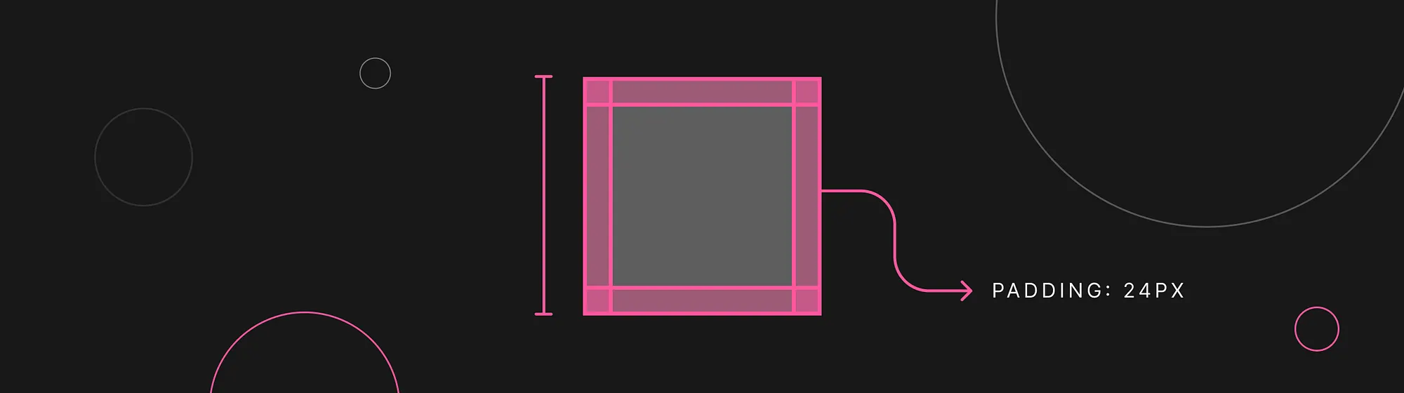
Document all technical requirements needed to ensure the quality and accessibility of that feature or product being delivered. Use Figma, Adobe XD, Sketch, or similar to illustrate with arrows and visual schemes.

The Zeplin tool can also help a lot with the handoff of Design System elements since it allows the import of components with their variables. This will be fundamental for defining the custom focus state.
Other text-oriented tools such as Google Docs and Craft can be used in addition to the design tools to add a layer of explanation for each requirement.

And finally documenting accessibility
Now that we have prepared the ground, created the layouts, and are equipped with the necessary tools, it will be important to delve a little deeper into the subject to write the necessary technical requirements. At this stage, a basic understanding of HTML can help a lot in communicating with the developer.
Correct HTML semantics
It is extremely important that HTML semantics are respected, because the screen reader will describe exactly the function of each element and, in this way, blind users will have more independence when using websites and applications without relying on visual clues. Let’s understand with some examples:
A button properly made with the button tag (and not a div or span) will read like this: “Buy now, button”.
<button>Buy now</button>Likewise, following the hierarchy of heading tags, we’ll indicate which elements are grouped by headings and subheadings.
<h1>News portal</h1>
  <h2>Sports</h2>
    <h3>Soccer</h3>
    <h3>Volleyball</h3>
    <h3>Basketball</h3>
Menus and navigation in general should also use the nav, ul and li tags:

<nav>
  <a>globo.com</a>
  <ul>
    <li>
      <a>G1</a>
    </li>
    <li>
      <a>O globo</a>
    </li>
    ...
Alternative texts
For each visual element that does not have a supporting text, such as photos, tables, or buttons made only with icons and advertising banners, for example, it is imperative that the designer, copywriter, or UX writer provide the text that will be applied in the HTML tag of that image, within the alternative description. Remember to add commas where there would naturally be breathing pauses in speech so that the reader speaks more naturally.

<!-- ALTERNATIVE TEXT -->
<img src="mafalda.png" alt="In the cartoon, Mafalda is lying on the ground
on top of a newspaper spread around it. She rests her face on her left hand
with a frustrated and pensive look. In a thought bubble, we can read:
yes, the drama of being president is that, when he starts to solve the
problems of the state, there is no time to govern."/>
Decorative images do not require a description and must be applied via CSS or have a null alt:
<!-- NULL ALTERNATIVE TEXT -->
<img src="image.png" alt=""/>
Elements that should be ignored by the screen reader
Decorative images, disabled inputs, and other elements that do not provide relevant information should be ignored by the screen reader. Indicate what these elements are in the handoff so that the developer can “hide” them from the readers to prevent users from wasting their time.
<div aria-hidden="true">
    <p>This element will be ignored by the screen reader.</p>
<div>
Help texts in error messages
All functionality runs the risk of an error occurring, whether due to a lack of internet connection, server problems, or incorrect data sent by the user. Therefore, it is necessary to describe these rules, diagnoses, and aids in order to explain the reasons and provide instructions for correcting the failure.
Component behavior
Some features may require manual adjustments, such as modals. According to WCAG, when accessing a modal, the keyboard and screen reader navigation must be limited to the content within it, unless the user clicks the close button. This way, it will be necessary for developers to create “focus traps” so that the navigation doesn’t spill over to the rest of the content behind it.
Information reading order
The reading order of a user without visual impairment will be influenced by the visual patterns we will use. Larger and/or bold texts can be read before others, even if they appear later. As well as buttons that can be placed in different places on the page code in a way that visually makes more sense.
However, when we are talking about screen readers, we are talking about a linear narrative: the user will hear the description of one element after another in the order in which it appears in the code. This means that, if we opt for a different order so that it makes sense visually, it will be necessary, through the page code, to indicate the correct order of reading the elements. The tab index can be used to reorder the HTML reading.
Element states
How does a button or input behave when given keyboard focus? What are the special conditions that must apply according to WCAG? If these states are already provided in the Design System, you can just include the documentation link so that they follow the visual standards. If not, prepare a page in Figma just for element interactions.

Responsiveness and compatibility
Accessibility is also about ensuring access to all types of technologies, browsers, and devices used by users. Remind developers to test in different browsers and don’t forget the resolutions of tablets and cell phones horizontally — which are often used coupled to other devices, as happens with wheelchair users who have little physical mobility.

WAI-ARIA
Accessible Rich Internet Applications is a complement to standard HTML accessibility: it can be used to define the role of macro areas of the website, for example, or replace the text of repeating buttons. It is a feature that developers can use to achieve a higher level of quality. The W3C website has extensive documentation on this.
Imagine an e-commerce site that has a list of dozens of products and the buy button only includes the text “buy”. The user who navigates using a screen reader, for example, ends up using the TAB key to jump from a link to another, in order to speed up navigation and not need to hear all the text on that page. This way, the TAB key would navigate from button to button, and it would hear only “buy, button”, “buy, button”, “buy, button”.

With WAI-ARIA, it is possible to apply an aria-label that will replace the text of the buttons just for the screen reader (the visual text will remain the same), so the user who relies on auditory information may hear “buy iPhone 14”, “buy iPhone 13”. See how Apple did it perfectly:

Developers who have a good knowledge of WAI-ARIA will be able to add extra layers of accessibility that will allow users to have a much more pleasant experience with the product, from the moment they will have more navigation agility and clarity about the information received.
SEO (Search Engine Optimization)
Search engine optimization, also known as SEO, is the practice of working on the content and the website itself to increase its ranking on Google. But what does this have to do with accessibility? Well, Google gives good priority to accessible sites. High scores on accessibility will rank better and thus make your site more visible to users, as it will appear in the top positions of search results. Therefore, we have a good argument with the teams responsible for landing pages, blogs, and other “open” pages, which do not require a login.
We can add accessibility requirements related to SEO to our handoff, such as image descriptions, page titles, use of correct HTML semantics, etc. A certain knowledge of SEO here will also be very welcome!
Let’s wrap it up
Set aside time to dedicate to the handoff process, it will be essential not only to ensure maximum accessibility of the products but also as an act of respect for other professionals who possibly will not have worked on it from the beginning as you did. Do it with care and attention and don’t forget the Design Review afterward.
Good job everyone!
References
- Check your WCAG compliance
- WAVE Web Accessibility Evaluation Tools
- Inclusive Components — A blog trying to be a pattern library. All about designing inclusive web interfaces, piece by piece.
- Ultimate Guide for Design Handoff
- Introducing Component Variants, Zapier Integration & new Notification experience
- Optimize design files for developer handoff
- WAI-ARIA Overview
- Sobre WAI-ARIA, acessibilidade e semântica
- Como organizo o design handoff
- Data reafirma os direitos das pessoas com deficiência visual