Bauhaus Graphic Design: Past, Present, and Future
The Bauhaus school revolutionised graphic design by pioneering bold, minimalist styles emphasising function over ornamentation. From 1919 to 1933, the Bauhaus united fine arts and crafts to create practical yet beautiful designs for the machine age. Bauhaus graphic designers embraced mixed-media collages, vibrant colours, and inventive typography to create posters, advertisements, magazines, and more that broke past conventions. Their forward-thinking work went on to influence generations of designers.
Table of Contents
Origins of the Bauhaus Approach

The Bauhaus was founded in Weimar, Germany, after World War I by architect Walter Gropius. He aimed to start a new movement in the visual arts that rejected the excessive historicism and ornamentation that defined late 19th-century design in favour of a modern, industrial aesthetic.
Merging Fine Arts With Crafts
Gropius wanted to return to the medieval roots of the word “Bauhaus,” which translates to “building house.” His concept was to remove the artificial separation between fine arts like painting and sculpture and applied crafts like typography, ceramics, and textiles. He envisioned a collaborative workshop where students learned multiple disciplines.
This interdisciplinary ethos produced designers equally comfortable with technical skills and abstract creativity. It also encouraged the artist to use diverse media, from photography to theatre.
Focus on Functionalism
The Bauhaus rejected the idea that form and function were at odds in design. Instead, Bauhaus designers pursued functionalism, an approach that dictated:
- Every design must have a clear purpose
- Its form should naturally suit this purpose
- Ornamentation is unnecessary if it does not aid the function
This functionalist philosophy was captured by the Bauhaus motto, “Form follows function.” It signalled a radical break from 19th-century craftsmanship that prized decoration over utility.
Key Figures in Bauhaus Graphic Design

Johannes Itten
As the school’s first form and colour theory professor, Itten established its preliminary course where students practised working with different materials. He was interested in expressionism and the psychological effects of form, colour, and composition. Itten encouraged self-discovery over directly teaching technical skills. His studies of colour and texture greatly influenced early Bauhaus graphic design.
László Moholy-Nagy
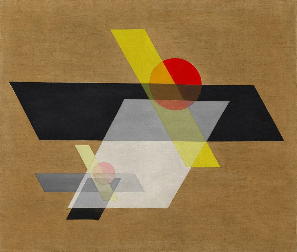
An avant-garde artist in diverse media, Moholy-Nagy taught the influential preliminary course at the Bauhaus after Itten left. He pushed students to experiment with technology, such as photographic prints and typography, which were set by machines instead of by hand. Moholy-Nagy pioneered kinetic art environments and non-representational graphic design. His approach balanced intuitive and technical innovation.
Herbert Bayer
Bayer, an Austrian graphic designer and photographer, made significant advancements in modern typography and advertising. He introduced universal lowercase sans-serif typefaces at the Bauhaus, believing their elemental forms reflected modernity. Bayer also produced striking geometric print advertisements and environmental graphic designs for such Bauhaus spaces as the workshop and dormitories.
Innovations in Typography
Bauhaus designers sought to liberate typography from traditional blackletter scripts through simplified, sans-serif fonts inspired by industrial precision. These stripped away decorative serifs and capital letters in favour of clean lines and blocks of text set in lowercase letters only.
Herbert Bayer’s universal typefaces, including Universal, 1925, defined this minimal approach. Their elemental letterforms delivered content clearly and efficiently to aid mass communication. Other vital examples included Jan Tschichold’s 1927 Status.
Expressive Use of Graphic Text
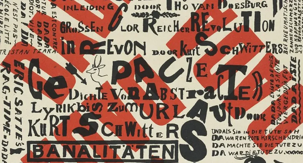
While their fonts were pared down, Bauhaus designers broke from the standard practice of setting prose in neat columns. Instead, they dynamically positioned text of varying scales and weights across posters and advertisements.
The text was dissolved into abstract shapes or crystallised into pictograms to capture the essence of the content graphically. These experiments transformed typography into a vital visual language for communicating ideas and emotions during the industrial age.
Vibrant Colour Palettes and Mixed Media
Bauhaus designers fully embraced the saturated hues of printing inks, which expanded upon the limited palette of metal type. They layered combinations of vivid primary and secondary colours with other media within geometric layouts.
Specific colour schemes recurred as visual shorthand, like yellow and black representing electricity. These palettes created energising focal points within designs during more vibrant than reasoning colour contrasts.
Dadaist Photomontage

Bauhaus graphic designers borrowed the Dada movement’s technique of photomontage to incorporate photographic prints of modern images into their collages and posters. These superimposed fragments of reality, from snapshots to newsprint, are symbols of contemporary life.
Photomontage elements added rich visual textures and motion that contrasted with solid colour fields and shapes. These dynamic but disjointed layouts defied clear narrative interpretation, instead conjuring an impressionistic mood.
Mixing Abstract Painting With Graphic Design
Some Bauhaus designers blended refined art methods like abstract painting with industrial printing techniques within the same composition. They continued classroom explorations of texture, line, and vibrant colour in their proclamation posters and advertisements.
Combining handmade marks with mass production added distinctive touches to designs even as it upheld functionalist principles. This mixed-media approach pushed graphic design to be as original and thought-provoking as fine art.
Bauhaus Photography Innovations
Bauhaus photographers learned by doing in the school darkrooms, testing extremes like solarisation, photograms, extreme contrasts, multiplication, and more. Despite limited resources, they produced influential avant-garde photography that rivalled modern art movements.
Influential Bauhaus works like László Moholy-Nagy’s angled views of Berlin’s new architecture and Oskar Nerlinger’s close-up geometric studies of buildings and infrastructure revealed urban landscapes in abstract terms. This starkly modern photography echoed the Bauhaus design aesthetic.

Bauhaus advertising often relied more on symbolic photographs than explanatory text to capture attention. Close-cropping, unusual angles, lighting, and projection effects infused product images with dynamism and intrigue. Lucia Moholy, for example, photographed tubular steel chairs as floating sculptures.
Environmental Graphic Design
The Bauhaus extended its minimalist aesthetic to environmental graphic design projects encompassing signage, displays, and spatial branding throughout its campus. Students lived inside a 3D example of the school’s functionalist philosophy regarding purposeful form following function.
Campus Wayfinding Systems
Herbert Bayer and Joost Schmidt designed cohesive wayfinding systems, including modular directional signs, maps, and diagrams from their Universal typeface. This provided a clear visual language even for complex, interlinked spaces like the school’s expansive new Dessau headquarters.
Exhibition Design Identity
Bauhaus exhibitions, starting with a 1923 international showcase of the school’s production prototypes for serial home goods, all shared a signature style. Their custom environmental graphics and typographic hierarchy spotlit particular objects within industrially-inspired black-and-white schemes.
Branded Architecture
The signature curves and glass curtain walls of Bauhaus building facades embodied the formal unity between the school’s functionalist design values and international modernist aesthetic. This made them icons of the architecture movement. Their entrance signs bearing the distinctive Bauhaus geometric logo became globally recognised.
Promotional Posters and Advertisements

Bauhaus graphic designers transformed proclamation posters and advertisements from mundane sales tools into avant-garde artworks, experimenting with arresting visual communication. They promoted both fine art and commercial trade exhibitions, theatre performances, Bauhaus products, and the school itself in signature styles.
Typographic Posters
Joost Schmidt’s 1924 informational poster typifying Bauhaus exhibitions used contrasting scales, weights, and positioning of elemental letterforms to convey details in a purely typographical layout dynamically. This exemplified the school’s ambitions to modernise communication through inventive graphic text.
Brand Identity Posters
Oskar Schlemmer deployed Bauhaus’s four-circle logo engraved in wood by Herbert Bayer as a graphic design feature and an eerie floating object across promotional posters. His 1929 designs for the school’s Berlin exhibitions visually intertwined the icon with other abstracted figural and architectural motifs to express the Bauhaus vision.
Photomontage Ads
Laszlo Moholy-Nagy designed graphic advertisements blending photomontage with typography in 1928 to promote Bauhaus’s partnership with industry. Extreme tonal contrasts and visual rhyming between technology images and product photographs underscored their functionalist fusion under slogans set in the geometric Universal font.
Bauhaus Magazine Layouts
Avant-garde art and literary magazines increased to support new experimental movements in the 1920s. Bauhaus members contributed to prominent publications, like De Stijl, and founded their publications to spread their ideas on design theory.
Elemental Layouts
Joost Schmidt’s Bauhaus magazine used virtually wordless, symbol-driven covers conveying concepts like technology with hard-edged forms, arrows, and transparent layers set against bright fields of colour. Inside, asymmetrical typographic compositions mixing various fonts and scales delivered content innovatively.
Diagonal Dynamism
László Moholy-Nagy positioned graphic elements diagonally across pages and bled in his 1923 cover for Oskar Schlemmer’s Broom magazine. This created animation and visual energy while allowing negative space to accentuate the limited red, black and white colour scheme. Such layouts inspired the New Typography movement.
The Impact and Legacy of Bauhaus Graphic Design

While the Nazi regime forced the Bauhaus school to close in 1933 after deeming its work indecent, many of its members went on to have hugely influential careers spreading its functionalist ethos worldwide. Today, Bauhaus graphic design remains a touchstone for minimal, modern aesthetics and creative problem-solving.
Pioneering Swiss Style
Former Bauhaus teachers like Laszlo Moholy-Nagy and Herbert Bayer played critical roles in defining the influential International Typographic Style, or Swiss Style graphic design, emerging in the 1940s-50s. Their precise, objective approach optimised communication through bold compositions and sans-serif type.
Mass Produced Minimalism
Many industrial designers trained at the Bauhaus translated its stripped-down aesthetic into successful serial product lines for companies like Braun through the 1960s. This made modernism mainstream—their adherence to pure function and lack of ornament aligned with mass production.
Conceptual Design Process
Even with technological changes, the Bauhaus Foundation method of beginning design projects by testing materials and learning technical skills before strategising concepts remains essential. Their workshop model encourages uninhibited experimentation, aiding innovation.
While movements like postmodernism and digital methods seem at odds with rigid geometries and utopian ideologies behind much Bauhaus graphic design, its focus on melding function, materials, and concepts continues advancing visual communication for the machine age.
Frequently Asked Questions About Bauhaus Graphic Design
What does the term Bauhaus mean?
“Bauhaus” translates from German as “building house” or “construction house.” Founder Walter Gropius used it to signify the school as a place to build the future of arts and crafts by returning to hands-on construction methods. It also referenced building modern housing using mass production.
Why did the Bauhaus school close?
Facing political pressure, the increasingly leftist Bauhaus lost funding and moved from Weimar to Dessau, then finally Berlin before the Nazi regime forced it to shut down in 1933 permanently. They deemed the style degenerate and incompatible with nationalist ideology.
What are the characteristics that define Bauhaus graphic design?
Simplified visual communication embracing primary colours, clean lines and curves, thick outlines, conceptual asymmetry or contrasts, photomontage, transparent layers, dimensional illusions, and disappearing ornamentation characterise instantly recognisable Bauhaus graphic design.
Did the Bauhaus have graphic design as a course?
Unlike painting or architecture, the Bauhaus did not offer specific classes in graphic design, even as it transformed the field. Relevant training was integrated throughout the curriculum, including Johannes Itten’s colour and form exercises in the preliminary course and typography or photography electives open to students studying any workshop discipline.
How did the Bauhaus change typography?
The most influential shift pioneered at the Bauhaus was streamlining typography to efficient yet dynamic sans-serif fonts stripped of ornate capitals and serifs. Setting lines of copy at contrasting sizes and angles instead of neat columns also changed approaches to layout in the New Typography movement.
