In today’s Photoshop tutorial I’ll show you how to easily create cool looking vintage logo designs by combining antique illustrations with some visually interesting text styles and layouts. This kind of artwork is really popular as T-shirt graphics, so I’ll show you how to set up your document at the appropriate size for a T-shirt design. To finish off the artwork, we’ll apply some vintage print effects and make use of my Washed and Worn textures to make the digital design look like a real old T-shirt print.
Watch the video
Subscribe to the Spoon Graphics YouTube Channel
![]()
The World’s Greatest Vintage Collection
![]()
Unless you’re a talented artist who can illustrate detailed drawings by hand, we will need some assets to make use of within our design. I’ll be using just one of the graphics from The World’s Greatest Vintage Collection, which features over 1000 high-quality vintage illustrations. It is incredible value considering the sheer number of items it contains, including elements, textures, patterns, and even a font. It will provide endless uses for the rest of your design career!
Buy The World’s Greatest Vintage Collection for $39
![]()
To create your vintage brand T-shirt design, open Adobe Photoshop and create a new document. Common dimensions for the printable front of a T-shirt is 12×14″, so create a document at this size. It’s sensible to set the resolution at 300ppi since your T-shirt artwork will likely be printed. And because we’re working for print, it’s a good idea to set the colour mode to CMYK, even though this design just makes use of white and red. This particular design will be intended for darker coloured T-shirts, such as black, so to fill the canvas with the default black foreground colour, use the shortcut ALT+Backspace.
![]()
Let’s choose an antique illustration from The World’s Greatest Vintage Collection to use as the foundation for this design. There are over 1000 illustrations to choose from that have been restored from old books. I’ll be using the snake drawing from Animals Volume 1.
![]()
Find and open the EPS version to be able to render it at the required dimensions. It will default to its standard size, but vector files can be scaled to any size. Put a *2 at the end of the width dimension, which will times it by two, effectively doubling its size.
![]()
Double-click the layer and add a Color Overlay. I’m going for a red colour of 20c,100m,100y,0k. Since we’re working in CMYK it’s a good habit to set specific ink values so you can be sure your colours will print as expected.
![]()
This illustration is slightly too large, but you can safely scale it down even though it has been rasterized. You just can’t scale it back up again afterwards… Unless you make a Smart Object first.
![]()
Choose the Rounded Rectangle shape tool and max out the corner radius to 1000 in the top toolbar. Change the dropdown menu to Path, then draw a shape on the canvas.
![]()
Switch to the Type tool, then hover over the path to see the Type on a Path icon. Click to begin typing out your brand name. Switch the foreground and background colours around to set the text in white.
![]()
My fictional brand for this tutorial is Sleeping Serpent Supply Co. I’m using the Trade Gothic font in its many styles. Set this wording in Heavy Compressed, then in the Character panel, activate All Caps and make sure the paragraph style is centered.
![]()
To centre the text relative to the shape, select the Path Selection Tool. You’ll then be able to drag the text into place. We want to make sure it’s centred, so drag a guide out from the rulers and allow it to snap to the middle of the canvas. Using the CMD+T shortcut brings up the bounding box handles so you can see whether the centres align. Size up the text so it covers the top half of the rounded rectangle.
![]()
There can only be one text element on each path, so use the CMD+J shortcut to duplicate this text layer and its associated path. Edit the wording, then use the Path Selection tool to drag the text to the bottom of the path.
![]()
To get the text to read the right way, it has to be positioned on the inside, but there’s a clever trick to move it to the outside. In the Character panel, alter the Baseline Shift to a negative value to move the text outwards, until it aligns with the path.
![]()
You can then make any adjustments to the font. I’m using Compressed with the Tracking set to 50.
![]()
To make some room for more elements under the snake, move this text element vertically. Select the Type tool again and spell out another text element in some empty space. You can fill out the space in vintage style logo designs with catchwords like Established, or Trademark. Use another variant of the Trade Gothic font to mix up the styling, while preserving a consistent typography style. I’m using the normal version in Heavy. Don’t forget to clear any unwanted character settings.
![]()
Add a new layer to draw some decorative shapes to outline this text element. Choose the Line tool and change the dropdown in the top toolbar to Shape. Draw a short line and give it a 10px Stroke.
![]()
Hold ALT and nudge the shape, which will duplicate it onto a new layer. Move this new version underneath the text. Double click the text layer and give it the same Color Overlay effect to inject more colour into the design.
![]()
Hold Shift and click all the layers that form this text element and the two lines, then use the shortcut CMD+J to duplicate them. Move these elements to the other side of the logo layout and edit the wording.
![]()
Place another text element in the space underneath the illustration. This time use a rectangle to outline the text, with the same 10px stroke setting. Make sure everything aligns to the guide by confirming it with CMD+T to check the centre handle.
![]()
Make a copy of the type on a path layer, scale it down and edit the wording. You can alter the visual hierarchy of text elements by using different sizes, weights, and also different font styles. I’m using the Cornerstore script font for this section.
![]()
You need to be careful with script fonts to make sure the letters smoothly flow into each other. Zoom in and configure the character settings to suit. Using the Optical kerning mode helps, then adjust the tracking to get it close enough. You can then position your cursor between two letters and make manual adjustments with the ALT+left/right cursor keys.
![]()
Tie this element in with the colour scheme by giving it the red colour overlay layer style.
![]()
Add a new layer and draw a surrounding border around the design using the Rounded Rectangle tool. Position it centrally by aligning it with the guide.
![]()
Shift and click from the top layer right to the bottom in the Layers panel to select everything, then move the entire design into place in the centre of the canvas. Scale it if necessary to fit within the printable T-shirt area.
![]()
As a finishing touch, let’s apply some effects to give the artwork more of a vintage appearance. One of my favourite tricks is to round off the corners of fonts to give them a bleeding ink effect. Highlight the main text layer and go to Filter > Noise > Median. Choose to convert the layer to a Smart Object, which will preserve the editable text inside it.
![]()
Zoom in a set the Median value as high as possible before the text starts to completely lose its definition.
![]()
Repeat the process for every other text layer. You can use the Median menu option right at the top of the Filter menu, but hold the ALT key while clicking it to make sure it asks to convert to a smart object first.
![]()
The smaller text elements will need a much lower value, so configure the settings for each one individually.
![]()
Since we’re designing a T-shirt, let’s make use of my Washed and Worn textures, which give your artwork the appearance of an old tee that has cracked and flaking ink from years of being washed and worn. Pssst, you get a 50% off discount code when you join my mailing list. Use the code NEWSUBSCRIBER to get it for $10.
![]()
Group all the layers so everything is contained in one folder, then apply a layer mask to this group. Open up one of the Washed and Worn textures, then copy it. Hold the ALT key and click the layer mask to edit its contents. Paste the texture, then use CMD+T to scale, rotate and position it to find the best texture layout.
![]()
Click anywhere to exit out of the mask to see the texture erases parts of the artwork as if bits have flaked away, just like an old T-shirt.
![]()
Don’t forget to turn off the black background layer before exporting your artwork, because you’ll want the background of your print to be the actual T-shirt fabric.
![]()
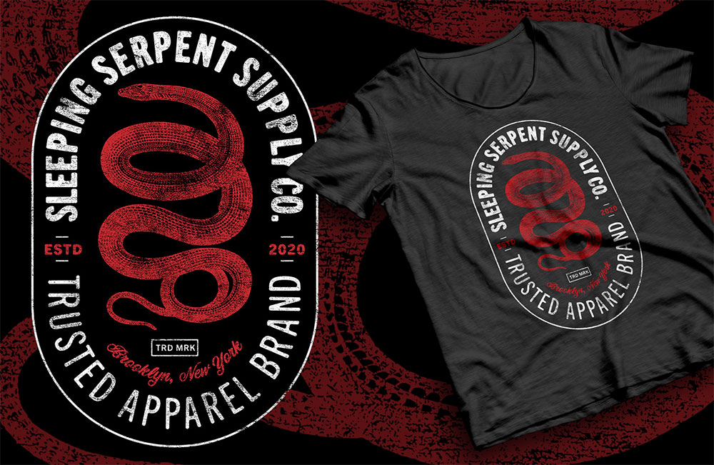
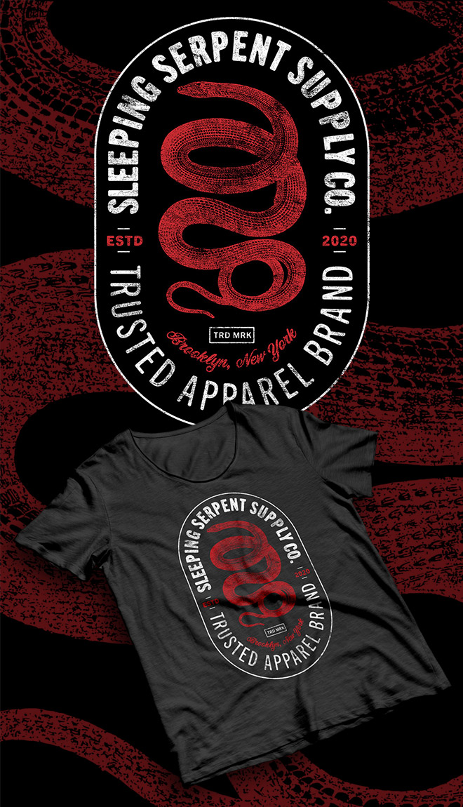
The final result is a cool vintage style brand logo that looks great as a T-shirt design. The antique illustration really enhances the design, especially with the limited colour scheme. Then simply laying out a range of text elements in a visually interesting composition builds a vintage badge logo that’s ideal for use as a T-shirt graphic, or as a real brand identity design.
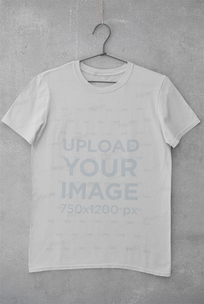
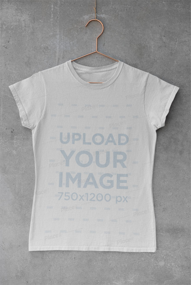
Mock up your T-shirt designs with PlaceIt
Upload your artwork to hundreds of ready-made mockups on PlaceIt to simulate how your design will look on a real T-shirt design!
T-Shirt Mockup of a Woman Relaxing

Basic Tee Hanging on a Concrete Wall
Mockup of a T-Shirt with a Copper Hanger

No Comments
Comments are now closed