The 7 Fundamental Graphic Design Elements & Principles
When it comes to graphic design, most of us focus on what's easy to get right: colours, fonts and images. But if you look deeper, you'll realise some basic principles apply across all types of designs.
The reason why graphic designers can turn a seemingly dull project into an interesting one is that they understand and apply graphic design elements. Every time you look at a logo, a poster, a flyer, or anything that uses visual media, you see the results of a specific set of rules and principles. The goal of any graphic designer is to make these principles come to life visually. If you want to learn how to be a great graphic designer, there are some fundamental elements and principles that you should understand.
In this article, I will cover the essential graphic design elements, including the seven fundamental principles of graphic design to live by when designing anything.
Table of Contents
The 7 Graphic Design Elements
Line

A line can be used as a structure to organise and present information, define shapes, and convey emotions. It can also represent the motion of things, including people and animals.
For example, the line can serve as a structure for information. You can use lines to create the path of movements, such as a train or a player's path during a basketball game.
A line can also indicate a physical boundary or separation. For example, the line can show where two objects separate or a person can be divided into two distinct parts, such as left and right.
There are many reasons why the lines you use on your projects can affect the outcome of your design. For instance, the type of lines you choose for a project will determine if it will work well for the viewer and the viewer's perception of the project. Horizontal, vertical and diagonal lines are the primary lines most often used.
Horizontal lines are straightforward to comprehend and can be applied to any shape. Vertical lines are also simple and straight. However, they may not have as much impact on the viewer as horizontal lines. Diagonal lines are harder to grasp. You can use them to convey a wide range of ideas. It's up to the artist to decide which line will best convey the concept they wish to convey.
Other lines include solid, broken, zigzag, and implied. Solid lines represent the exact form of the object being depicted. Broken lines break the object down into its constituent parts. Zigzag lines are curved and imply movement. Finally, implied lines show the lines that are implied or exist in a drawn shape.
As lines can be both visible and invisible, you can use them in both ways. You can use these guidelines to design the best-looking pattern. You create a solid and cohesive visual impact by placing elements over lines. Meanwhile, you can use visible lines with weight and form to communicate various messages and moods in a designer's final work.
It's important to remember that the lines you see around you don't exist in a vacuum. Lines are everywhere in your life, so it's important to note them.
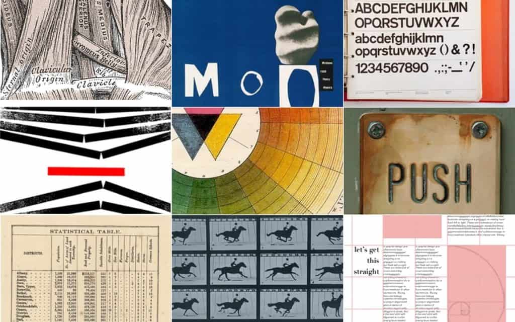
To begin with, start by noticing the lines around you. Are they heavy, thick, straight, or do they appear jagged? Look at your body language, and see if you can figure out what the lines tell you. It's also a good idea to notice how lines affect your mood.
The simple line is the basic building block for almost all designs. It is a powerful tool that can help designers create a strong visual impression in many different ways. It is instrumental in communication design, where it helps to build tension, drama, and excitement.
When designing for the web, the simple line can help designers create a strong visual impression and add a punch to the design. We can use the simplicity of the line to emphasise the message.
In addition, the simple line can help designers create strong contrast in the way it can help the designer draw attention to elements of the page. Simple lines can also help designers create open and free-flowing space, making the design easier to read and navigate.
Simple lines can also help designers create depth and dimension, helping the viewer understand the overall design better. You can also use it to help define areas within a design so that viewers know where to focus their attention.
You can combine a simple line with other design techniques to make an even stronger impression. A simple line combined with a subtle texture can help create a sense of movement.
Colour
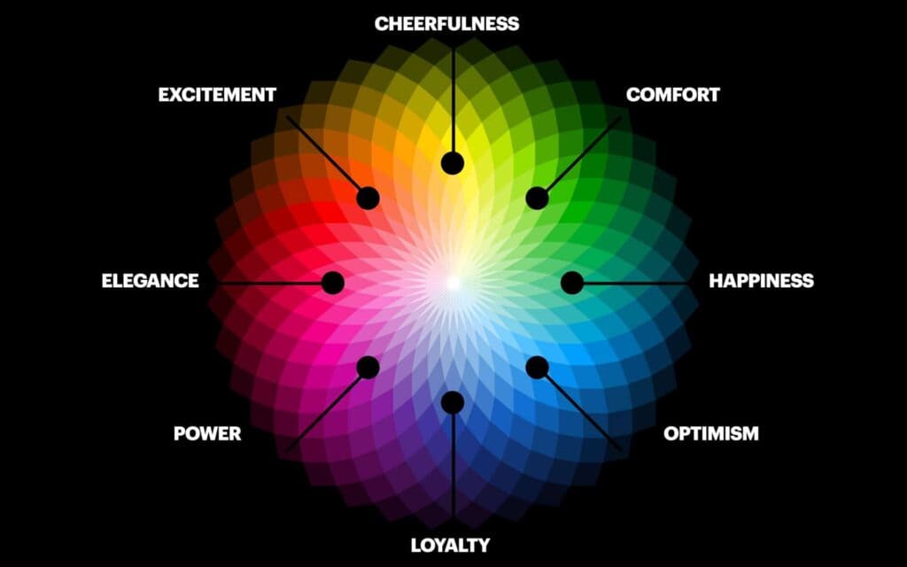
Colour theory can be a valuable tool for graphic designers who want to select a single colour or harmoniously combine multiple colours.
The Color Wheel is a group of hues that helps us categorise and understand all the different colours. This is especially helpful when we are designing a logo. We can quickly determine which colour category a colour belongs to and decide on what kind of message it will best convey.
Sometimes people try to create a certain mood or style through colour, which can look great when done correctly but also look terrible. If we choose the wrong colour combinations for our logo, it will look unprofessional.
A Color Wheel is a circle divided into 12 sections. Each section represents a colour, while the numbers indicate the level of the hue. So the colour red is on the first section, orange is on the second section, yellow is on the third section, etc.
Some people use the Pantone colour wheel, while others prefer the RGB (Red, Green and Blue) colour wheel. The best way to find out which is best for you is to compare them.
- Primary Colours: The primary colours are red, yellow, and blue. They are the primary pigments—those used to make all other colours. To make other colours, you can mix them.
- Secondary Colours: Secondary colours are formed by combining two primary colours. For example, violet is a mixture of red and blue; green is a mixture of yellow and blue, and orange is a mixture of red and yellow.
- Tertiary Colours: Tertiary colours are a group of colours formed by mixing the primary colour (red, yellow, blue or green) with the secondary colour (such as orange, purple or yellow). Tertiary colours are often used to describe the hues of the rainbow. Red-orange, yellow-orange, yellow-green, blue-green, blue-violet and red-violet are the six hues in this group. Red is the primary colour, orange is the secondary colour, and the rest are the tertiaries.
There is no absolute ‘perfect' harmony as every combination is different, and so will be the outcome. As with any combination of colours, the outcome of a combination will depend on the amount of each colour, the intensity of each colour, and the contrast between the two.
For example, a purple and orange combination could be beautiful. However, if the purple is too bright and the orange is too dark, it may not work well.
The same principle applies to colours in art and fashion. Combinations that work well in one environment may look awful in another.

- Opposites attract, so complementary colours lie opposite one another on the colour wheel. These colours are very contrasting and can express vibrancy and energy or be visually jarring, depending on their use.
- Choosing colours close to each other on the colour wheel is good practice. This can help create a sense of calm and harmony within a design, but it can also be dull and uninspiring if misused.
- The best way to add interest to a design is to introduce different colours that contrast with each other. For example, you can create a striking design by combining red with orange, blue with green, or yellow with purple.
- The Triad colour scheme is one of web and print design's most popular colour schemes. It's a vibrant and dynamic way to use colour in the design. This is because the colours are evenly spaced around the colour wheel. They are very lively and require balance to be visually pleasing.
- Split-complementary colour schemes are similar to monochromatic, except they include two additional colours that are complementary to the primary colour. As such, they provide more visual contrast than monochromatic colour schemes. They're also considered to be more visually appealing.
- The tetradic scheme is a square colour scheme that uses two sets of complementary colours. There are more than a few reasons why this is the case. First, the scheme allows for an extensive range of design possibilities. Second, the scheme uses two different colours, which means that the designer can create a colour scheme that is unique from others in the market. Finally, the scheme utilises four colours, giving the designer abundant colour choices.
If you consider your colour scheme, you might also want to consider what colours work best for your project. Darker shades may suggest seriousness or professionalism, but lighter colours may suggest happiness or fun.
The colours you use in your communications directly impact your results. That's why it's important to know what your audience associates with each colour.
For example, if you're writing a letter to a customer, you may want to use light blue ink to match your customer's company logo. If you're sending out a newsletter to a specific demographic, you may want to use a red font and yellow/orange colour palette.
Similarly, if you're sending out a press release, you might want to choose a green background and a bright orange headline. Or, if you're sending a business proposal to a potential investor, you might want to use a black background with a light blue font.
You should also consider your audience when choosing your design. Does your brand have a distinct visual identity? Is your audience familiar with your logo?
You must also learn your audience's colour associations and use them to your advantage or avoid them if your goal is to achieve a particular result.
Image

As a graphic designer, you must create something to capture your audience's attention. A good photograph or illustration can do just that. They provide a background for the design and add necessary drama or action.
The way that the graphic designer works on multiple levels is that they provide a framework for the designer to communicate. That means that when the audience looks at the image, they understand what the design is about and the purpose.
You also need to consider the mood that you want to convey. That may be different from the subject or theme of the design. Sometimes, the mood that the design is trying to create is essential.
In a sense, the graphic designer is working on three levels simultaneously:
- They need to tell the story.
- They need to make sure that the story is visually compelling.
- They need to ensure that it doesn't lose the audience.
An image is a powerful tool in all types of communication. Whether trying to persuade others or want to communicate a message to the masses, images can be a powerful way to get your point across.
Images can be created using many different mediums. From photography to painting, to graphic design, to animation, to printmaking, to sculpture, there are many different ways to convey your message through images. The trick to using images effectively is picking the right one for the purpose.
They are the most powerful communication vehicles because they communicate an immense amount in a fraction of a second. Using them well will make your work more effective than ever imagined.
Shape
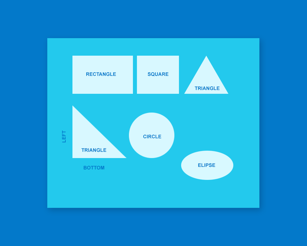
A graphic designer must be able to understand both organic and geometric shapes. They should be able to draw and design both in a transparent manner. A designer also needs to have a thorough understanding of the structure of the human figure. This is essential to drawing the proper proportions.
You need to be able to create an exciting composition that tells a story through the use of lines. In addition, you also need to be able to compose shapes and create interesting compositions of objects.
- Some geometric shapes can include either two-dimensional or three-dimensional forms. They are created by a set of points that connect straight or curved lines and are usually abstract and simplistic.
- Geometric shapes include triangles, pyramids, squares, cubes, rectangles, pentagons, hexagons, octagons, decagons, circles, ellipses and spheres.
- The most notable feature of organic shapes is that they vary considerably in size and proportion. For example, leaves can range from a tiny fraction of an inch wide to several feet long, while crystals and vines are much larger than most organic shapes. The shapes are symmetrical or asymmetrical and include natural forms such as leaves, crystals, and vines or abstract forms such as blobs and squiggles.
While many associate circles with happiness, community, love, friendship, and harmony, squares and rectangles suggest stability, dependability, and strength. People also use triangles to indicate stability, dependability, and organisation. Others use triangles to represent chaos, creation, and fun. If you pick a particular set of shapes, you can imply stability, dependability, and order. Choose others, and you can imply chaos, creation, and fun.
By Gestalt psychology, considered a prevailing design theory, audiences form an impression of designs by looking at them as a whole rather than by analysing each element individually. For example, if a design is made of unusual shapes, such as a triangle with rounded edges, it will stand out in people's minds. So when designing a website or a logo, you should be aware of the psychological principles behind the design and try to incorporate them into your work.
Texture
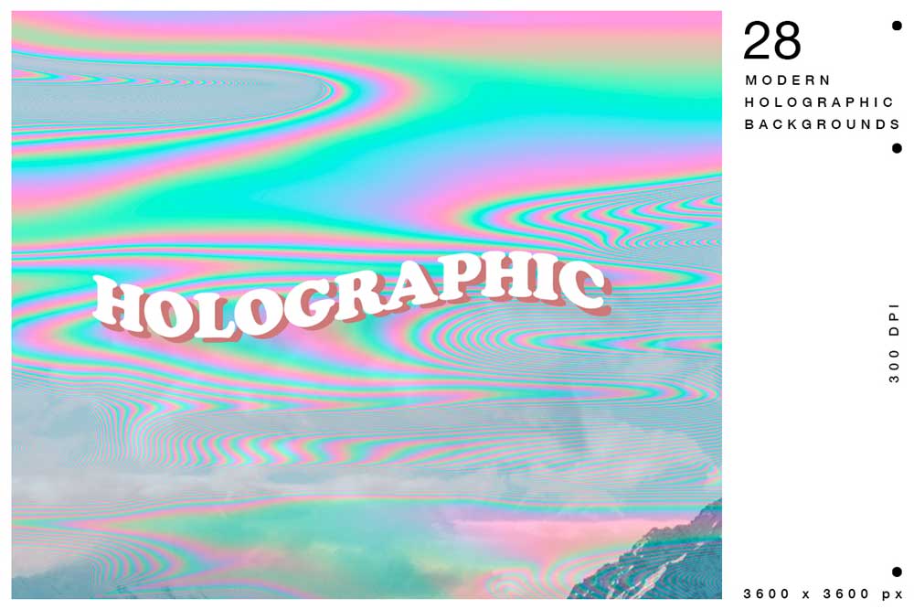
The texture is the feel of a surface—furry, smooth, rough, soft, gooey or glossy. It's crucial for visual designers who must visually convey texture by using illusions to suggest how their work might feel if viewers could touch it. It's essential to ensure that the textures you create look like they belong in the real world, not in a virtual one.
The natural world often inspires texture, but it doesn't always mean that you must look for something that resembles nature. In some cases, you may be inspired by manufactured textures. There are many different sources of inspiration for textures, and it may not always mean looking to nature.
Combining two-dimensional elements into one is a great way to create an abstract pattern. Using this technique, you can repeat uniform elements to create a two-dimensional pattern. Use the pattern to design a background for your images, and they'll pop off the page.
You can also combine patterns to create an abstract graphic. To do this, uniformly repeat the same element repeatedly, then use those patterns to design the background for your images. This will provide additional visual interest to your text and make your images stand out.
Nothing like a little textural contrast adds interest to a photo. This is where adjustments to your photo's colour saturation and transparency levels can help. If you're looking for something to bring texture to a layout, consider playing with your photo's colour saturation and transparency settings.
Space

A lack of space can have an impact on the impact of the design and the message you're trying to convey. Identifying essential information or messages within the design can make it difficult. It can also reduce the impact of the design and make it harder for the viewer to absorb.
If too much visual information is crammed into a design, it can also be challenging to see the overall picture. And if there's not enough space to give the viewer the breathing room they need to absorb the content, the design can feel like it lacks clarity and organisation.
We can use spacing to indicate the relationship between two visual elements. Narrow spacing between two visual elements is usually used to show that they are closely linked, while broader spacing indicates that they are less related. Surrounding a visual element with space suggests that it is crucial, but the space can also suggest loneliness and isolation.
While designers focus solely on creating a positive space, they forget the importance of negative space. However, the inclusion of negative space is equally important to a well-designed project. You'll notice the difference if you consider how negative space affects a design.
Type

If you're working on a website, you want to ensure that your content is readable. Use large text and avoid using too many colours or too much detail. Your type will be much easier to read if you keep the line height consistent throughout your text.
You can choose fonts and typefaces for a variety of reasons. Some fonts have a historical connection to certain events or places, while others have a specific emotional or cultural association. Choosing a font that reflects the mood and style of your piece can help bring your design together and establish a cohesive, unified tone.
The weight of your letters is just as important as their typography. They should reflect the importance of the words they convey. However, too much weight can cause them to look clumsy and fragile. Thin letters can convey elegance or modernity, but they can also seem fragile. If you can't decide on one font or size, there may be room for you to include more than three in your logo's final design. However, remember that it's best not to go beyond three in any project.
The 7 Principles Of Graphic Design
Balance
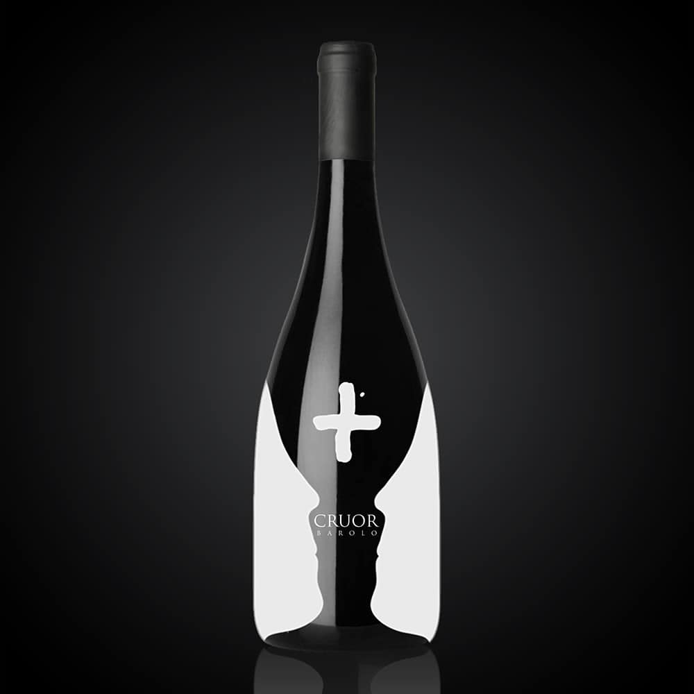
The weight of the elements on a page can be increased by using the element's colour, size, or texture. Colour is often used to make a particular element stand out. For example, the font of the text could be made larger to emphasise a particular word. You can also add colour to make an element stand out.
The size of a particular element can also affect the way it affects the reader. For instance, adding a larger font can emphasise a particular word. However, a word that is too large can be distracting. You can also use an element's texture to highlight one element over another. For instance, adding a patterned paper can give a page a more exciting look.
The term “symmetrical” comes from the Latin meaning “of equal weight”, while “asymmetry” is a result of imbalance. While symmetry is the norm for the human body and a good thing to strive for, asymmetry is also part of the natural world. Both plants and animals tend to grow and develop symmetrically. For example, the legs of a spider have always positioned the same way (or at least the majority of them), and both sides of a caterpillar are always equal.
When designing a piece of art, however, there is a difference between the two kinds of symmetry. In art, symmetry is a deliberate decision. Artists and designers are very particular about their choices and which elements they place on the page or screen. The human body doesn't work in this way. We all walk around with an innate sense of balance that makes us naturally symmetrical.
Symmetrical design is a design style that features a consistent balance of elements. It's a design that has no solid focal point. On the other hand, asymmetrical design is a more expressive design style. Asymmetrical designs are bolder and visually attractive.
Unity & Harmony
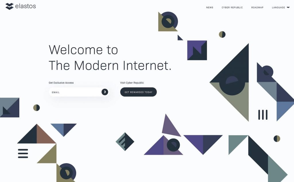
Harmony is the balance of the elements that make up a design. When these elements combine harmoniously, the composition will have an overall balance. Using similar colours that match and integrate elements organically creates a sense of unity, making the page appear as if it was created together.
Visual design is about achieving unity. Keeping things neat and organised is essential because otherwise, you risk creating an uninteresting design. You want to avoid creating designs that are too uniform. At the same time, you should use other elements to give the design personality, movement, and depth.
The layout design should help the viewer get a clear message. But your layout will feel cluttered and disjointed when it isn't cohesive. This will cause viewers to focus on the wrong element. A good rule of thumb is to place an element in the design only if it helps enhance the message. Think about what element is adding value to the composition.
Hierarchy

The concept of hierarchy is not as simple as it might appear. It seems to imply the organisation of physical objects, but as we look at it, we discover that it is also a way of structuring our ideas and relationships. When we use the word “hierarchy”, we describe the relationship between two elements, or “levels”.
A hierarchy is a set of rules for organising information to guide a viewer through a page or a website. It can be used to organise a page's content and to create a user experience that guides the eye in a specific direction.
Hierarchy is usually applied to a page's layout. It is a way to arrange elements on a page to relate to each other. You can use it to guide the eye and help the viewer understand where to go next.
Scale & Proportion

You need to pay attention to the size of the fonts and typefaces you use in your design. It must be in proportion with the rest of the design to look good in context. A design with highlighted vital elements, including the most critical points, will be better received. But don't make them so big that they overwhelm everything else.
You've got to catch the viewer's attention before you start to provide the information. Once you've accomplished that, it's time to start filtering in the details. But just because something is relevant to the message doesn't mean it has to be shown in its entirety. You won't overwhelm the viewer by keeping the details proportionate to the rest of the piece.
Dominance & Emphasis
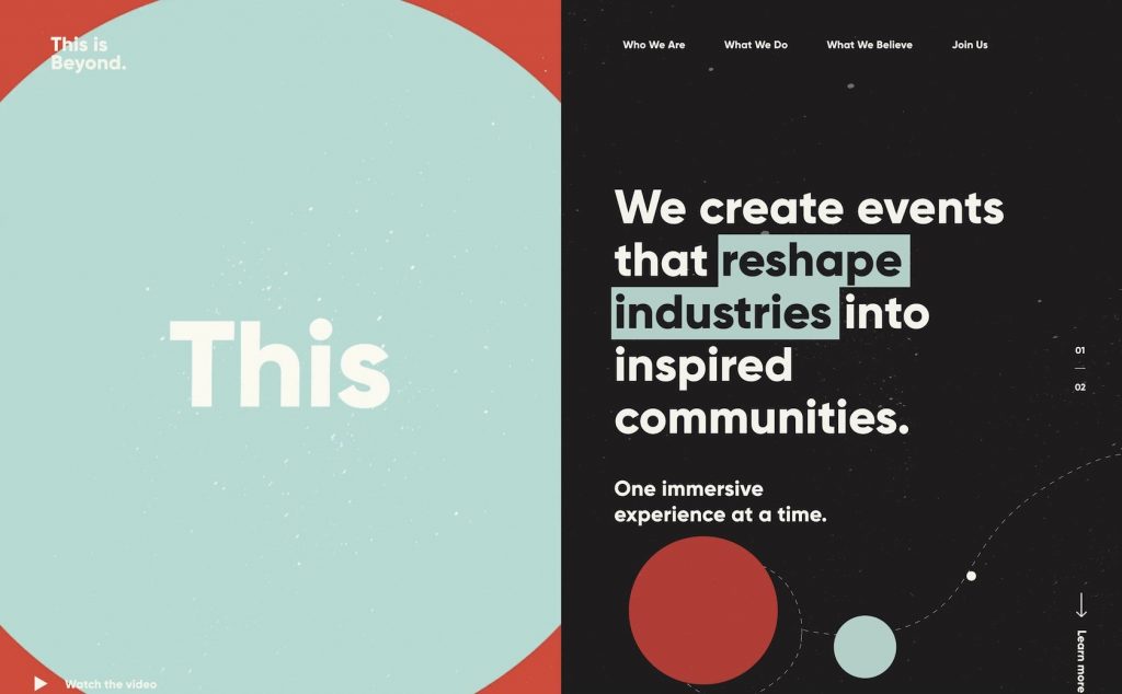
Dominance is a powerful way to emphasise and draw attention to the main element in your design. It's the main idea in the design. When we see something with dominance, we think about it immediately and subconsciously.
We want to create dominance when designing a page by emphasising one or more specific design elements. Dominance will lead the viewer to other parts of the page.
For example, if you have a photo as your dominant element, it will be where the viewer looks first, and most of the rest of the page is secondary.
When planning your design, try to identify your dominant element and then plan the rest of the page around that.
Each design should have a primary focus. This is often the place where the design will begin. From this point, you can add elements to the design that serve as secondary or even tertiary focus.
Dominance relies on contrast. It's an extreme contrast. Without it, everything would be the same.
Similarity & Contrast
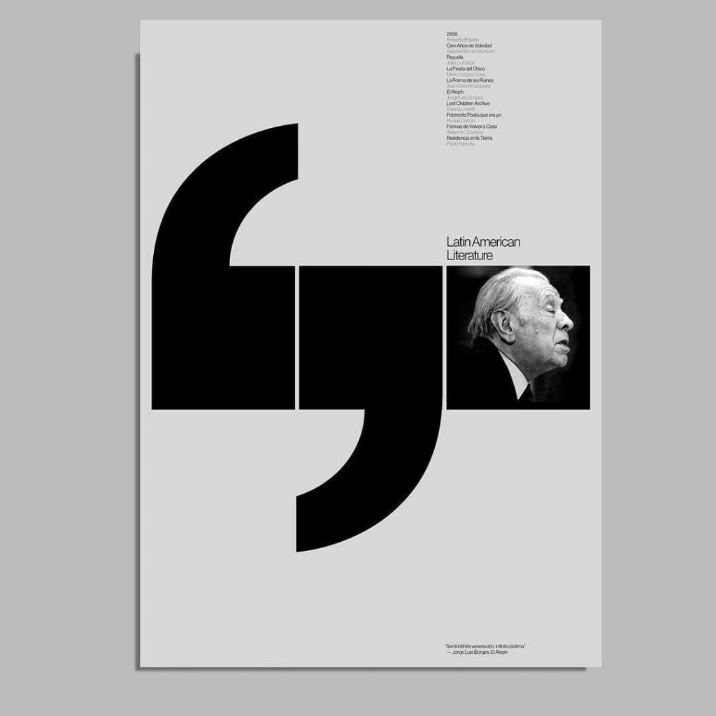
Similarity and contrast are tools designers use to attract viewers and shape how they perceive the design. When artists use similar colours, shapes, and sizes of objects, it suggests they are alike. Contrasting elements spark interest and, perhaps, excite you. You'll want to use these two tools to create a piece of art.
Their physical connection can show the visual similarity between two elements. If two objects are connected, then they should look similar. Otherwise, if they are not connected, they should look different.
The Similarity Principle states that we perceive the world in terms of its similarities and differences. This is why we see objects and people as groups of similar elements.
The Similarity Principle is essential in how we see and process information. We also tend to group and organise things based on the similarity principle. In other words, we see patterns and trends in our environment, not necessarily because they are the most common, but because they are the closest to being similar to what we already know.
White Space
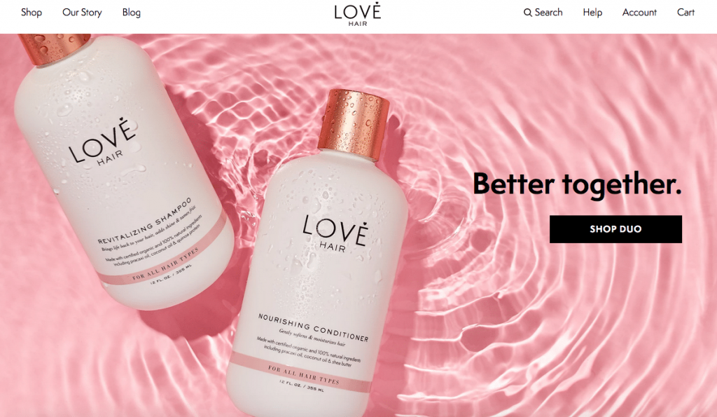
Because negative space is the only element of design that deals with what you don't add, white space is the only element that deals with what you don't add. This means that white space is the place where you can put things that don't belong in your composition. This can sometimes be an unsafe zone for beginning designers.
Sometimes simply giving a composition more room to breathe will help it improve.
White space doesn't just sit around doing nothing—it's telling us that something is essential enough to warrant being separated from other things. Our brains naturally associate plenty of white space around an object with importance and luxury. This tells our eyes that objects in one section are distinguished from elsewhere.
Conclusion
Graphic design is an art form that takes a lot of practice and study. Just like painting, drawing, sculpting and other creative arts, graphic design has a set of fundamental elements you need to master to produce a professional result. Some basic principles are as old as history, and others are relatively new. Some of these universal principles while others are more specific to certain professions.
It may sound complicated, but these graphic design elements and principles are simple and common sense. You should try them out in your next project.
