Unto by Studio Bergini
Opinion by Eleanor Robertson Posted 13 December 2022

Five years ago, the discerning and culinary-minded were content with their everyday Waitrose Essential Extra Virgin Olive Oil. But now – as with wine – there is increasing awareness that the taste of oil is individual, depending on olive variety, soil type, climate, cultivation method, and a host of other factors. From The River Café’s hotly anticipated annual pressing to Laudemio Frescobaldi’s fluorescent green tasting selection, today’s consumers recognise that EVOO is an artisanal product with complex flavour notes, and are looking beyond the supermarket shelves.
Where wine-making has châteaux with distinguished reputations, EVOO has the masseria. There’s Marina Colonna’s oil in its distinctive amphora vessel, stylishly modern Villa Manodori from three-Michelin-star chef Massimo Bottura, and Sicilian favourite Barbera (founded 1894). And then, again, as with wine, there are the new kids on the block, turning the industry upside down with innovative concepts and provocative packaging. Graza (design by Gander) comes in two playful squeezy bottle options, ‘Drizzle’ and ‘Sizzle’, for finishing and cooking, while Citizens of Soil (Freytag Anderson) offers a letterbox-friendly refillable pouch.

Unto, which means ‘greasy’ or ‘oily’ in Tuscan slang, might look like a cheeky challenger brand with two oversized cartoon olives doubling as eyes (or breasts, depending on context) – but the product is grounded in history and terroir, born of a serious ecological mission to revitalise ancient, abandoned fields in rural Tuscany. This isn’t just another EVOO, it’s a ‘rural recovery project’ produced by an ‘independent farming community’; and instead of ‘drizzle’, ‘sizzle’ or ‘buy now’, Unto’s CTA is ‘join us’, ‘help us restore this land, one bottle at a time’.
Aimed at a young, mid- to high-end food-conscious crowd (you can’t be a serious self-respecting foodie type these days without taking an interest in production), Unto’s sales strategy is to establish a reputation through specialised shops, delis, and restaurants in London, while selling direct-to-consumer internationally through an online shop and social media. To launch the brand and gain traction, Unto asked London-based Studio Bergini (run by Italian Francesco Corsini & Norwegian Kristian Hjorth Berge) to create a bold identity that would be as eye-catching on the shop shelf as on the Instagram feed, with the bottle as the primary identity application.


Since budget was limited, the design team devised a hard-working kit of parts with impactful typography, colour and illustration that can be flexed across platforms and surfaces. The resulting brand and packaging are proof that a little can go a long way and that austerity isn’t the opposite of amplification.

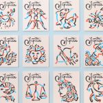
The wordmark, set in Caslon Italian from the Commercial Classics collection, communicates immediate character with experimental letterforms that reverse the fat face’s stress – thins become thicks and thicks become thins. Two centuries after its first appearance, the Italian form still confuses and offends but its inherent strangeness will always attract attention: it is a style that, in following the logic of reversing stress, creates both harmony and discord. In marketing assets, the font is used as a display face, making the same striking impression. Caslon Doric would have been a natural companion for Caslon Italian, but MT Grotesque also works well with its crude irregularities and inconsistencies.


On pack, palette is limited to two spot colours (Pantone Orange 021 and mossy 349), which against paper white form a sort of reimagined tricolore. It’s an exuberant pairing, dangerously close to vibrating and yet artful, delightful and premium. For digital applications, this is expanded into a range of mustard yellow, avocado green, earthy brown, rusty orange, sandy beige and rich puce that wouldn’t be out of place at a dinner party in the 1970s. While some of these combinations don’t jive (looking at you avocado-rust), the overall effect is fun and high-energy.
There are similarities to Pentagram’s work for Happy Face Pizza (perhaps inspired by Bushwick institution Roberta’s), which uses a vivid colour palette of green and yellow to play on a 70s pop theme, as well as a bespoke Italian-style typeface with a supporting quirky grotesque. But though both projects also share playful illustration, the Unto eye-olives have more maturity and wit in the abstract execution and simplicity of concept. The fraternal relationship between the 500ml and 250ml bottles is cute too, peeking down/up at one another as if for reassurance.

On the other side of the pack, the brand story is used as a key graphic element, locked up in a justified block with the logo. Some of the details here do annoy me – the fourth line is gappy, the sixth is getting tight, and why oh why is there a straight quote in front of ’50s? – but I like the idea of product as manifesto. (The proof of the oil is in the tasting and all that.)
Studio Bergini describes the aesthetic as ‘spaghetti western-inspired’ but there is plenty of finesse here too, not least in the honest, thoughtful use of materials and print, combining two-colour offset with screen print. IRL the finishes are even more sumptuous than they appear on screen with an irresistible tactile contrast between the gritty greaseproof labels and glossy silkscreened translucent ink.


And then there’s the campaign imagery, shot during harvest by the farmers of Fiesole themselves on disposable cameras, providing a unique look into the workings of the business, through images with the perfect, low-fidelity film quality. There is honesty in the snaps, as well as romance – a rusty tractor, dirty palms, an aimless chicken, all bathed in the hazy glow of Tuscan summer. You can almost smell the homecooked pasta.
Just take my money.