Clutch Automotive by Parker Studio
Opinion by Eleanor Robertson Posted 6 September 2022

From à la mode Lick paint to gramable Aokka coffee, everything comes in a tin these days. The rise of metal packaging solutions in food and beverages, healthcare, household and consumer is expected to accelerate by 3.1% year-on-year from 2021 to 2030, driven by the demand for sustainable alternatives to plastic and lightweight substitutes for glass.
Aesthetically speaking, the tin stands for practical utility that is free from pretence and geared for performance. The material’s heavy-duty resilience is often associated with industrial environments where structural integrity and protection (from light, water, oxygen, bacteria etc) are desirable qualities when you’re dealing with chemical solvents and fluids.
But where Two Times Elliot’s fresh graphic work for Lick brings utilitarian structure into a realm that is luxurious and aspirational, the shelves of your local hardware store or garage are typically neglected when it comes to curated colour and crafted typography. The product language is technical, highly-specialised and might ostracise the novice.
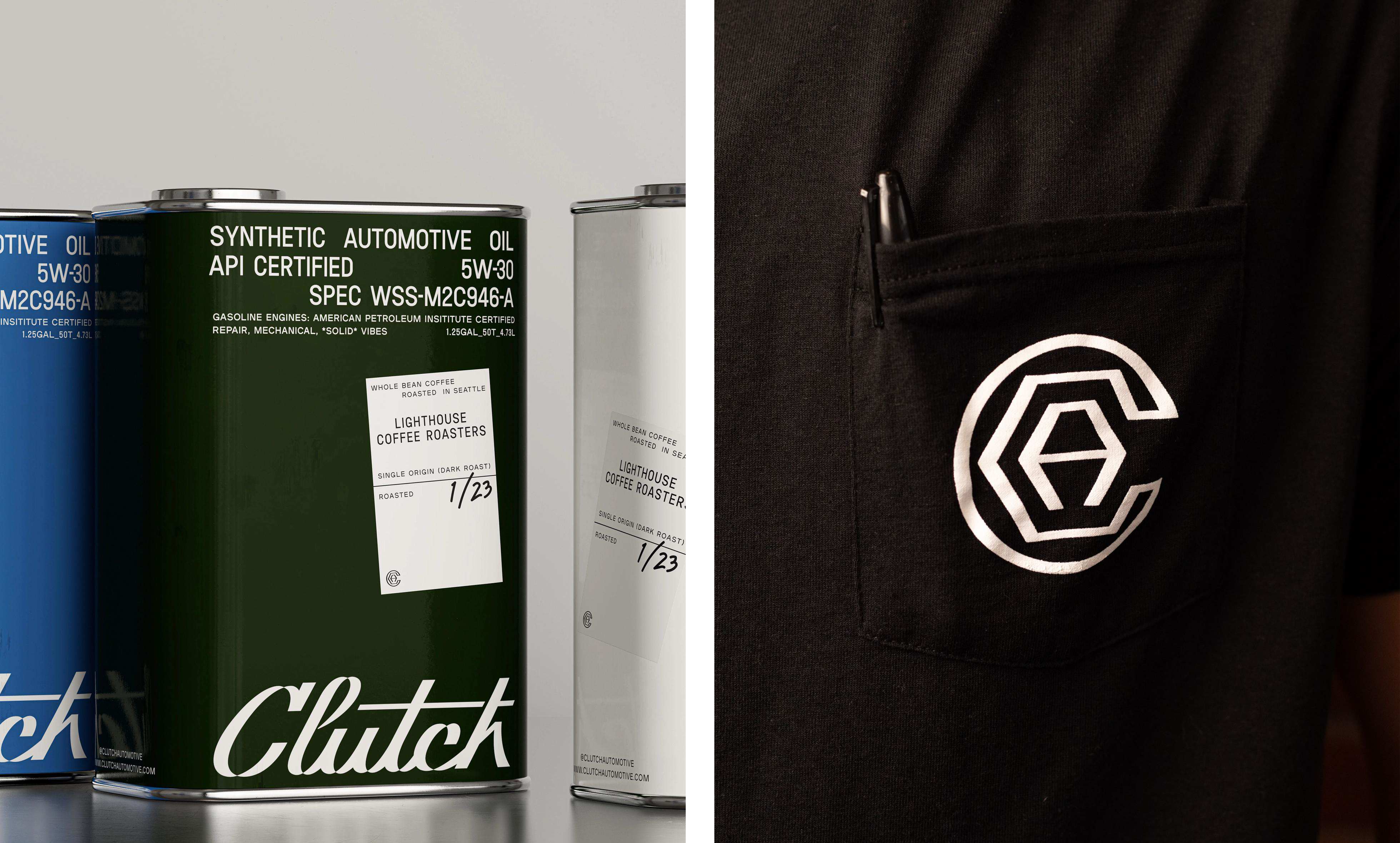
Clutch is a growing chain of modern auto shops based in Texas offering ‘maintenance, repair, evaluations and solid vibes’ as well as artisanal coffee from Houston roaster Katz while you wait. It’s an inclusive environment that welcomes serious motor heads and amateurs alike with accessible engine-talk in trendy sans serif typography, using Plaak from 205TF.
Clutch partnered with Seattle, WA-based Parker Studio to develop a brand, visual language and applications that balance the industry’s history with Clutch’s forward-thinking outlook. The business’s ambition to acquire and renovate derelict automotive shops primed the brand for a fresh take on the expected classic look.
The identity is fronted by a custom script logotype that combines a sense of quality and tradition with highly-contemporary typographic manipulations. At first glance, the logo has the vintage all-American flair of the Chevrolet or Cadillac emblem, but the vector outline has the playful character of Dávid Molnár’s conceptual Parabole for fashionable Swiss student collective ECAL Typefaces, the result of experiments with intersecting lines in letterforms.
Counters and stems are flipped resulting in an inside-out effect that creates a mesmerising pixel look in small sizes. Meanwhile, at a larger scale the distorted bezier curves have a multilayered complexity, suggesting ambiguous three-dimensional volumes. Historied chrome car badge meets Berlin club night, unsettling and defying categorisation while fascinating and demanding closer inspection. It’s Massimo Vignelli’s worst nightmares come to life.


Parker tells us that ‘Clutch upholds the ethos of a mom-and-pop auto shop while providing a modern experience that disrupts expectations’. Keeping true to the goal of creating an elevated neighbourhood pit-stop – founded on honesty, reliability, and friendliness – the print materials prioritise human interaction. Each shop’s business cards are left blank, allowing for the mechanic who hands hands them out to sign their name.
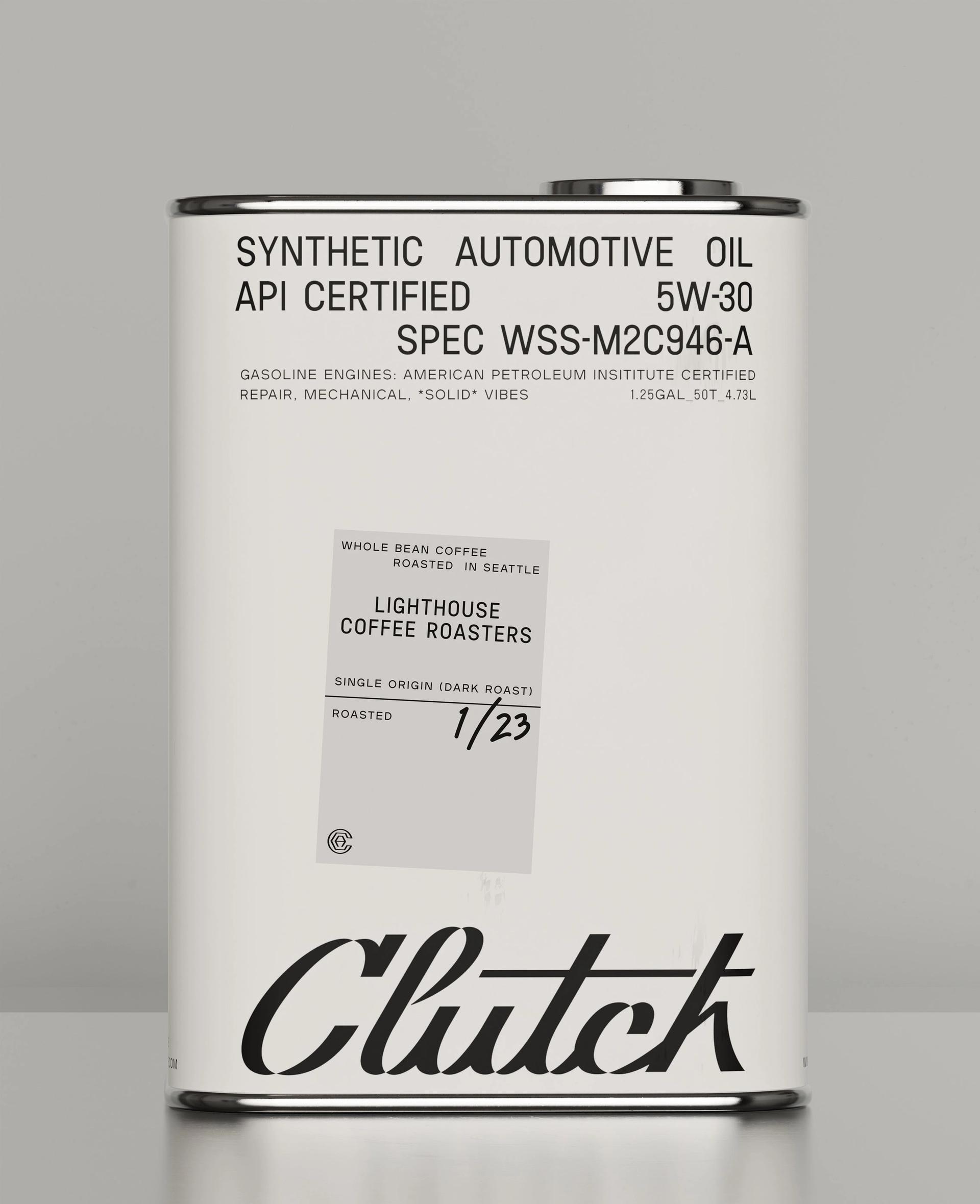
Collaborative packaging with Katz puts single origin dark roast beans in an old oil-tin, paired with a mug for ‘break fluid’. So we have our humble industrial source material (the hardy automative oil can) being drawn upon to create desirability for an aspirational product with a youthful audience (speciality coffee), which is sold/served in a car shop that has elements of both old-soul and new-wave. The track comes neatly full circuit.

The packaging palette is nice too with urethane metallics in iconic shades of go-faster-red, rally green and racing blue that serves as accents to the monochrome branding. Less successful is the ‘CA’ monogram, which contorts the letters into a hexagonal nut and wrench (the mechanic’s essential tools). It feels at odds with the sleek wordmark and clean typography, the symmetry of the ‘A’ is off, and the relationship between positive and negative space is unbalanced, especially within the ‘C’.
Nevertheless, this is work with integrity that maintains and elevates the legacy of the local garage as a community landmark. Parker have balanced auto shop history with progressive thinking to create a personality that can connect with old customers and establish a reputation with new ones.