Top 10 Email Design Ideas For The Holiday Season
Email is still one of the most lucrative channels in digital marketing. Despite the proliferation of social media, email continues to hold strong as ever. Does that mean that all emails are equally effective and converting? Clearly not! Many factors influence the success of email marketing, such as subject line, matter, tone, calls to action, etc. In this post, we look at one of the foremost elements of a successful email: design.
Design is the spine of an email: it makes the email stand upright, as it were. It is the context within which our eyes, and subsequently our brain, triggers the process of information retention.
So here’s an eye-catching factoid: our eyes process visuals 60,000 times faster than text. 90% of all information transmitted to the human brain is visual. We are picture readers anyway. We typically retain information in the form of images. In market-speak, people retain information better if it can be experienced.
How can one experience information? The answer is: through design. The goal of an email is to engage, inform, and precipitate action on the user’s part. Good design enriches user experience, consequently engaging and informing the user and making them act.
If design can kickstart the much-coveted cycle of email marketing success, you need to know what a good email design looks like. So, let’s find out!
Table of Contents
1 – Create A Proper Structure
First and foremost, you must invest sufficient time and energy in laying the foundation of a successful email — the structure. No matter how dynamic your email design is, without a solid construction to prop it up, it is sure to fail.
The layout of your email can be divided into three main parts: header, centre, and footer. Make sure these three elements are visible. You use the header to express your brand identity and include a website link. The centre of your email will contain the relevant content. The footer is where you place links, social media icons, addresses, telephone numbers, customer support information, etc.
Consider the following New Year email from Winc. The layout is divided into three parts. The black header shows the brand name. The centre, divided into two subparts, is where the New Year-related content has been placed. The footer contains social media icons and other relevant information. Note also how the template strikes a deft balance between text and visuals.

Generally, designers choose a one-column presentation to make emails more readily scannable. Scannability is a crucial element of email design. The viewer should be able to take in all the information quickly and easily. Minimum disruption is critical to holding the user’s attention.
2 – Simplify The Headings
We read from top to bottom. Therefore, making an excellent first impression with the headings in your email is essential. The header ideally consists of the following three elements:
- The name and logo of the company
- The focus and intent of the email
- The first general call to action
Depending on the style and character of the brand, the heading may contain other elements. But generally speaking, these are the core elements that make up your heading. As mentioned, the aim is to offer a readable, scannable email. In keeping with that objective, you must simplify your headers as far as possible without diluting the email's overall aesthetic value.
Because the heading introduces the email, simplifying it ensures that the user focuses on the content in the central part of the template. Don’t use overly decorative fonts in your headings. If possible, avoid colour. You want the header to lead the reader to the next logical section of the email, so there is no need to complicate the design.
Look at the headings in this Black Friday email from Active Campaign.

The brand name and logo are visible. There is a vivid call to action on the right-hand side. Most importantly, note the text in which the Black Friday offer is announced. It is simple, uses sans serif font (because the text is long), and is easily readable. The heading is a perfect introduction to the rest of the email.
Finally, a note on the alignment. Most designers left-align the heading. This may vary depending on the email type and your brand's temper. We suggest left alignment because that is the most legible. However, you can experiment with the alignment of your heading, depending on the overall nature of your content.
3 – Use Visuals Wisely
Visuals are a great way to make an impact on your subscribers. As explained at the beginning of this post, the human eye prefers visuals to text. Given the innate advantage of including visuals in your email, it is all the more important to use them properly, keeping the context of your email in mind.
First off, you need to alternate between visuals and text. Too many visual elements may annoy the viewer. Understand the need for visuals: they are meant to support the textual content instead of overriding it. If you want to use images only to communicate your message, ensure it is immediately understandable to everyone. This is particularly relevant in the case of product launch emails, where you rely chiefly on high-quality images and a fraction of text.
Because your email must reflect your brand identity, consider using custom iconography. Here’s why it is essential. Unless it is AMP-powered, your email redirects the subscriber to the website. In a word, the email is the teaser. So, it must be consistent with the movie, right?
When someone clicks on a CTA button in your email, the page one is redirected to must be distinct in its look and feel from the overall tenor of the email. The aim is to provide a seamless transition from email to website. Hence the need for brand-reinforcing visuals.
Here’s an excellent example of the same.

This Christmas email from Starbucks uses visuals in a very calibrated manner. It is clean, brand-optimized (green and white being the official colours of Starbucks), and light. The designer has used minimum visuals to create the vibe of Christmas: the two stars in the CTA block and the wavy partition between the centre and the footer mimicking snow.
4 – Choose a Content-Optimised Design
Generally speaking, designers benefit more from focusing on content first and then on design. This is because emails with design content can afford to be minimalistic. So first, know the type of content that you will be working on.
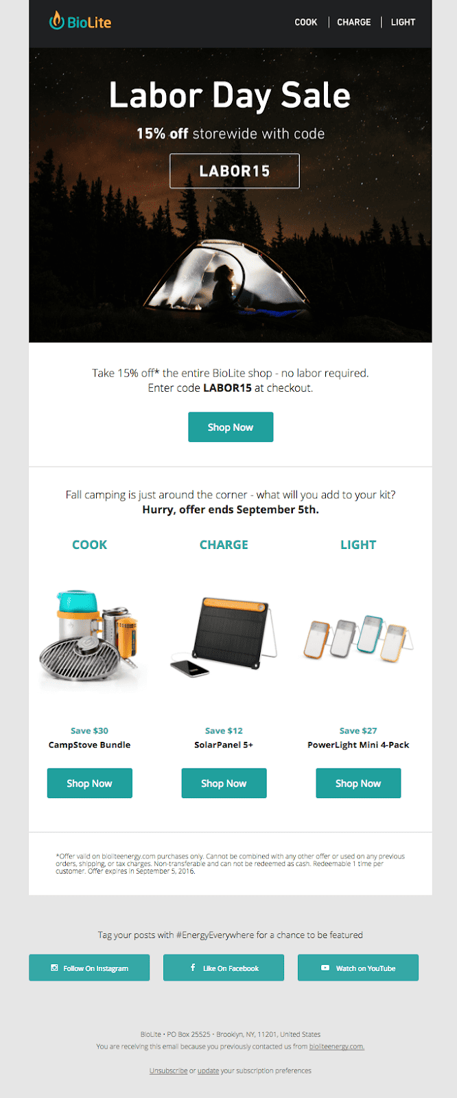
The above Labor Day email from BioLite is information-optimized. The designer has worked according to the quantum of text such an email would consist of. The email has eight calls to action, three product names, and sales descriptions in three places across the template. Almost all the descriptions are at least two sentences long. Only the topmost part of the email is chiefly image-based.
The use of negative space is particularly noteworthy. Despite the short-spaced images and the CTA buttons, the template looks clear. It is superbly readable, which means the design is also mobile-friendly.
The most important information—the discount offer—is rightly positioned at the head of the template. The copy is concise and urgent. For an email that contains so many elements, it is eminently lookable. It has a sober vibe, and the colour contrast, albeit conventional, is reasonably practical.
The template is also very neatly trifurcated. The first part uses a simple, relevant, and relatable image to introduce the theme of the content. It advances seamlessly into the second part, where the theme is elaborated. The concluding portion of the email begins outside the template, which is fitting since it is not something exclusive to Labor Day content.
5 – Exploit Negative Space
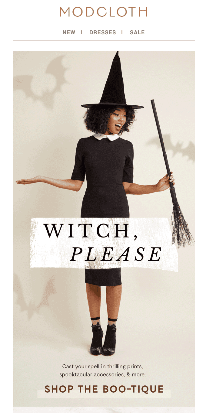
Negative space helps the viewer to make a logical sense of the information. Negative space provides visual clues to the brain as to where exactly its focus should be, making it easier for the brain to process the most valuable bits. Modcloth brilliantly exploits this neurological tendency and offers a sober, understandable, and balanced view of the email.
It is crucial to understand that negative space is not wasted that could have been used to add more content. For once and for all, negative space is meant to foster usability. User experience depends on how much textual and visual content complement each other.
Another significant benefit of negative space is that it boosts interaction with the image. Did you know that the average attention span of an adult internet user is 8.25 seconds? If used properly, negative space communicates the intended message quickly, enabling the user to pause and interact with the image.
Equally, negative space oozes sophistication and luxury. Generally speaking, the character of a web page is determined mainly by the presence of negative space on it. Modcloth’s sophisticated and luxurious email reflects the brand's essence and the value of its products.
Note also how the template blends clean design with sophisticated humour. The email creates a vivid visual experience. The large image of the “witch” controls the template's layout, directing the other graphical and textual elements according to its generated flow.
6 – Use High-Quality Images
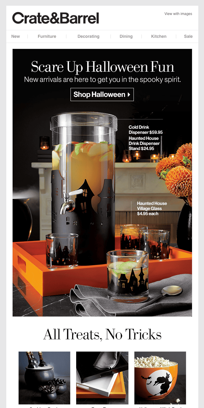
Here’s another Halloween-themed email template. This product promotion email from Crate&Barrel, a furniture and home decor company, uses hard light to produce high-resolution product images.
Arguably, the designer’s work is half done where there is good product photography. Product images heavily influence customers’ purchasing decisions. Inaccurate representation of products can often cause customers to return purchased items.
The template under consideration uses minimal design: straight lines, neat divisions between each section, a traditional colour contrast, and only one call to action. The entire focus is on Halloween-themed products.
Notice also the minimal use of props: this ensures minimum distraction and a more heightened view of the products. The props also provide context, which is helpful since customers want to envision the product amid natural surroundings.
One of the central attributes of the image is that it is scalable. It does not blur on being zoomed in on. This is crucial since customers will want to view the product up close. The image was not shot on a low-cost digital camera. The details are crystal-clear, leaving nothing to guesswork. The whole vibe of the image inspires trust, authenticity, and brand value.
Because the template is highly image-focused, the copy is sober and matter-of-fact yet not wholly devoid of Halloween humour. Notably, the email informs as well as captures our attention. It is not decorative; there’s no fluff. The product descriptions are well-placed; they don’t clutter up the spaces between the objects.
7 – Consider Animated GIFs
Dynamic email is the craze of the hour. People want to be entertained; they want to be moved. So, consider incorporating animated GIFs in your design regarding holiday emails.
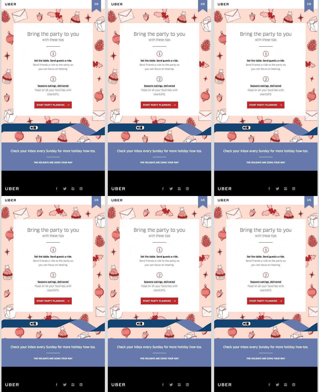
Uber’s dynamic Thanksgiving email is attention-grabbing, amusing, and inviting. The design makes the subscriber want to click on the CTA button.
Uber’s use of GIFs is moderate and practical. Just two loops, back and forth, that’s all. This is because the focus is on the content and the attendant call to action. The point is to harmonise dynamic content with its static counterpart.
Generally speaking, animated GIFs are an excellent alternative to videos. They are easier and quicker to make and take up only a little space. This is good news because many email clients need to support data-heavy content. GIFs are the bridge between minimal design and dynamic design. If you’re working on a small budget and want to create dynamic emails, you know it’s not impossible.
But the best part is that GIFs can trigger sales if used properly. Dell’s 2014 GIF-based email marketing campaign increased revenue by 109%. Again, moderation and simplicity were at the heart of this campaign. Here’s how David Sierk, who headed the campaign, described Dell’s approach to using a GIF in their product launch email:
“We wanted it to be straightforward and go back and forth so that the customer who is only going to look at the email for a concise amount of time — maybe a couple of seconds — could see the full thing, and it would tantalise them to click.”
8 – Pick The Right Colour
Colour creates a mood. Depending on the type of email marketing campaign, the colour you choose will decide the conversion power of your email.
Every colour is associated with a specific emotional experience. Black, for instance, signifies luxury and sophistication. Blue denotes trust and security; it has been empirically proven. Red is chiefly associated with passion and urgency.
You can continue with colour psychology and its relevance in the marketing world. Remember that your choice is driven by three factors: the time of your campaign, the focus and intent of your email, and your brand identity. So, if you were to create an email for Black Friday, black (or any dark colour) would be your obvious choice. For instance, consider the following Black Friday email from Adidas.

The colour choice is in sync with the timing of the campaign. The email intends to highlight the holiday offer, using white in the copy. Note also the bright-white CTA button, which pops out against the dark background. Finally, black and white are Adidas’ brand colours. Adidas always maintains its corporate palette from logo to home page to covers.
So, the email is designed in such a way as to evoke the experience of buying from a celebrated brand. Consistent brand identity is one of the hallmarks of a successful email design.
9 – Identify The Right Typeface
It is essential to realise the significance of typography in email design ideas. It influences user experience and readability when the email is viewed on a mobile device.
Like colours, fonts have their effects on our moods. Serif fonts evoke urbanity, whereas sans-serif fonts are more casual. So, you want to limit serif fonts to short headings and use sans serif fonts for longer text to improve readability. Decorative fonts should be used sparingly. Most importantly, employing more than two fonts in an email is not recommended. You want to use one font for the headline and another for the explainer text. Of course, there may be exceptions, given that you employ your ideas intelligently.
This Cyber Monday email from Tattly ticks all the boxes.
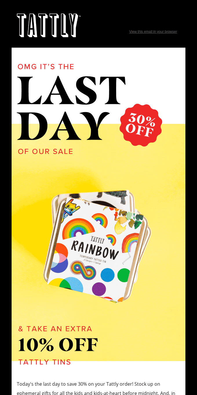
Given the use of serif fonts in the headings, care has been taken to use the right amount of space between the characters to ensure legibility. The spacing between the lines also seems perfect—notice the use of just two font types in the email. The longer text at the bottom is sans serif. Only the headings use serif fonts because they are shorter, focused, and demand an aesthetic touch.
10 – Try Accelerated Mobile Pages
While still in its early stages, Accelerated Mobile Pages (AMP) is tipped to be the next big thing in email marketing.
AMP aims to take the dynamic email experience to the next level. From calendars to carousels, AMP email provides a website-like interface for users. Subscribers can now complete forms and add items to their cart without clicking out of their email; this means that customers can complete transactions within an email with no extra steps and no redirects. Moreover, no third-party providers can use your data, making AMP emails fully secure.
Consider the following interactive Christmas email from Two. It’s a fun, engaging email optimised for a rich user experience.
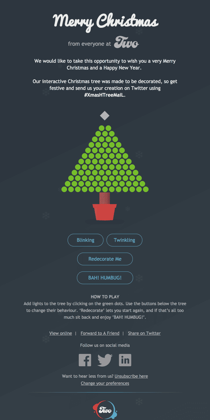
AMP continues to receive a rather lacklustre response from email marketers. This is due to two reasons. One, not all ESPs support AMP. Two, whether one can successfully track email metrics in AMP emails.
We suggest AMP is worth a shot, if only because not many marketers currently use it. You can lead the way and ignite widespread acceptance of new technology. Also, you can leverage the security advantages of AMP. Besides, it seems particularly appropriate for holiday email marketing campaigns. Holiday shoppers would appreciate being able to choose their favourite items, add them to their cart, and make a purchase – all without quitting their inbox.
This means that AMP-powered emails can lead to higher conversion rates as well. In April 2023, MoneyTap, India’s first app-based credit line, saw a 13X increase in customer engagement rate, thanks to Netcore Cloud’s AMP emails. The brand witnessed a 63% increase in the clickthrough rate.
With the help of Netcore’s AMP email technology, MoneyTap embedded games and gold load calculators in their emails to provide users with an immersive, memorable experience. And guess what? Within a very short time, the brand could clock over 4000 interactions.
Concluding our Email Design Ideas
The word ‘design’ can deceive the mind into overambitious imagination. No matter how rich and varied your aesthetic palette is, your email marketing campaign will fall apart without a proper strategy to back it up.
Email design is more than splashing colours, using decorative fonts, and investing in indulgent animation; we hope we have successfully driven home this very tenet in this blog. These email design ideas aim to provide a great user experience and make subscribers act. It demands nothing less than focused, value-intensive strategising.
