Remove marist
article thumbnail

QuiteLike Branding: How Universal Favourite Cooked Up a Deliciously Rewarding Identity

We And The Color

For the QuiteLike branding, the wordmark uses the serif typeface ABC Marist. The choice of ABC Marist hints at a slower, more thoughtful approach. This wasn’t an accidental choice. This particular typeface brings an immediate sense of warmth and considered character to the brand. QuiteLike wanted to signal something different.

article thumbnail

Big Cartel’s big rebrand by How&How throws caution to the wind

Its Nice That

Alongside Dinamo’s ABC Marist as the secondary supporting typeface, the typographic approach across the brand is led by Extraset’s ED Replan – an idiosyncratic variable sans serif utilised as the primary font and its logotype. “We The team practiced restraint in the context of playful, tactile texture and type.

article thumbnail

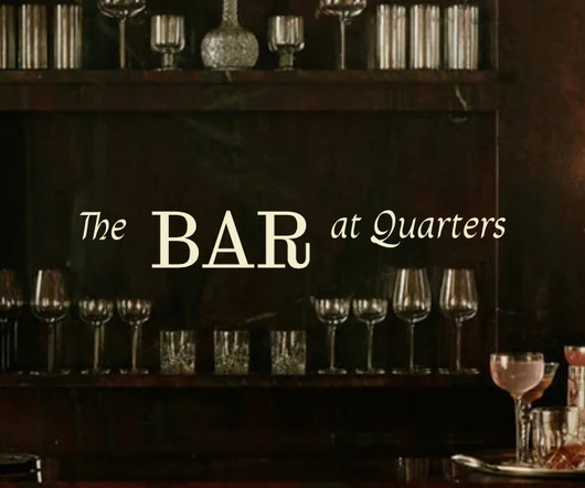
Quarters

Typewolf

Fonts: Droulers , Corfe , Marist , Monument Grotesk

Fonts 64