Porsche Logo Design History & Brand Evolution
The iconic Porsche logo is one of the most recognisable emblems in the automotive world. The distinctive crest has adorned Porsche sports cars for over seven decades, symbolising luxury, performance, and engineering excellence.
In this article, we'll journey through the origins and evolutions of the Porsche badge. We'll learn about Ferdinand Porsche's early inspirations that shaped the original design. We'll see how the logo adapted through Porsche's post-war growth before taking on the form we know today.
Along the way, we'll uncover lessons from Porsche's brand history that can inform creative approaches to modern logo design. The Porsche crest did not always feature the black horse. Its earlier iterations reveal a fascinating interplay between brand identity and business strategy.
By exploring the story behind one of the most famous logos in automotive history, we can better appreciate the importance of brand evolution and adaptation without losing sight of your core vision. Read on for a comprehensive look at the Porsche logo design history and secret influences that made it an iconic brand mark over 70+ years.
Table of Contents
The Birth of a Legend
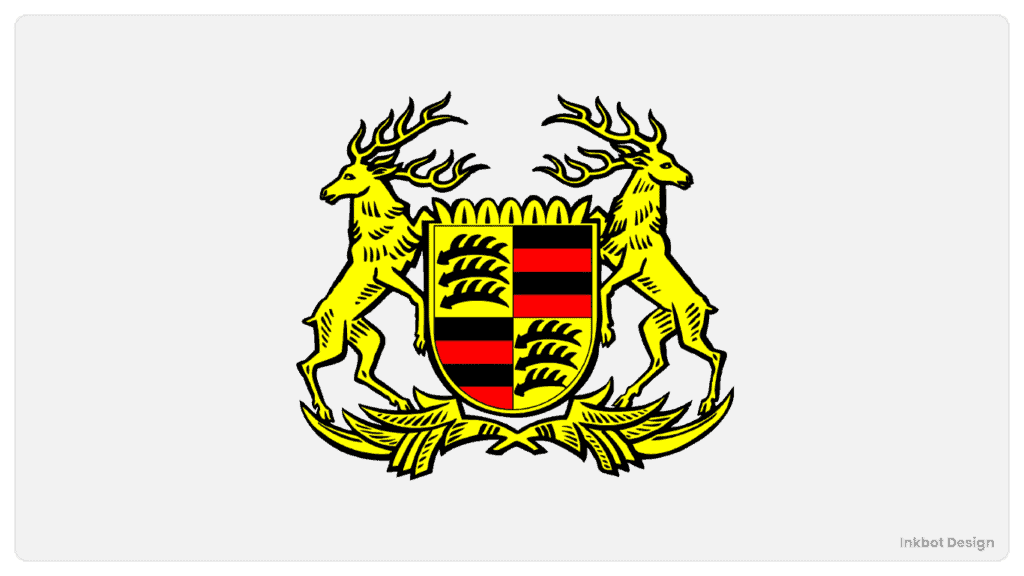
Early Beginnings (1931-1950)
Our journey started in 1931 when Ferdinand Porsche first opened the doors of his engineering office in Stuttgart, Germany. While Porsche is now recognised globally for its iconic brand, the company did not have an official logo in these early days. Instead, those first Porsche cars bore the coat of arms of the city of Stuttgart – a black prancing horse set against a yellow and red striped shield.
This humble beginning with the Stuttgart emblem symbolises Porsche's roots and close association with the city even as it grew into an international automotive powerhouse. Stuttgart had been home to Porsche since the company's founding. The city's coat of arms, featuring a stallion and antlers, reflected its centuries-old horse racing tradition tied to the regional history of Württemberg.
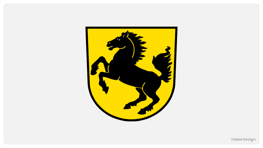
For the fledgling automaker in the 1930s, the Stuttgart horse proudly conveyed Porsche's regional heritage and connection to the local community. While Porsche was still establishing its identity and reputation in the automotive world, the Stuttgart emblem was a temporary placeholder on those first engineering projects and motor vehicles.
Of course, Porsche would soon create its iconic logo and visual identity as it gained worldwide renown. But its adoption of the Stuttgart coat of arms in those early days symbolised the company's German roots and mechanical craftsmanship that would forever be a part of the Porsche brand DNA.
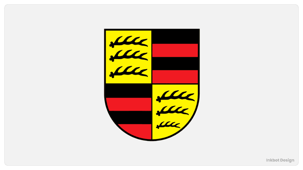
The Birth of the Porsche Crest (1952)
In 1952, Porsche took a significant step toward establishing its identity as a prestigious sports car manufacturer by introducing its first official logo, the Porsche Crest. This iconic emblem marked a pivotal moment in the evolution of the Porsche brand.
Creating the Porsche Crest was a carefully crafted branding strategy, not a random act. The striking logo featured a black stallion in mid-prance on a golden yellow background, enclosed within a frame of antlers and topped with a red crown. Each element conveyed meaningful themes and values core to the Porsche ethos.
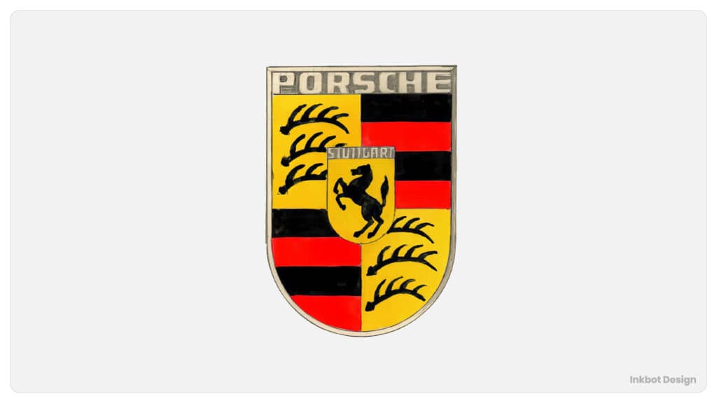
The prominent black horse symbolised the speed, power, and agility that Porsche aimed to achieve in its sports car designs. The golden yellow field paid tribute to the German city of Stuttgart, where Porsche was headquartered. In heraldry, black traditionally represents strength and determination, while gold conveys wealth and excellence – fitting associations for a marque with aspirations of dominance in the luxury sports car domain.
The antlers encircling the crest derived from the centuries-old coat of arms of Württemberg, the former state where Stuttgart was located. By incorporating this allusion to regional heritage, Porsche signalled its roots in southwestern Germany. Finally, the bold red crown exuded an aura of royalty, prestige, and victory – a visual embodiment of the dominance Porsche sought in the realm of high-performance automobiles.
The introduction of the Porsche Crest in 1952 proved seminal, providing the marque with an enduring symbol that succinctly yet powerfully captured its identity and spirit. In the following decades, the Porsche Crest became indelibly linked with the brand's engineering triumphs on road and track, granting it an instantly recognisable aura of automotive nobility.
Evolution of the Porsche Crest
Streamlining the Design (1952-1963)
The Porsche crest has evolved subtly yet significantly since its inception in 1952, reflecting Porsche's growth into an internationally recognised automotive icon. In the early years, the crest featured intricate detailing – the antlers of the Stuttgart coat of arms were highly stylised, and the horse had a more sedate posture.
As Porsche entered a period of rapid expansion in the 1960s and 70s, the company refined the logo to increase its versatility and instant recognition. The antlers became more slender and simplified, improving legibility at small sizes. The horse was redrawn in a more dynamic mid-gallop pose to convey the energy and performance Porsche was becoming renowned for.

These incremental updates aligned the crest with Porsche's engineering philosophy – technical excellence married to timeless design. The refined lines and minimalist style made the logo at once contemporary and classic, projecting the image of an innovative brand with a strong heritage.
While remaining faithful to its origins, Porsche's subtle logo modifications kept it modern and impactful through decades of evolution. As Porsche firmly established itself as an international automotive giant, its clean and dynamic crest became synonymous with luxurious, high-performance sports cars worldwide. The logo captured the company's blend of tradition and innovation in a memorable graphic emblem.
The Golden Age (1964-1994)
The 30-year period between 1964 and 1994 was a golden era for the Porsche brand. Having firmly cemented itself as a dominant player in motorsport and luxury automotive manufacturing, Porsche saw tremendous growth and evolution during these decades.
Porsche solidified its reputation for engineering excellence and racing dominance on the track. The legendary Porsche 917, introduced in 1969, racked up victories at Le Mans, Daytona, and many other endurance races. Throughout the 70s, 80s, and 90s, Porsche continued to succeed in sports cars and prototype racing with models like the 935, 956, 962, and 911 GT1. The company's continuous development of new technologies for racing helped strengthen its production of cars as well.
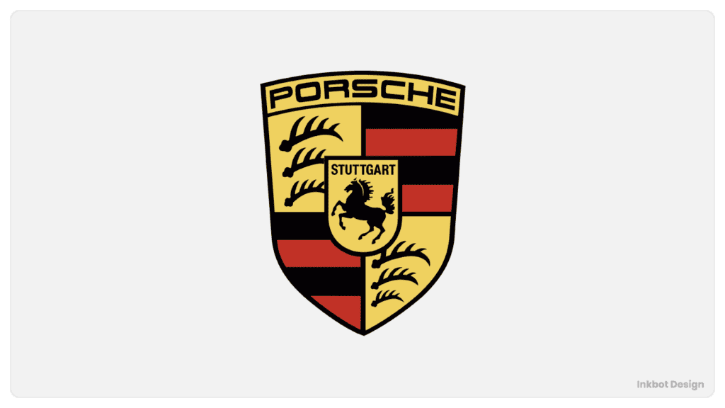
Porsche expanded its street lineup with new models that stretched the performance envelope. The 911 continued its slow but steady evolution from the first generation launched in 1964. Iconic variants like the 911 Carrera RS 2.7, 930 Turbo, and 964 RS demonstrated Porsche's ability to blend raw power with everyday drivability. Front-engine grand tourers like the 928 brought new levels of luxury and comfort.
Even Porsche's visual identity evolved during these transformative decades. The Porsche crest logo retained its elegant simplicity but adapted to match the brand's growing prestige. The prancing black horse remained front and centre, its pose exuding the power and performance Porsche had become synonymous with. The antlers were integrated more seamlessly into the crest's circular border, surrounded by the company's iconic colours. As Porsche progressed into the modern era, its logo evolved to represent this new chapter while respecting its storied heritage.
For Porsche, the period between the mid-1960s and mid-1990s set the stage for the company we know today. During those pivotal golden years, Porsche cemented itself as an automotive powerhouse with racing victories, technological innovations, and significant growth.
Entering the Digital Age (1995-Present)
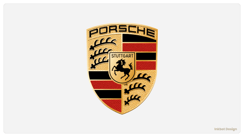
As Porsche transitioned into the digital age, the company faced the challenge of adapting its iconic logo for new mediums while preserving its heritage. The Porsche crest, featuring the prancing Stuttgart stallion, had graced Porsche automobiles since 1952 and became synonymous with the brand's identity. However, the intricate detailing of the crest that looked elegant on the hood of a 911 proved challenging to reproduce clearly on small digital screens.
Realising the importance of a robust digital presence, Porsche refined the crest to optimise its visual impact across websites, apps, and social media. The refinements focused on simplifying the lines and negative spaces to ensure legibility without compromising the essence of the design. The stallion's muscles became more taut and defined, improving clarity at small sizes. Thinner outlines helped the crest stand out against digital backgrounds. The result was a logo equally at home on a smartphone screen as on the steering wheel of a classic Porsche.
The digitally optimised crest launched in 2017, debuting on Porsche's redesigned website. Its cleaner lines and sharp edges looked modern while retaining the soul of the original design. The simplified crest allowed Porsche to maintain a consistent, recognisable brand identity across its digital platforms. As the company embraces new technologies like electric vehicles and digital integration, the iconic logo remains synonymous with Porsche's heritage even as it adapts to the future. The refined crest retains the charm of the original while positioning Porsche's identity for the digital age.
Porsche Logo Beyond the Cars
Beyond the Hood: Brand Expansion
The iconic Porsche logo has transcended the automotive world, becoming a symbol of luxury, performance, and status outside the realm of cars. You'll find the distinctive crest adorning everything from clothing to watches to golf equipment as Porsche expands into lifestyle and accessories.
This move into merchandise shows the enduring cachet and aspirational appeal of the Porsche brand. For enthusiasts, displaying that recognisable logo publicly is a way to showcase their passion and identification with the brand, even when they aren't driving one of the coveted sports cars.
Porsche-branded merchandise allows owners and fans to align themselves with the company's values of precision engineering and racing dominance. Items like Porsche Design sunglasses or a Porsche watch communicate sophistication, attention to detail, and appreciation for well-crafted aesthetics. Wearing a Porsche polo or hat is a subtle flex, signalling you're in the know about fine automotive engineering.
The prestigious Porsche crest neatly embroidered on jacket lapels or engraved on a leather wallet transcends the actual vehicles to become a lifestyle statement. Porsche drivers and admirers can display their passion and connect with the brand community even when not behind the wheel. The expanded Porsche lifestyle collection provides avenues to identify with the brand's aura of luxury performance publicly.
The Psychology of the Porsche Logo

The iconic Porsche logo evokes feelings of speed, prestige, and expert engineering in the minds of consumers worldwide. The Porsche crest features a black prancing stallion on a golden background, encapsulating the brand's performance, luxury, and craftsmanship values.
The prancing horse immediately brings to mind thoughts of power and agility. Throughout history, the horse has symbolised strength, speed, and endurance, making it the perfect icon for a sports car brand obsessed with performance. The rearward-leaning stance of the Porsche horse conveys a sense of forward motion, dynamism, and urgency. This poised gallop captures the sheer exhilaration of being behind the wheel of a Porsche sports car.
The black and gold colour scheme speaks to refinement and exclusivity. The bold black horse pops against the golden background, creating an eye-catching contrast. Black has connotations of sophistication and luxury, while gold implies prosperity and excellence. Together, they make the Porsche badge a status symbol representing the pinnacle of sports car engineering. Only the most discerning drivers who settle for nothing less than the best will be drawn to this gilded stallion.
Beyond the visual symbolic meaning, the Porsche crest has developed an aura and mythos from its long history of racing victories and its reputation for flawless German craftsmanship. For many, seeing the pristine badge on a vehicle elicits pride in owning an iconic piece of automotive history. The logo is a quality assurance seal, promising precision performance and timeless style.
In short, the Porsche emblem is much more than a decorative hood ornament. This powerful logo encapsulates everything the Porsche brand stands for – heritage, ambition, excellence and a passion for the open road. It will continue to trigger emotions and aspirations in car enthusiasts for generations.
- Hardcover Book
- Leffingwell, Randy (Author)
- English (Publication Language)
- 256 Pages – 10/11/2022 (Publication Date) – Motorbooks (Publisher)
Frequently Asked Questions (FAQs)
What is the significance of the Porsche logo?
The Porsche logo symbolises the company's history and commitment to excellence. It incorporates elements from the city of Stuttgart's emblem, where the company originated.
How has the Porsche logo evolved over the years?
The Porsche logo has undergone several changes since its inception in 1952. These changes reflect the company's growth, success in motorsport, and adaptation to the digital age.
What is the meaning behind the elements in the Porsche Crest?
The Porsche Crest features a prancing horse, antlers, and red and black colours. These elements represent the city of Stuttgart and its horse racing tradition, strength, power, wealth, and excellence.
Why is the Porsche logo so iconic?
The Porsche logo is iconic due to its association with high-performance sports cars, luxury, and a commitment to excellence. It has become a symbol of prestige and success.
Is the Porsche logo used beyond cars?
Yes, the Porsche logo is used on various products, including clothing and accessories. It has become a symbol of luxury and a lifestyle brand, allowing enthusiasts to express their passion for the brand in various aspects of their lives.
Conclusion
The Porsche logo is more than just a symbol; it is a defining representation of Porsche's storied legacy and relentless commitment to technical innovation and design excellence in the automotive world. As we have traced the evolution of the Porsche badge across decades, we can appreciate how its thoughtful refinements mirror the continuous advancement of the Porsche brand.
From its origins as a graphic interpretation of the Porsche family crest, the logo has been refined to capture the essence of Porsche's identity. The graceful, streamlined contours of the modern badge evoke Porsche's trademark marriage of form and function and the brand's emphasis on sleek aerodynamics. The prominence of the word “Porsche” boldly proclaims the company's confidence and strength of identity.
And while the visual elements have been updated, the iconography retains links to Porsche's heritage, like the black foreground referencing the family colours. This balance of evolution and continuity is a fitting reflection of Porsche itself, a company that has innovated across decades while remaining true to its racing roots. Even as Porsche expands into new domains like electric vehicles, the badge will continue representing their passion for high performance, married to timeless design.
The Porsche emblem stands as an enduring symbol of excellence, a visual encapsulation of the Porsche spirit that drives the brand into the future even as it honours the company's storied history. It is not just a logo but a signpost of Porsche's relentless commitment to pursuing automotive perfection.
Last update on 2024-05-14 / Affiliate links / Images from Amazon Product Advertising API

