Seems like Graphis has been around forever. I stop by the website every once in a while, normally after clicking a link in an article, or clicking through from a logo in an image search. I think to myself, oh, this is good, I should add it to the site.
Then I go back to whatever I was doing.
So a number of years later than expected, here’s a signpost to the Graphis logo archives, where a record’s kept for the likes of these, and many more.
For my international readers, Our Price was a chain of record stores in the UK and Ireland.

Some previously featured Woody Pirtle logos.
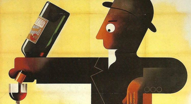
Of course, it’s not just logos on show. Graphis has a respected award program for posters, annual reports, photography, advertising, and more. One of my favourite studios, Baxter & Bailey (their Little Green Pig logo makes me smile), just picked up this trophy for a series of posters.

That’s a nice trophy.
Graphis also publishes books and magazines on design, communication, and the arts, with a vast archive dating back to 1944 when it was founded in Switzerland by Walter Herdeg and Dr Walter Amstutz.
In 1986, the company was sold to B Martin Pedersen, and a few years later, the headquarters were relocated from Zürich to New York City.
Graphis. Worth another look.

Comments
A couple of true classics here. The beauty in simplicity of the Endura Nail Corporation logo, yet I wouldn’t be surprised if it got rejected in more modern times through a simple “but how does it scale” comment.
Love how the British Railway logo is so simple, recongnisable and timeless. Shame the service isn’t as good as the branding.