Top 10 Logo Design Mistakes That Can Derail Your Brand
A company's logo is often the first impression people get of your brand. It's on your website, business cards, packaging, and anywhere else you promote your business.
However, designing an effective logo that represents your brand and resonates with your target audience takes more work than it seems. Many entrepreneurs make critical logo design mistakes that can hurt their brand over time.
To help you avoid common pitfalls and create a logo you'll be proud of for years to come; I've outlined the top 10 logo design mistakes to avoid at all costs. Learn from others who came before you so your logo becomes an asset, not a liability.
Table of Contents
Top 10 Logo Design Mistakes
Choosing the Wrong Colours

One of the most common logo design mistakes is using colours that don't align with your brand identity or industry.
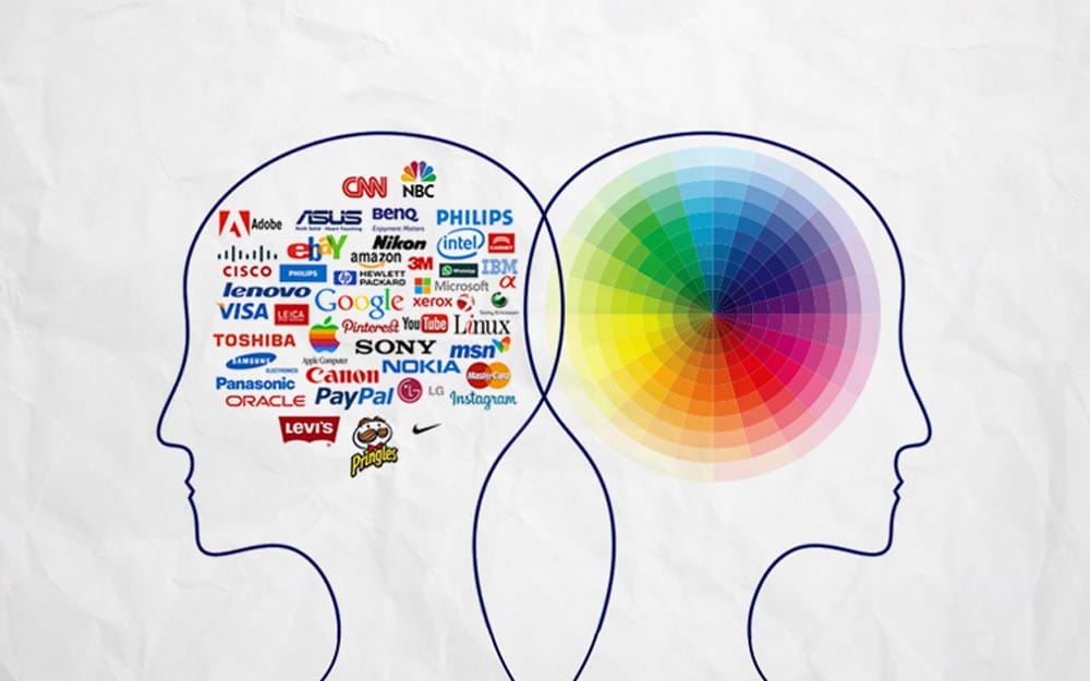
Colour is mighty. Different hues evoke different emotions and associations in people. So you must choose colours purposefully, not just because you like them.
Consider what feelings and ideas you want your brand to spark in customers. Then, select colours that will help strengthen that impression.
For example, blue is associated with trust, security, and dependability. It's popular in the technology and financial sectors. Meanwhile, green represents nature, health, and tranquillity. It's common for gardening or environmental brands.
You can use online colour psychology resources to help select logo colours that reinforce your desired brand image. Just don't choose randomly based on your colour preferences.
Trying to Do Too Much
Another mistake is cramming too many design elements, themes, or concepts into a single logo.
Simple logos are more effective and recognisable. Trying to combine multiple ideas just muddles the message you want to convey.
For example, Apple's iconic logo is clean and minimalistic – an apple with a bite taken from it. The bite represents knowledge and technology, while the apple ties to nature and food.
But they don't also add leaves, a worm, stars, or any other extra design elements just for the sake of it. That would dilute their brand image.
So, focus on one or two key brand attributes you want to get across. Then, translate those into a simple, uncluttered logo.
Forgetting Versatility
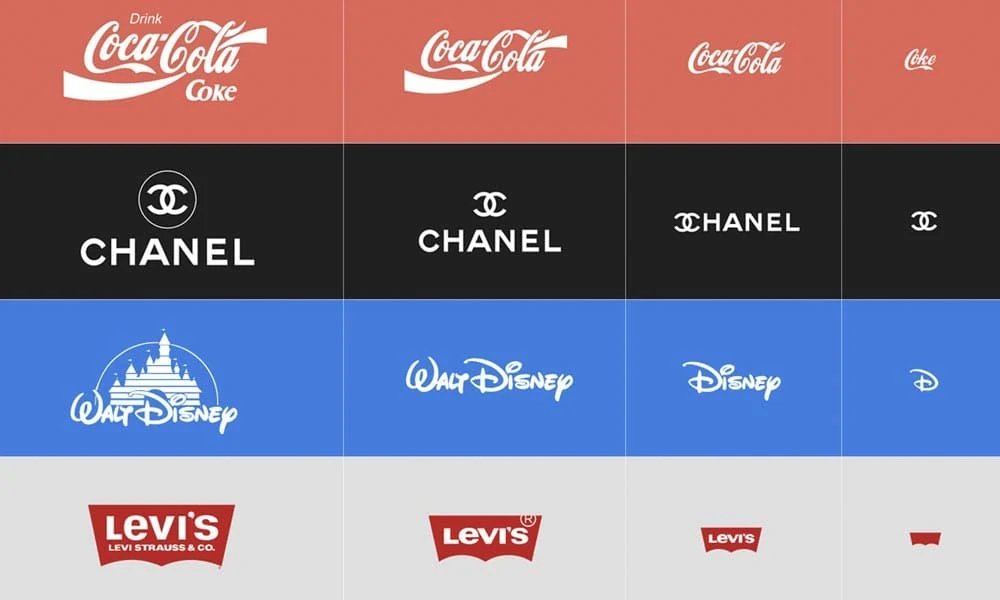
An ideal logo works across various sizes and contexts – from billboards to social media icons to embroidery on uniforms.
However, many logo designers don't consider versatility and later find their logo doesn't function as needed in real-world use.
For example, detailed or intricate logos look cluttered and illegible when shrunk to fit social media icons. Conversely, ultra-simple logos may look dull and empty on large signage or banners.
So, as you conceptualise your logo, continually visualise how it would look across various sizes, formats, and contexts. Ensure it remains clear and impactful in all the ways you plan to utilise it.
Lacking Originality

Unoriginal or derivative logos are a surefire way to appear generic rather than unique. Customers associate copied concepts with a lack of creativity.
While you can take inspiration from competitors or industry leaders, outright mimicking their logo design is a mistake.
For example, Twitter and Facebook both use simple, single-word logos. But they each crafted distinct fonts, colours, and styles that set their brands apart rather than blurring them together.
Brainstorm extensively when conceptualising your logo. Seek innovative ways to represent your company that don't mimic your competitors. Your logo should telegraph your brand's distinctiveness.
Choosing Overused Stock Images
Some entrepreneurs just search for generic stock logos they can customise with their company name. But stock logos feel disconnected from your specific brand.
For example, you'll see specific images like lightbulbs, speech bubbles, and globes repeatedly on stock logo sites. But they don't say anything meaningful about your company.
Work with a talented designer to create a custom logo from scratch that captures the essence of your brand. It will better resonate with your audience compared to an overdone stock image.
Making It Difficult to Read
Logos should clearly and immediately communicate your brand name to viewers – but many entrepreneurs make readability mistakes.
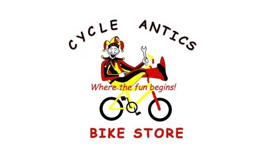
Using intricate or overly embellished fonts can reduce legibility, especially in small sizes. Conversely, choosing boring, nondescript fonts hides your brand name from view.
Also, avoid creative flourishes that disrupt your logo's readability. For example, using small text inside a more prominent graphic element makes customers work excessively hard to decipher your name.
Stick with simple, classic fonts applied legibly. You want customers to recognise and remember your brand name, not struggle to figure it out.
Forgetting Scalability

As mentioned, logos appear at various scales – from massive billboards to tiny social icons. But not testing scalability is a common oversight.
View your logo at different sizes during the design process to ensure it remains clear and impactful. Tiny logos should still be distinctive and legible. Conversely, prominent symbols shouldn't appear imbalanced or distorted.
Consider how your logo will be embroidered or die-cut as well. Avoid intricate details that might disappear or bleed together at small scales.
Test across contexts before finalising your logo. Scalability will allow your logo to transcend size restrictions and make a great impression wherever it appears.
Failing On White Space
White space is the space around and inside a logo. It enhances aesthetics and improves legibility. However, many designers devalue its importance.
Cramming a logo edge to edge with design elements feels cluttered. Conversely, a logo floating in excessive white space can feel insubstantial.
Carefully balance white space based on your logo size, shape complexity, fonts, colours, and other elements. Strive for sufficient breathing room so details don't mush together.
Follow white space best practices for your logo's industry and dimensions. Don't underestimate how proper white space improves visual communication.
Choosing Overly Trendy Designs
Logos are meant to endure for years or even decades. However, choosing trendy logo styles risks premature obsolescence.
For example, logos with drop shadows or metallic effects feel outdated today. But they were popular fads in web and graphic design years ago.
To avoid rapid irrelevancy, lean toward classic, timeless design aesthetics for your logo. Rely on your brand story and attributes, not fleeting style fads.
Of course, you can update logo stylings years later as needs evolve. But don't start yourself out with excessive trendiness that won't stand the test of time.
Designing Without Strategy

Some entrepreneurs start designing a logo without any strategy to guide the process. But this leads to arbitrary or disjointed results.
Define your brand identity, target audience, positioning, personality, and other strategic foundations.
This provides creative direction to inform your logo design. It focuses decisions around your brand strategy rather than just personal preferences.
For example, outdoor retailers should design rugged, adventure-oriented logos. Nonprofits may feature inspiring imagery related to their cause.
The strategy ensures your logo aligns with your brand essence rather than resulting from unguided creative choices. Let strategy steer the design.
Bonus: Failing to Evolve
Though logos should remain broadly consistent over time, occasional evolution is wise to stay current. However, many brands fail to redesign even after decades.
Logos created 30+ years ago can start feeling outdated, generic, or disconnected from modern audiences. A facelift can realign branding to the present.
For example, Pinterest and Spotify both refreshed their logos in recent years. The new versions feel more contemporary and aligned with their brand growth.
So don't change your logo constantly. But every decade or two, consider refreshing it to keep pace with the times. People's design sensibilities evolve, so brands should grow in tandem.
Ensure you “version” your new logo so the link to your original is still apparent. Never change a logo entirely beyond recognition.
Key Takeaways and Action Steps
Logo design impacts your brand and business success. A suitable logo builds customer recognition and reinforces your desired brand image. However, mistakes can lead to ineffective or even counterproductive results.
Here are the critical mistakes to avoid based on this article:
- Using random or generic colours vs intentional colours that reinforce your brand identity
- Including superfluous design elements rather than keeping it simple
- Failing to consider size and context versatility during the design process
- Copying competitors or using overdone stock images rather than creating an original concept
- Sacrificing readability through busy fonts or distracting flourishes
- Not testing scalability across contexts early on
- Neglecting strategic white space best practices
- Chasing temporary trendy styles rather than more enduring, classic design
- Starting to design a logo without a clear brand strategy to inform the direction
- Failing to evolve your logo over decades as needs change
By learning from the missteps of others, you can proactively avoid these pitfalls as you create or redesign your company logo.
Here are some essential tips to keep in mind:
Develop a clear brand strategy first – Map out your brand identity, audience, personality and another approach to steer your logo design decisions, not just personal preferences.
Prioritise simplicity and restraint – Resist cramming in multiple ideas or excessive details. Stick to one or two key brand attributes you want to convey.
Test extensively – View your logo across contexts, sizes, formats, and applications to ensure it works as intended in the real world.
Use colour and fonts purposefully – Choose design elements that strategically reinforce your desired brand image and emotions.
Creating a great logo that stands the test of time takes more strategic thought than many founders realise. But the investment is well worth it for how an effective logo builds customer recognition and loyalty over years or even decades.
Avoid the pitfalls that can derail your efforts. Design an iconic, ownable logo aligned tightly to your brand essence and strategy. Your logo can become one of your company's greatest assets by telegraphing your unique identity and values at a glance.
Frequently Asked Questions
What are some examples of good logos?
Some examples of compelling, iconic logos include the Nike Swoosh, McDonald's Golden Arches, Apple's Apple logo, the Starbucks twin-tailed mermaid, and Coca-Cola's Spencerian script. They are simple, recognisable, scalable, and visually linked to their brand identities.
How much should you spend on a logo design?
Expect to spend $1000 – $5000 on a professional custom logo design. Logos are crucial long-term brand assets, so this is not an area to cut corners. An experienced designer will provide strategic insights and thoughtfulness that exceeds a generic stock logo.
Should you design your own logo?
It's generally only advisable for entrepreneurs with graphic design skills to design their logos. The strategic and technical nuances of incredible logo creation are hard to master. Investing in a professional designer almost always yields better results and a more substantial brand asset.
When should you update or redesign your logo?
Plan to update your logo every 10 – 20 years on average. Symbols may feel outdated, generic or disconnected after one or two decades, especially as design trends evolve. Thoughtful facelifts can modernise branding while retaining familiar elements.
How do you choose the right colours for your logo?
Start by defining the emotions and ideas you want to convey, then choose colours strategically to reinforce them—for example, blue boosts perceptions of stability and trust. Green represents natural or eco-friendly attributes. Red signifies excitement and boldness. Review colour psychology guidance online for more insights.
