Top 10 Simplest Logos in Design History
In the vast and ever-evolving world of graphic design, logos hold a special significance. They serve as visual ambassadors for companies, encapsulating their essence into a single memorable symbol. Among the multitudes of logos that surround us daily, there is an intriguing paradox – often, the most iconic and impactful logos are those with the most straightforward designs.
In this article, we embark on an exploratory journey through the world of minimalist logo design. We examine some of the most famous logos that have achieved global recognition, analysing the elements that make them so profoundly effective. From the iconic golden arches of McDonald's to Apple's ubiquitous bitten apple, these logos exemplify the power of simplicity. With clean lines, limited colour palettes, and symbolic shapes, they relay the core identities of their brands at a glance.
As we survey these top 10 examples of brilliantly simple logos, we also dive into the psychological science behind why elementary designs can leave such enduring impressions. We look at principles of perception, colour theory, semiotics, and brand awareness that give these pared-down logos their potent and memorable nature. Additionally, we consider the impact of simplicity in logo design on a company's market presence and consumer relationships.
Minimalism in logo creation is far from simplistic – it is an art that demands thoughtful refinement and restraint. Join us as we respectfully unveil the stories and strategies behind these ten logos, appreciating them as timeless symbols of flawless visual communication. Their success is a testament to the resonance of elemental design, proving that often, less is truly more.
Table of Contents
Introduction: The Beauty of Minimalism in Logo Design
Logo design is a subtle yet profoundly impactful art form. An exceptional logo can encapsulate a brand's essence and ethos in just a few simple lines and shapes. While complexity and intricacy can undoubtedly add depth and interest to a logo, simplicity often proves most effective for communicating an organisation's core values. Cleverly crafted simplicity possesses the remarkable ability to convey multifaceted ideas and messages through clean, minimalist visuals.
In today's digital era of fractured attention spans and information overload, a straightforward, memorable logo can make all the difference between being noticed or overlooked. The iconic brands we know today, like Apple, Nike, and Amazon, rely heavily on their bold, streamlined logos to stand out. Their success demonstrates simplicity's immense power to cut through the noise and resonate with audiences.
Minimalism in logo design should not be mistaken for laziness or lack of creativity. On the contrary, it reflects a masterful understanding of visual communication and restraint. The ability to distil the essence of a brand into a few minimalist elements requires great skill. Simple logos also benefit from flexibility – they can be recognised even when resized or viewed from afar.
The most fantastic logos tap into our emotions and psychology through perfected simplicity. They forge connections, convey key messages, and evoke feelings with just a curve, a line and a colour. As we explore some of the most iconic and enduringly impactful logos ever made, we can extract critical lessons on the art of visual communication and the power of simplicity. For any aspiring designer today, studying the stories and impacts of these logos reveals valuable insights into just how much can be communicated through so little.
The Evolution of Minimalism in Logo Design
Before delving into the specific logos, it's crucial to understand the evolution of minimalism in logo design. The journey towards simplicity was not instantaneous; it emerged as a response to the complexities of the mid-20th century. Logos that were once intricate and detailed underwent a transformation, shedding layers to reveal their core identity. This shift was an aesthetic choice and a strategic one—simpler logos were easier to reproduce, recognise, and remember.
Key Milestones in Minimalist Logo Design:
- 1940s-1950s: The birth of simplicity can be traced back to this era, with logos like the IBM and CBS logos adopting cleaner and bolder designs.
- 1960s-1970s: The renowned “Golden Era” of logo design saw iconic marks like the Nike Swoosh and the Shell logo embracing minimalism, setting a new standard.
- 1980s-1990s: Logos entered a phase of refinement, where intricate details were further stripped away, giving rise to timeless designs like the Apple logo.
Unveiling the Top 10 Simplest Logos of All Time
1 – Apple: The Bitten Fruit That Changed Everything
The iconic Apple logo is a shining example of how a simple design can encapsulate a compelling narrative and crystalise an entire brand identity. When graphic designer Rob Janoff created the original rainbow-striped apple with a bite taken out of it in 1977, he could hardly have predicted the logo's eventual worldwide fame and influence.
Yet this modest image carried multilayered symbolism that resonated deeply with Apple's vision. The apple evoked knowledge and innovation, a fitting icon for a company determined to revolutionise personal computing. The colours represented humanity's boundless creativity. And the bite mark made the logo seem less formal while paying subtle homage to mathematician Alan Turing, a computing pioneer who committed suicide by eating a cyanide-laced apple.
Over the decades, Apple's logo evolved with the company. The rainbow stripes were eventually simplified to monochrome, aligning with Apple's streamlined aesthetic. But the fundamental image remained intact. Today, the Apple logo has transcended its commercial origins to become a globally recognised symbol, instantly summoning associations with cutting-edge technology, user-friendly design, and ingenious creativity.
This kind of brand recognition and loyalty is priceless. Thanks to its spare, elegant simplicity, the Apple logo succeeded where verbose advertisements would have failed. The logo distilled the company's identity and ethos into a striking image that captured the public imagination. Even as Apple grew into one of the world's most valuable brands, the unassuming apple with a bite spoke volumes about its vision. It exemplified how simplicity, when thoughtfully executed, can be infinitely powerful.
2 – Nike: The Swoosh that Ignites Action
In 1971, graphic designer Carolyn Davidson was tasked with creating a logo for a fledgling athletic shoe company called Nike. At the time, Nike was starting under the leadership of Phil Knight and Bill Bowerman. They needed a logo to capture the spirit of athletic excellence their shoes aimed to enable.
Davidson devised a deceptively simple design – a curved checkmark that seemed to embody motion and speed. With one fluid swoosh, she conveyed the essence of sports and competition. This mark became known as the Nike Swoosh.
Little did Carolyn Davidson know at the time that she was creating what would become one of the most iconic brand symbols in the world. Over the next five decades, the Swoosh would rise from humble origins to global ubiquity, representing Nike shoes and a more significant lifestyle and ethos.
Today, the Nike Swoosh is instantly recognisable worldwide as a symbol of athletic prowess, motivation, determination, and empowerment. Its clean curves and implied motion symbolise the energy and forward drive of all athletes that choose Nike. For millions worldwide, wearing the Swoosh is a badge of focus and perseverance in pursuing excellence.
Beyond its symbolic significance, the Nike Swoosh has been instrumental in making Nike the behemoth brand we know today. Its memorable shape helped burn the Nike name into popular consciousness. The Swoosh conveyed movement and speed at a glance, even as Nike shoes were worn for casual fashion as much as hardcore training.
The logo has aided Nike in becoming one of the most valuable brands in the world, associated with not just sports but also culture, fashion and innovation. The Swoosh connects Nike's past, present and future, tying together its heritage and continual evolution as a global force.
Fifty years later, Carolyn Davidson's original Swoosh design remains integral to Nike's identity. It continues to inspire athletes and non-athletes alike to push boundaries and embrace their potential. The legacy of one simple curved line has exceeded all expectations, motivating generations well beyond its Oregon origins.
3 – McDonald's: The Golden Arches of Familiarity

The iconic Golden Arches of McDonald's have become far more than just a corporate emblem – they are now a globally recognised symbol that represents a welcoming sense of familiarity and consistency. When those gleaming yellow arches come into view, they act as a beacon, drawing in millions of customers daily who know precisely what to expect when they cross that threshold.
The origins of this powerful logo stretch back to 1962, when the Golden Arches debuted. Jim Schindler designed the logo as a stylised interpretation of the architectural arches incorporated into the slanted metal roofs of early McDonald's restaurants. By evoking the physical restaurant design in abstract form, the Golden Arches logo established instant brand recognition while symbolising ideas like community, connectivity, and family.
Over the decades, McDonald's has consistently maintained this logo across its 37,000+ global locations. As the company expanded internationally, the Golden Arches became a globally understood symbol, crossing language and cultural barriers. Today, McDonald's claims brand recognition by 96% of schoolchildren worldwide – an astonishing awareness level demonstrating the logo's effectiveness.
The simplicity and timelessness of the Golden Arches logo is a crucial factor behind its success. Using just two repeating yellow arches encapsulates welcoming, connecting, nourishing, and consistent concepts in a memorable graphic form. The bright yellow immediately catches the eye, while the familiar shape sparks nostalgic associations. This cleverly designed icon has become a visual shorthand for McDonald's brand promise and experience.
After 60 years, the McDonald's Golden Arches logo has attained cultural icon status. It is a testament to the power of strategic design – how a thoughtfully conceived graphic symbol can transcend its marketing purpose and become globally recognised visual shorthand, signifying ideas of community, reliability and American capitalism itself. The Golden Arches are more than just an emblem – they are now a ubiquitous symbol of comfort that will likely continue to welcome customers for decades.
4 – Target: The Bullseye that Hits the Mark
The iconic Target bullseye logo has become synonymous with the retail giant since its introduction in 1962. The bold, red circle and centred white target represent the brand's focus on delivering quality merchandise and exceptional customer service.
The logo's concentric circles radiating from the bullseye imagery signify Target's mission to provide value and convenience to shoppers across various products. The symmetry and sharp lines of the design reflect the retailer's emphasis on organisation, order, and efficiency.
Target has created an enduring brand image in just a simple graphic comprised of two concentric shapes and the colour red. The logo evokes a sense of accessibility, accuracy, and consistency. It succinctly encapsulates the retailer's commitment to helping its customers fulfil their wants and needs.
Over the decades, the Target emblem has built tremendous customer loyalty and brand recognition. The consistent, strategic use of the logo in stores and marketing campaigns has cemented Target's industry standing as a one-stop retail destination. The bold red and white target continues to be a visual embodiment of the precision, focus and reliability customers expect from Target.
5 – FedEx: The Arrow of Forward Momentum
The iconic FedEx logo has an exciting design evolution that reflects the growth and values of the company. When FedEx was founded in 1971 under Federal Express, the original logo featured the company name in bold blue. However, in 1994, the logo was updated with a subtle yet clever visual trick – an arrow formed by the negative space between the “E” and “x” in the name.
The logo designers intentionally added this hidden arrow in the redesigned FedEx logo to symbolise forward direction, speed, and precision. For a delivery company like FedEx, portraying motion and progress is fitting. The right-pointing arrow suggests the brand's commitment to reliably moving packages forward to their destination with accuracy and on-time delivery.
Beyond direction, the arrow represents FedEx's corporate philosophy of always moving forward and striving for innovation. FedEx rapidly expanded its services and capabilities when the new logo first debuted. The technology-driven company thrived on progress, seeking new ways to facilitate logistics and connect people worldwide. The hidden arrow in the logo nods to this forward-thinking mindset.
Over the years, the FedEx logo has become an iconic staple in the business world. The simple purple and orange wordmark is instantly recognisable on delivery trucks, planes, and drop boxes across the globe. Yet beneath its straightforward type treatment, the logo holds an insightful message. The strategic addition of the arrow symbolises the ongoing evolution, advancement, and efficiency that FedEx champions. This critical visual element creates depth and meaning in a memorable, thought-provoking package – much like FedEx's services.
6 – IBM: The Stripes of Structured Innovation
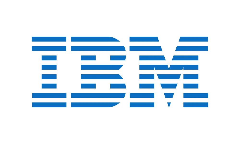
In 1972, legendary graphic designer Paul Rand was tasked with redesigning the logo for IBM. Until then, IBM had utilised a more literal logo that spelt “International Business Machines” in a serif font.
Rand's redesign took a radically different approach – simplifying the logo to the three letters “IBM” in a bold, sans-serif typeface. But the artistic use of alternating blue and white horizontal stripes made the new logo iconic.
The stripes evoked images of speed and dynamism, representing IBM's forward-thinking approach to technology. At the same time, the balanced arrangement and consistency of the lines also conveyed stability and reliability. This combination of traits perfectly encapsulated the IBM brand.
The redesign was an unmitigated success. Rand's IBM logo became one of the most recognisable corporate symbols in the world. It demonstrated that simplicity and minimalism did not have to come across as dull or generic. With thoughtful colour choices and graphic elements, Rand could imbue the three letters with energy and character.
The logo has stood the test of time over the past 50 years, though it has gone through subtle updates here and there. Paul Rand's artistic vision for the IBM brand continues to leave a lasting legacy. His IBM logo epitomises that clean, impactful design does not preclude boldness and originality when crafted by a masterful designer.
7 – Mercedes-Benz: The Three-Pointed Star of Luxury

The iconic Mercedes-Benz logo has become synonymous with luxury and innovation in the automotive industry. The distinctive three-pointed star enclosed within a circle was first introduced in 1909 and was inspired by a postcard founder Gottlieb Daimler sent of his 1885 Benz patent motorcar.
The three points of the star represented Mercedes-Benz's stated goal at the time to achieve dominance in land, sea, and air transportation. On the ground, the company's high-performance vehicles were designed for superior driving comfort and safety. At sea, Mercedes-Benz manufactured reliable marine engines to power boats and ships. And in the air, the brand was pioneering new aviation engines used in airships and aircraft.
Over the decades, the essential elements of the logo have remained unchanged, with only slight modifications to modernise its appearance. The circle represents the brand's quest for global success and universal appeal. And the star emblem pays homage to the company's origins while projecting a vision of limitless possibility shaped by technological innovation.
Today, the Mercedes-Benz logo is instantly recognisable worldwide as a symbol of prestige, luxury, and cutting-edge engineering. Its graceful simplicity evokes a sense of sophistication and timeless style. The Tristar logo has represented the brand's commitment to excellence and iconic standing within the automotive industry for over a century. It exudes an aura of ambition, achievement, and supreme quality that continues to captivate consumers globally.
8 – Chanel: The Interlocked C's of Timeless Fashion

The iconic interlocked double ‘C' logo of Coco Chanel has become one of the most recognisable emblems in fashion history. Introduced in the 1920s during the height of Chanel's influence as a pioneering designer, the logo's simplicity and elegance mirror her groundbreaking minimalist aesthetic.
The two interlaced Cs are a creative yet understated representation of Coco's name, formed by the graceful overlap of the curves. The symmetrical shape reflects the precision and refinement for which Chanel's styles became renowned. Devoid of extraneous decoration, the logo evokes her philosophy of creating clothing based on clean lines, graceful silhouettes, and functional details.
Over the decades, the double C has evolved into a symbol of the House of Chanel's pursuit of timeless sophistication. Its repetitive geometry hints at the endless variations Chanel brought to her signature tweed suit and the Little Black Dress. The crisscrossing lines reference the quilted chains and textures that added a refined edge to her designs.
From its humble origins to its iconic status, Coco Chanel's interlocked C logo encapsulates the revolutionary but classically elegant aesthetic she introduced to modern fashion. Its simple graphic lines contain multitudes – the spirit of the flapper age, women's liberation, and a chic conceptualisation that continues to endure as her most lasting legacy.
9 – Volkswagen: An Emblem of Timelessness

Volkswagen's iconic logo is a shining example of how minimalist design principles can create a brand identity that stands the test of time. This deceptively simple logo features two letters – a bold black “V” overlapping a slim “W” – enclosed within a light blue circle. The logo's uncomplicated yet thoughtful design speaks to Volkswagen's engineering philosophy of stripping away complexity to deliver quality vehicles, emphasising reliability and functionality.
The logo's minimalist aesthetic allows it to remain recognisable and impactful across decades and various applications, from glossy magazine ads to the grilles of its cars. The balanced use of colour, space, and line creates an enduring visual signature. Whether emblazoned on a billboard or keychain, the logo's clean lines and thoughtful use of negative space help it maintain its bold presence.
This less-is-more approach to the Volkswagen logo aligns with the company's early history in 1930s Germany when the “People's Car” was developed as an affordable, no-frills automobile for the everyday driver. The logo became an iconic piece of this branding vision. To this day, its straightforward but thoughtful design continues to reflect the company's commitment to stripped-down quality.
While trends come and go, Volkswagen's minimalist logo remains timelessly current. The logo exemplifies how a streamlined design can create instant recognition and visual longevity. As Volkswagen continues evolving as a company, its iconic circular logo persists as a masterclass in effective branding through simplicity.
10 – Amazon: From A to Z with a Smile

At first glance, Amazon's logo appears deceptively simple – just the company's name in black text with a curved arrow connecting the letters A and Z. But this minimalist design conveys a more profound meaning about Amazon's brand values and customer commitment.
The arrow doubling as a smile represents Amazon's dedication to providing a satisfying, even joyful, shopping experience from start to finish. It symbolises their promise that customers can find whatever they need – from A to Z – on Amazon's vast online marketplace. The arrow also suggests swiftness and precision, reflecting how Amazon delivers purchases promptly and accurately.
By using such an understated logo, Amazon makes its mark instantly recognisable across various mediums and platforms. The clean lines and hidden symbolism demonstrate how powerful simplicity can be in logo design. Amazon does not need flashy graphics to get its message across. The humble arrow conveys it all.
This strategic minimalism allows the logo to remain iconic yet versatile, adapting seamlessly to websites, delivery boxes, app icons and more. Customers never have to second-guess that smiling arrow, which builds immense brand loyalty for Amazon. So while it may seem basic at first glance, Amazon's logo contains creative insight into presenting a brand as familiar and all-encompassing. The subtle arrow achieves what verbose slogans cannot – it makes Amazon feel like the world's most customer-centric company.
The Psychology of Simplicity: Why Less is More
The appeal of simple logos goes beyond aesthetics—it taps into the psychology of perception and memory. Human brains are wired to recognise patterns and conserve energy by processing information efficiently. As a result, minimalist logos are easier to remember and recognise.
Simplicity also fosters a sense of trust and clarity. A cluttered or intricate logo can lead to confusion, whereas a simple design immediately communicates the brand's identity. Additionally, the absence of distractions allows viewers to focus on the core message a brand wants to convey.
The Impact of Simple Logos on Brand Identity
A logo is the cornerstone of a brand's identity, serving as the visual representation of its values, products, and ethos. The simplicity of a logo can significantly influence a brand's perception and reception.
Brand Recognition: Simple logos are more memorable, enabling consumers to recognise and recall the brand more easily. This recognition becomes a powerful asset in a competitive market.
Versatility: Minimalistic logos are adaptable across various mediums and sizes. A simple logo remains clear and recognisable on a billboard or a mobile screen.
Timelessness: Trends come and go, but simplicity endures. A minimalist logo is less likely to become outdated, allowing the brand to maintain relevance over time.
Global Appeal: Simplicity transcends language barriers and cultural differences. A simple logo can communicate its message globally without the need for translation.
Lessons for Aspiring Designers: Embracing Simplicity
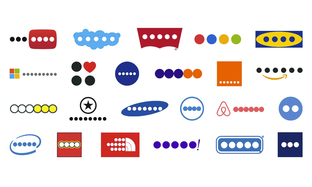
Aspiring logo designers can draw valuable lessons from the success of these iconic logos:
- Understand the Brand: Before designing, immerse yourself in the brand's values, mission, and target audience. A simple logo must encapsulate the brand's essence.
- Capture the Essence: Focus on the core identity of the brand. A simple logo should communicate the brand's message with clarity and precision.
- Less is More: Avoid unnecessary details that can clutter the design. Prioritise elements that contribute to the overall message.
- Versatility Matters: Test the logo's adaptability across various mediums and sizes. A versatile design ensures consistency in branding.
- Longevity over Trends: Trends come and go, but a simple logo stands the test of time. Aim for a plan that remains relevant for years to come.
The Enduring Legacy of Simplicity
In a world saturated with information and stimuli, the power of simplicity shines brighter than ever. The top 10 simplest logos discussed in this article have demonstrated the profound impact of minimalistic design on brand identity and recognition. These logos have transcended time, culture, and technological advancements, leaving an indelible mark on the business landscape.
Aspiring designers can draw inspiration from these logos, using them as guiding lights in their creative journey. Distinguishing complex concepts into simple, iconic symbols is a hallmark of true design mastery. The evolution of logo design continues, but the legacy of simplicity remains steadfast, a reminder that in the pursuit of visual communication, sometimes, less truly is more.
