Optimising Page Layout Design for Better UX
Creating a practical page layout is crucial for any website or publication. The layout directly impacts how easy and engaging your content is to read and navigate. Optimising your page design requires considering multiple factors, from typography and whitespace to grid systems and responsive design. This comprehensive guide will provide fundamental principles, strategies and tips to optimise your page layouts for enhanced usability and aesthetics.
Table of Contents
Establishing a Grid Foundation

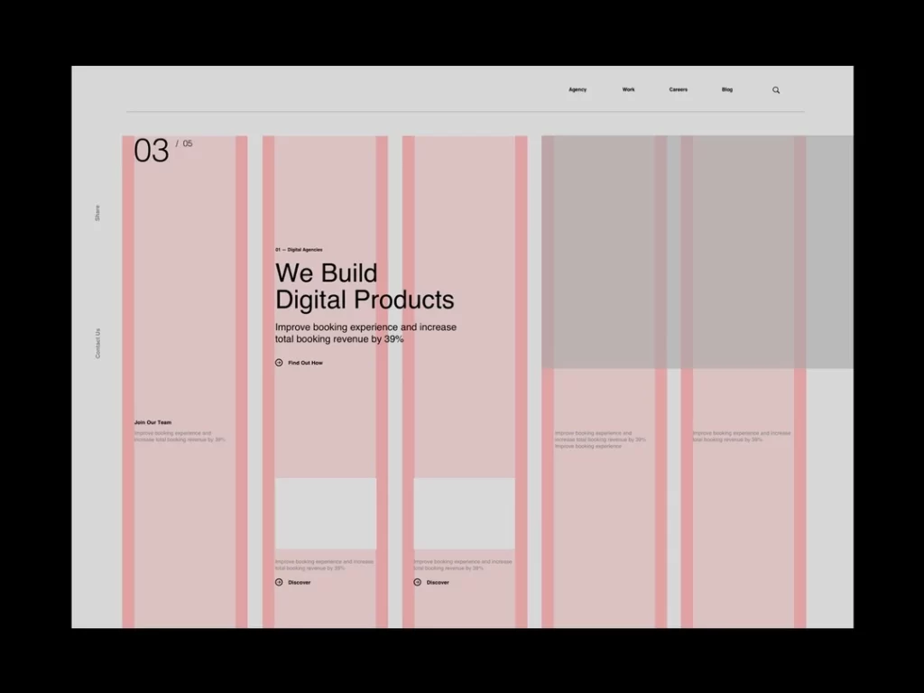
A grid system provides an underlying structure and consistency for page layouts. Setting up a solid grid foundation is one of the most critical steps in optimising page design. Grids establish alignments, proportions and spacing to organise content logically and flexibly.
Benefits of Using a Grid
- Creates visual harmony and order to layouts
- Provides a consistent structure for positioning elements
- Enables flexibility to display content in different arrangements
- Defines hierarchical zones for headings, body text, sidebars, etc
- Allows for responsive design and adapting layouts across devices
Grid Options
- Columns – Most grids use columns to divide up the page horizontally. Common column counts are 12, 16 or 24. More columns provide greater flexibility.
- Modules – Modules are divisions within the grid columns, e.g. main content vs sidebars.
- Rows – Rows split the grid vertically, defining areas for headers, body content, footers, etc.
- Gutters – Gutters are the spaces between column and row divisions, creating margin and breathing room.
Creating a Grid
- Plan grid structure – Define columns, rows, modules and gutters based on content requirements. Balance simplicity and flexibility.
- Map key elements – Determine what elements must fit within the grid (e.g. logo, navigation, headings, featured images, etc).
- Design breakpoints – Create separate grid variations for each layout breakpoint, including desktop, tablet and mobile.
- Develop grid guidelines – Document detailed specifications for the grid to guide designers, e.g. column widths, gutter sizes, and max-content widths.
- Use a grid overlay – Display grid lines or background while designing to adhere to guidelines. Turn off for final designs.
Responsive Grids
To optimise for different devices, grids must adapt across breakpoints. Some ways to achieve responsive grids:
- Fluid columns – Columns resize as a percentage rather than fixed widths
- Wrapping columns – Columns stack vertically on smaller screens
- Changing column numbers – Reduce columns on smaller viewports
- Collapsing modules – Merge sidebar modules into one on a mobile
Grid Tools and Frameworks
Tools like CSS Grid, Bootstrap and Foundation provide pre-made responsive grid frameworks to accelerate development. However, defining your custom grid gives the most control for optimised layouts.
Maximising Whitespace

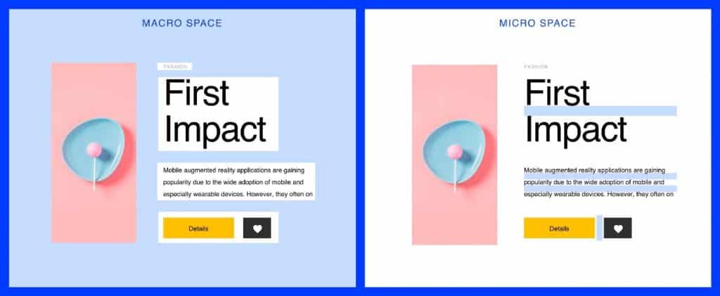
Whitespace, also known as negative space, is the empty area between and around elements on a page. Implementing sufficient whitespace is a fundamental design principle for optimising page layouts.
Benefits of Whitespace
- Directs focus towards important content
- Improves scalability and readability
- Communicates visual hierarchy
- Balances busy and empty areas
- It enables elements to breathe and not feel cramped
Types of Whitespace
- Margins – Space around outside of pages and containers
- Padding – Space between container edges and content
- Line spacing – Space between lines of text and paragraphs
- Breaks – Vertical space between UI components and sections
Using White Space Effectively
- Provide ample margins for page sides and containers
- Increase line height for improved paragraph readability
- Separate sections with breaks using padding and margins
- Use indentation and hangs for chunking long pieces of text
- Employ generous padding around buttons and inputs for touch targets
- Be consistent with whitespace amounts throughout the design
Negative Impacts of Minimal Whitespace
- The content feels cramped and cluttered
- Reduced scannability and increased cognitive load
- Essential elements fail to stand out
- Touch targets hard-to-tap-on mobile devices
- Overall, design aesthetics suffer
Choosing Optimal Typography

Typography refers to text styles, arrangement and appearance in page layouts. Optimising typography improves readability, which enhances user experience.
Typography Elements to Optimise
- Font family – Simple, familiar fonts optimise readability. Sans-serif fonts like Arial work well digitally.
- Font size – Body text should be 16px minimum. Headings at least 24px. Size impacts scannability.
- Line height – 1.5 to 1.8x font size improves readability spacing.
- Line length – 45-90 characters per line. Wider is more challenging to scan.
- Letter spacing – Wider tracking improves scalability for headings.
- Colour – High contrast from the background. Black on white is most readable.
- Paragraph spacing – Add vertical space between paragraphs for better distinction.
- Ragged alignment – Avoid justified text as spacing looks uneven.
Typographic Hierarchy
Establish a clear visual hierarchy for typography by varying styles across headings, subheadings and body text.
Some techniques for creating a hierarchy:
- Size – Increase font size for more essential headings
- Weight – Use bolding strategically rather than all bold text
- Colour – Darker shades draw attention
- Spacing – Increase around headings through padding and breaks
Typography Optimisation Tips
- Limit fonts to 1-2 families with three weights maximum
- Strike a balance between character and line spacing
- be consistent with styles and alignment across all text
- Use bullet lists for scannability rather than big paragraphs
- Avoid text over images, as contrast suffers
- Enable responsive font sizes for smaller mobile screens.
Crafting Scannable Layout Content

Optimising content layout for web scanning behaviour improves the findability and consumption of information.
How People Scan Online Content
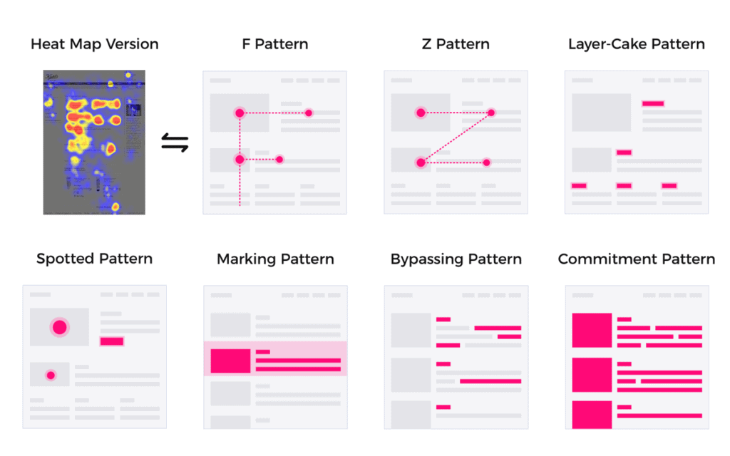
To ingest content quickly, users skim web pages rather than reading word for word to consume content quickly. Their eyes follow an F-shaped pattern:
- Horizontal – Scan heading and text start
- Vertical – Scroll down left rail scanning subheads
- Horizontal again – Scan content in the first paragraphs
Optimising for Scanning
Structure and format content to align with natural scanning behaviour:
- Use clear, descriptive headings and subheadings
- Highlight keywords and critical sections
- Write concise paragraphs and sentences
- Use bulleted lists for quick facts
- Include ample line spacing and breaks
- Left align text for easy flow
- Chunk long-form text into smaller sections
- Position important info higher up the page
- Keep related content together in columns
Signs of Poor Scannability
- Walls of dense text without visual breaks
- Long, unbroken paragraphs and narrow columns
- Justified text with uneven word spacing
- Low contrast between text and background
- Text overlaid on busy image backgrounds
- Unclear flow between sections
- Excessive scrolling is required to find info
Best Practices for Long-form Content
Additional optimisation helps facilitate user scanning and reading comprehension for pages with lengthy content.
Include a Clear Introductory Summary
Briefly summarise what the article will cover to aid scanning and anchor understanding. Use it to highlight critical points upfront and provide context for the following details.
Structure Content with Well-written Subheadings
Divide long pages into distinct sections using concise, descriptive subheadings. Subheads make key points stand out and break up dense text.
Chunk Content into Smaller Paragraphs
Paragraphs of 3-5 sentences are most scannable and readable online. Break up any large blocks of text accordingly.
Use Numbered or Bulleted Lists
Present any lists of facts, steps, pros/cons, etc, in bullet point rather than paragraph format for better scalability.
Insert Effective Visual Aids
Illustrative pictures, graphs, charts and tables distil complex data into easily digestible formats. But don’t overdo it.
Include Margins and White Space
White space improves scannability. Leave ample margins around the text and increase spacing between sections.
Use Text Styling for Emphasis
Bold and italics selectively highlight critical names, terms, or numbers within paragraphs.
Provide Clear Navigation
Navigation links help orient users and allow skipping around lengthy pages. Provide “Back to Top” links for longer articles.
Enable Reader View Mode
Include a control to switch to a simplified reading view, removing distractions and optimising typography for sustained reading.
Crafting Engaging Layout Content

Beyond scannability and readability, layouts should be designed to engage readers and convey information effectively.
Principles for Engaging Page Content
- Establish narrative flow and logical ordering
- Use transitions between sections
- Write conversational content in plain language
- Add some personality and brand voice
- Include rhetorical questions and thoughts
- Vary tone and sentence structure
- Use active voice with subject-verb ordering
- Avoid excessive passive voice and nominalisations
- Implement analogies and metaphors for complex topics
Ways to Improve Engagement
- Appeal to self-interest – Communicate the relevance and benefits of content to the reader upfront.
- Add supporting details and anecdotes – Support points with concrete facts, examples and stories for credibility.
- Use visual aids – Illustrations, charts and diagrams reinforce and enrich complex information.
- Include surprising facts – Intriguing facts and statistics that engage readers. But don't overdo it.
- Feature people and emotion – Discussing people makes content more relatable and memorable.
- Use comparisons – Compare concepts to more familiar ones and reference cultural examples readers know.
- Ask questions – Posing interesting questions encourages readers to think more deeply about topics.
- Provide clear takeaways – Summarise key learnings and include call-to-action steps when applicable.
Optimising Layouts for User Focus
Specific page layout strategies help grab and direct user attention towards key content and call to action.
Content Hierarchy Techniques
- Visual prominence – Use size, colour, and spacing to make some content stand out
- Positioning – Place essential elements higher up the page where attention goes first
- Divided attention – Use complementary sidebars for secondary information
- Progressive disclosure – Reveal content gradually as the user interacts
- Visual flow – Use alignment, repetition and proximity to direct focus
- Emphasis – Establish a clear visual hierarchy of headings and text
- Negative space – Surround key content with breathing room
- Colour contrast – Ensure high contrast between foreground text and background
- Decluttering – Remove unnecessary elements that distract and compete
Guiding the User Journey
Layout guides users towards conversion goals via:
- Clear, concise, descriptive text labels
- Prominent calls-to-action buttons and links
- Direction symbols, icons and illustration
- Breadcrumbs and wayfinding menus
- Effective use of whitespace to direct gaze
- Strong information hierarchy and flow
- Highlighting important user steps
Testing with Heatmaps
View aggregated heatmaps of eye-tracking data on prototypes to identify weaknesses and optimise page designs to capture user attention in the right areas.
Achieving Aesthetically Pleasing Layouts

Beyond functionality, optimised page layouts also exhibit robust visual design and aesthetics.
Visual Design Principles
- Unity – Cohesive design with consistent styles and alignment
- Balance – Equal distribution of visual weight across the layout
- Contrast – Variations in colour, size and style add interest
- Scale and proportion – Elements relate logically in size and spacing
- Dominance and emphasis – Certain elements draw attention over others
- Similarity – Visual linking of related UI components
- Repetition – Repeat visual motifs and patterns for coherence
Layout Composition Tips
- Use odd numbers of elements and asymmetrical balance
- Align elements along a baseline grid
- Frame key content within negative space
- Combine complementary fonts and colour palettes
- Layer graphical and textual elements thoughtfully
- Follow Gestalt principles of perception
- Use directional lines and shapes to lead the eye
- Employ the rule of thirds for focal points
Mood and Emotion
The colour palette, typography, imagery, and spacing affect the mood, tone, and emotions the page layouts communicate. Consider the desired feelings you want to evoke in users from layout aesthetics.
Optimising Page Layouts for Print
Print media has different requirements for optimising page layouts compared to digital displays.
Allowances for Print Layout
- Higher resolution and dpi for printed output
- Bleed for objects extending past the page edge
- Inside margin space for bookbinding
- Specify colours using CMYK rather than RGB
- Flatten transparency layers
- Convert fonts to outlines
- Rasterize vector graphics for predictable rendering
Print-Specific Layout Tips
- Choose paper size, orientation and binding method
- Limit fonts and typography styles
- Use master pages for multi-page consistency
- Allow adequate margins for easier handling
- Specify crop marks and registration info
- Add printer's marks for quality control checks
- Include bleeds, trim marks and safety lines
- Output as high-quality PDF ready for print
- Use tools like Adobe InDesign optimised for print design
Key Page Layout Optimisation Takeaways
- Establish a structured grid foundation for consistency
- Maximise whitespace for improved scalability
- Optimise typography for readability and hierarchy
- Craft content for easy online scanning
- Engage users with compelling text and visuals
- Direct focus on critical elements via layout techniques
- Apply visual design principles for aesthetics
- Adapt layouts for the medium, whether digital screens or print
By considering these various facets of page layout optimisation, you can deliver the best user experience and effectively communicate information through improved findability, readability, aesthetics and engagement. Keep iterating designs based on user testing data to further optimise page layouts. A/B test layout variations and continue refining to meet user needs best.
Page Layout Design FAQs
Here are answers to common questions about optimising page layout design:
What are some typical page layout software options?
Popular tools include Adobe InDesign for print, Adobe XD, Figma and Sketch for web/apps, and WordPress for content management sites.
How many columns should I use in a grid system?
Columns between 8-12 offer a good balance of flexibility without excessive complexity in most cases.
What font size should be used for body text?
Aim for a 16px minimum font size for body text according to web accessibility standards.
What line height is optimal for readability?
Use a line height between 1.5 and 1.8 times the font size. More considerable line heights improve readability.
What should the maximum line length be?
Limit lines to 75-90 characters maximum for optimal reading flow. Wider causes strain.
How much whitespace should be used?
There are no set rules but aim for margins of 1.5-2rem and line spacing around 1.5-2x font size as starting points.
How do you create a solid visual hierarchy in layouts?
Vary font size, weight, colour, and spacing to distinguish different levels of headings from body text.
