An In-Depth Look at Colour Theory
Colour theory is the art and science of using colour effectively. It guides colour mixing and how colours can work together harmoniously. Understanding colour theory allows artists, interior designers, web designers, and others to make informed decisions about colour use.
At its most basic level, colour theory examines how colours interact and the visual impacts of colour combinations. It looks at the colour wheel and harmonies like complementary, analogous, triadic, and split-complementary. It also explores concepts like shade, tint and tone.
Table of Contents
Defining Primary, Secondary and Tertiary Colours
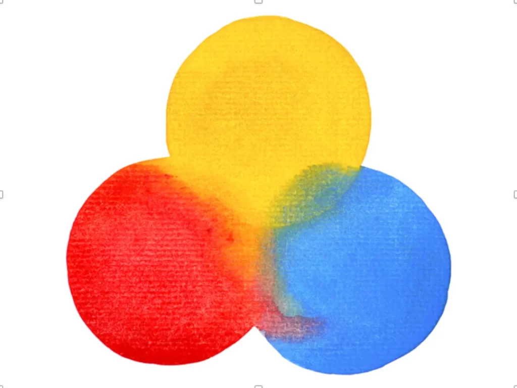
The primary colours are red, yellow and blue. These can't be created by mixing other colours, but when combined, they make the secondary colours of orange, green and purple. Mix primary and secondary shades, and you get the tertiary colours: red-orange, yellow-orange, yellow-green, blue-green, blue-purple and red-purple.
Key Takeaways:
- The primary colours are red, yellow and blue
- The secondary colours are orange, green and purple
- Tertiary colours are mixes of primary and secondary shades
Understanding the interplay between these colours is fundamental to applying colour theory principles.
Colour Properties
Before diving further into colour combinations, it's important to review key characteristics of colour. These properties provide vital information for working with colour effectively.
Hue
Hue refers to a colour's position on the colour wheel. It indicates the pigment of a colour, differentiating a red from a green or a yellow. Hue is what gives a colour its fundamental identity.
Critical Notes on Hue:
- Hue indicates a colour's position on the colour wheel
- It gives a colour its essential identity, differentiating red from green
- Knowing hue allows accurate colour mixing and identification
Value
The value indicates the lightness or darkness of a colour. It distinguishes light, medium and dark variations. Value becomes essential in creating colour harmony and contrast.
Things to Remember About Value:
- The value defines the lightness/darkness of a colour
- Allows adjustments from light to medium to dark shades
- Essential for establishing colour contrast
Saturation
Saturation refers to the intensity or purity of a colour. It defines how bright or dull a colour appears. Fully saturated colours contain only one hue, while less saturated colours have some grey.
Notable Aspects of Saturation:
- Refers to the intensity/purity of a colour
- Defines colours as bright or dull
- Grey is added to hues to reduce saturation
- Vibrant colours like neon tend to be highly saturated
Temperature
Temperature indicates whether a colour appears warm or cool. Warm colours like red, orange and yellow evoke heat or passion. Cool colours like blue, green and purple feel calm or tranquil. Using colour temperature helps stir specific emotions.
Warm Colours:
- Red
- Orange
- Yellow
Cool Colours:
- Blue
- Green
- Purple
Critical Notes on Temperature:
- Warm colours evoke heat, passion
- Cool colours feel calm and tranquil
- Temperature conveys emotions based on associations
Colour Schemes and Harmonies
Various colour schemes and harmonies combine colours following specific guidelines. These palettes create aesthetically pleasing mixes that work well together.
Colour schemes provide harmonious guidance, but breaking “rules” can lead to striking results. Creative tension and purposeful contrast also produce visually compelling palettes.
Below, we analyse essential colour scheme types artists and designers regularly utilise.
Complementary Colours

Complementary colours sit opposite each other on the colour wheel, emphasising contrast. Common complementary pairs include red/green, blue/orange and yellow/purple. When combined, they create solid visual tension by accentuating their differences.
Placing complementary colours near each other intensifies both, making them appear more vibrant. Complementary colours also balance one another, producing stability within a composition.
Critical Notes on Complementary Colours:
- Sit opposite each other on the colour wheel
- Create strong contrast
- Intensify and balance one another
- Offer great flexibility for vibrant palettes
Analogous Colours
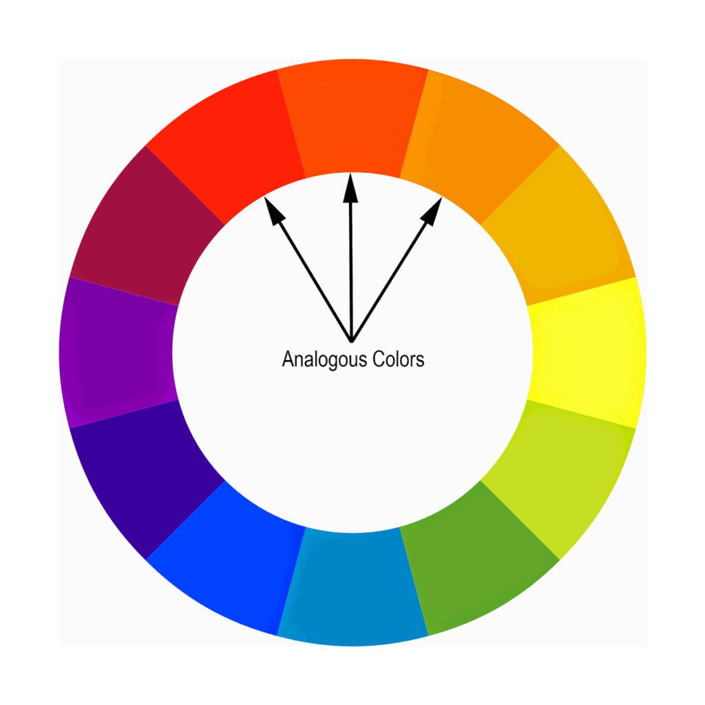
Analogous colours sit beside each other on the colour wheel, emphasising harmony. They commonly number three or five hues, blending seamlessly.
Analogous harmonies create comfortable, soothing combinations. While they lack contrast, inserting an accent colour like yellow creates the contrast needed for enhanced focal points.
Helpful Information on Analogous Colours:
- Sit side-by-side on the colour wheel
- Offer harmony through limited hue variation
- Work well for backgrounds
- Insert accent colours to increase contrast
Triadic Colours
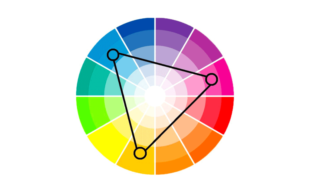
Triadic colour harmonies utilise colours spaced evenly around the colour wheel. This commonly involves triangle-like combinations featuring a primary, secondary and tertiary colour.
The balance and contrast within triadic harmonies create visual interest without the extremes of complementary colours. Triadic palettes offer great versatility across many applications.
Key Triadic Colour Facts:
- Spaced evenly around the colour wheel
- Often comprise primary, secondary and tertiary colours
- Offer contrast without the visual tensions of complements
- Versatile for many design solutions
Tetradic (Double Complementary) Colours

Tetradic harmonies combine two sets of complementary colours, utilising four hues. This creates vibrant colour combinations with intense visual contrast.
Double complementary, tetradic harmonies bring great colour richness. But the contrast can be jarring if not appropriately balanced. Hue variations should share equal visual weight.
Tetradic Colours Overview:
- Combine two complementary colour pairs
- Enable vibrant, high-contrast palettes
- Contrast risks being too extreme if unbalanced
- Managing contrast levels is key
Split-Complementary Colours

The split-complementary scheme offers the contrast of complementary colours while softening tensions. It pairs a base colour with the two hues adjacent to its complement. This retains colour richness but with fewer extremes.
Basing schemes off one dominant colour plus split complements create the focal strength of a critical hue without overpowering contrast. Vibrance stems from colour diversity, not opposition.
Split-Complementary Colours Notes:
- Combines a colour with hues adjacent to its complement
- Provides contrast while limiting tensions
- Intense focal colour without overpowering extremes
- Vibrance through diversity rather than opposition
Monochromatic Colours

Monochromatic schemes utilise a single base hue, offering numerous shades, saturation and tint variations. Without contrasting hues, interest derives from value and temperature differences.
Monochromatic harmonies let a dominant colour shine. However, adding complementary tones allows monotonous visuals to have a slight colour variation.
Things to Keep in Mind Regarding Monochromatic Colours:
- Single hue with value/saturation/tint variations
- Dominant colour shines without competition
- It can appear monotonous without colour contrast
- Add complements to bolster interest
Achromatic Colours
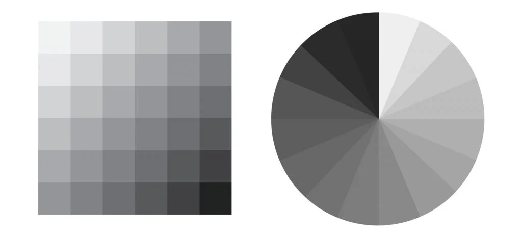
Achromatic colour schemes lack hue completely, employing only black, white and grey tones. Contrast stems from gradations in value, taking attention away from colour itself.
Achromatic palettes create bold, high-contrast visuals through sharp value shifts. Small colour accents can dramatically punctuate predominantly greyscale schemes.
Essential Achromatic Colour Knowledge:
- Devoid of hue, utilising only blacks, whites and greys
- Interest through dramatic tonal contrast
- Bold high-key and low-key chiaroscuro effects
- Colour accents dramatically stand out
Colour Context
Colour associations stem from biological, cultural and personal factors. Colours take on symbolic meanings through learned connections over time. Context impacts colour interpretation, eliciting emotional responses.
Some Common Colour Association Examples:
- Red: Love, warmth, danger
- Yellow: Happiness, positivity, warning
- Blue: Calm, trust, sadness
- Green: Nature, growth, envy
- Purple: Creativity, spirituality, nostalgia
Context characterisation examples:
- Bright red lipstick signifies glamour
- Camouflage green conveys military
- Hospital blues promoting sterility
- Cheerful yellow evokes optimism
Colours gain meaning through learned associations. Effective colour palettes require understanding contextual impacts on audience interpretation.
Mixing Colours
Learning colour mixing fundamentals allows artists to create required hues that are custom-made. Mixing relies on understanding primary colour combinations and the colour wheel.
A Blue + B Yellow Makes Green.

Critical Facts About Colour Mixing:
- Combines primary pigments to form new hues
- The colour wheel depicts mixing possibilities
- Light vs. pigment mixing follows different rules
- Digital software provides advanced options
Additive mixing utilises light. Combining all hues produces white. Computer screens use this RGB (red, green, blue light) colour model.
Subtractive mixing employs physical pigments. Combining all hues results in black. Painting utilises the RYB (red, yellow, blue pigment) colour model.
Light/Pigment Key Differences:
- Additive (RGB) mixing produces white
- Subtractive (RYB) mixing produces black
- Digital displays follow additive principles
- Painting follows subtractive principles
Understanding these models solves problems like monitors not matching print colour output. The intended medium determines the optimal mixing approach.
Colour and Composition
Beyond colour theory knowledge alone, effectively applying colour to communicate visually further involves compositional principles. Colour impacts focal points, movement, contrast and visual flow.
Noteworthy Colour Composition Factors:
- Defines emphasis through contrast
- Directs movement and eye flow
- Balances elements evenly or asymmetrically
- Aligns with light source interpretation
Colour Composition Examples
This magazine layout utilises strong complementary colour contrast between the red title text and green background to draw attention. The saturated colours also create vibrancy.
The analogous blue and purple hues in this poster composition promote visual harmony. Tiny complementary orange accents in the graphic icons provide contrast to add visual interest.
Proper colour application involves understanding colour harmonies and how colour impacts composition through contrast, movement, hierarchy, balance and other principles.
Psychology of Colour Perception
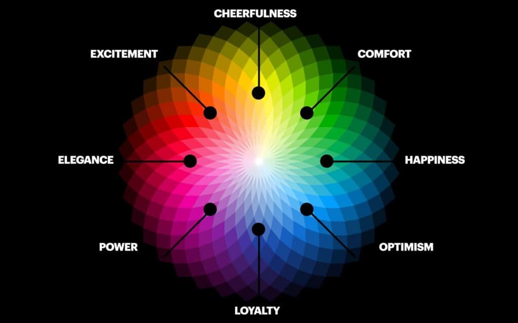
The psychology of colour examines how colour influences emotion and behaviour. Colours can deliberately guide attitudes, or skewed colour use can negatively impact audiences.
Colour Psychology Factors:
- Associations trigger emotional reactions.
- Impacts moods, feelings, behaviours
- Influences perceptions and preferences
- Guides judgement and decision-making
For example, blue packaging conveys reliability and trust. Using blue instead could harm perceptions of luxury or excitement. Design psychology requires planning contexts appropriately.
Common Psychological Colour Impacts:
- Blue = Trusted, dependable
- Black = Powerful, sophisticated
- Red = Passionate, aggressive
- Yellow = Happy, energetic
- Green = Natural, peaceful
Understanding colour psychology allows the purposeful targeting of emotional responses to influence human behaviour through strategic colour application effectively.
Terminology Glossary
Many vital terms appear across colour theory and its practice. Below, we clearly define essential colour vocabulary for reference:
Chroma: Colourfulness relative to a neutral grey with the same lightness
Value: Relative lightness or darkness of a colour
Hue: Pigment characterising a colour by wavelength
Shade: Dark value of a colour created by adding black
Tint: Light value of a colour produced by adding white
Primary Colours: Red, yellow and blue pigments which mix to form all other hues
Secondary Colours: Orange, green and purple pigments made by mixing two primary colours
Tertiary Colours: Intermediate shades between primary and secondary colours
Saturation: Intensity and purity of a colour's hue
Warm Colours: Colours evoking warmth – red, yellow, orange
Cool Colours: Colours evoking coolness – blue, purple, green
Complementary Colours: Colour pairs located opposite each other on the colour wheel
Analogous Colours: Set of colours situated side-by-side on the colour wheel
Monochromatic: Containing only one hue but with value and saturation variations
Achromatic: Containing no shade, only neutral black, white and grey tones
Conclusion
Understanding and applying colour theory enables the strategic use of colour to produce aesthetically pleasing and practical visual solutions across many creative domains, products and experiences.
With foundations like the colour wheel and essential colour properties firmly grasped, exploring harmonies leads to impactful colour palettes suiting projects' contextual needs and goals.
Extending theory into practical application requires considering harmonies and interplays with composition and colour psychology. Scheme knowledge does little without skilled and purposeful implementation.
Fully utilising colour's potential involves comprehensively understanding its core tenets and how to strategically apply this visual element powerfully and responsibly to captivate audiences and achieve defined objectives.
So, dive deeper into colour's intricacies and broaden the scope to see colour working within full compositions. Creative breakthroughs and emotional connections await through mastery of colour.
Colour Theory FAQs
Here are some common colour theory questions:
What are the primary colour schemes?
The most popular harmonies include complementary (contrasting), analogous (adjacent), triadic, tetradic (two complement pairs), split-complementary, monochromatic and achromatic schemes.
How are colours mixed?
Using the additive RGB model, combining coloured lights creates white. With subtractive RYB mixing, combining pigments makes black. Digital and print models differ.
How do colours influence emotions?
Colours trigger associations that spark psychological reactions. Blue calms, yellow cheers, red intensifies, and black enhances power. Context impacts interpretation.
What defines warm and cool colours?
Warm colours like red, yellow and orange feel active and remind us of heat/fire. Cool colours like blue, purple and green feel calm and remind of water/ice.
What is colour value?
The value indicates a colour's lightness or darkness. A higher value means lighter. Understanding value allows tonal contrast between hues.
