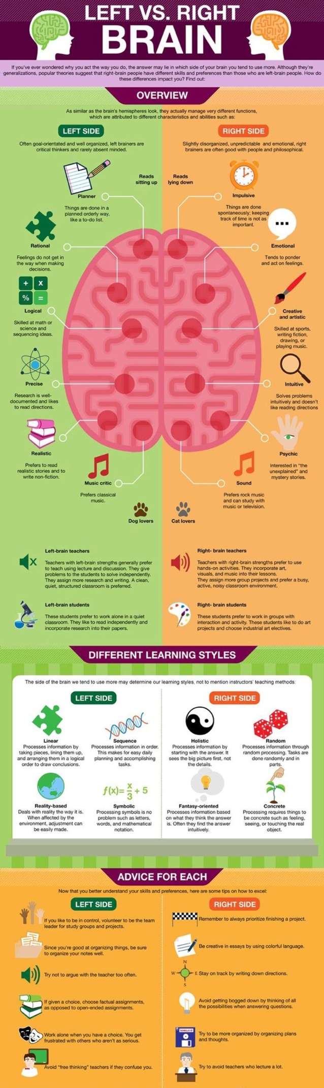
We live in a time that is overrun with data. Businesses that can give their target audience relevant data in an easy-to-understand style have a distinct edge. Producing infographics is one of the greatest methods to attain this aim. Infographics are one of the most common ways to graphically convey and distribute information. Infographics are also graphical representations of complicated facts. They give a pleasant approach to learning more about a specific topic without having to read a lot. Infographics may now be found on a wide range of websites, from news portals to basic blogs.
Creating infographics takes careful consideration. Making a successful infographic necessitates striking a balance between providing enough information and avoiding overload. Visual information is preferred and responded to more favorably by today’s audience than plain text alone. Whether you are selling anything or simply talking about ordinary topics, including an infographic on your site now and then would only help you.
Creating an infographic that is both attractive and effective may appear to be an insurmountable challenge to someone who isn’t a designer, but this is far from the case. Here are some key guidelines for producing effective infographics.
Come up with a great idea
The concept serves as the foundation for your infographic. Begin with a collection of 8–10 ideas. Investigate each to gather material and information about your selected topic, and check if any other infographics have previously covered your concept.
If this is the case, what more information and value can your infographic provide? Your topic should be one in which you are well-versed and could easily be considered an expert. To come up with a concept for your infographic, your marketing, creative, and business teams must collaborate.
Define your goals
If you don’t have a clear aim in mind, your picture will appear unfocused and it doesn’t matter what data visualization tool you are using, something good still won’t appear like magic. Whatever your aim is, it will affect how you present the information in your infographic. An infographic is a type of visual communication that may serve various purposes.
It can:
- provide a summary of a topic
- visualize a process.
- Describe and simplify a complicated procedure
- Data reporting
- Showcase study findings or survey results
- Contrast and compare multiple possibilities
- Employee onboarding
Use the best data
After you’ve settled on your concept, you’ll need to collect the data that your infographic will depict and ensure that the material you collect supports your aim. Your data ought to be original and intriguing, as well as pertinent to your message. Many individuals concentrate exclusively on the design components while producing an infographic. However, if the data utilized isn’t engaging or useful, it won’t matter how nice the infographic appears.
Make certain that your sources are reliable. If you have your data, that’s fantastic. The handiest location is your firm, but you may not have access to (or choose not to utilize) your company’s data on occasion. In such a situation, you have access to a wealth of public data.
Examine the following data sources for ready-to-use data:
• Kaggle

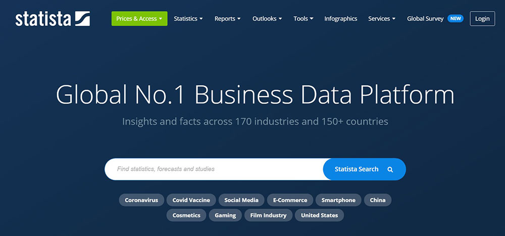
• Statista
• Google Scholar

• AggData

• Pew Research
• Google trends Datastore
• Data Is Plural
• Cool Datasets

Tell an interesting story
Infographics are a form of narrative. All of the facts you select should essentially support and shape your core story. An infographic cannot just be a compilation of interesting data; each component of the infographic must flow logically from one area to the next. Furthermore, any additional material provides value to the primary topic and does not distract the viewer. Create a structure that indicates how this tale will progress.
Keep it simple but stand out

To improve the readability of your infographics, keep the design components constant and basic. Limit the number of typefaces you use, stay to a single style for your visual material, and stick to your color palette.
Choose colors
Color is an effective means of communication. Did you realize that colors account for 85 percent of the reasons consumers buy? Color affects the tone of your infographic. If you utilize too many colors, you may confuse and turn off your viewers. Consider using three basic colors and several shades of each. Keep the aim in mind, as well as the message you wish to convey. You don’t want to use bright and fun colors when discussing a serious issue since they imply joy and enthusiasm. While the mood is solemn, neutral hues will have a calming impact. As a result, selecting the appropriate colors is critical to the success of your infographic.
Pick your test & fonts
Fonts, like colors, must be utilized with caution. Fonts may make or break the readability of your infographic. If you choose the incorrect one, your message will take on a completely different meaning. Consider an infographic to be a visual summary–the text should only be there if it is required to comprehend the key concepts and support the visuals. The correct font selections give your infographic atmosphere and individuality. When producing infographics, choose three or fewer typefaces. For headers and subheadings, use a show or bold font, and then use legible fonts for the rest of the content in the infographic.
Adding images and icons
An infographic with simple text is boring, so add graphics and symbols to liven things up. When it comes to generating infographics visuals, you have a lot of possibilities. Photographs or photo-realistic pictures, as well as illustrative graphics, can be used. There are also infographic creators, vector templates, and other elements accessible for free or at a cost. What pictures and icons you use will rely on your message and the emotional message you want to convey. But keep in mind to avoid overused stock images.
Use negative space

Negative space is as essential as any other design aspect. The portions of the page that do not include any text or pictures are referred to as negative space, also known as whitespace. When pictures and text are grouped too closely together, the viewer is unable to differentiate one element from the next. Everything blends into one jumbled image. To avoid this, allow space around each primary element grouping in your infographic, as well as margins around the edges, spaces between unrelated parts, and so on.
Make it shareable
Now that you’ve completed your infographic and double-checked spelling and information, you’re ready to distribute it. One of the most significant advantages of utilizing infographics is that they can be shared. Because infographics may bring a lot of traffic to your website, you should integrate them into blog posts, optimize them for sharing, and, of course, distribute them on your social channels. Not only do you want to distribute it widely, but you also want to make it easy for others to share it by including a call to action at the bottom of the infographic. Include social sharing buttons for the main social networks, such as Pinterest, Facebook, Twitter, Reddit, and LinkedIn, in your infographic.
A striking infographic may instantly pique your audience’s interest. Infographics based on meaningful facts that convey an engaging story are widely shareable, making them an ideal content vehicle for the social web. Always include your website URL, company logo, and connections to your social networks in the infographic so that people know who produced it.
Making infographics may assist to enhance your brand and increase social shares. Furthermore, infographics assist to establish your expertise in your field. If you overlook any one of these suggestions, your infographic may struggle to flourish. You might wind up with a wonderful infographic but no marketing plan, a gorgeous infographic reflecting a bad idea, or a terrific idea but lousy design work. You’ll have an infographic that everyone wants to share if you follow the recommendations above.
About the Author

Mirko Humbert
Mirko Humbert is the editor-in-chief and main author of Designer Daily and Typography Daily. He is also a graphic designer and the founder of WP Expert.