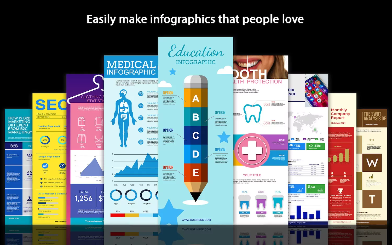
You must plan to make an infographic. Because infographics have become the most effective and popular way of business communication, and one of the most shared and favorite content on social media. Because infographics can not only make you a visual focus but also easy to digest.
And, like everyone else, you voted for “Infographics are one of the best and fastest ways to convey data and information to your audience.”
However, making an infographic is not easy, especially for beginners with no design experience.
Therefore, please take a moment to read the following. Then follow the “11 simple steps to make an infographic” to create your own infographic.
- What is an infographic?
- How to make an infographic in 11 simple steps?
- How to avoid common mistakes in the creation of infographics?
What is an infographic?
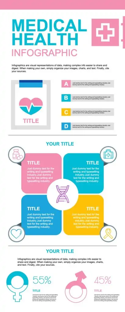
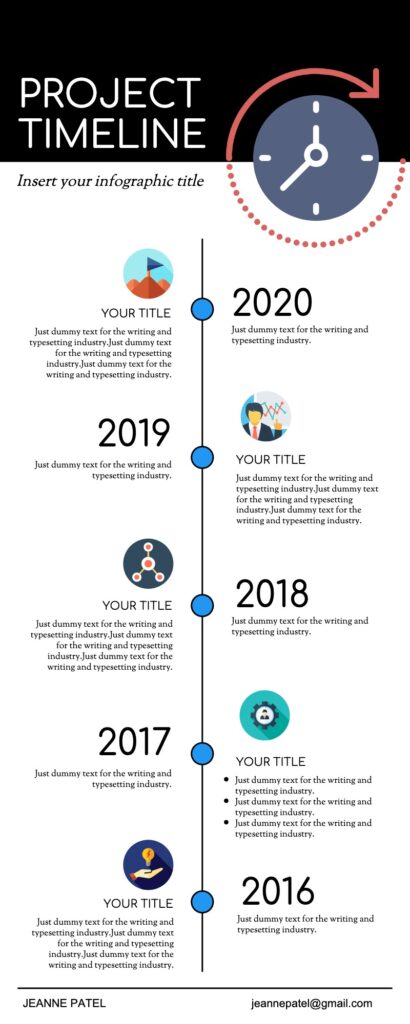
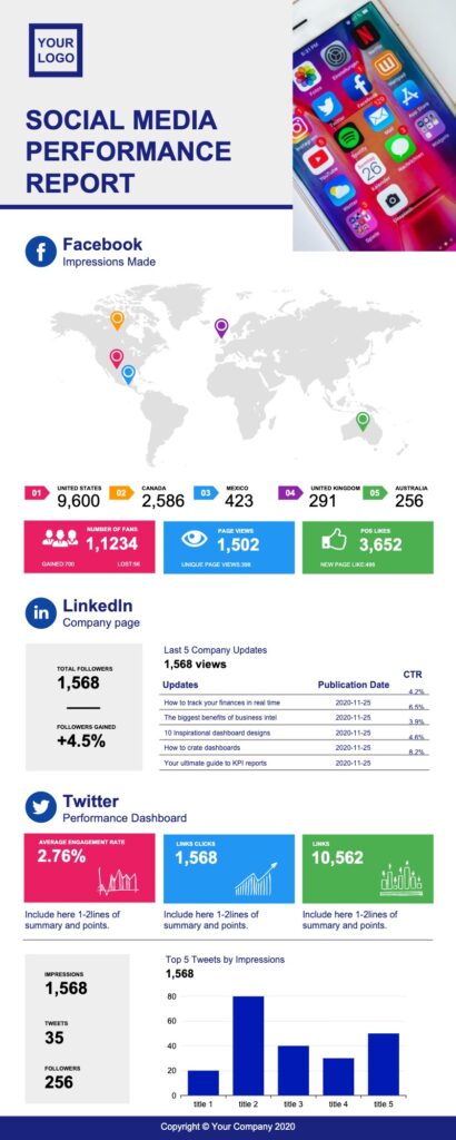
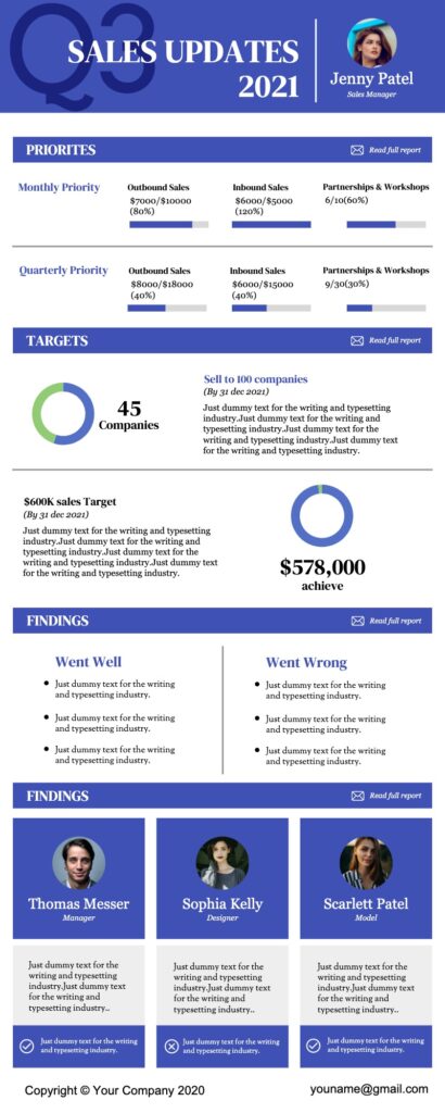
Infographics are graphic visual representations of information, data, or knowledge, designed to present information quickly and clearly.
Infographics have been around for many years. In 1626, Christoph Scheiner published the Rosa Ursina sive Sol, a book that revealed his research about the rotation of the sun. Infographics appeared in the form of illustrations demonstrating the Sun’s rotation patterns. Infographics appeared in the form of illustrations, showing the rotation pattern of the sun. Today, many companies use infographics as a medium for communicating with and attracting potential customers. With the popularity of social media, infographics have become more and more popular.
The three parts of all infographics are vision, content, and knowledge.
Vision consists of colors and graphics. There are two different types of graphic themes and references. Thematic graphics are included in all infographics, and they represent the basic visual representation of the data. Reference graphics are usually icons that can be used to point to certain data, although they are not always found in infographics. Infographics are effective because of their visual elements. Humans get input from all five senses, but compared to the other four senses, they get more information from vision. Through eye-catching colors, graphics, icons, and charts, infographics will draw the attention of readers and make the theme more accessible.
Statistics and facts are often used as the content of infographics and can be obtained from a variety of sources, including census data and news reports.
One of the most important aspects of infographics is that they have some kind of insight into the data presented-this is knowledge.
In addition, when designing an infographic, three basic rules of communication also need to be evaluated, namely attractiveness, understanding, and retention.
Attraction refers to spreading ideas that need to attract an audience. Understanding means that the viewer should be able to easily understand the information presented to them. Finally, “reserved” means that the viewer should remember the data shown in the infographic. The order of importance of these regulations depends on the purpose of the infographic. If an infographic aims to convey information in an unbiased way, for example in academia or science, you should first consider comprehension, then retention, and finally attractiveness. However, if the infographic is used for business purposes, then attractiveness becomes particularly important, followed by retention and understanding.
How to make an infographic in 11 simple steps?
Yes, in any case, what you need urgently is how to create an infographic. However, it is still recommended that you follow the steps below. Because they will help you make amazing infographics easily (not in minutes).
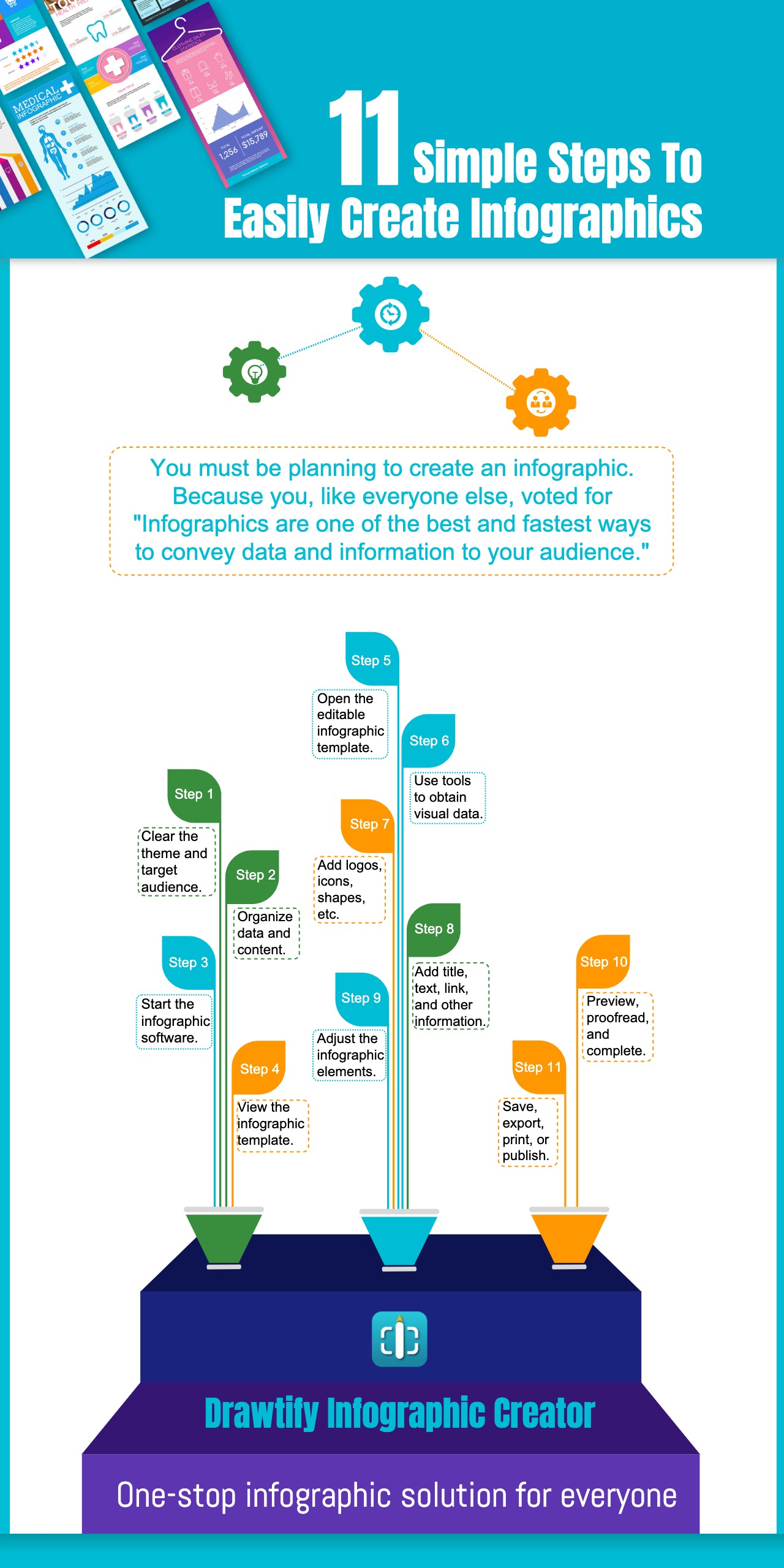
1. Clear the theme and target audience.
It may take some time to determine the topic and target audience. However, the infographic must have a clear theme, and it needs to be used in conjunction with a clear target audience in order to choose the appropriate format, color, etc. of the infographic.
2. Organize data and content to make it absolutely accurate, short, and easy to understand.
Organizing data and content also takes some time. But the infographic must ensure that the data is accurate, the information is short and easy to understand, to ensure that the content is easy to digest.
3. Download the most suitable infographic software and start it.
Although there are many tools that can be used to make infographics, professional infographic software will help everyone, and it is also a guarantee to ensure that the infographic is effective.
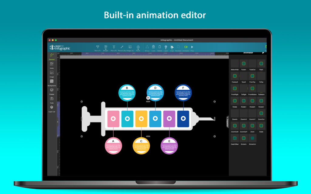
For example, an editor that can easily realize data visualization (including charts, maps, tree diagrams, etc.), a vector editor that can freely draw shapes, a special effect function that can quickly enhance visual effects, a photo editor that can easily optimize images, and a complete And easy-to-use layout functions, etc. Of course, for beginners, rich editable infographic templates and infographic elements and icons are indispensable. Although they can be sold separately on the Internet and support regular office software for editing, it is obviously difficult to obtain excellent Visual effects.
Therefore, choosing a suitable infographic software will be the key to your smooth start of infographic creation. Please take some time to choose and try.
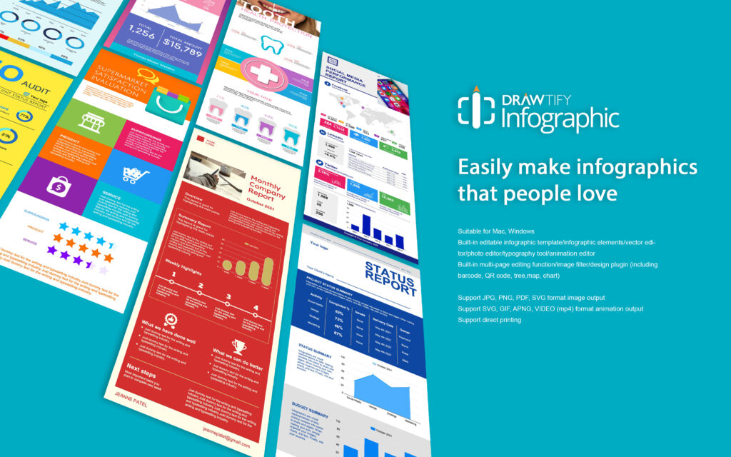
Of course, you can trust Drawtify Infographic Maker. (Infographic Creator: One-stop solution for infographics and presentations). Or log on to the Drawtify website directly, because it is an online graphic design platform that can easily create infographics.
4. View the infographic template to inspire you to determine the format of the infographic.
Whether you are an experienced designer or an inexperienced beginner, looking at the infographic template is worth the time. Because they will help you determine the format, color, etc. of the infographic faster and more accurately.
5. Confirm and open the editable infographic template. Or create a blank file (not recommended for beginners).
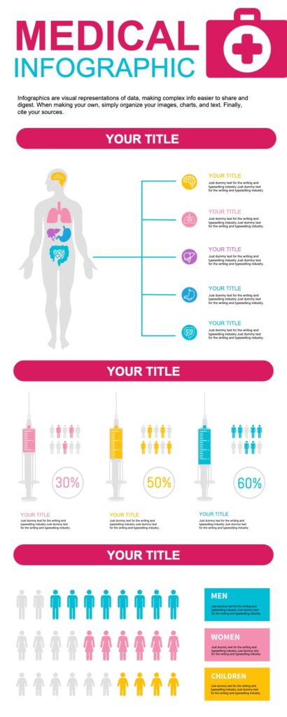
For starters, making an infographic with an editable infographic template is the right choice. It will save you a lot of trial time and guide you to avoid many common mistakes. For example, unsuitable chart format, confusing layout, unmatched icons, unclear fonts, etc.
6. Select a suitable chart format to import data (or modify) to obtain a visual chart.
Basically, software suitable for creating infographics supports data import, but it is particularly important to choose a suitable chart format because it not only affects understanding but may also cause an unreasonable layout. Therefore, it is recommended that beginners use editable infographic templates and infographic elements to modify or import.
7. Add logos, company names (or creators) and appropriate icons (or modify), or draw shapes to enhance reading orientation.
Add logos, company names (or creators) and appropriate icons (or modify), or draw shapes to enhance reading orientation.
If it is a business infographic, then the logo and company name are the basic elements. In addition, the icon is highly concentrated information and has a high degree of recognition. Therefore, the creator of the infographic must choose the appropriate icon based on the content. In addition, one of the most effective techniques for creating infographics is to enhance the readability of infographics with directional shapes, such as arrows.
8. Add (or modify) the title, text, link, and other information, and then select the appropriate font.
The title can usually quickly reflect the topic, and the short text will help you read it in-depth and deepen your understanding. Adding links to specific infographics is essential, but you need to pay attention to the output format. It is worth noting that infographics do not rely on powerful fonts to attract people. Clear, uniform fonts are a better choice.
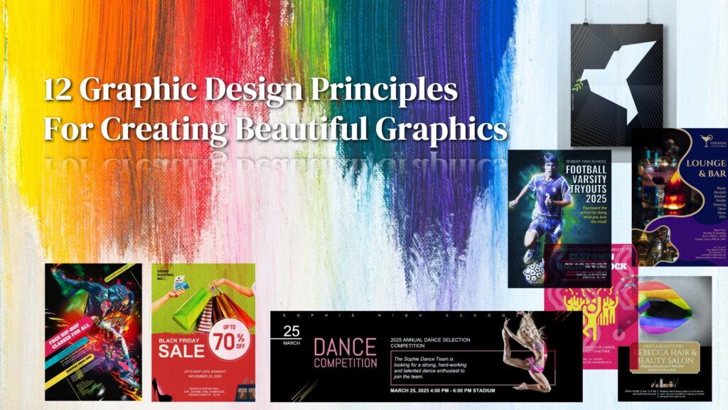
9. Follow the “graphic design principles” in order to get a better visual effect.
As mentioned earlier, infographics are effective because of their visual elements. Therefore, when creating an infographic, you should follow the “graphic design principles” to adjust the color, layout, or add special effects to all elements to ensure that the infographic has a good appeal.
10. Preview, proofread, and complete.
The content of the infographic can be simple, but it must be accurate. Otherwise, its easy-to-understand and easy-to-remember characteristics will become a disaster. Therefore, please carefully check and proofread through the preview after completing the previous steps.
11. Save, choose a suitable format for output, print, or publish to any place.
Please don’t forget to save. Because not all software supports automatic saving. In addition, please select the correct format for output to ensure clarity, suitable for printing and publishing. It is worth mentioning that it is equally important to ensure that it is effective, such as the SVG format that supports built-in links.
How to avoid common mistakes in the creation of infographics?
With the booming development and trend of infographics, almost all storytellers are trying to use infographics to enhance the readability of stories, especially marketers. However, not everyone can produce beautiful and effective infographics.
Remember: the main goal of creating an infographic is to improve the appeal, comprehension, and memory of the story through the infographic. To ensure that you can do this, we will provide reasonable tips on “How to avoid common errors in infographic creation?“
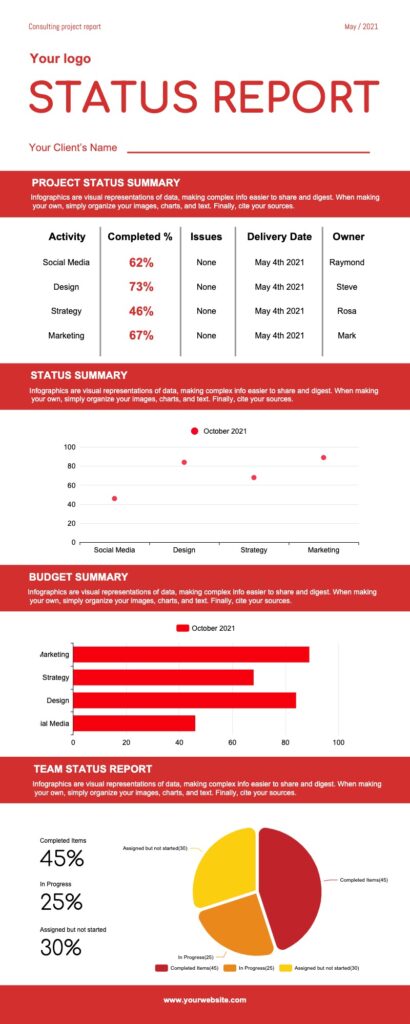
1. Lies or incorrect data visualization (chart style)
Compared with beautiful and effective infographics, wrong data, information distortion and even lies are the most unacceptable. Secondly, wrong chart styles are used, such as pie charts that total more than 100%, histograms with huge data differences, etc. Therefore, you must ensure that the data and information are accurate, and carefully choose the appropriate chart style.
2. Forgotten or boring theme (including titles)
The theme is always the first element of graphic design. As the visual carrier of information, the information map is usually pointed out directly by the title. Forgetting it is unforgivable, and a boring theme will only drown your infographic in the ocean. Therefore, when you start to create an infographic, you need to be clear about the subject and title.
3. Confusing layout
Like other graphic design types, chaotic layouts are unacceptable. For infographics, neatness (including parts) will be more conducive to reading. Therefore, you need to always remind yourself to “make reading easier.”
4. Too crazy colors
Although “crazy colors” may make you an immediate focus. But remember, the infographic tells a complete story. Too crazy colors will inevitably cause visual disturbance and disrupt your planned reading order. Therefore, it is recommended to follow the brand color guidelines and use less than two main colors, plus less than three auxiliary colors or decorative colors.
5. Excessive abuse of typography
Although creating a chart requires highlighting the main heading. But remember: Less is more, and more is nothing. Therefore, when creating a chart, avoid the excessive use of exaggerated fonts.
6. No clear order
The infographic should have a good reading guide. Therefore, the creation of infographics should arrange levels through layout, add guiding shapes, etc.
7. Irrelevant icons
Icons are one of the techniques for information graphics to shorten text messages. But irrelevant icons will only cause confusion in reading. Therefore, infographic creators should choose icons reasonably.
8. Irrelevant pictures (illustrations)
Infographics can use pictures and illustrations. However, like icons, irrelevant pictures or illustrations can also cause confusion in reading. Therefore, infographic creators should choose pictures and illustrations reasonably.
9. Too much text
The most important feature of information graphics is to change the way of reading through visualized data, icons, shapes, pictures, illustrations, etc., to enhance reading comprehension and memory. Therefore, continuing to use too much text will greatly reduce the need to create diagrams.
10. Not proofreading carefully
In fact, any type of graphic design should be carefully proofread to ensure that it is correct. However, because infographics contain large amounts of data, information, etc., they are more prone to errors. Therefore, before completing the infographic, careful proofreading is one of the most important steps.

The Next Chapter For Infographic & Presentation
Drawtify Infographic Maker: One-stop infographic and presentation solution for everyone.
Not only provide exquisite and free infographic templates and presentation templates but also includes full-featured and easy-to-use infographic design software and presentation App.
Therefore, anyone can easily create eye-catching infographics and presentations in one-stop with Drawtify Infographic Creator. And 100% customize any detailed information.

At last
If you are still thinking: how to quickly make an infographic online for free?
Then, please click the link below immediately.