The Evolution of the Volvo Logo: A Design Masterpiece
The Volvo logo is one of the most recognisable symbols in the automotive world. For over 90 years, the iconic Volvo iron mark has represented the brand's core values of safety, reliability and environmental care. When we see those diagonal stripes across a circle, we instantly think of the Swedish automaker. But the Volvo logo is more than just a simple graphic – its journey reflects the company's evolution.
The Volvo story begins in Gothenburg, Sweden, in 1927, when the first Volvo car rolled off the production line. The young company's founders, Assar Gabrielsson and Gustaf Larson, decided early on that Volvo would be Latin for “I roll,” emphasising reliability and motion. In keeping with those values, they chose the ancient chemical symbol of iron as their logo. The iron alloy spoke to durability, strength and protection. Placed on a blue background, the iron mark embodied the traditional colours of Sweden.
Over the decades, the primary emblem remained but evolved subtly alongside the brand. In 1930, Volvo began exporting vehicles, and the logo was enclosed in a circle with the brand name arcing above. The logo was modified across different regions and applications as Volvo expanded globally. Stylistic changes were made to suit various eras, but the essential iron symbol remained intact.
Today, the Volvo logo has reached iconic status globally. The diagonal iron slash set against a blue background evokes associations of cutting-edge safety technology, upscale design and environmental stewardship. Yet it retains links to its origins, reflecting the brand's heritage and values. For Volvo enthusiasts, the emblem holds rich meaning – a visual encapsulation of the company's journey over nearly a century. The story behind the Volvo logo reveals how an automotive brand identity can evolve while staying true to its core.
Table of Contents
The Birth of an Iconic Emblem
The iconic Volvo logo has an intriguing history that goes back to the company's founding in 1927. Volvo was established in Gothenburg, Sweden, by two businessmen – Gustaf Larson and Assar Gabrielsson. Sweden was known for innovation, quality manufacturing and functional design aesthetics. Larson and Gabrielsson wanted to create an automobile company embodying these national values.
More specifically, the founders envisioned building cars renowned for their safety, durability and dependability. The logo they chose needed to project these ideals to customers. After considering several options, they settled on a chemical symbol for iron as the logo. The iron alloy symbol, a circle with an arrow pointing diagonally upwards to the right, conveyed the strength and resilience they wanted to be associated with Volvo vehicles.
The iron symbol was also a nod to Sweden's mining and steel industries, which were integral to the nation's economy in the early 20th century. Volvo wanted to show its patriotic ties and appreciation for Swedish industrial workers who would build their cars. Beyond patriotism, the metals and ores used in iron production were crucial materials for auto manufacturing, so the logo had a double meaning.
By choosing the iron symbol as their logo, Larson and Gabrielsson created an impactful branding image representing Volvo's mission for safety, durability and innovation. Over the decades, the logo has evolved in styling and presentation but retains the iconic original iron emblem. It remains a globally recognised icon reflecting the carmaker's heritage and commitment to building safe, high-quality vehicles.
The Circle and Arrow: A Symbolic Evolution
As Volvo continued to grow and expand its product line, the company updated its logo in 1935. This redesign introduced elements that would become iconic for the brand.
The Circle and Arrow
This sturdy, industrial logo reflected Volvo's roots as a manufacturer of bearings and other heavy machinery. However, in 1935, Volvo underwent a complete rebranding and introduced a radically different logo – a circle with a diagonal arrow pointing upwards to the right.
This forward-thrusting arrow was symbolic of Volvo's new vision for the future. Having just begun manufacturing automobiles eight years before, the company set its sights on innovation and leading the way in the burgeoning automobile industry. The kinetic arrow logo captured this forward-thinking aspiration perfectly. Volvo was determined to continuously improve and evolve, pioneering new technologies and setting new standards in both engineering and safety.
The redesigned logo was sleek minimalist, and exuded a sense of motion and progress. The removal of the Iron Mark hammered home Volvo's transition from a machinery company to a trailblazing car manufacturer. The bold, simplified aesthetic aligned Volvo with the sleek, modernist look defining 1930s industrial design. This was not merely a logo change but a declaration of intent – Volvo was a dynamic, future-focused brand at the cutting edge of the automotive industry.
Over the decades, Volvo's logo has evolved. Still, the basic circle and arrow concept has remained at its core, a testament to the enduring spirit of innovation and progress embodied by that 1935 redesign. More than just a visual marker, the diagonal arrow symbolises Volvo's heritage of looking ahead and striving to engineer cars that would spearhead new levels of safety, comfort and performance. The arrow points the way forward, guiding Volvo into the future.
The Modernisation of Volvo's Identity
The 1950s and 1960s saw significant changes in Volvo's logo design, reflecting the evolving trends in graphic design and the company's growing global presence.
Streamlined Simplicity
As Volvo entered the 1950s, the company looked to refine its brand image and logo to match its sleek, minimalist automobile designs. Until then, Volvo had utilised a symbol of the company name circled by an arrow since 1927. While this original logo effectively conveyed motion and speed, Volvo sought a more streamlined and simplified design to reflect its commitment to Scandinavian-inspired functional elegance.
In 1957, Volvo unveiled a dramatically revised version of its logo that retained the iconic circle and arrow motif but presented it in a cleaner, more minimalist aesthetic. The new arrow curved gracefully around the Volvo name in a slender, tapered line. This pared-down design embraced the Scandinavian design ethos of the era, which prized simplicity, functionality and a lack of ornamentation.
The redesigned logo perfectly complemented Volvo's automobile models of the 1950s, which featured aerodynamic contours and an absence of excessive chrome or decoration. The company explained that the new branding “radiated timeless elegance and harmonious functionality.” Throughout the decade, Volvo utilised its streamlined arrow logo on dealerships, print advertising, owner's manuals and other marketing materials.
The simplified yet distinctive arrow logo helped Volvo cement itself as a globally recognised symbol of Scandinavian modern design. Just as Apple's logo would later come to embody minimalist tech design, Volvo's branding gave the company an identifiable visual signature that conveyed its commitment to functional, unostentatious vehicles. The 1950s logo expressed Motion and Speed through its graceful, flowing lines rather than distracting ornamentation. This midcentury evolution of Volvo's logo ensured that the circle and arrow motif would remain recognisable and resilient for decades.
Going Global
In the 1960s, Volvo's iconic logo underwent a subtle but meaningful evolution to position the brand for continued growth in the decades ahead. The fundamental elements – the circle representing a car's tire and the arrow symbolising iron alloys used in the auto industry – remained intact. However, the company made refinements to give the logo a sleeker, more contemporary aesthetic suited to the changing times.
Specifically, Volvo smoothed out the circular icon, streamlining its curved edges. The iron arrow was redrawn at a sharper diagonal angle, lending a sense of forward motion and speed. The Volvo name was rendered in a modernist sans serif font and moved inside the icon for a more integrated, cohesive look. These nuanced updates helped the logo exude a sleek, Scandinavian simplicity aligned with Volvo's reputation for cutting-edge safety and engineering.
This revised branding was strategically launched when Volvo expanded into new international markets in the 1960s. As the company grew into a global automobile manufacturer, the logo needed to transcend languages and cultures. The minimalist, iconographic emblem could convey the core values of innovation and reliability to audiences worldwide. Whether seen on dealership signs from Sweden to Australia or printed across marketing materials in multiple languages, the logo presented a consistent, recognisable image.
The simplified, versatile logo of the 1960s positioned Volvo to build its brand globally in the following decades. While later symbols introduced more three-dimensional effects and visual flair, the primary emblem remained intact. The circular icon with a diagonal arrow is now synonymous with Volvo's Scandinavian design heritage and dedication to moving the world forward.
The Logo's Resilience Through the Decades
As we moved into the late 20th century and early 21st century, Volvo's logo remained remarkably consistent, a testament to its enduring design and brand identity.
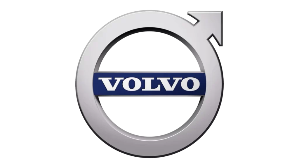
A Timeless Emblem
Despite subtle adjustments in proportions and shading, the core elements of the circle and arrow have remained intact. The logo's continuity sends a powerful message of reliability, trustworthiness, and a commitment to Volvo's core values.
In an era when many brands were overhauling their logos to keep up with design trends, Volvo's decision to maintain the integrity of its emblem spoke volumes about its dedication to tradition and its unwavering commitment to its heritage.
Current Volvo Logo Design
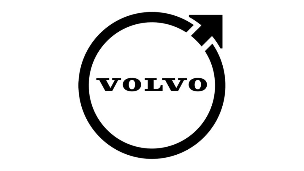
In 2021, Volvo unveiled a refreshed, streamlined version of its iconic logo, marking the first time in seven years that the Swedish automaker has updated its branding. The most noticeable change is that Volvo has moved from a three-dimensional logo design to a flatter, two-dimensional look.
Gone is the metallic silver circle behind the Volvo name that gave a sense of depth. The new logo does away with this effect, presenting the name and icon on a single plane. Additionally, the blue diagonal banner that has long been a fixture across the circle is no longer present.
By removing the banner and flattening the design, Volvo has created a cleaner, more modern aesthetic. The circle shape around the iconic iron alloy emblem is still integral to the logo, but it has been slimmed down for a more refined, less chunky appearance. This more straightforward presentation aligns with Volvo's move toward more minimalist Scandinavian vehicle interior design.
This refreshed logo marks Volvo's first significant branding change since 2016 when the current 3D version was introduced. Over the past seven years, the logo has become globally recognised and synonymous with Volvo's upscale yet pragmatic image. The two-dimensional redesign retains familiar elements while positioning Volvo as a dynamic, future-focused brand. It balances visual continuity with the company's heritage while presenting a fresh, streamlined look.
FAQs
What does the Volvo logo symbolise?
The Volvo logo symbolises strength, durability, and forward-thinking progress. The circle and arrow represent a commitment to safety and innovation, while the iron symbol in the early logo emphasises the brand's reliability.
Has Volvo ever radically changed its logo?
No, Volvo has maintained the core elements of its logo, such as the circle and arrow, throughout its history. While there have been minor refinements, the logo's overall design has remained consistent.
How has the Volvo logo adapted to different cultures?
Volvo's logo design is inherently versatile, making it easy to adapt to various markets and cultures. Its simplicity and universal symbolism have contributed to its global recognition.
What is the significance of the diagonal arrow in the Volvo logo?
The diagonal arrow in the Volvo logo represents progress and aspiration. It conveys the brand's commitment to moving forward and innovating in the automotive industry.
How has the Volvo logo contributed to the brand's success?
The Volvo logo has played a significant role in establishing the brand's identity and communicating its core values of safety, reliability, and innovation. Its iconic design has made Volvo instantly recognisable worldwide.
Conclusion
The iconic Volvo logo is more than just a visual representation of the Swedish automotive company. Over the decades, it has symbolised Volvo's unwavering dedication to safety, reliability and innovation.
The logo's origins date back to 1927, when Volvo founder Assar Gabrielsson chose the chemical symbol of iron as the emblem for his new automobile company. Known as the Iron Mark, this early logo reflected Volvo's roots in the steel industry and Sweden's reputation for excellent ironwork. It was a fitting symbol for the durability and strength that Volvo hoped its vehicles would embody.
Over the years, the Iron Mark evolved to keep pace with Volvo's growth and vision. 1930, the logo was enclosed in a circle to project a more well-rounded, welcoming image. In 1947, Volvo updated the logo again, tilting the iron alchemist's symbol to signal forward momentum, flanked by the company name in a robust and confident font.
Throughout the changing trends and fashions of the automotive world, Volvo has modernised its logo yet remained faithful to its heritage. Today's Volvo emblem retains the iconic iron symbol, now rendered in glossy, three-dimensional silver. The bold Volvo wordmark has been simplified while maintaining a sense of Swedish minimalism and precision.
This blend of tradition and contemporary style aptly reflects Volvo today – a company with nearly a century of expertise continually innovating and defining new standards in safety and sustainable mobility. Over decades, the consistent use of the Iron Mark has imprinted Volvo's brand identity on the global consciousness. It represents dependability, intelligence and Striving for excellence in protection and performance.
As Volvo charges ahead into the future, the familiar Iron Mark endures as a timeless representation of the company's core values. It connects Volvo's storied history with its forward-thinking vision, just as it connects Volvo with its loyal customers across generations. The logo is a reassuring symbol of the human-centric approach and pioneering spirit that will continue driving Volvo far into the 21st century and beyond.
