How to Design a Social Media Friendly Logo
Logos are the avatars of your brand. They represent you in profile pictures, ads, packaging – everywhere your customers interact with you online. However, not all logos are created equal in the social media age. The logos that thrive on platforms like Instagram and TikTok follow new rules.
These logos are human-centric. They focus on connecting with your customers rather than just showcasing your brand name. Your logo needs to feel approachable and convey what makes your company unique. Modern logos must also stand out as tiny-sized profile pictures and work across platforms and devices.
In this article, we'll explore the fundamental principles for designing a logo that pops on social media and builds an emotional bond with your followers. We'll look at examples of brands doing social media logos right. You'll learn tactics to make your logo more authentic, unique, inclusive, and eye-catching.
With the right approach, your logo can become an iconic and memorable social media avatar for your brand. It takes thoughtfulness and empathy for your digital audience. But do it right, and your logo will connect with customers whenever it's seen. Let's dive into the art and science of designing a social media friendly logo.
Table of Contents
Tips to Design a Social Media Friendly Logo
Know Your Audience and Brand Personality
The first step is clarifying who your ideal customers are and what emotional response you want to elicit. Study your target demographic – age, location, values, interests and purchasing habits. This will inform the look and feel of your logo.
It's essential to have a firm grasp on your brand identity and the personality attributes you want to convey, such as:
- Fun and playful
- Reliable and trustworthy
- Innovative and bold
- Sophisticated and elegant
Your logo should align with your brand promise and connect emotionally with your audience. The colours, symbols, typography and style you choose will communicate the essence of your brand.
Prioritise Simplicity
The most shareable logos are simple, clean and minimalist. Remove any excessive details, gradients or complicated textures. Simple logos are more memorable and recognisable on a small screen.
Aim for an uncomplicated icon or wordmark logo, lines and negative space around your logo. Icons like Apple's Apple with a bite, Target's ‘target' and Starbucks' mermaid are instantly identifiable.
For wordmarks, choose a distinctive yet readable font. Make sure the name is easily read in smaller sizes—Prioritise simplicity for maximum impact.
Use Contrasting Colours
Vibrant colours that stand out grab people's attention on social media. Bright primary colours activate emotional responses. Think about colours that represent your brand identity.
Using contrasting colours, like red and green or orange and blue, makes the different elements distinguishable on a small screen. White space also helps the colours and shapes stand out.
Avoid gradients and subtle colour variations that won't translate on various screens. Stick with clean, contrasting colours for a bold social media logo.
Scale Down to a Tiny Size
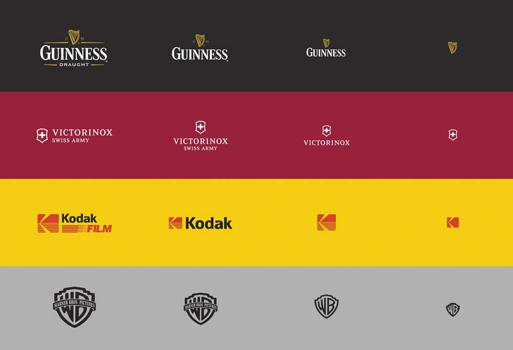
Most social media profile pictures are small circles or squares. Imagine how your logo would look as a tiny icon. Can you still clearly identify it?
Start by designing your logo at only 32 x 32 pixels. This forces you to simplify details and use bolder shapes and fonts. If it's recognisable when super small, then it will be identifiable when scaled up.
Test it at multiple sizes to ensure it's versatile. Aim for scalability so it conveys your brand whether it's displayed large or tiny.
Evaluate Black and White
Strip your logo down by viewing it in grayscale. Without colours, are all the elements – icons, typography, shapes – still distinct?
Eliminate any overlaps or ambiguities when colours are removed. Use contrasting shapes and whitespace to differentiate between graphic elements.
A logo should be recognisable in black and white to ensure versatility across platforms. Test it on coloured and grey backgrounds.
Pick Memorable Typography
For wordmark and letterform logos, select a font that communicates your brand personality. Fonts have different associations like modern, fun or elegant.
Please keep it simple and legible with no more than two complementary fonts. Script or serif fonts often get lost at smaller sizes, so go with thick, sans-serif fonts.
Make letterforms bold with ample spacing between characters to remain readable on a tiny profile icon. Pick distinctive typography that people will remember.
Design a Versatile Icon
If your logo includes an icon or graphic element, it should be unique yet simple. The Nike “Swoosh” checkmark and Apple's Apple shape are globally recognised icons.
Aim for a timeless symbol that visually represents your brand. Keep the lines, shapes and details minimalistic. Avoid photos or complex illustrations with lots of fine lines.
The icon you choose should remain identifiable when viewed as tiny. Test it at multiple sizes to ensure versatility across platforms and uses.
Create Visual Cohesion
A cohesive logo ties together different elements like shapes, fonts and colours. Align shapes and lines to connect visually with the typography.
Overlapping, grouping or containing graphic and text elements creates cohesion. Use consistent sizing, spacing and alignment across elements.
Unify your logo with colours, shapes and styles that complement each other. Consistent design creates a memorable, recognisable social media logo.
Design a Square Format
The square profile picture format is ubiquitous on most social platforms like Facebook, Instagram, Twitter, YouTube and LinkedIn.
While you can crop a horizontal logo into a square, it's better to design it in a square format. This prevents distorting or cutting off essential elements.
Start your design process with a square canvas rather than attempting to recrop a horizontal logo. Develop it specifically for a square profile picture to optimise for social.
Provide Plenty of White Space
Also known as negative space, white space helps your logo breathe on social media. Dense, cluttered logos get lost on a small screen.
Leave ample padding around your logo graphic and text. Follow the rule of thirds by keeping the subject off-centre and surrounded by space.
The white space around your logo maximises clarity and focuses on the critical central imagery. Don't be afraid of space!
Test on Various Backgrounds
Social media sites have coloured backgrounds and profile pictures. Test your logo on a white, black and grey background.
Ensure it has enough contrast to stand out clearly on different backgrounds. Light logos on dark backgrounds tend to have the most differences.
Simplify overly complicated designs that clash with busy backgrounds. Clean logos are more adaptable and visible on varied surfaces.
Optimise File Types for Social
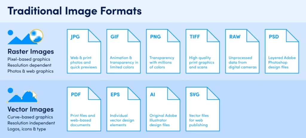
To keep your logo crisp and clear, save it in vector format as an SVG, EPS or AI file. Vector graphics can scale infinitely without losing resolution.
For web and mobile use, PNG is the best bitmap file format. PNGs retain higher quality than JPEGs and support transparency.
Use JPEG for photos, but avoid it for logos. JPEGs get pixelated and lose clarity when enlarged. Stick to vector or PNG files.
Size Recommendations
Follow these size guidelines tailored to popular social networks:
- Profile Picture: 170 x 170 pixels
- Cover Photo: 820 x 312 pixels
- Shared Image Thumbnail: 1200 x 630 pixels
YouTube
- Channel Icon: 800 x 800 pixels
- Video Thumbnail: 1280 x 720 pixels
- Profile Picture: 400 x 400 pixels
- Header Photo: 1500 x 500 pixels
- In-stream Photo: 1024 x 512 pixels
- Profile Picture: 110 x 110 pixels
- Post Thumbnail: 161 x 161 pixels
- Shared Image: 1080 x 1080 pixels
- Personal Logo: 400 x 400 pixels
- Banner Image: 646 x 220 pixels
- Shared Image: 590 x 300 pixels
- Profile Picture: 165 x 165 pixels
- Pin Image: 735 x 1102 pixels
- Board Display: 222 x 150 pixels
Logo Shapes and Formats
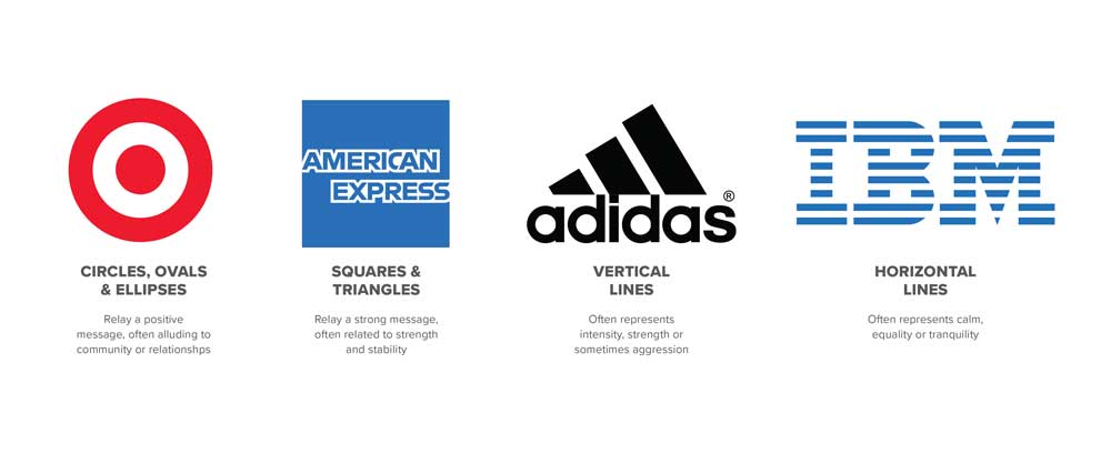
Logos come in different shapes, formats and orientations. Here are the most common logo layouts:
Horizontal Logo
Elongated shape, wider than it is tall. Horizontal logos work well in headers and banners. Allow ample whitespace around the logo.
Vertical Logo
Taller than it is wide. Vertical logos are optimised for mobile and adaptable to narrow columns.
Square Logo
Equal height and width. Squares are ideal for social media profile pictures and mobile design. They avoid cropping.
Circle Logo
The circular shape contains logo detail inside. Circles make versatile profile pictures and icons.
Landscape Logo
More comprehensive format with graphics spanning the width. Landscape logos display well in headers and wide spaces.
Portrait Logo
Smaller format with graphics stacked vertically. Portrait logos are made for mobile screens.
Emblem Logo
Typically, a graphic shape like a seal, badge or crest. Emblem logos look classic and official.
Lettermark
Initials or single letters representing brand name. Letter marks are simple, bold and recognisable.
Pictorial Mark
Illustrated image or mascot representing the brand. Pictorial logos are playful and friendly.
Combination Mark
Combines typography and graphical icons. Allows using images and text together.
Do's and Don'ts
Here are some logo design best practices for social media:
DO
- Keep it simple and minimalist
- Use clean, bold colours with contrast
- Incorporate negative space around the logo
- Design first for a small square format
- Choose an image that conveys brand identity
- Make sure the typography is clear and legible
- Test logo on black, white and colour backgrounds
- Provide logo in vector, PNG and JPEG formats
DON'T
- Use busy, intricate details that get lost
- Rely on subtle colour gradients and shading
- Overlap elements or clutter the design
- Use photos or illustrations with fine details
- Incorporate drop shadows or 3D effects
- Use more than two fonts
- Put text over busy graphic backgrounds
- Export logo only as JPEG
Tools and Software

You don't need fancy design skills or software to create a quality logo. Here are some easy tools for DIY social media logo creation:
Free graphic design platform with logo templates, fonts, shapes and images. Easy to use drag-and-drop tool.
Adobe Express
Create logos with the Adobe Express logo maker template. Add icons, images, text and shapes.
Logaster
Logo generator with AI capabilities. Choose icons and fonts for customised logo options.
Squarespace Logo
Squarespace's logo maker helps create simple logos with custom icons and text.
Looka
Looka uses AI to generate logo ideas based on your brand, industry and style preferences.
Stencil
Stencil provides logo templates and easy customisation tools like icons, colours and fonts.
LaughingBird
LaughingBird offers logo templates and creation tools focused on simple, clean designs.
GIMP
Free, downloadable photo editing and graphic design software similar to Photoshop.
Inkscape
Vector graphics editor for logos, icons, and illustrations. Free alternative to Adobe Illustrator.
Signs of a Good Logo
How do you know if your logo is well-designed for social media? Here are the signs of an effective logo:
- Instantly recognisable and memorable
- Evokes the brand's emotions and personality
- It looks great on both light and dark backgrounds
- Conveys brand story and purpose at a glance
- Remains identifiable at tiny 32 x 32-pixel size
- Works seamlessly on multiple platforms and sizes
- Has visual cohesion between elements
- It uses contrasting colours and whitespace effectively
- It appears original yet timeless
- Is consistent across brand touchpoints
- Flexible to work with diverse content formats
- sparks positive reactions and engagement from the target audience
If your logo checks most of these boxes, you've likely created a versatile design optimised for social media. Please test it out across different platforms and collect feedback from friends or colleagues. Refine shapes, symbols, text size and colours to maximise visual impact. With a memorable social logo, you can build consistent brand recognition across all your online platforms.
5 FAQs About Social Media Logo Design
To wrap things up, here are answers to five frequently asked questions about designing compelling logos for social media:
What size should my logo be for social media?
Aim for a logo with a minimum width and height of 170 x 170 pixels to accommodate most social media profile pictures.
What file type should I use?
SVG or PNG files are best for retaining quality across screens. Avoid JPEG for logos.
What's most important for social media logo design?
Simplicity, recognisability and bold visual contrast are key. Remove extra details and use shapes and colours strategically.
What if my current logo is too detailed?
Consider creating a more straightforward version optimised for small screens while keeping brand identity intact.
What free tools can I use to make a logo?
Canva, Adobe Spark, Logaster, Squarespace Logo, Looka and LaughingBird all offer free and low-cost DIY logo design tools.
Designing an effective logo tailored to social media platforms allows you to maximise brand visibility and visual storytelling. A strong logo instantly communicates who you are wherever it's viewed online. With a strategic design approach, you can craft a versatile logo that engages your audience across social.
