National Portrait Gallery by Edit Brand Studio
Opinion by Thomas Barnett Posted 14 September 2023

In June 2023, a giant of British cultural life awoke from a three year slumber. The return of the National Portrait Gallery evokes a joy that is made all the keener when one recalls the troubled time in which it closed its doors: March 2020, as the COVID-19 pandemic took hold and public life evaporated in the announcement of that first, most frightening lockdown.
In reality, one could make the case that the NPG began to slip into sleep long before it was anaesthetised for reconstructive surgery. Despite containing some of the most important paintings in the Western world (the only extant from-life portrait of Shakespeare; the Phoenix, Ditchley, Pelican and Coronation portraits of Elizabeth I), the NPG has never quite seemed to achieve the apex cultural cachet of its neighbour, the National Gallery, the V&A or the Tates Modern and Britain.
Perhaps this was because of its necessarily more niche angle on the worlds of art and history, its inherently popular appeal, or the fading vogue of portraiture in the cutting edge of the contemporary art world. Perhaps it was because of the position and design of the building itself, tucked away around the corner behind the National, while the latter magisterially commands the principal aspect of Trafalgar Square. Or perhaps it was due to its rather bland and unremarkable branding.
Whatever the reason for the NPG’s lacklustre former presence, the recently-completed regeneration project seems ready to usher in a new era of ascendency. Manchester-based Edit Brand Studio acknowledge the former lack of clout as one of the guiding principles of their rebrand, recognising the need for ‘a new brand identity to [create] more presence, more reach and more relevance.’ Because this work coincided with a genuinely ambitious architectural and strategic transformation, Edit stood a decent chance of achieving these lofty aims.


It is beyond doubt that the jewel in the crown of the new identity is a flawlessly elegant monogram logo, the letters NPG entwining in a way that is fluid yet immediately legible, the stems and bowls of the letters gracefully leading the eye and brain through the abbreviation. The lettering was handled by illustrator and typographer Peter Horridge, the man responsible for King Charles III’s official royal cypher, and the three lions of the England football team.


Working in collaboration with type foundry Monotype, Horridge’s monogram is a refinement of a sketch unearthed in the gallery archives, doodled by its first director, Sir George Scharf, in 1893. The modern logo borrows from Scharf’s basic arrangement and connection between the three letters. Horridge’s innovation is to thicken the original spidery pen-strokes into lettering that is sleek yet robust; classic yet contemporary. Subtle but steep serifs nod to the gallery’s heritage, while creating a solid profile for satisfyingly stamping over artwork and other imagery throughout the brand.
![]()
Edit’s case study includes a luscious video providing a behind-the-scenes look at the process, featuring tantalising glimpses of other ‘wonderful motifs, mosaics and monograms’ that were discovered in the museum archives. Though the design that was chosen as an inspiration point was undoubtedly the right choice, one itches to leaf through those other alternate monograms. I would buy a ticket to a mini exhibition just about the early attempts to brand the museum. As it is, my imagination glitters with a wild profusion of Ns, Ps and Gs articulated in Arts & Crafts mosaics, gorgeous Victorian calligraphy, chic Bloomsbury-esque early-modernist doodles and more phantasmagorical typographical ephemera.
The chosen monogram design is pretty simple in a structural sense: the straightforwardly correct approach. But it is so compelling, so completely right in every detail of its execution that after spending very little time with it, one finds it hard to imagine that the NPG ever signed itself differently at any point in its august 167–year history. The monogram evokes so many beguiling historical and art-world associations: the graphic, monogrammatic signatures of artists like James McNeill Whistler and Albrecht Durer; the venerable stamps of collectors and auction houses that bedeck the reverse sides of important artworks; the wax seals and signets of many of the collection’s aristocratic subjects.
As with the recent rebrand of the Natural History Museum, the gallery has chosen to lead with its abbreviated name, and the monogram is accordingly trumpeted as the hero asset (one assumes that Horridge’s involvement doesn’t come cheap). This could be seen as symptomatic of the rest of London’s cultural institutions following in the wake of the V&A’s bar-setting game-changer monogram and accompanying brand.
However, as Emily Gosling observes in BP&O’s review of the recent rebrand of the Natural History Museum (now ‘NHM’), aiming for this kind of abbreviated iconicness is not always guaranteed to succeed. Unlike the ‘NHM’ (see?) the NPG, thanks in equal part to a less well-established previous identity, and a more euphonic, less breathily-aspirated trio of letters, stands a good chance of pulling it off. Long live the En Pee Gee!
The lettering of the monogram is equally charming and solid when expanded into a full wordmark and custom typeface. The wordmark is deployed in a design system that allows it to flex across one, two or three lines to ensure that the integrity of the portraits is preserved when they are used in layouts. The Monotype-designed brand font is rolled out with simple but interesting variation: alternating sentence-case and all-caps, vertical headings, and sparing touches of colour for emphasis. The secondary sans serif Inter Sans is occasionally used for subheadings and captions, to pleasing contrast.

Like the flexible logo system, the colour palette is cleverly curated to provide just enough options so that text and monogram clearly contrast with whatever artwork it is used over or alongside, without ever stealing focus from or subordinating those important works. The colour scheme is led by a hero trio of bright mint green, electric yellow and a hot vermillion orange. A more business-like cerulean blue rounds out the combo. The palette works brilliantly layered over imagery from the collection, or on black or off-white backgrounds. Conversely, the hero colours work well as solid backgrounds, primarily in digital applications.
This careful, sensitive foregrounding of the gallery’s collection is a wise move by Edit. The NPG has always been, in my opinion, easily the most fun of London’s great galleries and museums. Not because it offers an especially packed programme of evening openings replete with mid-tier DJs and cocktails in plastic cups, nor because it boasts a janky augmented-reality app with which to scan its paintings, or any other such frivolous stabs at modernity – but because its collection is so effortlessly alive.


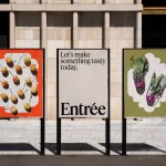
The story of Britain (which is of course an endless multiplicity of contradictory and often unreliable stories) that is told through these portraits palpably leaps off the walls. In the words of Denise Vogelslang, Director of Communications & Digital, the NPG is ‘a gallery of people, for people’. That vivid sense of life is centre-stage in the new brand in simple but endlessly inviting designs for posters and social media assets.


This rebrand is an exquisitely well-executed example of intentional design. There is not a lick here that is superfluous, nothing that doesn’t serve its purpose with admirable versatility and plenty of style. The work remedies the undeserved sense of inferiority that blighted the NPG, and shepherds it to reclaim its rightful place in the highest echelons of British cultural institutions.
Seeing the NPG resplendent in its newly(old) finery after a three-year leave of absence is a deep joy. Edit should be proud of their careful, loving work. It is to the great benefit of this nation that the NPG chronicles with such incomparable charisma. The history of Britain has never looked more vivid than when seen through the lens of its incredible collection, and now, thanks to the work of Edit, Peter Horridge and others, the collection itself has never looked more inviting and alive.