
Pantone unveils app to colour match with “real life”
The tool will also help creatives adapt to new ways of working following the COVID-19 crisis, according to the colour company.
Colour company Pantone has revealed a digital platform and matching product for designers which aim to streamline the colour decision-making process.

Pantone Connect rolls out across mobile, web and the Adobe Creative Cloud suite of applications. The mobile app provides access to the complete range of Pantone’s colour spectrum.
“Capture colour from real life”
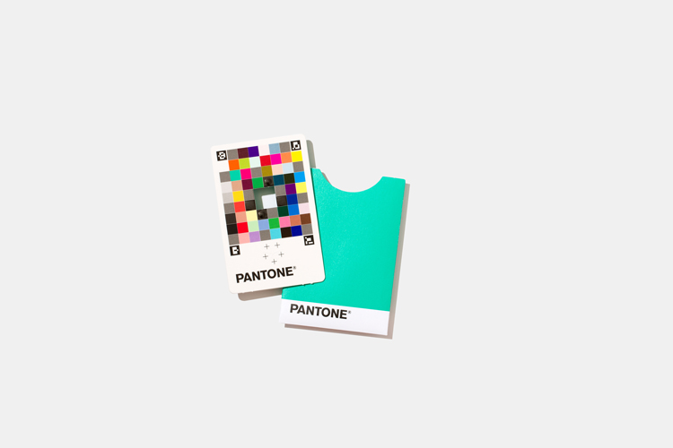
As part of the announcement, Pantone has also launched a product. Colour Match Card is a credit card-sized target that can be calibrated with a phone’s camera to “capture colour from real life”.
The card has a hole in its centre, and users centre it on an object whose colour they want to use. It is then as simple as taking a photo. By uploading it to the mobile app, Pantone can then match it to the nearest tone. The app then saves the colours into the designer’s palette.
Pantone Digital Solutions senior product manager Nick Bazarian says: “With the Colour Match Card and Pantone Connect app, a designer’s phone has now become a legitimate colour capture device to match the physical world more accurately to Pantone Colours.”
An opportunity to increase “workflow productivity”
The new service is also “workflow productivity tool” which aims to reduce the “colour communication process”, according to Bazarian. This has been given added relevance during the COVID-19 pandemic, the company says.
The health crisis has accelerated challenges for designers, by “rapidly replacing the collaborative, light-filled and resourceful design studio with virtual chats at living room tables”. “Communicating colour intent” is difficult under normal circumstances, Pantone says, but even harder with remote working conditions.
The Colour Match Card and identification app will help to streamline these decisions across dispersed design teams. It will also aid freelancers, Pantone says.
Pantone is best known for picking a colour of the year. Their choice for 2020 was Classic Blue, which was chosen for its “confidence” and “constancy”.
Read this next

-
Post a comment


