The Power of Beauty Logos: Top 10 Designs
A logo is the face of a beauty brand, encapsulating its identity and values in an iconic visual mark. In the crowded beauty industry, a compelling logo is crucial for standing out, making an instant impression, and forging an emotional connection with consumers. The most effective beauty logos fuse art and psychology, employing thoughtful design elements that evoke desirable emotions and convey a brand's aspirations.
The most iconic beauty brands are defined by their logos. Chanel's sleek burgundy box and gold lettering immediately evoke luxury and sophistication. The understated black Helvetica font of Clinique represents clinical precision and reliability. The flower icon of L'Occitane whispers of Provence's fields and natural beauty. These logos have permeated our cultural consciousness, becoming visual shorthand for the brand image.
This article explores the ten most impactful beauty logos, analysing the components that make them memorable and effective. We examine their shape, colour palette, typography, symbols, and negative space. We also look at the brand vision behind each logo and how they psychologically appeal to beauty consumers with feminine imagery, hints of indulgence, or associations with health.
These logos inspire beauty brands seeking to design a mark that captures attention at a glance. They highlight the importance of thoughtful logo development to distil a brand's essence into an alluring graphic. When a beauty logo fires the imagination and forges an emotional bond, it becomes an invaluable asset in a competitive marketplace. The most well-crafted symbols withstand trends and constantly evolving beauty ideals by tapping into core human desires for self-expression, confidence, luxury, and youth.
Table of Contents
The Beauty of Simplicity

Simplicity is often the key to creating an impactful and memorable logo in branding and marketing. This principle holds in the beauty industry, where many top brands have achieved icon status through clean, minimalistic logo designs that exude sophistication.
Take Chanel's famous interlocking C logo, for example. The crisply overlapping Cs, framed by a circle in a serif font, has become synonymous with the height of luxury and timeless beauty. Coco Chanel first introduced the logo in the 1920s, but its straightforward elegance has remained unchanged. The mark stands out for its simplicity yet conjures instant associations with exclusivity and glamour.
Similarly, Clinique's lowercase “c” enclosed in a box projects a clean, clinical aesthetic befitting the brand's origins as an offshoot of the Estée Lauder Companies founded by a dermatologist. The sparse, san serif font evokes science and expertise, while the geometric shape enclosing the letter adds a modern, minimalist sensibility.
Other beauty brands that use straightforward logos to project luxury include Dior, with its bold block-letter wordmark; Lancôme, with a single stylised rose; and MAC, whose primary logo is simply the brand name in a basic, bold font. Minimalism allows the quality and reputation of the brands to speak for themselves.
So while elaborate logos can work for some companies, many of the most prestigious and recognisable beauty brands stick to simple, elegant designs. As in fashion, cosmetics customers often respond best to clean and minimalistic logos, yet distinctive in their fonts, shapes and composition.
Nature-Inspired Elegance

The beauty industry has long drawn inspiration from the natural world, with many brands incorporating organic elements into their logos and packaging. Flowers, leaves, fruits, and other natural motifs allow brands to communicate values of purity, sustainability, and natural ingredients.
For example, the Body Shop's iconic logo features a wreath of green leaves enveloping the company name in a handwritten font. The leaves are reminiscent of ivy, symbolising vitality and growth. Their vibrant green colour evokes the earthy hues of plants, highlighting the brand's commitment to using ethically-sourced botanicals and natural ingredients. The handmade look of the logo also nods to the company's humble origins, which began as a small shop selling naturally-based beauty products.
Similarly, Aveda's logo features a sun rising over a mountain, surrounded by swirling petals or leaves. This imagery conjures up ideas of organic beauty rituals using plants fresh from nature. The intricate details showcase Aveda's expertise in sourcing and crafting plant-based hair and skin solutions. Meanwhile, the sun represents enlightenment and personal growth, reflecting the brand's holistic approach to inner and outer beauty.
Other significant players in the industry follow this template as well. L'Occitane's logo is a spring of flowers, communicating the Provençal roots of the brand and its use of natural ingredients from the French countryside. The curving leaves in the Burt's Bees logo styled after a bumblebee evoke the meadows where bees harvest pollen and nectar for their honey. And the juicy orange fruit in the Glow Recipe logo symbolises the brand's ethos of using food-based ingredients to nourish the skin.
In summary, nature is an infinite source of inspiration for beauty brands looking to design memorable, meaningful logos. By incorporating organic shapes and motifs, they can creatively communicate their values and product benefits to consumers who seek natural beauty solutions. The connection between the beauty industry and the natural world continues to bloom.
The Magic of Typography

Typography is a critical design element for beauty brand logos, as the font style and shape can evoke certain emotions, personalities, and brand values. Beauty brands often aim to convey prestige, elegance, femininity, or modernity through deliberate typography choices in their logos.
Elegant script fonts are frequently used in luxury beauty brand logos to impart a sense of timelessness, sophistication, and classic beauty. For example, the flowing, looping script of the Sally Hansen logo has an inherently luxurious, feminine, and romantic feel. The cursive letterforms and soft edges evoke notions of couture, suggesting that the brand offers products that will make women feel beautiful, confident, and chic. This elegant script captures the essence of Sally Hansen's aspirational identity.
On the other hand, bold, straight-edged, sans-serif fonts can communicate a modern, minimalist aesthetic for contemporary beauty brands. Glossier's logo utilises thick capital letters in a clean sans-serif font, aligning with the brand's pared-down, millennial-friendly image. The bold typography implies confidence and no-fuss beauty.
Some beauty brands combine script and sans-serif fonts for contrasting feelings of timelessness and modernity. Anastasia Beverly Hills blends a flowing script with an angular sans-serif, hinting at classic elegance and current trends. The logo speaks to feminine glamour with an edge.
So, in summary, beauty brands thoughtfully use different typography styles, from script to sans-serif, to reflect their identities, evoke specific eras, and connect with target demographics through visual and emotional cues. The nuances of font design play a key role in compelling beauty brand logos.
Colour Psychology in Beauty Logos

The psychology of colour is essential for brands, especially in the beauty industry. Different colours evoke different emotions and associations in consumers, powerfully shaping brand perceptions. Beauty brands carefully consider selecting logo colours and product packaging hues that connect with their target audience on a deeper, emotional level.
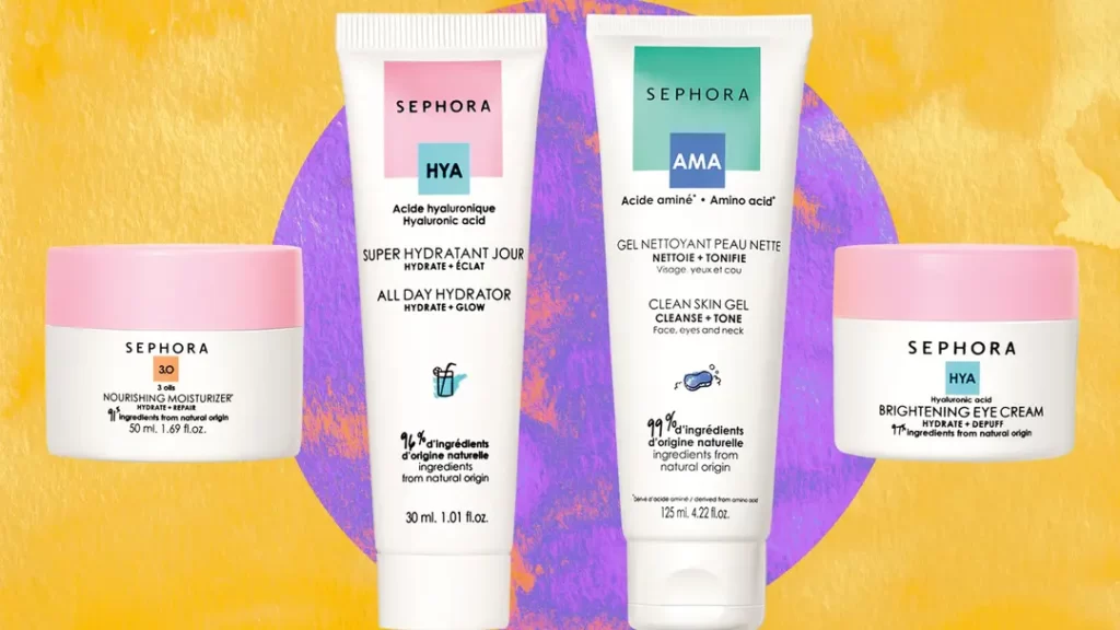
For example, Sephora uses black and white in their logo to exude luxury, sophistication and modernity. Black represents exclusivity, power and sophistication. White conveys purity, innocence and elegance. Together, this classic colour combination creates a memorable, authoritative brand image. Sephora stores also use black lacquered displays with bright white lighting to reinforce this sleek, modern aesthetic.
L'Oréal Paris also draws on colour psychology in their branding. Their signature shade of blue evokes feelings of trust, honesty and stability. Studies have shown that consumers psychologically associate the colour blue with qualities like intelligence and dependability. This reinforces L'Oréal's positioning as a reliable, expert beauty brand. Their blue tones create familiarity and approachability compared to edgier blacks used by more exclusive brands.
Colour choices even extend to specific products and lines. Urban Decay's makeup packaging features dark midnight blues, blacks and purples to align with their provocative, edgy brand image. Their Naked palette uses warm nude tones to evoke natural sensuality. Loreal's True Match foundation comes in cool, warm and neutral undertones to appeal to different complexions and colour preferences.
Overall, colour is an impactful branding tool. Beauty brands conduct extensive consumer research on colour associations and preferences among their target demographics. Their strategic use of colour evokes certain moods and emotions in customers, influencing purchasing decisions on a deeper psychological level.
Symbolism and Icons

Beauty brands, in particular, often incorporate unique symbols or icons into their logos that reflect core values and product benefits. These symbolic elements allow beauty brands to establish instant recognition while reinforcing their promise.
For example, the globally recognised Nivea logo features a simple blue oval shape. This iconic blue colour was selected to represent reliability, trust and care. For millions of customers worldwide, this calming azure shade evokes a sense of cleanliness, purity and gentleness. This reflects Nivea's central brand promise of providing effective yet mild skincare products that nourish and protect sensitive skin. The oval shape also signifies Nivea's commitment to care and protection.
Similarly, the embellished flower icon in the logo of the beauty brand Fresh conveys a sense of natural, wholesome ingredients. The floral symbol implies using botanical extracts and essences to craft skincare and cosmetics. This aligns with Fresh's brand ethos of using pure, raw ingredients for effective beauty solutions.
Prestige makeup brand Dior features an abstract five-petal flower shape centred on the letter D. This elegant floral motif represents femininity, luxury and refined beauty – aligning with Dior's upscale, glamorous brand image. The symmetrical shape also signals balance and harmony.
Through the strategic use of colour, shape and symbolism, beauty brands can distil their core identity and product benefits into a single memorable logo. Icons and symbols allow companies to communicate brand values intuitively and emotionally while establishing visual familiarity across markets. A thoughtfully designed logo is a powerful asset for beauty brands seeking to engage consumers and stand out from competitors.
Logos That Tell a Story

The most effective beauty brand logos tell a compelling story that allows consumers to connect emotionally with the company and its values. A thoughtfully designed logo encapsulates the brand's essence, communicating its vision, ethos, and purpose.
Take MAC Cosmetics as an example. The logo features the brand name in bold, capitalised font, with a vibrant red “Viva Glam” sign below. This striking addition references MAC's iconic Viva Glam campaign, which has raised over $500 million for AIDS research and outreach programs since its launch in 1994.
The campaign itself was revolutionary, as MAC was the first major beauty company to create a lipstick line where 100% of proceeds went towards charitable initiatives supporting people impacted by HIV/AIDS. The vibrant red Viva Glam logo communicates these values of social activism and philanthropy that MAC has championed for decades. It immediately tells the story of a mission-driven brand committed to creating positive change.
Consumers form an emotional bond with MAC by using their products and supporting a company that aligns with their compassion and social justice values. The logo encapsulates this narrative in a simple yet powerful way that builds brand loyalty based on shared ideals.
This is the hallmark of a great beauty brand logo. It should visually communicate what a company stands for, not just its products. When done effectively, a logo can speak directly to consumers by telling the brand's unique story.
Adaptability and Versatility

A striking beauty brand logo should be versatile enough to work across various marketing channels and materials. The logo design should impact whether displayed on product packaging, social media platforms, print and digital advertisements, storefront signage, or even on employee uniforms.
The most effective beauty logos are flexible in their application while maintaining brand consistency wherever they appear. For example, L'Oréal's timeless logo featuring the name in a sleek, clean font has become globally iconic. The minimalist logo adapts seamlessly to stand out across store shelves, glossy magazine pages, influencer collaborations, and website banners while remaining inherently recognisable as L'Oréal.
Beauty brands must consider how their logo will translate across diverse contexts in today's omnichannel retail environment. A logo that pops up on an Instagram story may get lost on a tiny product bottle. Effective logo design requires evaluating aesthetics, versatility, and visibility across potential touchpoints. The most successful beauty brands feature logos that telegraph their image powerfully yet can adapt to any situation. A versatile, memorable logo becomes invaluable as beauty brands expand their reach across digital and brick-and-mortar channels.
Minimalism vs. Intricacy

In the beauty industry, brand logos distinguish between simplicity and intricacy. While clean, minimalist designs are often favoured for their sleek aesthetic, some brands opt for more complex and ornate symbols to communicate prestige and capture attention in a crowded market.
Take Versace's iconic Medusa head logo, for instance. The mythological figure with her crown of writhing snakes is an apt symbol for Versace's bold, provocative essence. The intricate detailing in the logo, from the defined facial features to the textured scales of the serpents, reflects the brand's dedication to superior quality and craftsmanship. The logo strikes the perfect balance – it has depth and visual interest while remaining recognisable and cohesive as a Versace brand mark.
Similarly, the logo for Yves Saint Laurent features intricate line art of the brand's initials. The flourishing calligraphic strokes reveal the brand's French roots and convey an air of luxury and sophistication. While ornate, the logo retains clarity and seamlessly expresses the YSL brand identity.
Not all beauty brands opt for baroque styles when designing logos. Clean, minimalist symbols can also effectively communicate a brand's values. Take, for instance, The Ordinary's pared-down font and single underline – this simplicity conveys their focus on clinically-proven skincare ingredients rather than costly frills.
So while the beauty industry often favours minimalism, more elaborate designs are still possible if they authentically represent the brand. The key is to balance complexity and coherence when crafting a logo that captures a brand's unique sensibilities. Intricacy for intricacy's sake can overcomplicate, but strategic ornamentation paired with design principles can yield an elevated look.
Timeless vs. Trendy

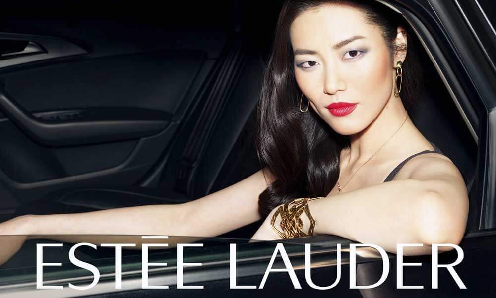
Beauty brand logos face an exciting challenge – creating a design that stands the test of time yet still feels fresh and current. Many iconic beauty brands opt for a timeless, classic logo that can remain recognisable and relevant for decades without significant changes. Estée Lauder's logo exemplifies this approach. The elegant, scripted font and minimal design have remained unchanged since the brand's founding in 1946. This consistency has helped cement Estée Lauder as a storied, prestige brand.
However, beauty is also an industry intrinsically tied to trends and innovation. As such, some brands take a more adaptive approach to their logos, updating them periodically to align with modern aesthetics. Brands like CoverGirl and Maybelline tend to embrace current design styles, helping them maintain a youthful, approachable image. Their logos have evolved to feature sleek, sans-serif fonts and simplified graphics.
The key for any beauty brand is finding the right balance between timelessness and modernity in their logo. An overly trendy logo risks quickly feeling dated, while an excessively stiff, traditional logo can make a brand seem stuffy or out of touch. The most successful symbols feature an enduring, recognisable design concept that can be subtly adapted over time. For instance, Clinique's logo font and “Clinique” name have stayed consistent for decades, but the flower graphic has become more fresh and contemporary.
A beauty brand's logo should reflect its core identity and desired perception. Timeless brands can stick with a classic, elegant logo, while more youthful brands may require more flexibility and updates. But no matter the approach, longevity and adaptability are critical.
The Ever-Changing Beauty Industry

The beauty industry constantly changes as new trends emerge and consumer preferences shift. As a result, beauty brands must regularly reevaluate their branding and marketing strategies to remain competitive in the marketplace. A critical element of a beauty brand's image is its logo. Over time, a symbol may no longer communicate a brand's identity or resonate with its target demographic. Redesigning or refreshing a beauty brand's logo can revitalise the company's look and feel.
For example, in 2019, the trendy beauty brand Glossier unveiled an updated logo, moving away from the playful, bubbly font it had used since its launch in 2014. The new logo features sleek, uppercase sans-serif lettering in a bold shade of pink. This rebranding marked a transition for Glossier, signalling a more sophisticated and elevated aesthetic to match the brand's growth and expansion. While Glossier had developed a cult following among young millennials with its girly branding, the new minimalist logo helped attract a broader demographic, including older millennials and Gen Z consumers. The redesigned logo aligned with Glossier's focus on skincare, wellness-oriented products, and makeup.
Rebranding a logo is a strategic decision for beauty brands to remain fresh and relevant. As consumer preferences change and new trends emerge, brands must be willing to reinvent their visual identities. A logo redesign can communicate a company's evolution, realign with target markets, and help brands differentiate themselves in an increasingly crowded industry.
Conclusion
The logos of the most iconic beauty brands have the remarkable power to create lasting impressions and spark emotions that deeply resonate with consumers. Through thoughtful design choices, including simplicity, natural elements, typography, colour psychology, symbolism, storytelling, adaptability, and timeless aesthetics, these logos masterfully exemplify the art of visual communication.
When consumers see Nars's sleek, minimalist logo, they feel the glamour and sophistication of the brand. The intricate letterforms of the Chanel logo evoke tradition and luxury. Glossier's logo's youthful, fun colours express a passion for self-expression. Fresh's natural-yet-elevated logo creates associations with high-quality ingredients and efficacy. These and other top beauty brand logos deeply tap into consumers' aspirations and emotions.
As the beauty industry continues its remarkable growth and evolution, we can expect to see more show-stopping logos emerge, each telling its unique story and forging meaningful connections with target audiences. The symbols explored here represent thoughtful design's tremendous impact on a brand's success and its ability to leave an indelible impression on the exciting world of beauty. These icons demonstrate the resonance of visual communication when skillfully executed. Without saying a word, they reflect and shape the image and essence of the brands they represent.
