
This post contains affiliate links. We may earn a commission if you click on them and make a purchase. It’s at no extra cost to you and helps us run this site. Thanks for your support!
Unveiling the Power of DuPlay: A Revolution in Typeface Design.
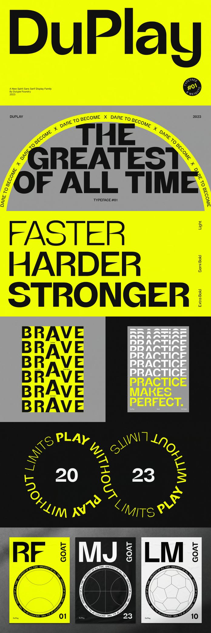
In the dynamic realm of font design, where creativity meets functionality, one name has been making waves since its inception in late 2023 – the DuPlay font family by Dutype Foundry. Crafted by the visionary Darman Kadir, DuPlay stands as a serifless marvel influenced by iconic Swiss typefaces such as Helvetica, yet forging its path to redefine the landscape of contemporary design.
A Symphony of Form and Function
DuPlay is not just a typeface; it’s a statement. With its sleek and modern aesthetic, this sans-serif font captures the essence of speed, strength, and sophistication. The robust strokes and sharp edges give it a solid and rapid appearance, setting it apart from conventional font families. It’s not just a set of letters; it’s a visual anthem that resonates with the energy of the sports and fashion industries.
Swiss Precision Meets DuPlay Innovation
Swiss typography has long been celebrated for its clarity and precision, with Helvetica reigning supreme as a design icon. DuPlay, however, emerges as a bold alternative, marrying the time-honored principles of Swiss design with a contemporary twist. While paying homage to its predecessors, DuPlay ventures into uncharted territory, pushing the boundaries of sans-serif typefaces to new, exciting heights.
The Game-Changer for Your Brand Presence
DuPlay isn’t just a font; it’s a strategic move for brands seeking to elevate their sport and apparel presence. The solid and swift appearance of this font injects a sense of urgency and modernity into your visual identity. It goes beyond being a mere typographic choice; it’s a bold statement that commands attention and strengthens your brand image.
Diving Deeper into DuPlay’s DNA
Let’s delve into the intricacies that make DuPlay a powerhouse in the world of typography:
- Solidity Redefined: DuPlay boasts a solidity that sets it apart from the many fonts available. Each letter is meticulously crafted to convey strength and resilience, making it an ideal choice for brands looking to project a robust image.
- Swiftness Personified: The swift and elegant design of DuPlay injects a sense of dynamism into your messaging. Whether on apparel, digital platforms, or print media, the font’s rapid appearance resonates with the fast-paced nature of sports and fashion.
- Influence of Swiss Tradition: DuPlay pays homage to the legacy of Swiss typefaces, incorporating the precision and clarity that defines the genre. However, it ventures into a realm of its own, embodying a contemporary spirit that aligns seamlessly with the demands of the modern world.
The Verdict: DuPlay Transcends Boundaries
DuPlay stands tall as a beacon of innovation and style. Darman Kadir’s creation has seamlessly blended the timeless elegance of Swiss design with a fresh and audacious approach, offering a font family that transcends conventional boundaries.
For brands seeking a typography overhaul, DuPlay isn’t just an option; it’s a necessity. It’s the missing piece that completes the puzzle of a compelling visual identity. Embrace the power of DuPlay, and let your brand speak a language of strength, speed, and unparalleled style.
Feel free to find more recommended typefaces on WE AND THE COLOR.


