
This post contains affiliate links. We may earn a commission if you click on them and make a purchase. It’s at no extra cost to you and helps us run this site. Thanks for your support!
Unveiling RNS Sanz: The Architect of Typography
In the vast landscape of typography, where form meets function, one typeface stands as an epitome of clarity, rationality, and unwavering functionality – the RNS Sanz font family. Crafted by the ingenious mind of Yorlmar Campos, this font family embodies a neutrality that serves as an unassuming workhorse for any design purpose, and its versatility transcends the boundaries of conventional typefaces.
A Symphony of Rationality
Imagine a typeface that speaks volumes through its simplicity, yet holds the power to convey messages with absolute clarity. RNS Sanz is precisely that symphony of rationality. With seven meticulously crafted weights ranging from the delicate Light to the commanding Black, each weight is a testament to precision and purpose.
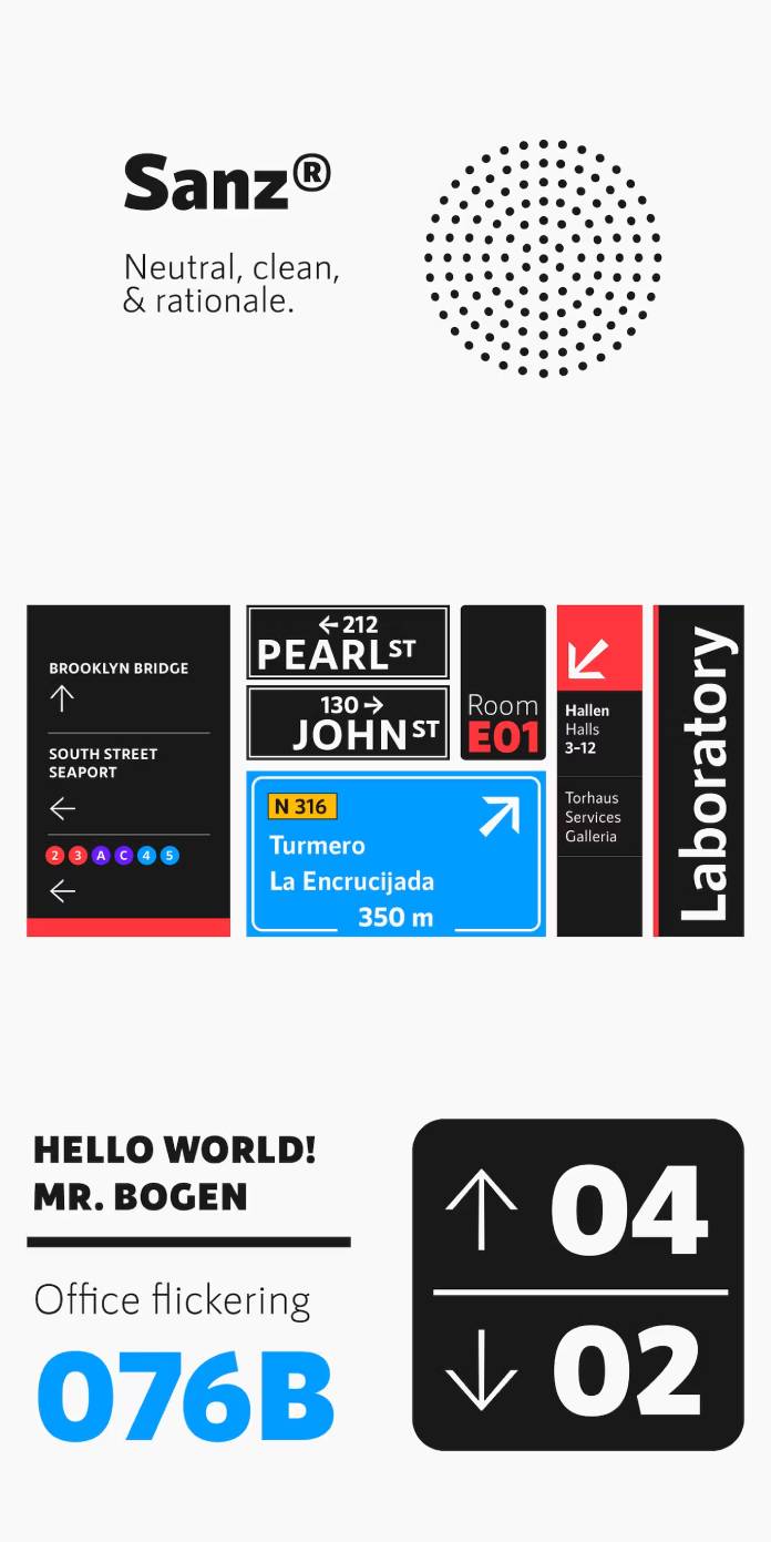
Crafting Functionality
Functionality is at the heart of RNS Sanz’s design. Its clean lines and clear strokes make it a true chameleon in the world of typography. Whether it graces the signage of a bustling metropolis or adorns the pages of a sleek website, this font family seamlessly adapts to any environment without losing its distinct character.
Versatility Redefined
What truly sets RNS Sanz apart is its adaptability across mediums. With file formats catered for webfont use – OTF, TTF, WOFF, WOFF2, EOT – it effortlessly transitions from print to digital, offering a consistent and legible experience across various platforms.
Architectural Elegance in Typography
Much like the architectural marvels it finds its affinity with, RNS Sanz exudes a sense of structural elegance. Ideal for signage systems and rational architecture, its design philosophy aligns perfectly with clean, functional spaces, where every element serves a purpose.
Small Caps, Big Impact
The inclusion of small caps across all seven weights adds a touch of sophistication and versatility to this font family. Whether it’s the subtlety of Light or the boldness of Black, the small caps feature accentuates the essence of each weight, providing designers with a broad spectrum of creative possibilities.
Embracing the Future of Typography
As the world of design evolves, RNS Sanz remains a timeless companion, embracing the future with its adaptability and reliability. Its compatibility with multiple formats ensures that it not only stands the test of time but also remains at the forefront of modern typography.
In conclusion, the RNS Sanz font family is not just a collection of letters; it’s an architectural marvel in itself. Its rationality, clarity, and adaptability make it an indispensable tool for designers seeking a balance between form and function in their creations. Yorlmar Campos’s creation transcends the realms of mere typeface; it’s a testament to the artistry and ingenuity that define exceptional design.
Feel free to find more recommended and trending typefaces for different creative needs on WE AND THE COLOR.
Subscribe to our newsletter!


 Template")